
According to research from the marketing company WebPageFX, it takes fewer than 90 seconds for customers to form subconscious judgments about products—with a whopping 85% citing color as the primary reason for purchasing a certain product and 80% saying color increases brand recognition. Furthermore, ads in color are read up to 42% more often than ads in black-and-white.

Perhaps more than ever, today’s brands and marketers understand that when it comes to images, the right hue often makes all the difference in the eyes of consumers. As more of us prioritize sustainability, for example, green and blue logos can influence customers to view a brand as more ethical. One study suggests that colors in ad images could even encourage us to pay more for products with extra features, when compared with black-and-white.
For commercial photographers, a basic understanding of color theory and color psychology can serve as an invaluable resource in storyboarding, executing, and editing images that sell. Read on for our best tips and tricks for using the color wheel to boost your Licensing sales potential.
Track the trends
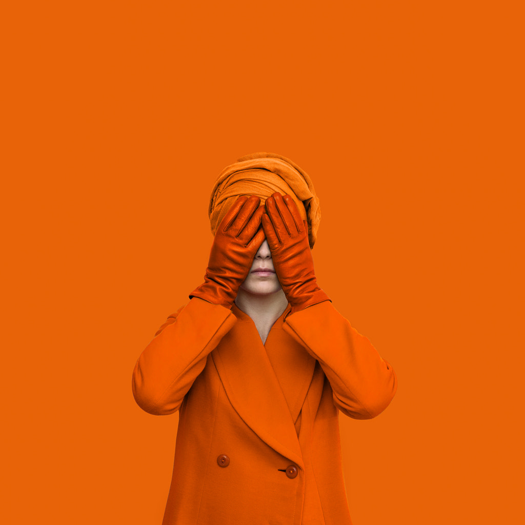
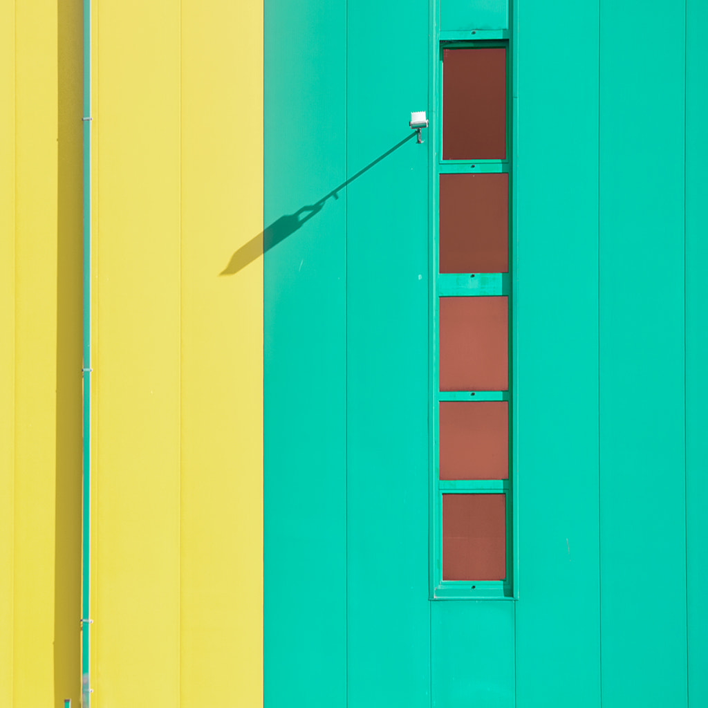
Commercial photography evolves at rapid speeds, so keep your finger on the pulse of current trends. Every year, design, color, and paint companies like Pantone, Behr, Sherwin Williams, and Benjamin Moore release their Colors of the Year. The 2020 selections include Classic Blue, Back to Nature, Naval, and First Light. Think: verdant greens, deep blues, and soft pinks. Blues have also been popular on 500px Licensing in the last months.
Many of these paint companies start their research a few years in advance of their predictions, drawing from sources like fashion, art, film, social media, tech, and more, so they tend to be good indicators of what brands will look for in the near future.
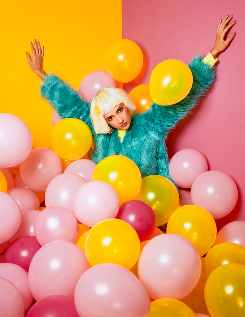
Although trends come and go, some colors have longevity, particularly in the commercial realm. A few years ago, for example, Getty Images named ‘Gen Z Yellow’ as one of their top trends, spanning the worlds of fashion, design, and business. They traced this rebirth of yellow back to Beyoncé’s 2016 visual album Lemonade, a tour de force that has continued to shape visual culture ever since (who could forget that internet-breaking Roberto Cavalli dress?).
Between 2017 and 2018, customer searches for “yellow” on Getty Images rose from between 100% to 300%. Earlier this year, their Creative Insights team reported that yellow was still having a “moment,” especially in popular images relating to business and corporate life.
Warm yellows tend to “pop” off the page when combined with another recent trend for darker, low-key tones, so consider pairing it with a moodier palette for some added contrast, “oomph,” and optimism. “Part of Gen Z yellow’s appeal was, and is, its ability to stand out,” the 500px Content Team tells us.
Incorporating new trends—and predicting emerging ones—can give your photos an edge over the competition and add freshness and vibrance to your portfolio.
Know what colors look good together
We’ve written two articles so far on the nuances of color theory, so be sure to check those out to see what works—and what doesn’t—when combining colors. If you’re using one saturated color, for example, consider pairing it with a neutral gray color to make it stand out more.
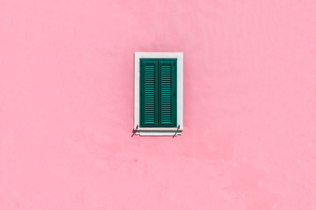
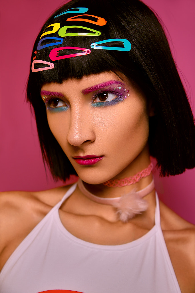
Similarly, you can use complementary colors like red and green or blue and orange to heighten the energy of a dynamic shoot, or use analogous colors for a harmonious, natural vibe. Maybe you use one “key color” to highlight your main subject and use the rest to support it.
That’s not to say that you always have to follow a specific color “rule,” but starting with the color wheel is a good place to start. From there, you can mix it up and see what works with your vision.
A few years ago, the editor and publisher of the PantoneView Colour Planner, David Shah, coined the term “accidental color” to describe the mix-and-match-style trend unfolding in the United States. Don’t be afraid to play with a few creative color options (backdrops, wardrobe, etc.); if you’re used to sticking with one palette, you could land on a new scheme you hadn’t previously considered, like triadic or even monochrome colors.
Think like a buyer
When selecting a color palette for a Licensing shoot, consider where your images will ultimately appear. What kinds of clients suit your aesthetic, and what themes might they use your photos to convey? A brand looking for photos to promote their all-natural CBD skincare line, for instance, is likely to use a different color palette than a marketer designing a book cover for a fast-paced thriller.
“Brands will often search content for specific colors that will help make their products and branding more memorable and evoke their desired emotions,” the Content Team explains. Color is subjective, but the more commercial images you study, ranging from photoshoots to logo designs, the better you’ll understand how colors can influence our emotions–and purchasing decisions.
For example, markets might use red as a “call to action” color that evokes feelings of power and energy, or they might choose yellow to project an uplifting, hopeful outlook. Green could convey health and wellbeing, while another company might select blue to spark a sense of dependability and trust.
Before your shoots, visualize your ideal buyer and brainstorm ways to align your vision with theirs using color. If you’re targeting a specific niche, like healthcare, fashion, or tech, it’s also worth keeping up with trends within that industry; follow brands you admire, and take note of the colors they use in their campaigns.
Go bold
26% of the 250-plus designers who participated in the Sherwin-Williams 2019 Designer Panel Survey say that Gen Z is most likely to include yellows and oranges in their designs in 2020, further reinforcing the momentum of ‘Gen Z yellow.’
While older generations might prefer more conservative, neutral tones like whites and beiges, this emerging generation points to a future of warm, vibrant hues. The survey also suggests that millennials like neutrals and bolder colors like blue and purple too, so there’s ample room for experimentation.
Following a wave of minimalism, we might well be headed back into a more saturated, maximalist color territory, as Pantone names bright, eye-popping colors like Flame Scarlet and Saffron among their Spring Colors 2020. Within the last year, bright citrus colors made a splash in 500px Licensing as well.
Saturated colors carry more visual weight than desaturated hues, so images that incorporate them tend to stand out more than their muted counterparts; for brands emphasizing innovation and forward-momentum, these kinds of creative, stylized images can be particularly appealing and memorable. At the same time, remember to keep your colors natural and true to life; check out our article on attaining natural tones here.
Bright, vibrant color has always had a prominent place in advertising, beginning in the magazine spreads of the 1920s, when early market surveys suggested that color ads resulted in more product orders. Even before color photography was accepted by the art world, it flourished in marketing.
If recent trends are anything to go by, bold colors haven’t faded into the background over time, so it’s important to stay up-to-date about what works in the commercial sphere. Social media is also a great place to search for inspiration, so stay ahead of the curve with trending hashtags like #popofcolor, #colorstory, #colorpalette, or #colorinspiration.
The fun thing about color is that it evolves over time, mirroring popular culture, so use it as an opportunity to challenge yourself and push outside your comfort zone. Keep track of what photos in your portfolio sell well, and see if you can notice any recurring color motifs to incorporate into your next shoot. First, there was ‘Millennial Pink,’ and now there’s ‘Gen Z Yellow’—but it’s up to all of us to determine what comes next.
Not on 500px yet? Sign up here to explore more impactful photography.


Leave a reply