Marcie Cooperman has taught color theory for decades. At the Pratt Institute, Parsons School of Design, and other venues, she’s lectured on the role of color in art and design. She even wrote the textbook on the subject—literally. Her book Color: How to Use It is the result of all her years spent in education.
While Marcie encounters all kinds of artists, ranging from painters to fashion designers and everything in between, she says photographers very rarely learn the fundamentals in school. “Most of the photographers I work with have not ever had a color class,” she tells us. “Not one.”
Still, she assures us that the same objective color guidelines that govern painting and design also apply to photography. When browsing graduate photography exhibitions, Marcie immediately recognizes when an artist understands the science behind color—and when they don’t.
This article is part two of three in an ongoing series about color theory for photographers. Last time, we took a look at the color wheel and different color harmonies. In particular, we looked at why certain colors (orange+blue, yellow+orange+red, or green+orange+purple/violet, etc.) look good together.
This time, we’re going to dive a little deeper and look at the three elements of color: hue, saturation, and value (or lightness). In most photo editing apps and software, these three variables can be controlled through sliders or color pickers.
Hue
When we say “color” colloquially, we’re usually talking about hue. Red, green, yellow, blue, orange, etc. are all examples of hues.
A color’s hue is determined by light frequency, with red having a lower frequency, blue a higher one, and green in the middle. Hues are often measured in degrees using a color wheel like the one we discussed in part one of this series. As you move around the wheel (or circle), you change the hue.
By changing the hue of just one element, like your subject or background, you can sometimes shift the overall mood of your photo. In the two portraits below, for instance, the photographer, David Abbs, has changed the light on his model Caterina from a purple/violet hue to an orange.
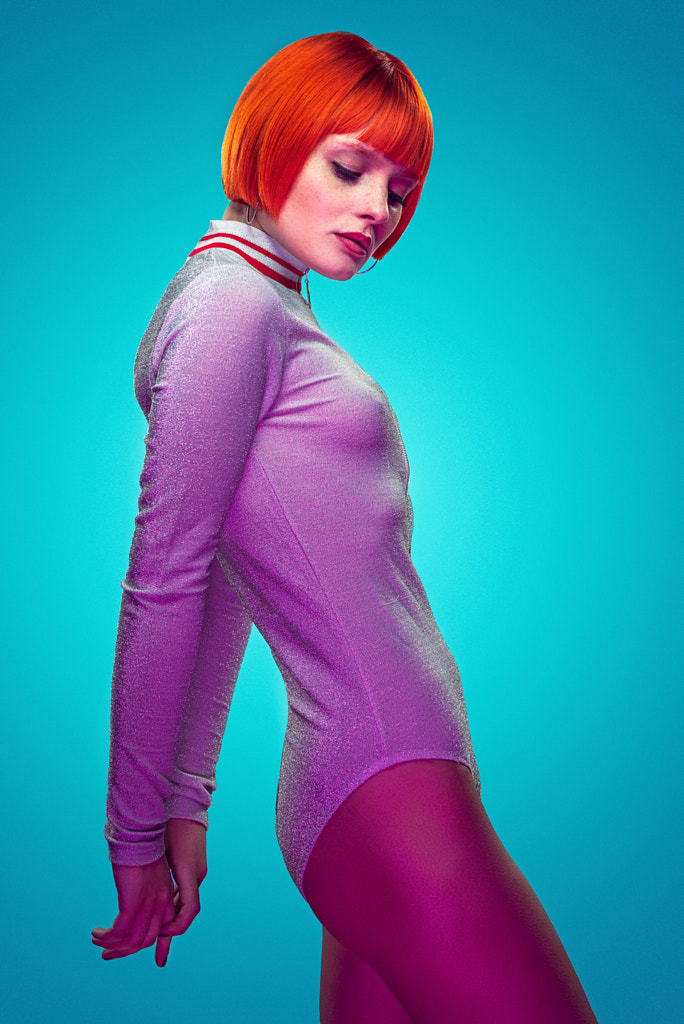
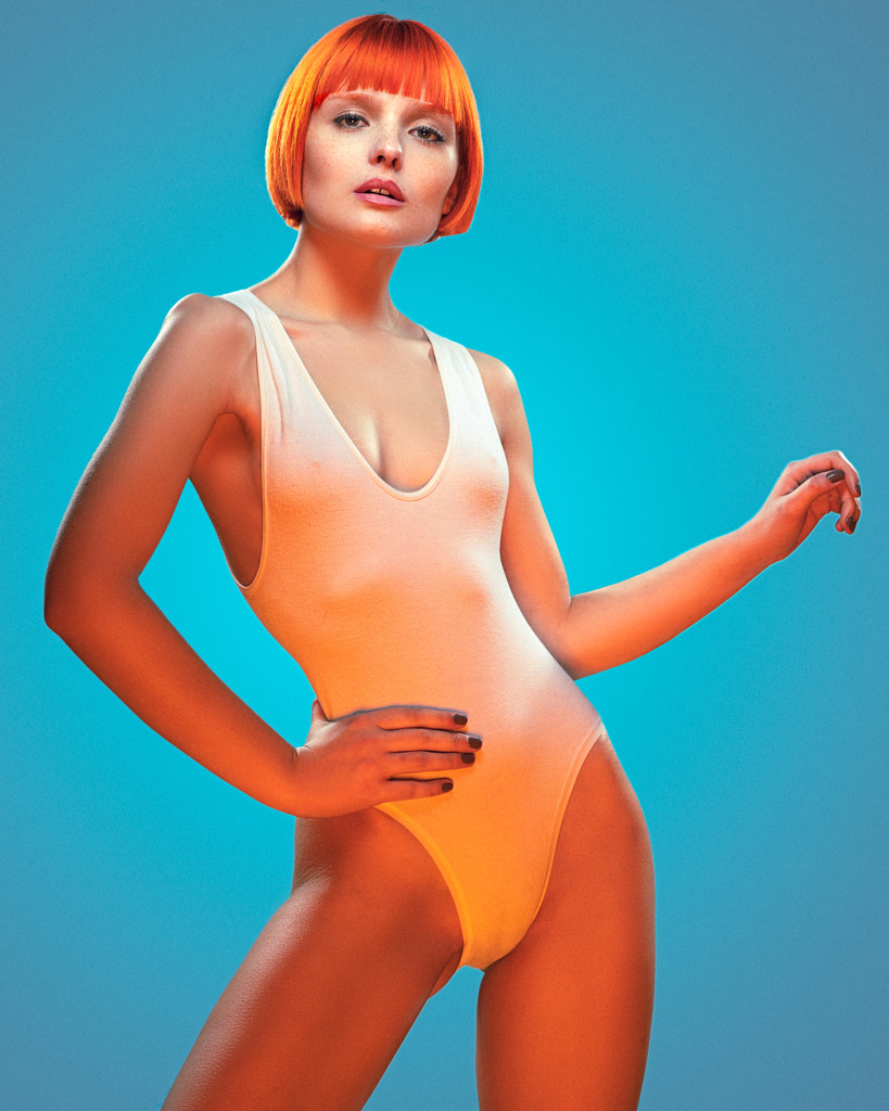
Both shots are effective, but they evoke different emotional responses—while the cool purple might be described as more calming or introspective, the warm orange against the blue background makes for a more punchy, high-energy picture.
Quick Tip: If the colors in your photo look “wrong,” and you don’t know why, it’s time to brush up on color relationships—or, more accurately, hue relationships. Keep your main color the same, and feel free to tweak your other hues until you get the look you want.
Saturation
Saturation, sometimes called intensity, measures the purity of a color. A color is heavily saturated if it has no gray mixed into it; the more gray you add, the less saturated it becomes. You can also desaturate a color by mixing it with the color opposite it on the color wheel. Saturation is generally measured on a scale of one to one hundred, as it is in Photoshop.
Marcie calls heavily saturated hues “screaming colors” because they demand our attention. So if you want your photos to leap off the page, try saturating your colors. This photo by Glen Wooseok grabs the eye instantly because of its bold, vibrant colors.
Desaturating your photos will also alter the emotional valence of the scene. In this picture by Karen Khachaturov, the muted pastel colors contribute to a surreal vibe, adding a touch of melancholy and nostalgia. Sliding the saturation of your colors up or down is like changing the volume on a radio. There’s no “right” or “wrong,” but the choices you make will significantly influence the atmosphere of your images.
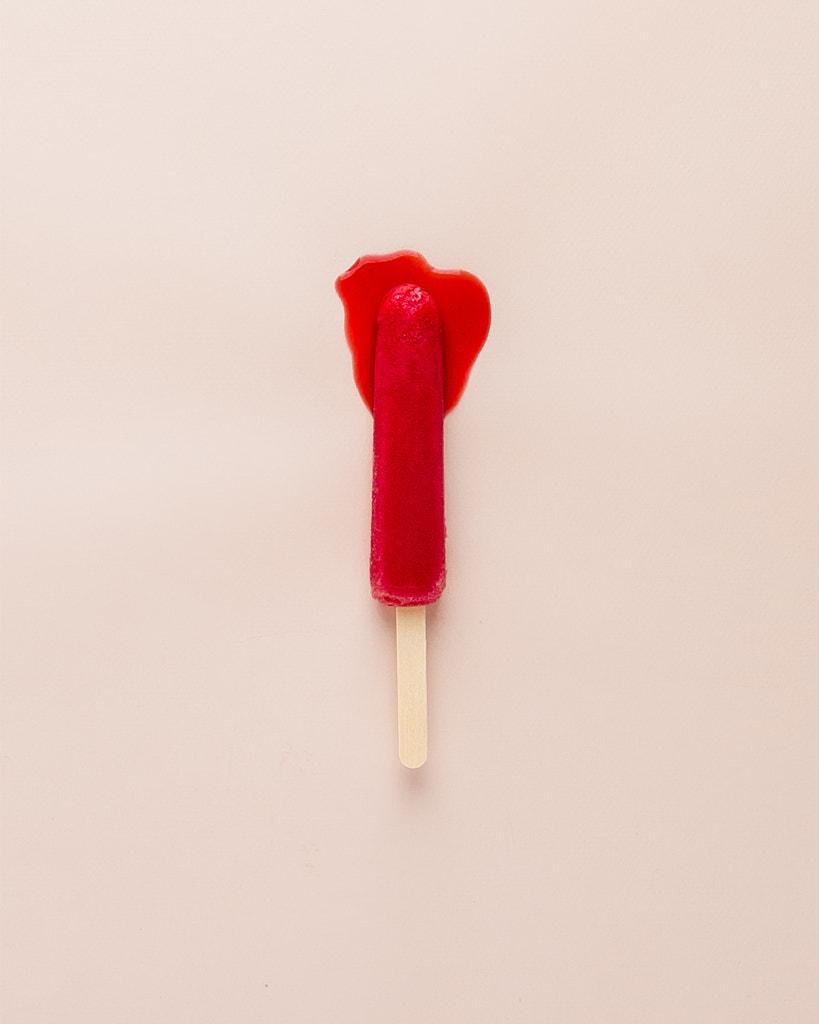
Quick Tip: You can also bump up the saturation of your subject and desaturate your background to draw the eye exactly where you want it. In this photo below, for example, the saturated popsicle stands out powerfully against a relatively desaturated background.
If you want to take it a step further, you can combine saturated colors with gray (no saturation) to make them even stronger.
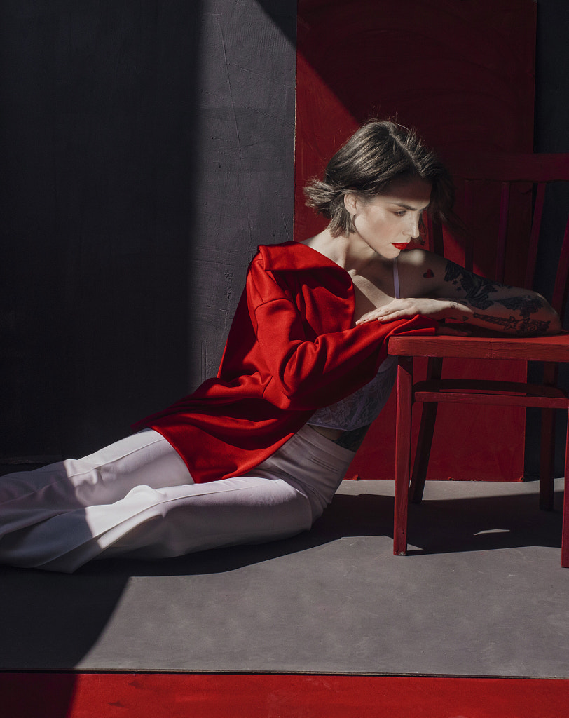
“If you take a very highly saturated color (like a red) and you put it next to a color with no intensity at all (let’s say, gray), that red is going to be very strong because the gray has no visual strength,” Marcie explains. “Gray is like a good friend. It makes your colors just as wonderful as they can possibly be.”
In this portrait by Marta Syrko, for example, the red of the jacket and chair leap off the screen when set against the gray of the wall.
Quick Tip: On the other end of the spectrum, if you have a color that sticks out in a way that’s not pleasing to the eye (or feels ‘loud’), you can decrease its saturation for a more balanced photo.
Value
Simply put, value (or lightness) measures how light or dark a color is. “White is the lightest; black is the darkest, and all colors fall between those two,” Marcie explains.
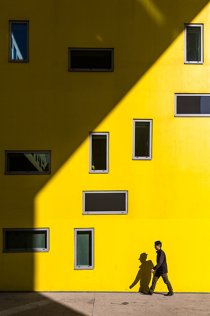
It’s easy to spot the difference in value when you’re working within a single hue. This street photo by Yves L., for example, incorporates a high-value yellow, as seen in the portion of the wall that’s in sunlight, and a low-value yellow, visible in the shadows.
Ideally, your photos will have a similar range of different values to provide balance and depth, but when we move into color schemes that are not monochromatic (e.g., complementary, analogous, triadic harmonies), it’s harder to notice variations in value.
Quick Tip: Marcie suggests converting your photos to black and white to get a feel for how the colors interact. “If everything is middle gray, you’re going to be lacking in value contrast when you convert your photo back into color,” she explains. “It’s a wonderful tool to test your pictures and see how good they’re going to be. I always say, ‘Contrast is your friend.’”
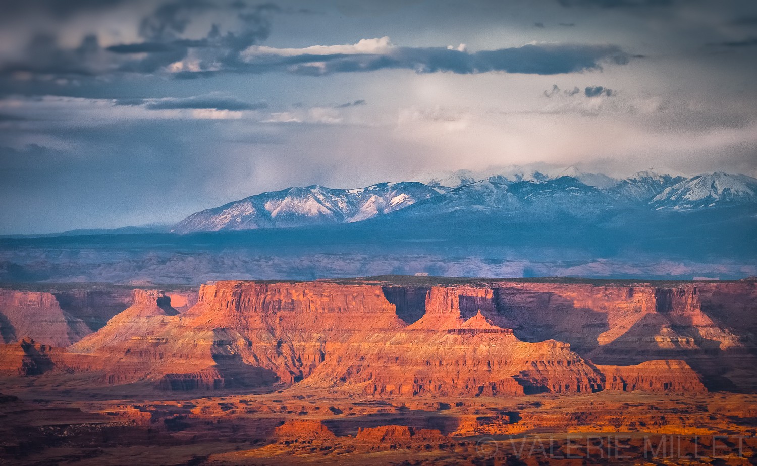
On the surface, we can see that this photo by Alla Korg includes different hues (red, orange, yellow, green, blue) around the color wheel, and it features highly saturated colors. But if you convert it to black and white in Photoshop, you’ll also see it has a wide range of values. Some areas are close to white, and others are almost black—with lots of grays in between.
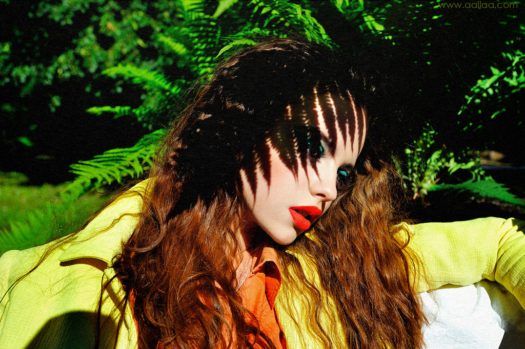
“A photographer who knows about color will understand how to use values to convey a message,” Marcie tells us.
If you notice that your photo doesn’t include a variety of values, try subtly lightening or darkening some of your colors to direct the eye to your intended focal point. When doing this, you’ll want to aim for dynamic contrasts between light and dark colors. This process is somewhat intuitive, so make sure to go back and forth between black and white and color to make sure your changes are working in both versions.
The more you know about the three elements of color, the more tools you have at your disposal. “Color theory is about ‘tools’ as opposed to ‘rules,’” Marcie stresses. “‘Rules’ sound restrictive.” Knowing what colors look good together is only part of the equation, so remember to look out for how small changes in hue, saturation, and value alter the effect of your images as well.
The more you practice during post-processing, the easier and more intuitive these principles will become, so get started mastering those sliders today—and stay tuned for part three of our series on color theory for photographers.
Not on 500px yet? Sign up here to explore more impactful photography.