In 1907, Auguste and Louis Lumière presented autochrome—a revolutionary method for reproducing color in photographs. The world was stunned and enraptured. “Soon the world will be color-mad,” photographer Alfred Stieglitz wrote that July from Munich. “And Lumière will be responsible.”
We’ve come a long way in the last century, and we no longer need potato starch—the crucial ingredient in the autochrome process—to render color. But the power of color hasn’t faded over time; all these decades later, the world is still color-mad.
While you can find color theory in any painting classroom, it remains a somewhat overlooked field in the world of photography, so we’re devoting a three-part series of articles to examine colors and the relationships between them. This is just part one–an introduction to the color wheel–so keep an eye out for the rest in the coming months.
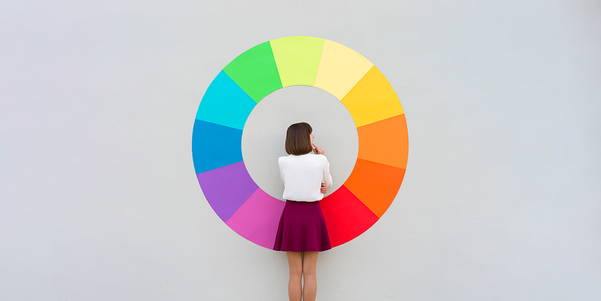
The Color Wheel
A color wheel is just a convenient way of visualizing the relationships between colors. The most common wheel used by painters is based on RYB color system–where red, yellow, and blue are the primary colors. Mix those colors, and you end up with secondary colors orange, green, and violet. Combining those results in one of six tertiary colors: red-orange, yellow-orange, yellow-green, blue-green, blue-violet, or red-violet.
Sometimes, however, photographers might use the RGB system–in which case, red, green, and blue are the primaries. Mixing these colors will create secondary colors yellow, cyan, and magenta. The RGB system also has six tertiary colors: orange, chartreuse green, spring green, azure, violet, or rose.
In this brief introduction, we’ll look at six easy ways photographers can use the color wheel and simple “color schemes” to strengthen their compositions. While photographers can certainly use the RGB system, we’ll rely on RYB for right now.
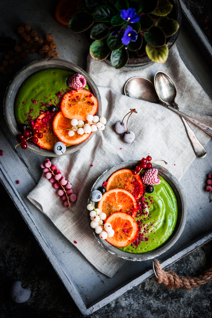
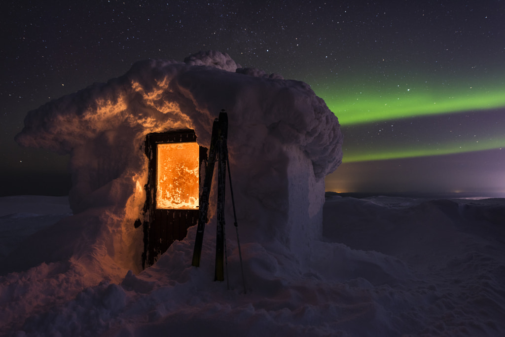
Monochromatic colors
A monochromatic color scheme uses one of the twelve colors on the color wheel with different tints, shades, and tones. You create a tint by adding white to your base color, a shade by adding black, and a tone by adding gray. Photographers can use these schemes to create harmony throughout a composition.
Puchong Pannoi’s photograph of the ancient city of Bagan in Myanmar has many layers, from temples to trees to a hot air balloon floating in the distance. While these elements could be distracting in the eyes of another photographer, Pannoi has brought them all together beautifully–with a little help from a monochromatic palette.

Monochromatic color schemes can often be bold. According to photography legend, Ansel Adams was once so displeased upon seeing one of William Eggleston’s most famous monochromatic photos that he remarked, “If you can’t make it good, make it red.” Fortunately, these days dramatic color is not only accepted but embraced–with stunning results. Take a cue from 500px Contributor Estislav Ploshtakov, and use it to make a strong impact.
Complementary colors
For a complementary color palette, use two colors on opposite sides of the color wheel. Complementary color schemes are well-suited for photography because they add contrast–resulting in pictures that “pop” off the page and screen. Here, Da Miane uses complementary colors green and red.

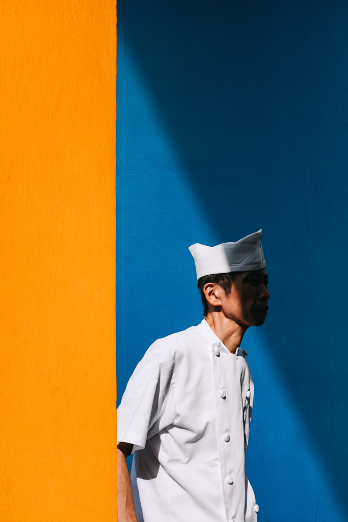
In this street photo from Singapore, Peter Stewart uses complementary colors blue and orange. No need for an overly complex composition–these colors catch our eye all on their own.
Split-Complementary Colors
In this variation on a complementary color scheme, you’ll select your base color, and then instead of using the color directly opposite, you’ll use the two colors on either side of it.
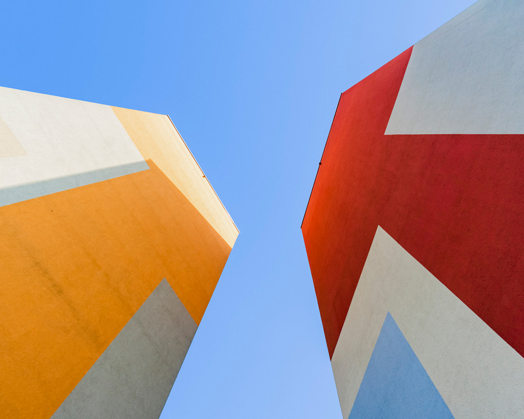
In this colorful photo, Claudio de Sat photographs the blue sky against the architecture of East Berlin’s Plattenbauten buildings. He then incorporates hues closer to red-orange and yellow-orange on the color wheel. The result is a striking and harmonious photo with a little bit less of the dramatic tension we’re used to seeing in photos with complementary colors.
Tetradic colors
A tetradic color scheme, sometimes called double-complementary, features a total of four colors, including two sets of complementary colors. Of the basic color schemes we’ll cover here, this one might be the trickiest to pull off–if only for the fact that it incorporates four colors.
This photo by Alena Haurylik does it brilliantly. By using two complementary pairs (orange-blue, green-red) in moderation, it succeeds in being both eye-catching and sophisticated.
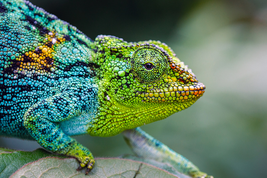
Analogous colors
Analogous color schemes incorporate three colors that sit next to each other on the color wheel. Wildlife photographer Jonne Seijdel encountered this dazzling Rwenzori three-horned chameleon while traveling through the Rwenzori mountains in Uganda. In this photo, he was able to include side-by-side colors for a pleasing and dynamic result. Perhaps unsurprisingly, given this example, analogous colors are often found in nature.
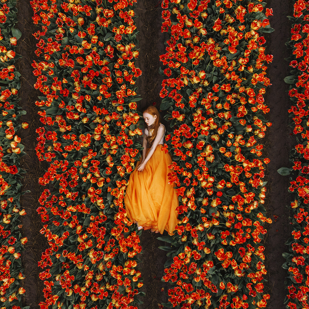
When using analogous colors, photographers usually choose one dominant color and then use the others in a supporting role. Designers use what they call the “60-30-10 rule”–meaning that the main color (usually primary or secondary) takes up 60% of the space, while a supporting color (secondary or tertiary) takes up 30%, and the final color takes up just 10%.
This photograph by Jovana Rikalo, appropriately titled Orange Dream, features mainly the color orange, with red and yellow accents.
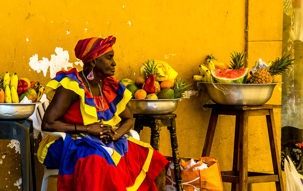
Triadic colors
A triadic color scheme comprises any three colors that are evenly spaced around the color wheel. Like complementary colors, these schemes are vibrant and full of contrast. In the majority of situations, these will be the three primary or secondary colors. 500px Contributor Sabrina Hb’s portrait of a woman and fruit in Colombia might be called Yellow, but those touches of blue and red on the woman’s dress complete the photo–giving it that extra “oomph” and vitality.
Designers generally recommend sticking to the three primary or three secondary colors for that “clean” look. Use too many tertiary colors, and you run the risk of a photo that looks muddy. This landscape by Gunar Streu is another perfect example of color done right because it uses the three secondary colors of the RYB color system: orange, violet, and green.
While color theory might be easiest to implement in the studio, these talented photographers remind us that photographers of any genre, from street to wildlife to architecture, can use it to their advantage. Color is a photographer’s playground. Experiment with different schemes, and see what works best for you. We’ll see you again in part two of this three-part series on color theory.
While color theory might be easiest to implement in the studio, these talented photographers remind us that photographers of any genre, from street to wildlife to architecture, can use it to their advantage. Color is a photographer’s playground. Experiment with different schemes, and see what works best for you.

Stay tuned for part two of this three-part series on color theory.
Click here to learn more about Licensing with 500px.
*Cover photo by Anna Devís and Daniel Rueda.


Leave a reply