From bold neons to vintage polaroid-inspired hues, the last few years have brought with them tons of creative approaches to post-processing and color correction. On 500px and around the web, you can find something for everyone; on one end of the spectrum, you have faded, nostalgic tones and, on the other, the super-saturated technicolor of HDR.
Brands are looking for new ways to use color in their campaigns, and at the same time, commercial photographers are transforming fads into classic, timeless images. So how do all these trends fit into the realm of commercial photography? When it comes to color, one of the best things you can do to boost the marketability of your Licensing portfolio is to use authentic, natural tones.
Straight off the camera, your files might look flat or washed-out, and just a few minutes of editing can make all the difference. At the same time, commercial clients value realistic colors, so a light touch is critical. Over-editing reduces the quality of your photos and makes them less adaptable—two things to avoid in the commercial world.
Striking that delicate balance between too little and too much editing can be tricky, and post-processing is subjective. Still, as a rule, natural photos with true-to-life colors and a nice dynamic range will outsell those with unnatural or overdone colors. Here are our tips for getting those flawless and genuine colors that resonate with buyers. We refer to Adobe apps here, but you can apply similar adjustments with your software of choice.
Set your white balance
If you have your RAW files handy, you can easily set your white balance in Adobe Camera Raw. Use the drop-down menu to match the image to the real-life conditions that were on set or location, whether you were shooting in daylight, with flash, or anything in between. You can move the temperature slider located below to make precise changes. Slide the white balance down to make it cooler or up to make it warmer.
In Lightroom, you can also adjust your ‘temp’ and ‘tint’ sliders for a proper white balance. Hover your eye-dropper tool over any areas that should be white, and move the sliders around until your RBG readouts are the same (or very close) to one another.
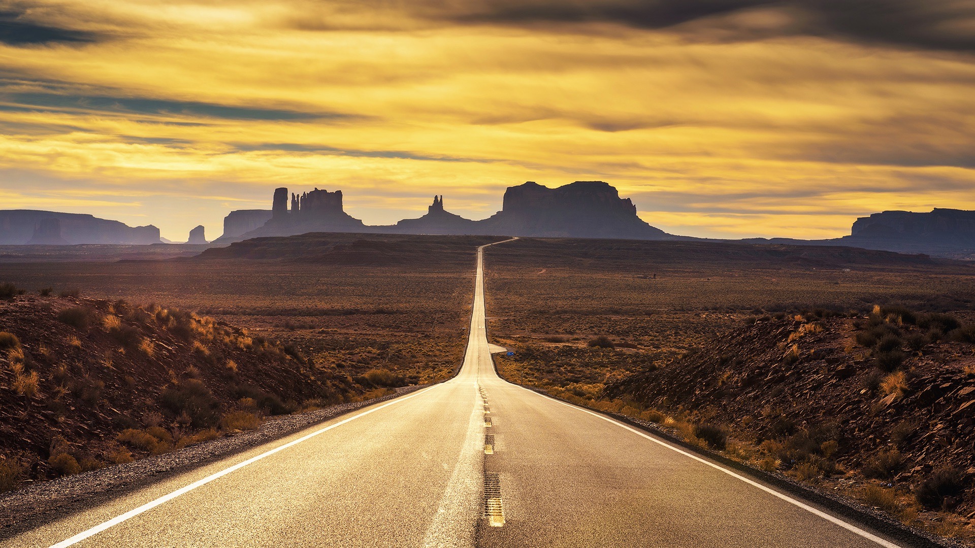
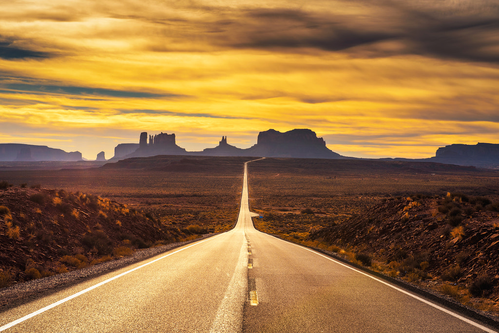
When dealing with color, it’s important to keep everything natural and true-to-life, so avoid extreme changes in temperature. Even small adjustments in temperature can change the mood of your images, transforming them from clean and cool to warm and inviting or vice versa.
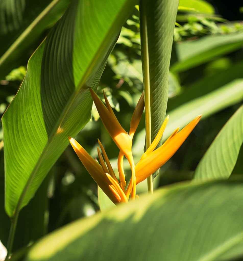
In general, subtly warm photos tend to perform better in Licensing than very cool ones. In fact, warm colors are so popular that, late last year, Getty Images named ‘the warmth of humanity’ as one of their trends to watch—83% of the financial institutions they work with said they looked for warm tones when buying images.
Watch that saturation
These days, commercial clients tend to prefer natural, warm tones without saturation. While some saturation is fine for making your colors more intense, it’s easily overdone, especially with HDR images. Over-saturating can also add noise and degrade the quality of your photos due to color clipping.
If needed, consider substituting your saturation slider for selective saturation on individual colors, and go lightly. You can also adjust the vibrance slider instead, as it will boost the intensity mostly on the muted colors in the image. You want the colors to look real, not artificial or garish. Of course, remember to avoid heavy use of HDR techniques.
Saturation, brightness, and contrast are easy adjustments to make, but you can also make some powerful edits using levels, which brings us right into our next tip.
Perfect your tones with levels
Within the levels adjustment layer, you’ll find a histogram representing the tones in your photo, with three points running from left to right: blacks, mid-tones, and whites, respectively.
The black and white pointers serve to indicate which areas of your photo should be pure black or white; moving them inward towards the midpoint will increase contrast, but you should also keep an eye out for clipping and loss of detail in the shadows or highlights. As you do this, you’ll extend the tonal range across your image, and your histogram will start to change. You can move the mid-tones pointer left or right to make your photo brighter or darker.
When you want to fine-tune the tones within your image, select the black, white, or mid-tone dropper to “tell” Photoshop which spots should be black, white, or gray. If you have areas that are pure black, white, or gray (including a gray card), this simple adjustment will work wonders, making for a natural-looking photo that doesn’t feel faded or washed out. You can always switch from RGB into your specific color channels to set tones for that hue.
Finesse with curves
Curves are another powerful tool for correcting your images, especially when you’re dealing with a lingering color cast. Create a new curves adjustment layer, and select the channel where there’s an issue (i.e., too much blue, too much red, etc.).
As you drag the curve, you’ll bring that color up or down, and you can also adjust its complement to manage the cast. For example, if you have too much (or too little) cyan, you can fix it using the red channel. As with levels, you’ll be working non-destructively with a new layer—and that’s always a bonus.
Avoid black and white
With trending hashtags like #blackandwhiteisworththefight and #bnwsouls dominating our social feeds, there’s no denying that monochrome photography is having a “moment” right now. Still, while these beautiful palettes can work in a commercial setting, they aren’t ideal for Licensing.
Any color photo you upload can easily be converted to black and white or sepia by the buyer, so it can appeal to everyone, whatever their preferred color palette might be. By converting to sepia or black and white yourself, you’re limiting the potential buyers who can license your photo to suit their needs. You could also potentially lose some information and reduce quality if you haven’t converted properly, so it’s best to steer clear.
Use a calibrator
This one isn’t a post-processing tip per se, but it’s important, nonetheless. You want the colors on your screen to match how they’ll look in print and on other devices, so they need to be accurate. Pros swear by the Spyder Monitor Calibrators by Datacolor, though they’re on the pricey side.
Believe it or not, it might also be worth color correcting in a room with low light so that you can see everything clearly. Some photographers even purchase special shields, cloths, or visors for their monitors to avoid ambient light in post; you get them from most major camera stores like B&H.
Post-processing in commercial photography is all about improving and refining your images, rather than changing them entirely. Similarly, proper color correction boils down to making your photos look more realistic—not less. While editing, think back to how the scene looked when you shot it, and then try to bring out and recreate those colors in post. As the 500px Content Team puts it, “Always remember your goal in editing is to create a vibrant photo that looks like it hasn’t been touched.”
Not on 500px yet? Sign up here to explore more impactful photography.
![Everything a beginner needs to know about astrophotography [Guide & tips]](https://iso.500px.com/wp-content/uploads/2020/05/stock-photo-mt-bromo-under-the-stars-46785278-1-1500x1000.jpg)

Leave a reply