Whenever we have conversations about improving photography techniques with the 500px community, we often hear questions focused on the mechanics of photography. What type of camera and lens should I use to take the photo? What is the rule of thirds, and how did you apply it? How do I work with great models?
These are common questions the 500px team gets asked, which are all valid questions with concrete answers. But as we all know as photographers, having the answers to these questions doesn’t necessarily mean you will produce high-quality photos. Sometimes, it’s essential to take a step back and focus on the intangible — the photographer’s eye.
We all know how important colors are in photography. You usually can tell right away when a color (or a color palette) is or isn’t working. The challenge is learning to identify what is causing the photo to be “off”.
Mastering when to use the right colors is another matter. The color wheel is our guide to determining what is causing the photo to be off, and mastering the wheel is the first step to creating eye-catching photos consistently.
In this article, we’ll cover the basics of color theory, focusing on applying the color wheel to choosing the right color for your composition. We will walk you through examples of various configurations to help you choose the best color palette for your photos, using examples from the 500px community.
You are going to learn:
- What the color wheel is and how it works
- How color psychology affects our emotions (and our customers’ emotions)
- What color harmony is and the characteristics of it
- How to find the right color in post-processing
Understanding the color wheel is the first step to applying it in photography
It is important to note that consumers are attracted to color schemes that are commonly used in photos on print designs and websites. These use of these specific color trends are precise and calculated by the brands that are using them.
What this means is that producing an eye-catching cohesive photo with the right colors has become even more essential in creating great photos that match today’s consumer interests.
Once you understand how to use colors, you can learn to recognize (and/or seek out) colors that work with, and communicate, your vision.
Colors hold power, and injecting the right color is the real power of a great photographer.
Let’s talk about the color wheel
The color wheel is a set of rules and guidelines that designers, artists, and photographers use to visualize the relationship between colors and is the primary tool we will be using today. It will be much easier for you to take great photos if you understand which colors go together and are pleasing to the eye.
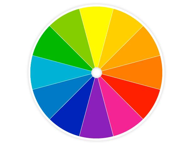
As you can see from the color wheel picture above, the colors are arranged in a circle, with a natural progression from warm tones to cooler colors and back.
Red, yellow, and blue are the primary colors. By mixing these three primary colors, you’ll end up with the secondary colors, which are orange, green, and violet. Combining those secondary colors results in one of six tertiary colors: red-orange, yellow-orange, yellow-green, blue-green, blue-violet, and red-violet. To understand the full power of the color wheel and how to use it effectively, you need to know the feelings color can evoke in the viewer.
Pro-Tip
For a primer on color theory, or if you want to go deeper into this topic, be sure to read our introduction and intermediate-level articles on color theory:
- An Introduction to Color Theory
- Color Theory: Hue, Saturation, and Value
What feelings does each color convey to the viewer?
The colors used in a photo can impact the way a viewer feels when looking at the image, and different colors bring out different feelings.
Here are some examples of images that use a key color to evoke a certain mood.
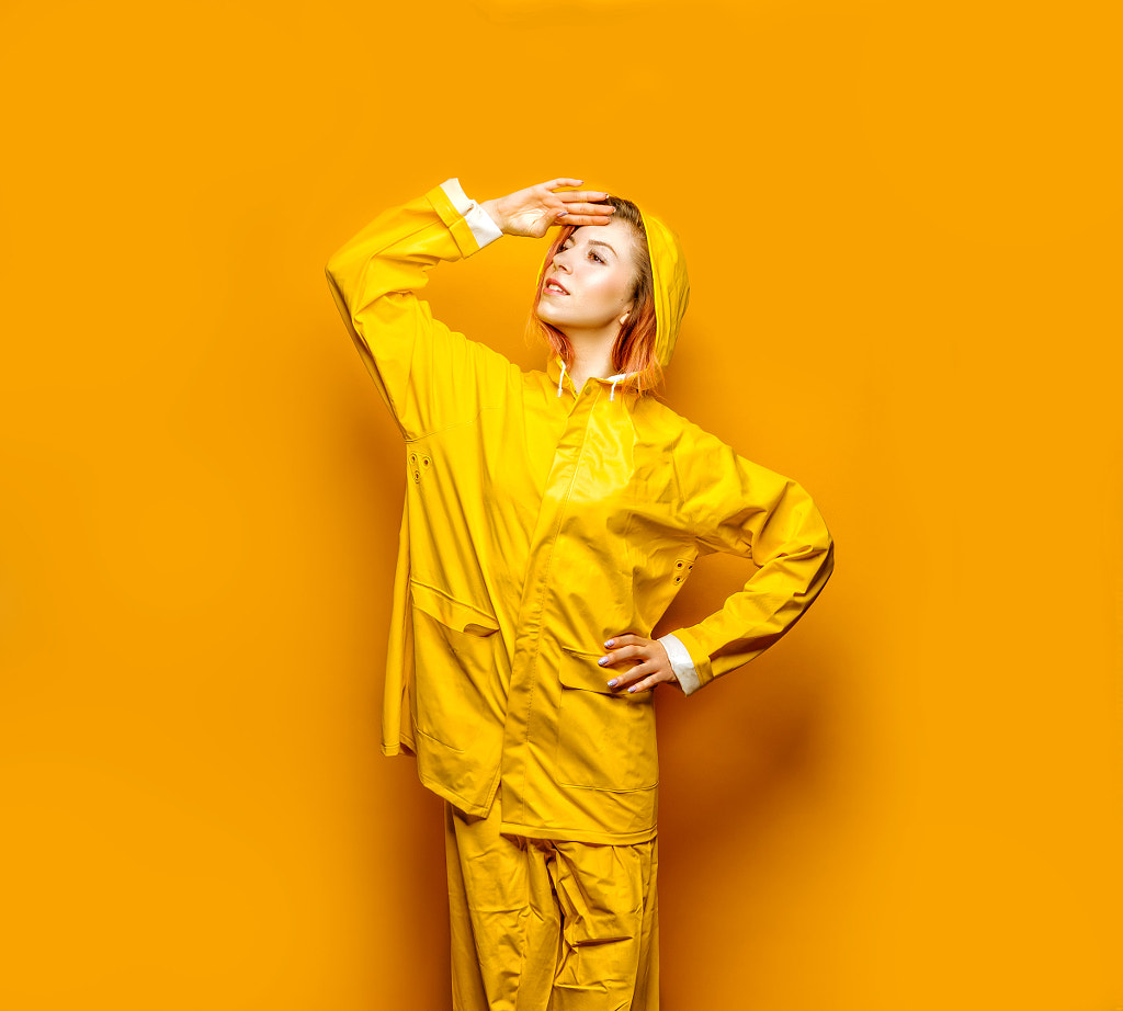
Yellow
This color is optimistic and youthful, and it is often used to grab the attention of window shoppers.

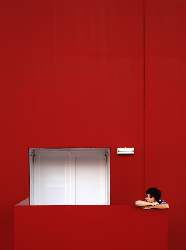
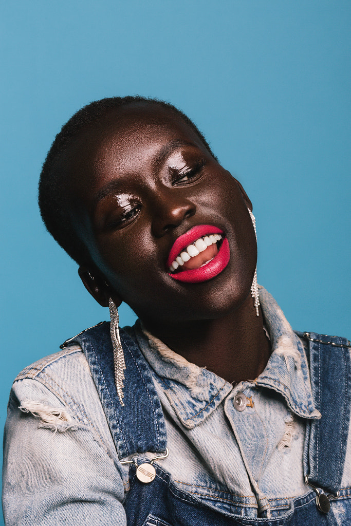
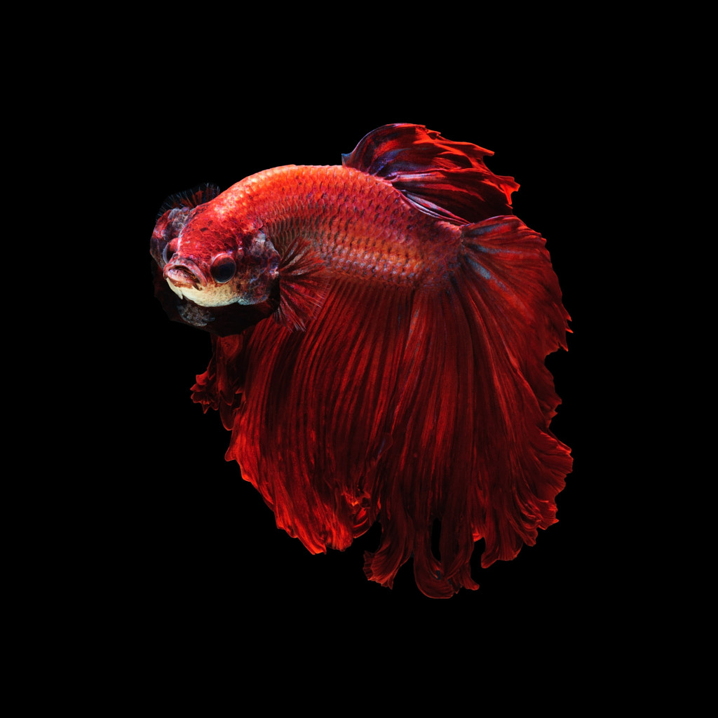
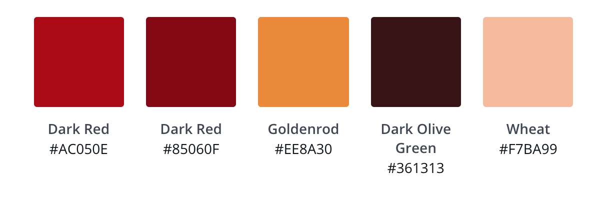
Red
Brands often use red to convey a feeling of energy and to increase the viewer’s heart rate. It also creates a sense of urgency, which is why you see it used at clearance sales.

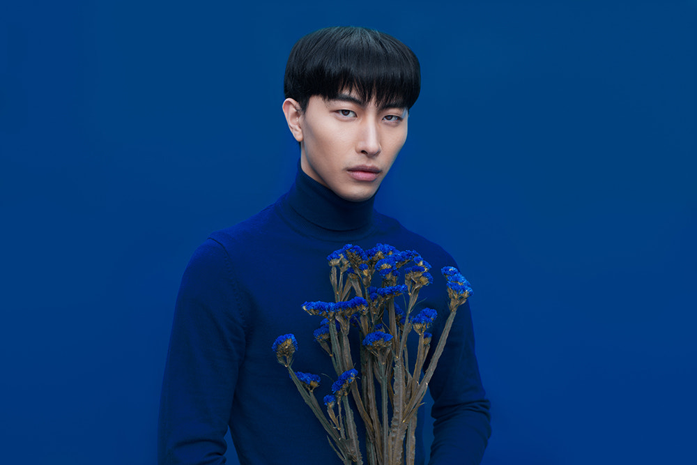
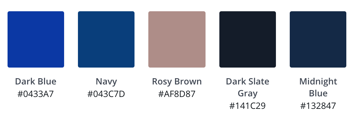
Blue
Blue is a calming color that conveys trust and security. It is used often in the marketing of banks and businesses.

Black
Black is seen as powerful and sleek, and is often used to market luxury products or services.

This may seem simple enough, but, in reality, it would be naive to think that a single color creates one specific emotion for everyone — colors can have multiple meanings to different viewers, which can change based on their own experience and the culture they grew up in.
What is color harmony?
Color harmony is a fairly simple concept — it is the process of creating balanced combinations of colors that are pleasing to view.
Color harmony looks at how colors interact with each other instead of how colors mix. For photographers, this is a crucial concept.
The photos you just saw above all have color harmony. There is a seamless transition between each color. For example, in one of the yellow photos, there is an eye-catching transition between the red lips and yellow background. Or, you may have seen photos of the sky which show different colors of blue, each interacting with each other perfectly. These shots stand out because of the way the colors live together, and the color harmony.
Once you understand color harmony, you can learn to recognize (and/or seek out) color combinations that work with your vision. Put simply, this means using colors that go together. Determining which colors combine well can be accomplished by consulting our color wheel and identifying the color palette of a photo. You can then get in the habit of selecting a color palette that includes colors that interact well based on their location in a photoshoot.
Here’s what you need to do to see the color palette of your photo or location.
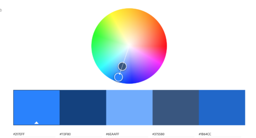
Upload your photo to Canva Color Palette Generator, Adobe Color, or Paletton

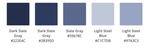
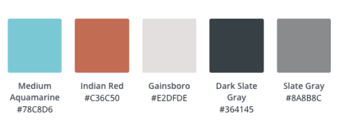
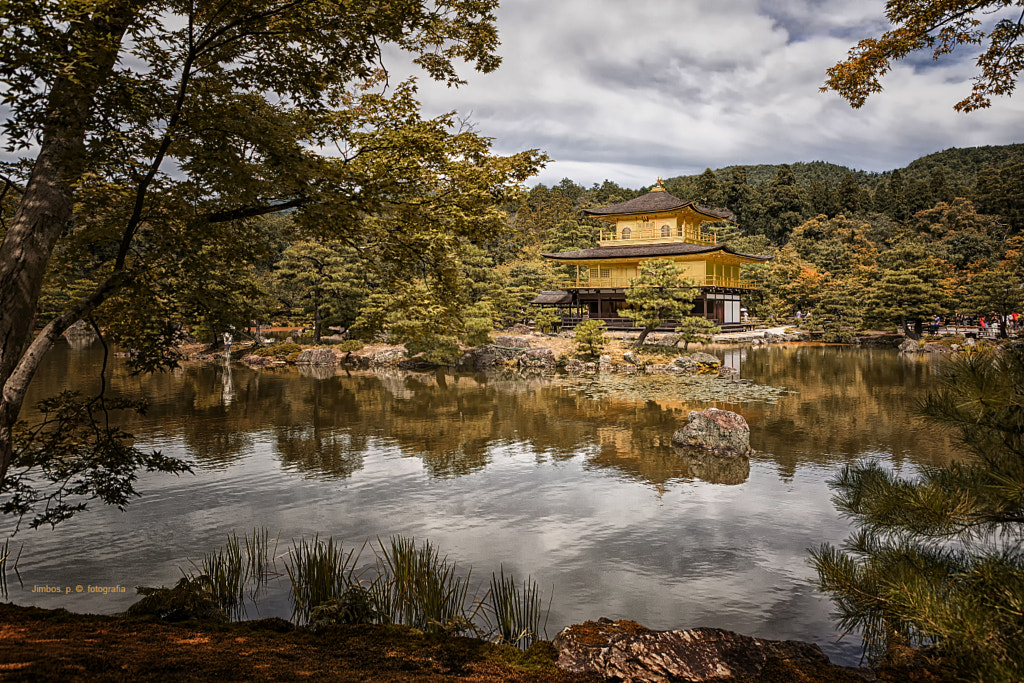
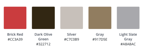
It’s essential to understand how the colors in your photo are interacting with each other. An easy way to do this is to use tools like Adobe Color or Canva Color Palette. All you have to do is upload your image, and you will be able to see how the colors are interacting with each other.
Use your color palette to determine harmony
You can use your newly created color palette as a base to determine and create harmony. There are a few different ways that you can develop the best color palette for your photos. Let’s break down the different ways these combinations can be selected by focusing on blue and pink as examples.
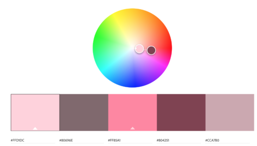
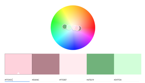
What are analogous colors?
Think back to the color wheel for a moment. You can find an analogous color scheme on your color wheel by choosing a color, then choosing another color right beside it on the circle.
Analogous palettes use their key color and at least two nearby colors to create a palette.
The key color is the base color, while the secondary colors should only be used to highlight or as accents. One important aspect when it comes to analogous palettes is ensuring there is enough contrast when choosing the palette.
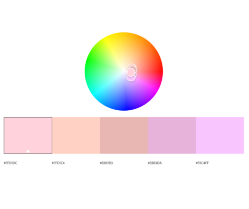
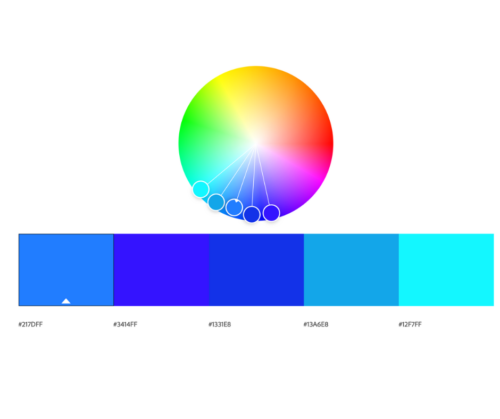
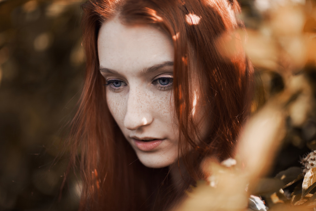
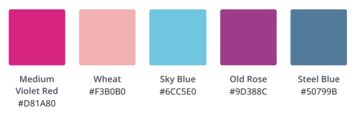
As you can see from our examples above, using blue and pink, each color palette is similar in range to each other. Let’s investigate how we can use them and, most importantly, why.
Why use analogous colors in photography?
When using an analogous color scheme, there is one key color and two or more secondary colors placed symmetrically around it on the color wheel. What this does is creates a palette that communicates consistency and uniformity within a photo.
Below are some examples of photos by members of the 500px community that are using analogous color palettes effectively.
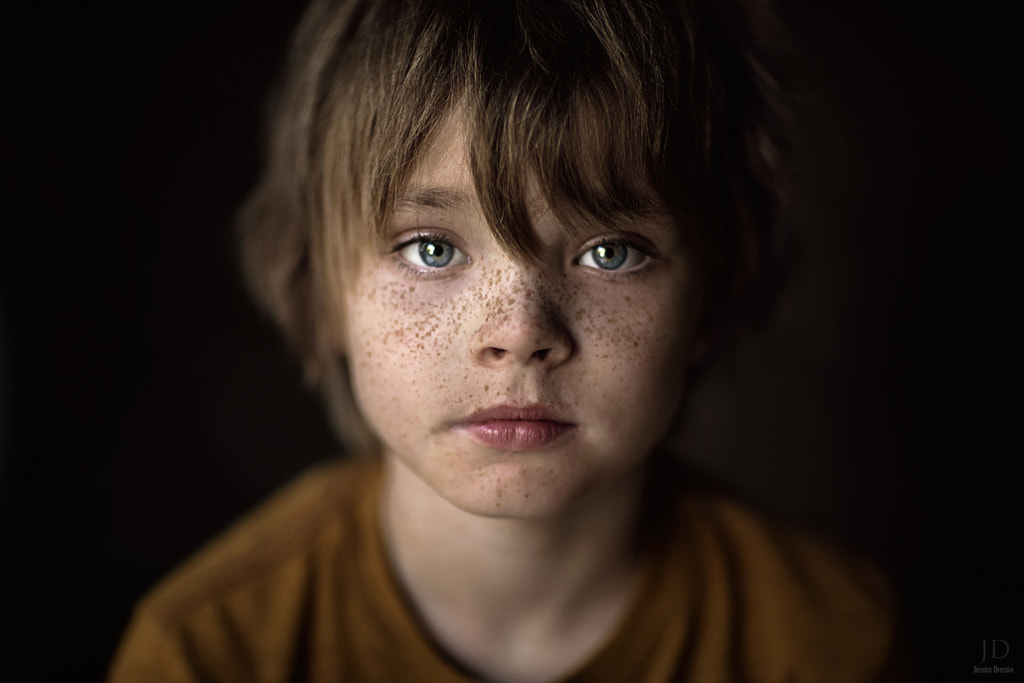

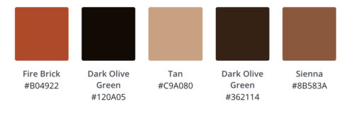
What are monochromatic colors?
Monochromatic colors are all related in terms of a single hue, with variations in luminosity and saturation of that hue. These variations can be found in the tints, shades, and tone of the key color.
Now, if you aren’t a painter, you may not know offhand what tints, shades, and tones are, so let me just give you a brief rundown. A tint is a color to which white has been added, a shade is a color to which black has been added, and a tone is a color to which gray has been added.
How to use monochromatic colors
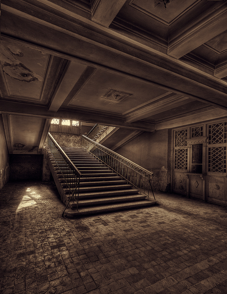
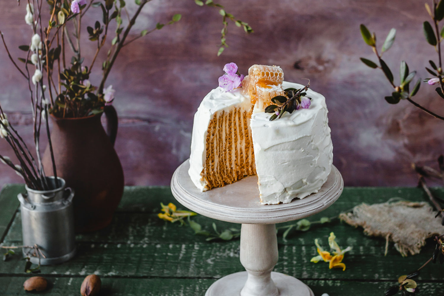
Monochromatic colors are a great way to add emotion to your photos. Black and white is a well-known monochromatic type of photography, but it’s not only limited to that color scheme. Similar to black and white photography, monochromatic colors are also a great way to simplify the photo.
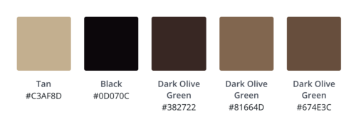
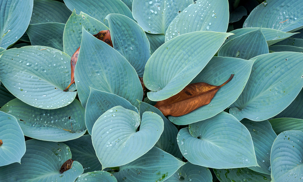
Below are some examples of photos by members of the 500px community that are using monochromatic color palettes effectively.

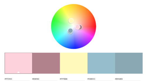
What are triadic colors?
A triadic color scheme uses three colors that are evenly spaced from each other on the color wheel.
How to use triadic colors
While analogous colors make a photo look soothing and calming, triadic colors are vibrant and uplifting. They create contrast in the eye, but the colors still work together.
To use a triadic color scheme, the colors should be carefully balanced so that you have one dominant color, while the other two support.
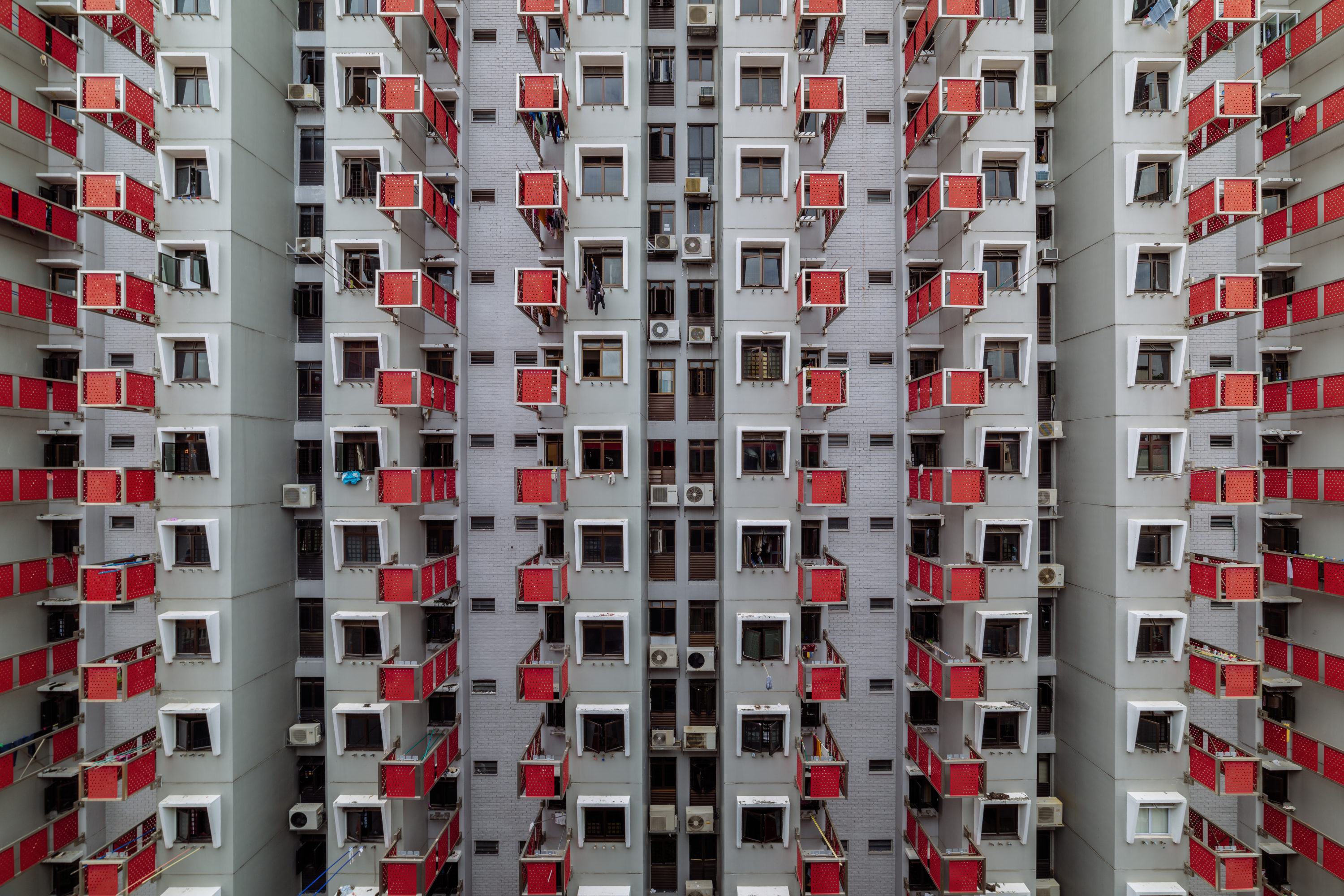
It’s easier to find triadic color schemes in the human-made world, as these palettes are often seen in architecture, painted objects, and human-made designs.
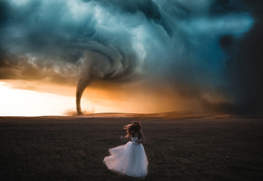
Here is an examples of a photo by members of the 500px community that are using triadic color palettes effectively.

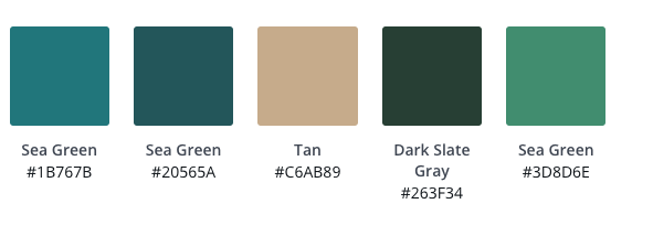
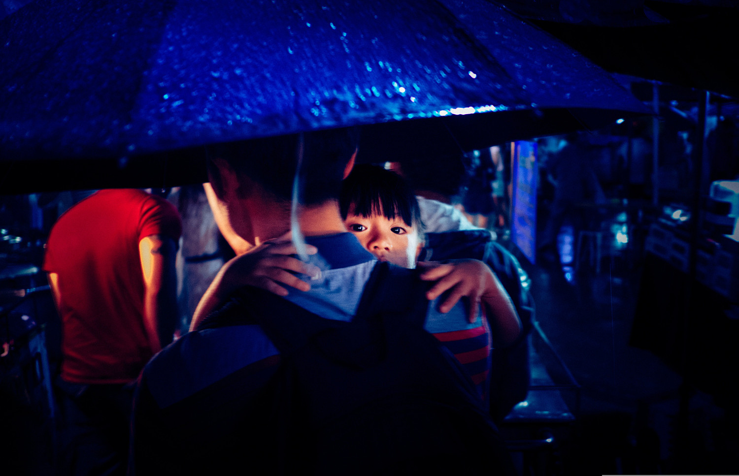
What are complementary colors?
When it comes to complementary colors, the key color is generally dominant, while the other color is used sparingly. This usually results in striking visuals, as complementary colors are always opposite to each other on the color wheel.
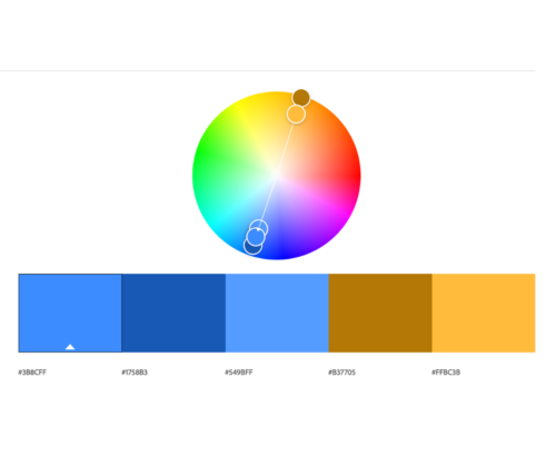
How to use complementary colors
Complementary colors are all about opposites, so one trick we’ve seen our community use is focusing on one color.
Below are some examples of photos by members of the 500px community that are using complementary color palettes effectively.


Finding your color in post-processing
When it comes to getting the color just right in your photos, post-processing is where you’ll have the most flexibility. You’re probably using software like Photoshop to edit your photos, but may not have considered using it to manage, evaluate, and change your color harmonies.
Something to remember about using color theory in post-processing is that you need to always start with the key color (the most dominant color). So when you are focusing on making your color harmony — for example, looking to find the complement of a yellow hue — you may get a blue result rather than a purple. Consider this to be a starting point, and don’t be afraid to make tweaks to the overall photo.
If you have colors in your photo that do not have great color harmony, or are hostile to the eyes, you can play around with them until the palette you are using fits one of the categories we’ve covered (analogous colors, monochromatic colors, triadic colors, and complementary colors). The original photo may look very different when the dominant and agency colors are altered to fit one of the categories mentioned.
Conclusion
Chances are, you have already used color theory in your shooting and not even realized it. Your eyes will have noticed on their own that some colors behave differently when they’re near others, and you probably made some adjustments in the moment to where and how those colors appeared in your image.
The difference is that now you know the “why” and can not only make better decisions when faced with complementary color combinations, you can actually plan for and harness them! Whether you use this information to plan your shoots more efficiently, or when you are editing your images in Photoshop, it’s a powerful new tool that you’ve added to your kit.
What are your favorite type of colors to use in your photos? Let us know below.
Not on 500px yet? Sign up here to explore more impactful photography.


Leave a reply