Several years ago, the popular blog Digital Photography School conducted a poll of more than 72,000 people to see what shooting mode is most popular among photographers. While most preferred manual or aperture priority modes, automatic mode accounted for a solid 14%.
That’s the beauty of modern digital cameras; they’re good at “guessing” what settings work based on the conditions at hand. The tradeoff of automatic mode, however, is that you don’t get full creative control over the settings that determine the mood and story at the heart of your photo.
You know about the exposure settings—aperture, shutter speed, and ISO—but your camera settings go far behind that crucial trio. Next up? White balance, the key to getting the right color temperature in your photos.
Understanding how your white balance settings affect your images will prevent unnatural color casts like the kind you get with some non-studio lights—and you can also use them for creative effect. It’s also the next step towards shooting manually. Here’s a quick guide to understanding how it works.
The color temperature of your light source falls somewhere on the Kelvin scale, whether you’re using natural light, harsh fluorescents, professional speedlights, or LED panels. Warm orange candlelight falls on the lower end of the scale, around 2000K, while cool blue moonlight falls on the other end, around 8000K.
Even within the same light source, there might be variations, depending on the conditions; sunlight, for example, might look neutral at noon (~500-6000K) but warm at sunrise or sunset (~3000).
Candlelight has a warm temperature, and looks more orange than light that has a higher number on the Kelvin scale.
The brain sees color relatively well in different color temperatures; that is, we understand that a white sheet is white, whether we’re looking at it in warm light or cool light. The camera, on the other hand, doesn’t compensate for the color temperature of your light source automatically, so if you want it to record accurate colors, you might need to go in and adjust your white balance settings.
The light on rainy, overcast days can take on an ethereal blue.
Your DSLR has white balance presets like Tungsten, Fluorescent, Daylight, Shade, and more that you can set depending on your lighting conditions. Presets might vary based on the camera you use, but they’re a solid estimate for different light sources; “tungsten” will be closer to 3200, and “shade” might be around 7000-8000.
If you’re going for a neutral white balance—similar to daylight—you want your whites to appear white.
By plugging those in, you’ll indicate the color temperature of your light source, and your camera will compensate for it by adding the opposite color. It can help to think of color temperature and white balance as opposites; warmer light falls lower on the Kelvin scale, but setting a lower number on your camera will cool down the image rather than warm it up.
That is, at lower settings, it’ll add in blue; at higher settings, it’ll add orange. In both cases, it will balance the scene so that white objects appear white.
For example, the light on overcast days tends to be cooler, and, therefore, you might want to use higher white balance settings to add back some of that orange. If you’re shooting with warm candlelight, you might do the opposite and add in some blue using a lower setting.
Regardless of your light source, a proper white balance setting will make all your colors look accurate and true to life—pure whites included.
You can also go in and manually set your white balance exactly where you want it, in degrees Kelvin. Depending on your camera, you could have a wide or narrow range of settings to select manually on a scale from around 2000-11000, so you can get specific.
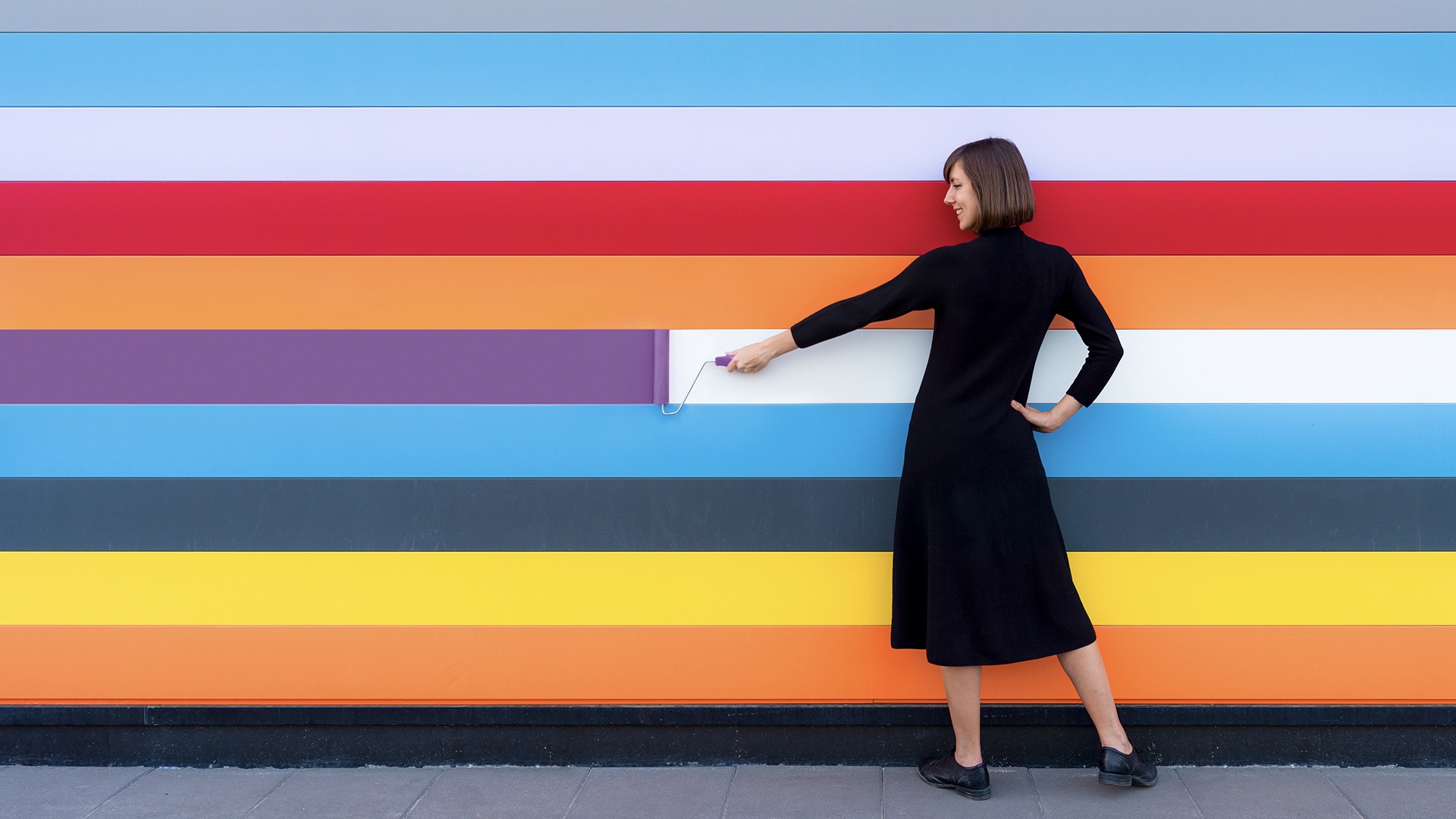
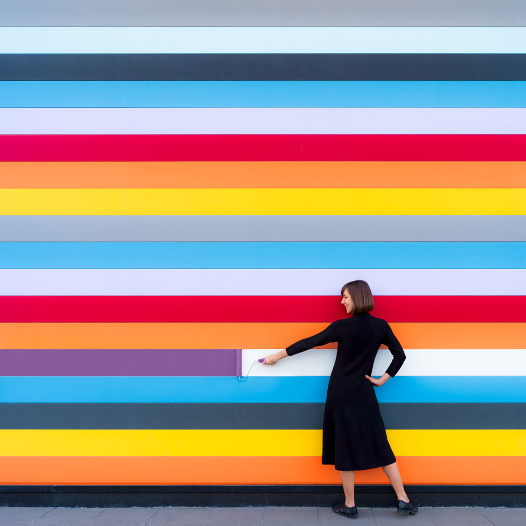
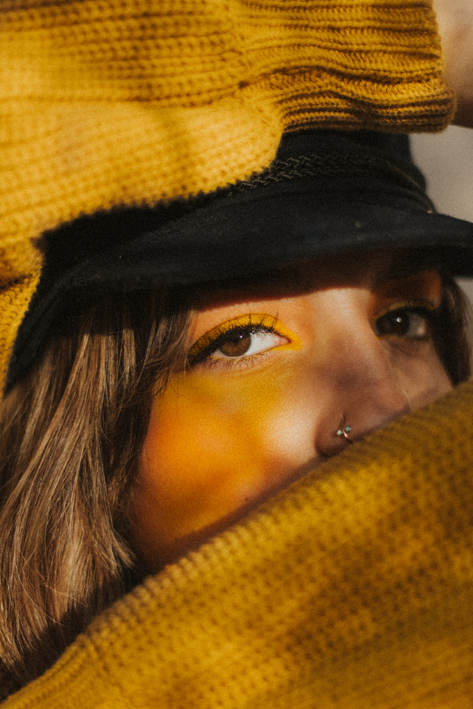
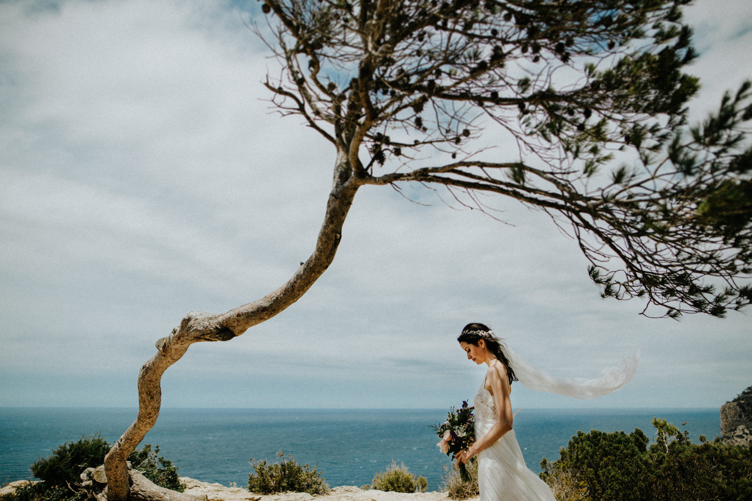
White balance can be particularly useful for getting natural skin tones. Look for something neutral or white in your photo to make sure all the colors are accurate. This woman’s dress is pure white, so this photo reflects the scene well.
DSLRs also have a “white card” setting that determines the color temperature of your ambient lighting based on, well, a white or gray card. Consult your manual to see how it works, and then simply take a photo of a white or gray card or a white sheet of paper, and your camera will measure the white balance. This preset is handy for when you’re working in mixed lighting, like natural window light and artificial bulbs.
Auto white balance leaves the choice up to your camera, without your input. That can work well in many cases, but if you don’t have any pure white in the frame or you’re dealing with mixed lighting, it might struggle. Your camera might also have trouble if the subjects of your photos are particularly warm or cool.
White balance isn’t just a powerful tool for accurate color correction, but also for artistic intent. We know that white balance settings can be used to make a photo look natural and realistic, but they can also do the opposite and make them look preternatural or otherworldly.
Warmer photos can evoke the sensation of home, comfort, and togetherness. Increasing your white balance setting or using a preset designed for shady, overcast days is one way to enhance this feeling.
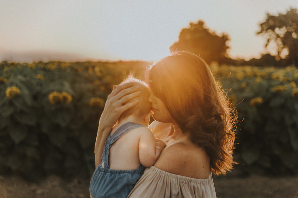
Let’s say you’re shooting in daylight at noon; you could set your white balance to Daylight for a neutral temperature, or you could make it warmer or cooler depending on the mood you want to capture. For a family photo, for instance, you can bring out the warmth of a moment by setting your white balance higher on the Kelvin scale than you normally would; conversely, you could bring out the feeling of solitude or loneliness by setting it lower.
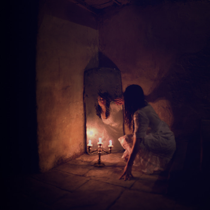
Cool blue tones can evoke a feeling of mystery, melancholy, or magic. To make your photos look cooler, you can decrease your white balance setting.
In cinematic nighttime shots, warm or cool color casts from street lights can also work beautifully, so that’s something to consider. You can also adjust your temperature to make a blue hour photo feel moodier, or a sunset seem fierier. Sometimes, photos echo our memories more than they reflect reality; a sunrise sometimes feels warmer than it really is, or a vast landscape feels colder and more desolate when filtered through our emotions.
Warmer colors can remind us of autumn, so fall photos might have a higher white balance setting than pictures that capture the mood of different seasons.
This idea is subjective, so there’s no correct or incorrect way to use it. An autumn photo might use high white balance settings to add orange, and a winter photo might use lower ones to add blue. In commercial photography right now, there’s a trend towards warmer photos that feel homier and more inviting.
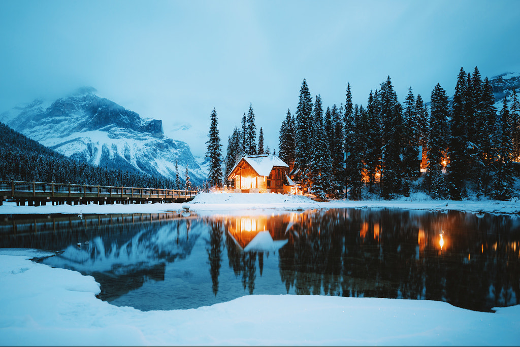
Some photos combine warm and cool light sources to create contrast and atmosphere. In this photo, the warm artificial light feels cozy and comforting, while the blue mountains feel isolated and silent.

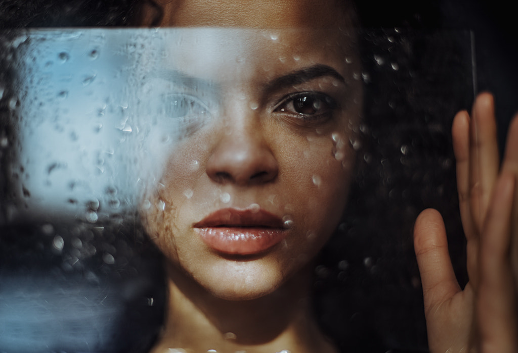
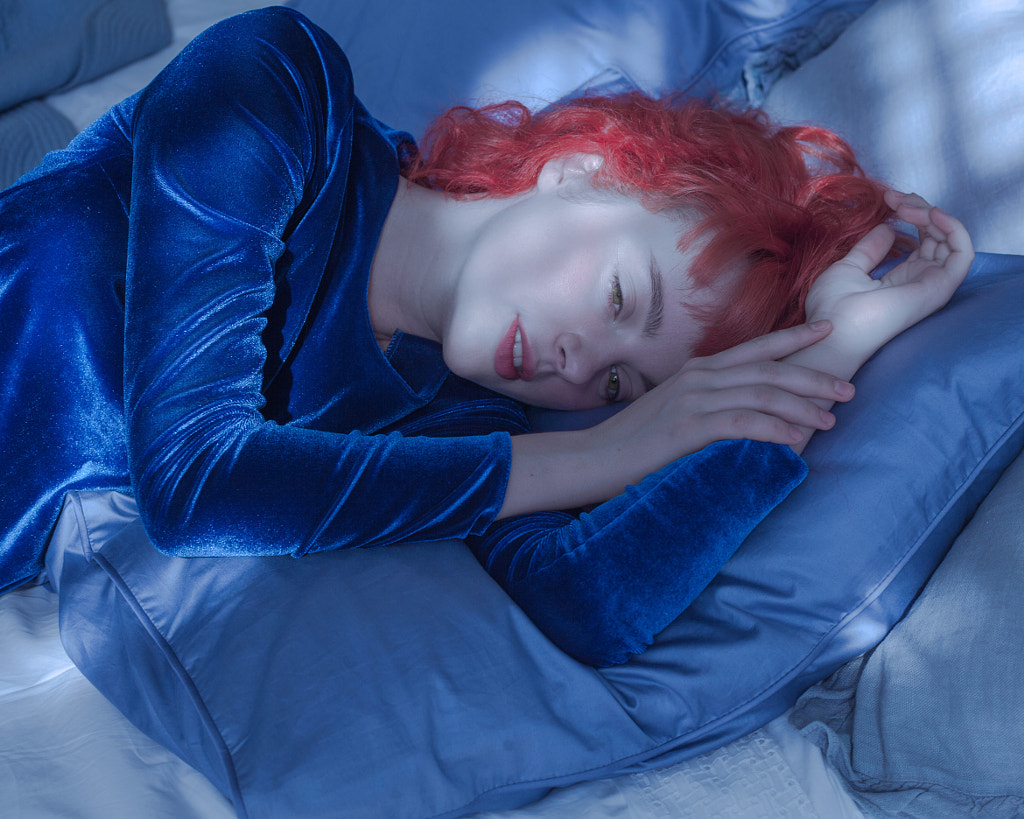
Cooler colors can evoke feelings of physical cold. If that’s what you’re looking for, you might not want your whites to be pure white but slightly blue.
Of course, mixed natural and artificial lighting can make the process more complex. Most photographers prefer to set their white balance to the natural light source rather than the artificial one, because it will generally result in a more realistic-looking outcome.
If you want even more control, however, you can also use an adjustment brush or filter effect in post-processing to adjust the temperature in a specific area of your photo. This is a good option if, for example, you want to make water look bluer but keep your sunset golden.
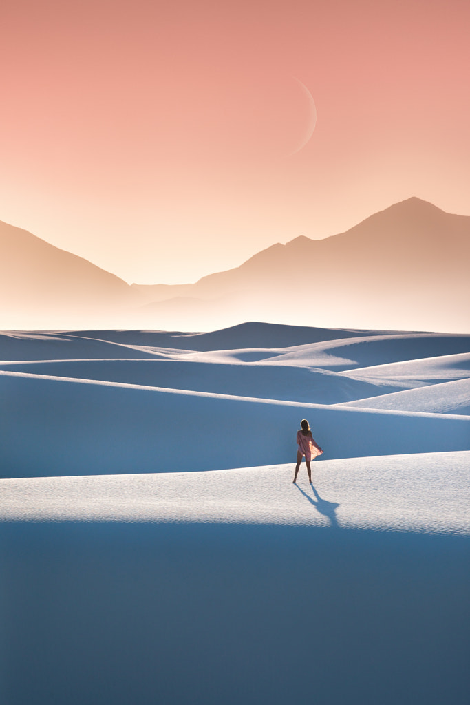
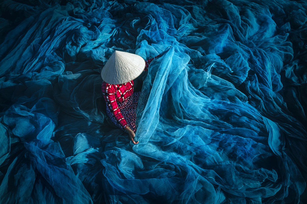
Adjusting white balance to a lower number is one way to make white sand appear blue, heightening that dreamy quality and imbuing your photo with an otherworldly atmosphere.
One final tip? Shoot RAW. That way, it’ll be easier to correct or adjust your white balance in post, even if you rely on auto white balance and don’t get it perfect in-camera. Adjusting your “tint” sliders will add green or red rather than the blue and orange of the “temp” sliders, so you can finesse them to suit your needs. We discussed color correction tips recently in our guide to achieving natural color and tone in Photoshop, so feel free to check it out.
Warmer images can spark feelings of nostalgia and childhood wonder, and using higher white balance settings is one way to highlight these emotions.
If you’re unsure of what white balance settings to use, try out a few and see what works. Remember what settings you used in different conditions, and then rely on those numbers in future shoots in similar locations. If your images turned out too orange, decrease your degrees Kelvin; if they’re too blue, bump them back up.
To understand the importance of color cast, temperature, and white balance, we need not look through the annals of photo history but recall a quirky anecdote from recent memory, when, in 2015, a photo of a dress known simply as “the dress” went massively viral online due to a debate over its color.
Those who saw the dress as white and gold might have assumed the photo was taken under a blue shadow, while those who saw it as black and blue might have perceived it as bright neutral light and registered the colors as “washed out.”
In the end, The New York Times published another photo of the same dress side-by-side with a white wedding gown, putting the controversy to rest. When we saw the white gown, it became easier for us to understand the ambient light in the scene, and we could accurately perceive the dress as blue and black.
For the most part, the meme seemed relatively inconsequential for photographers, but it does make you wonder: had the person who photographed the dress included a white card, or adjusted the white balance to get more accurate colors in post, would “the dress” have caused so much confusion in the first place?
Not on 500px yet? Sign up here to explore more impactful photography.

Leave a reply