In 1961s, Fred Herzog photographed a woman on the street, with just her green skirt and red stockings visible in the frame. In 1972, Helen Levitt photographed kids in New York City, dressed in various shades of yellow and purple. In the 1980s, Martin Parr photographed an ice cream shop in an English beach suburb, right down to the bluish scoops and the many orange cones populating the scene.
Each of these three historic photographs is iconic in its own right—created by different artists in different decades and with different color palettes—but they do have something in common: complementary colors. Fads within the industry might come and go, but a good complementary color scene will always make a photo “pop” off the page (or screen).
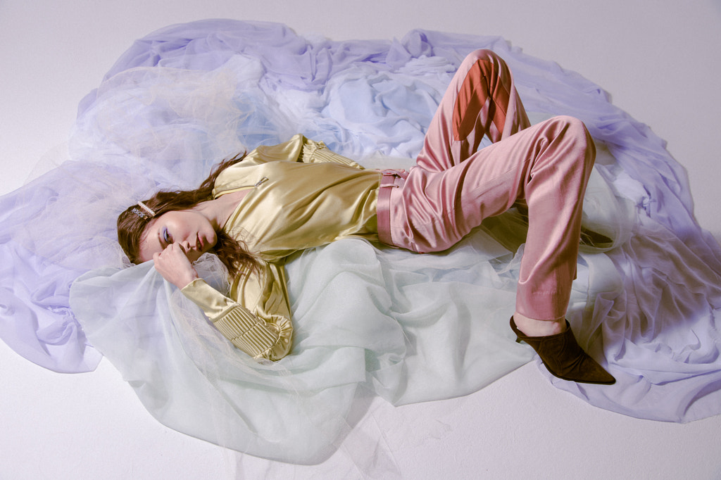
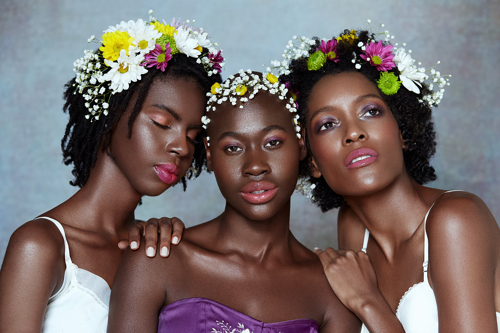
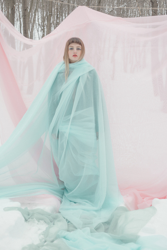
Yellow and purple
Let’s examine how and why these color combinations work, while taking a look at some inspiring images from the 500px community.
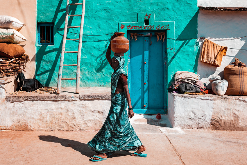
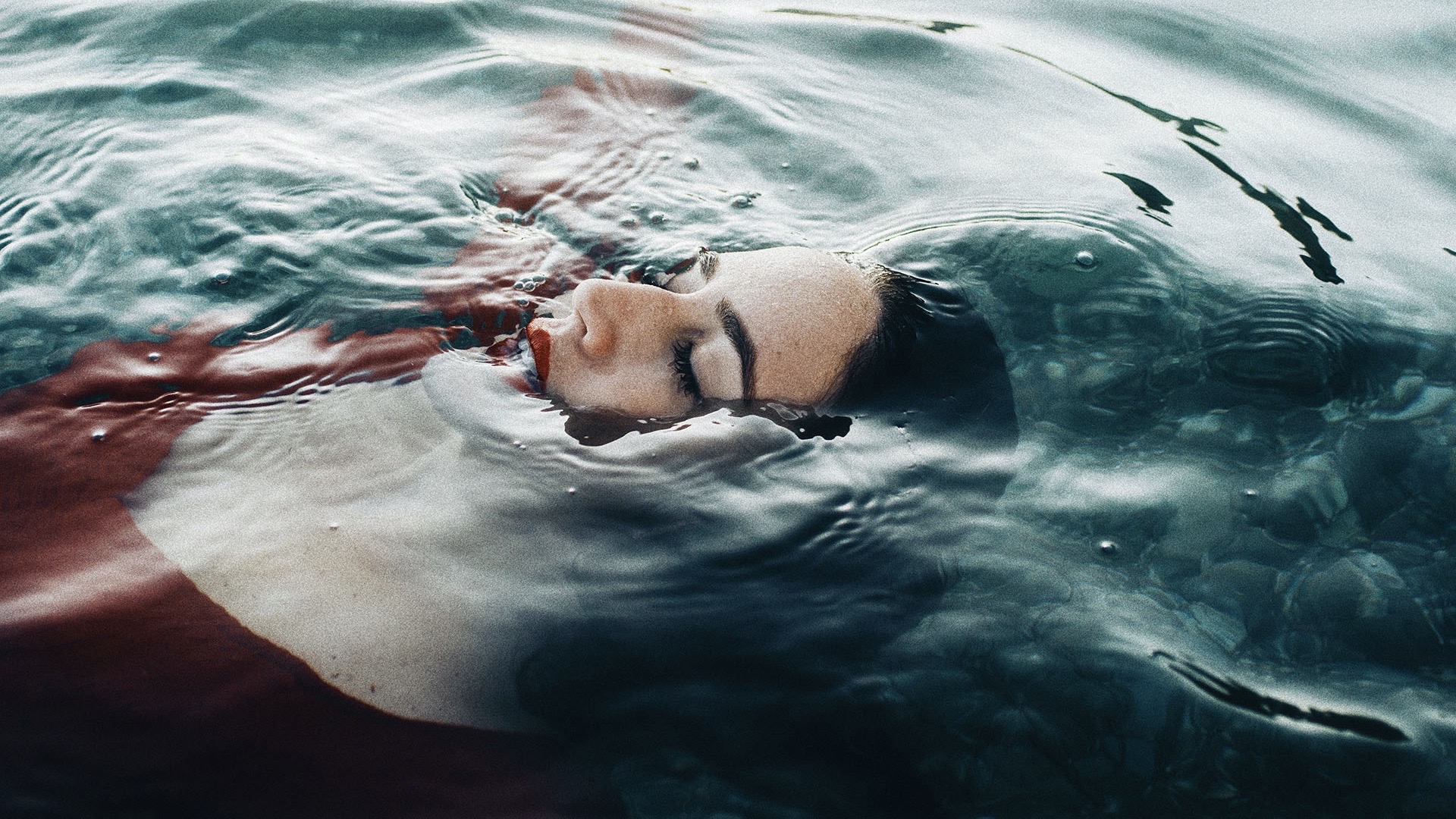
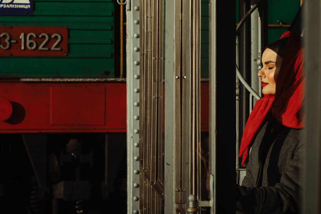
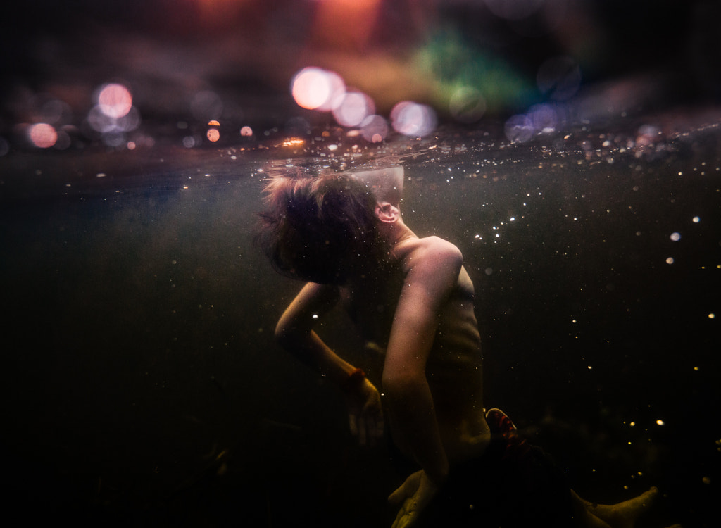
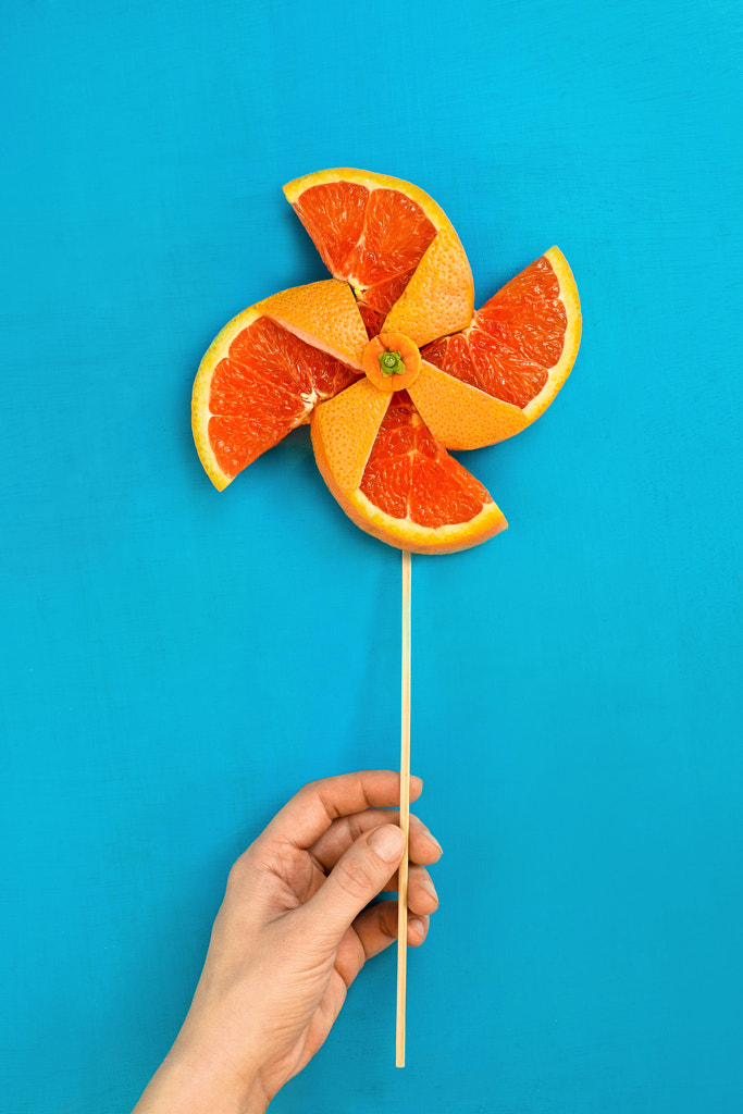
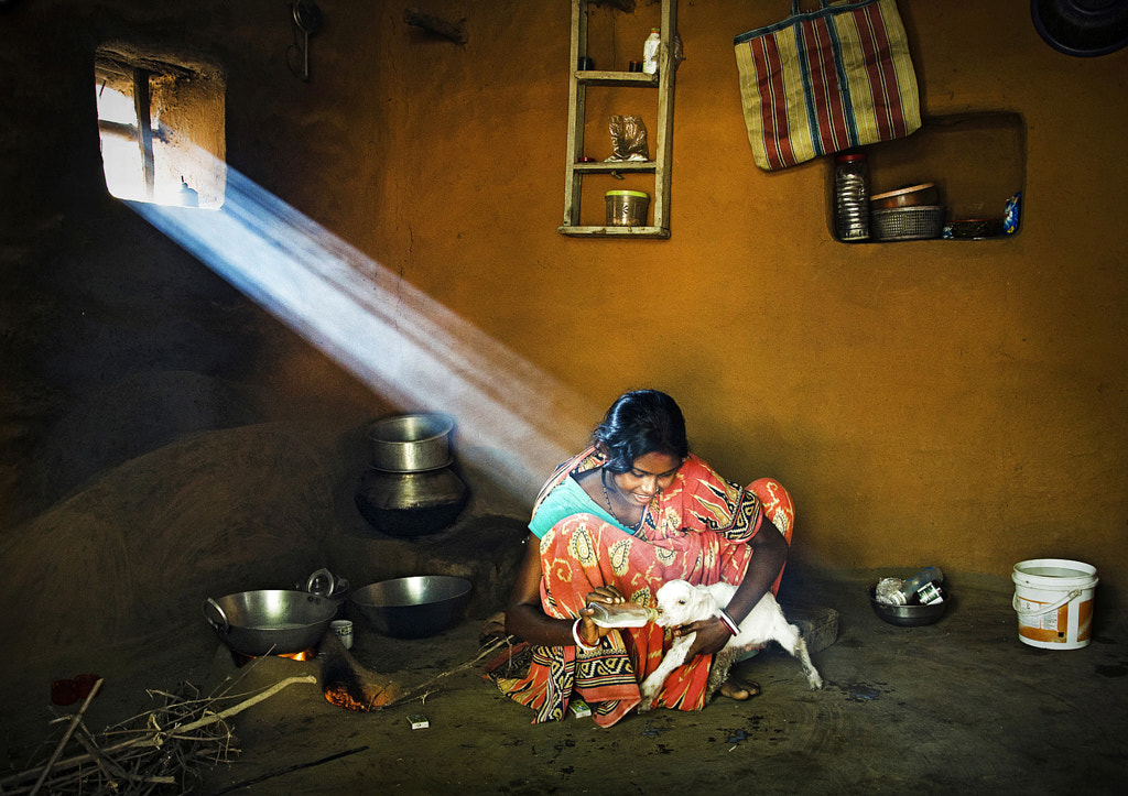
Blue and orange
On a traditional RYB color wheel, where red, yellow, and blue are your primaries, you’ll find three pairs of complementary colors, directly opposite each other: red and green, blue and orange, and yellow and purple. Simply put, complementary color pairs consist of one primary plus the secondary color you get when you mix the other two primaries.
Yellow and purple
Try this: stare for several moments at a block or pattern of solid color, and then redirect your eyes to a white wall. On that white wall, you’re likely to see an afterimage of the complement of the color you’ve just observed. Red will produce a green block on the wall; blue will produce an orange one, and so on.
In photography, as we’ve discussed in our introduction to color theory, complementary colors look good together because they “boost” each other’s intensity. The painter Josef Albers was a master when it came to using color; because color is relative, he regularly instructed his students to use colored paper to explore how different hues interacted with—and changed—each other.
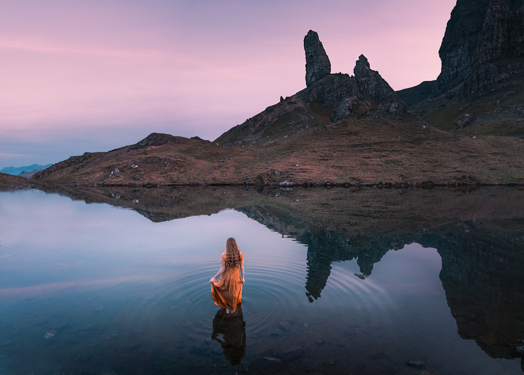
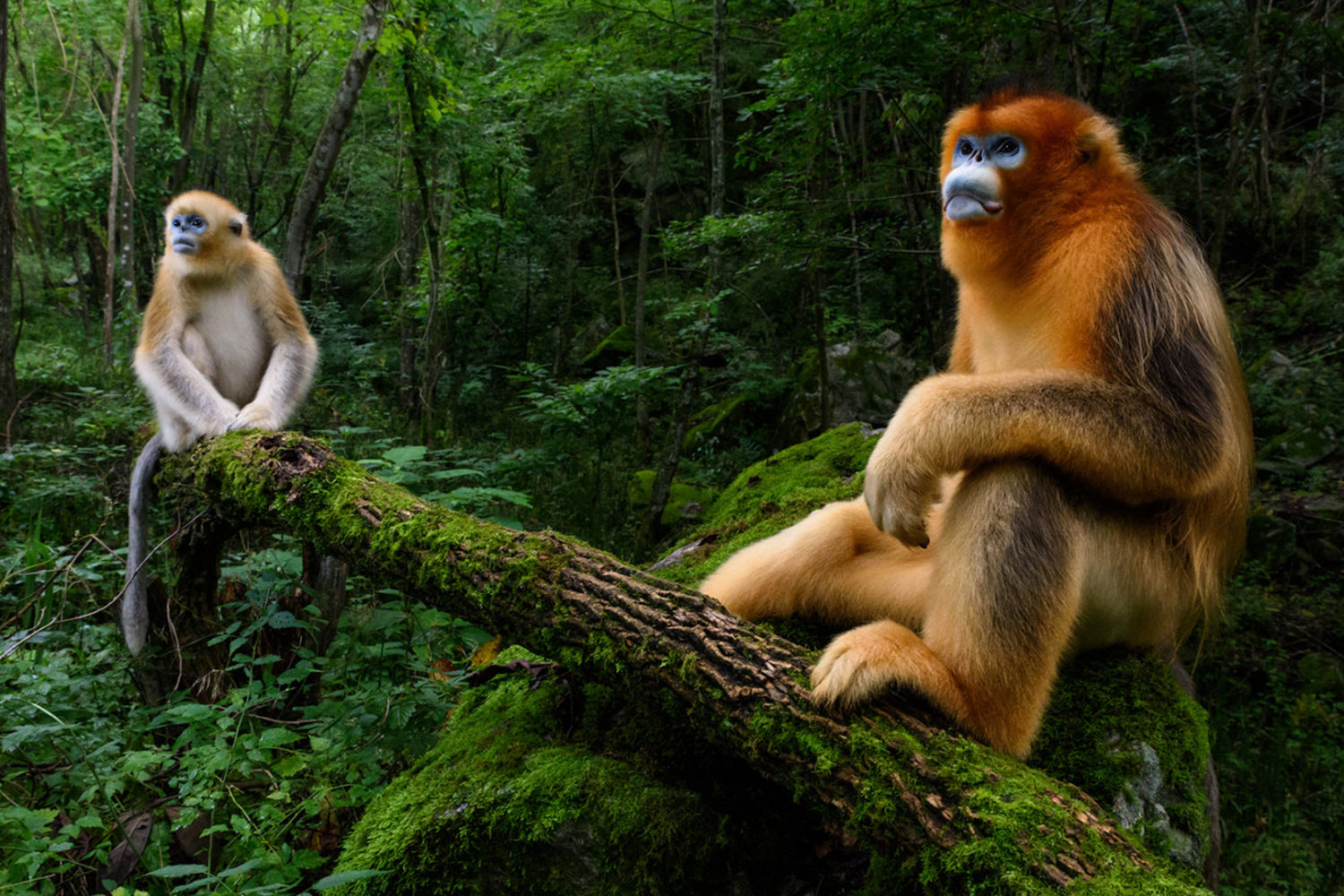
Blue and orange
Here’s another exercise you can try with colored paper or on your computer: place a square of orange next to its complement (blue), and it will take on a different appearance than it would when placed next to, say, another shade of orange. By doing this exercise—developed by Albers—you’ll notice that it’s possible to make just three colors look like four, and that’s a testament to the power of complementary colors.
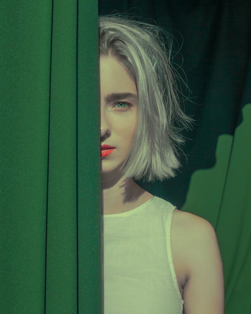
Red and green
You can also practice by taking a simple object and setting it against a seamless background with a complementary hue.
If you’ve chosen a red apple, try placing it against a green backdrop. If you don’t have a roll of seamless paper, some construction paper or fabric should do the trick. You can also paint the objects themselves to complement whatever background you have. Limit yourself to just a few colors so you can home in on their relationships.
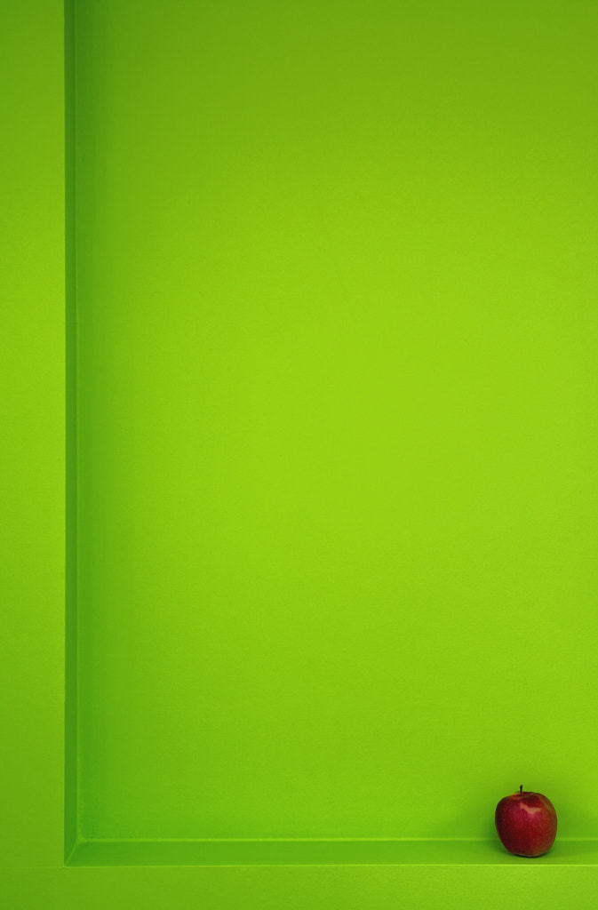
Red and green
Once you’re done, you can experiment with changing your hues in post-processing; a simple slider can transform yellow to green or red to orange, etc. Having a good monitor (or calibration tool) is crucial when it comes to color, as the photographer and educator Pedro Quintela points out in this article on his best photography secrets.
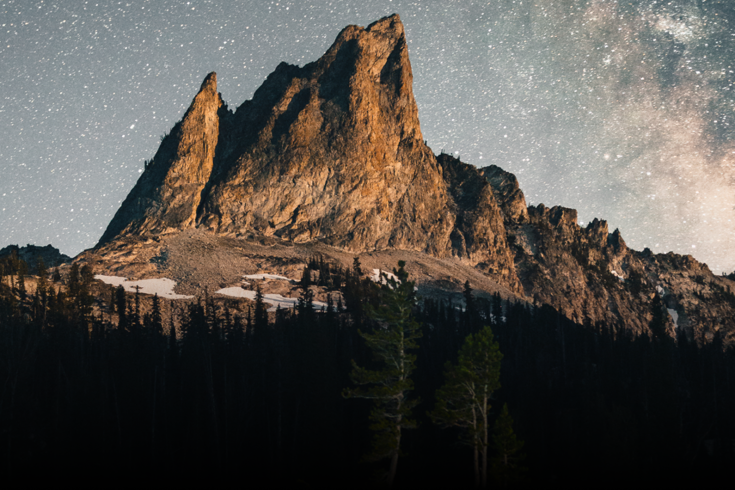
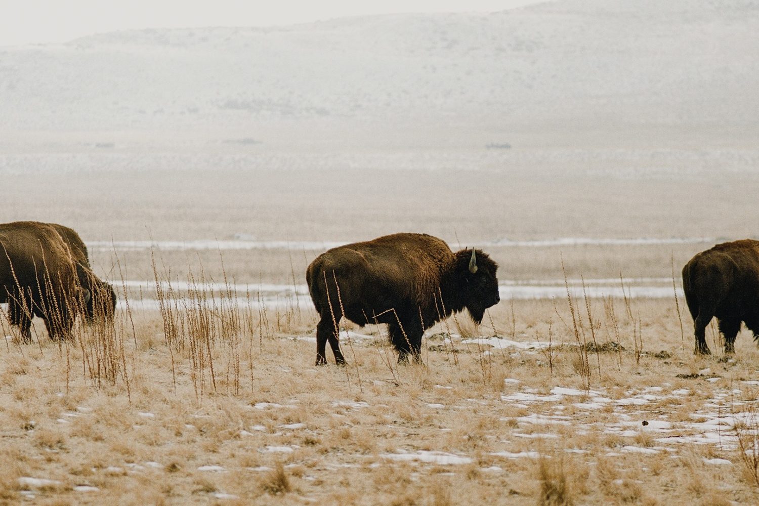
Blue and orange
Red and green
The saturation of your hues, discussed in-depth in our second article on color theory, will also have an effect on your composition. Saturation measures the intensity of a color—paint that comes straight out of the can, for example, is usually fully saturated, but by mixing it with white or gray, you can tone it down and make the effect more subtle.
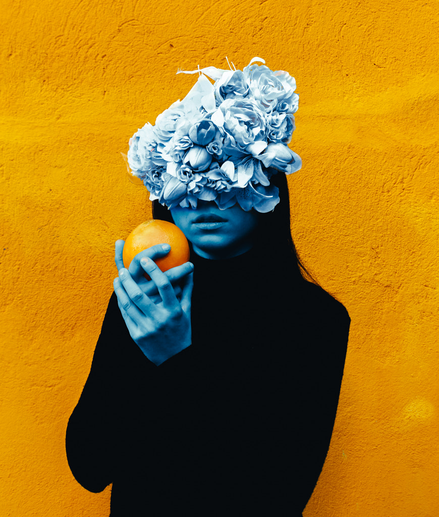
Blue and orange
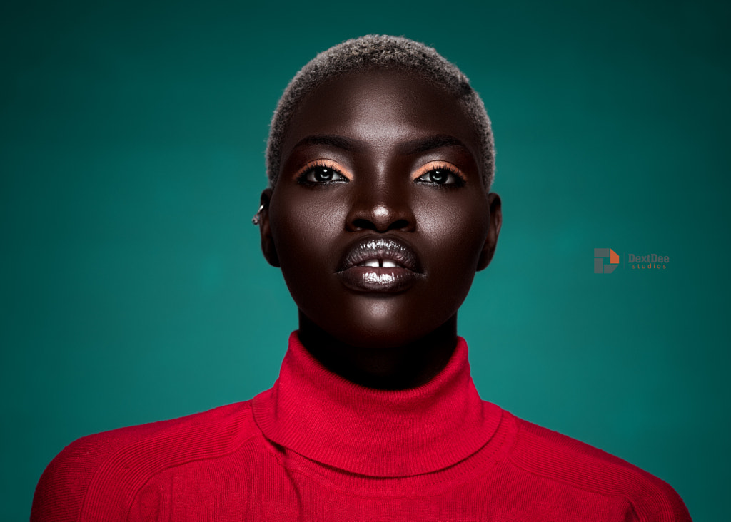
Red and green
In applications like Photoshop and Lightroom, you can easily change the saturation of a particular hue by using the saturation slider. If you’ve used complementary colors, you might want to bump up the saturation of one of your hues to indicate the most important part of the image.
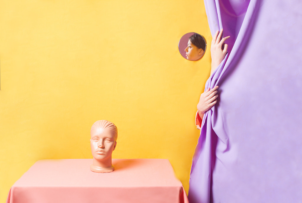
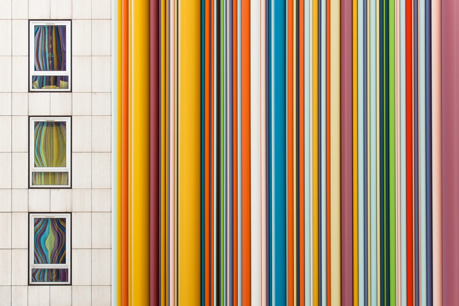
Yellow and purple
Red and green
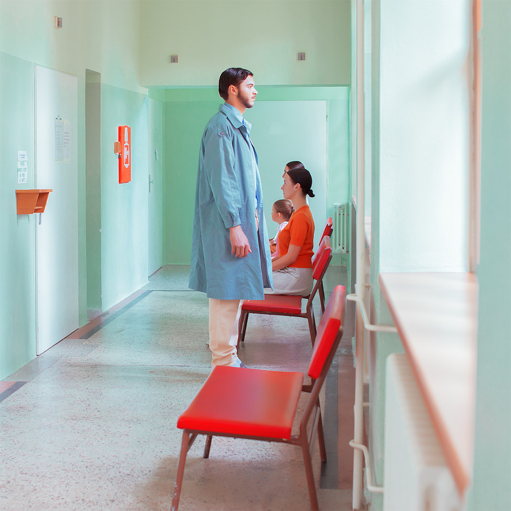
In the photo above by Maria Svarbova, the reds of the waiting room interior are more intense than the greens, reinforcing the fact that the main subject of the picture is the woman in red; the walls are there to compliment her, but they don’t steal focus.
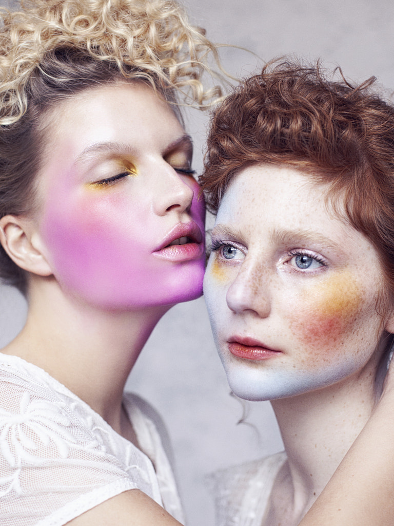
Yellow and purple
You might notice that most of the images featured here include one “key” color and another “accent” color. In other words, one color takes up the majority of the frame or is more intense than the other. Alternatively, both colors are used as subtle accents.
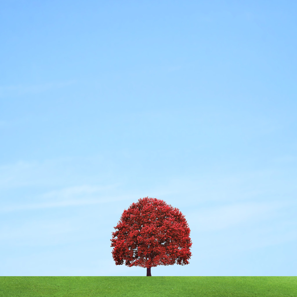
Red and green
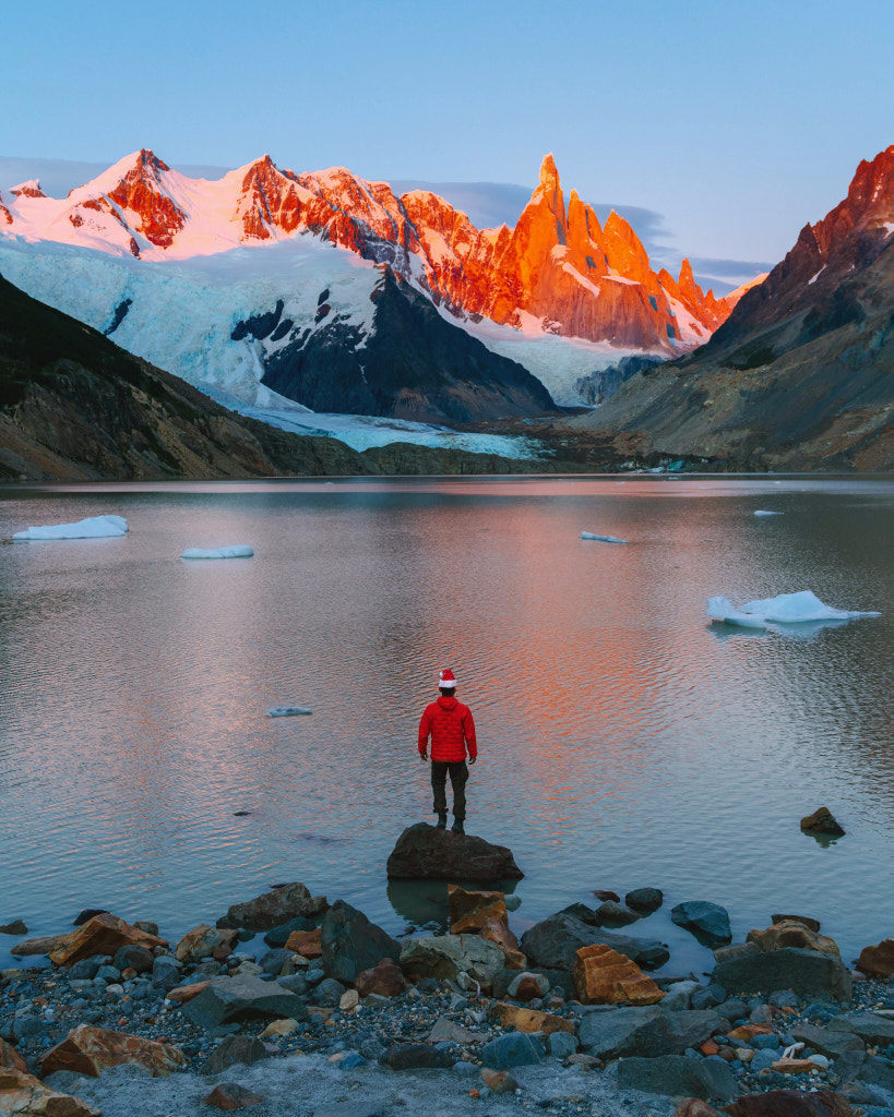
Blue and orange
Complementary colors are all about vibrance and contrast, and that’s a good thing, but it can easily overwhelm the eye if there are too many elements competing for our attention. For that reason, these photographers have chosen to use at least one color sparingly. They’ve told us where we’re supposed to look, without distracting us from the meaning and significance of the picture overall.
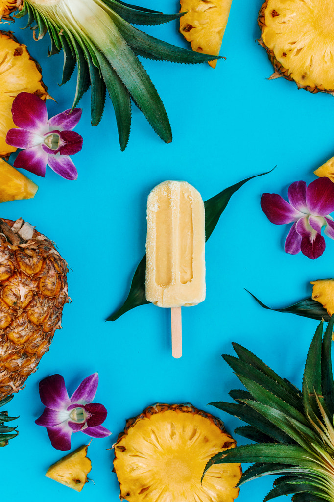
Yellow and purple
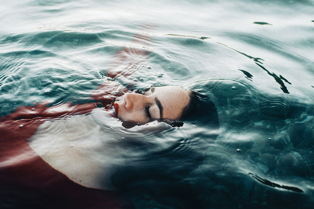
Red and green
When discussing color schemes, you might also hear photographers refer to “split complementary” colors. These sets of colors are similar to regular complementary sets, but they’re less intense; to use a split-complementary scene, identify your key color, and then pair it with the colors on either side of its complement. For example, if you’ve chosen purple as your key color, perhaps you choose yellow-green and yellow-orange instead of pure yellow for a softer vibe.
Purple, yellow-green, and yellow-orange
When working with color, it’s also important to recognize that hues are both timeless and trendy. As Pantone’s hugely popular Color of the Year can attest, color trends extend from the world of interior design, through paintings in art galleries, and into photographs published in magazines around the world.
Yellow and purple
Blue and orange
Our suggestion? Occasionally pull photos you love from 500px and social media, and then go over them once you’ve gathered a substantial collection. You might notice that certain colors are in vogue and then decide to include them—and their complements—in your compositions.
Blue and orange
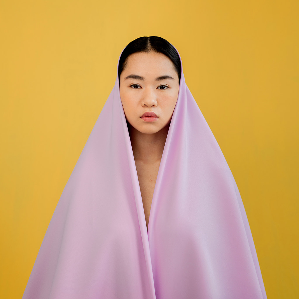
Yellow and purple
Some of this year’s biggest colors include classic blues (paired well with oranges or corals), earthy or minty greens (paired well with reds and pinks), and muted lavender (paired well with yellows and golds).
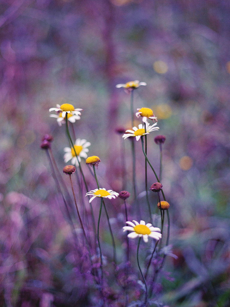
Yellow and purple

Blue and orange
Your colors might also change based on the lighting, time of day, or color cast created by ambient light. Colors don’t exist in a vacuum; instead, they’re influenced by what’s around them. Use them as a chance to experiment with new things and push yourself outside your comfort zone; after all, there are no hard-and-fast rules for using color in photography—just suggestions for further exploration.
Red and green
Not on 500px yet? Sign up here to explore more impactful photography.

Leave a reply