Photo: “Marius a avalé de travers….” by Bastien HAJDUK
The psychology of color is something that marketers have been leveraging for years. However, a quick Google search will show that there’s a lot of misinformation and oversimplification out there about the meaning of colors and how to use them to promote your product.
While it’s tempting to look to a pseudoscientific infographic to choose your brand colors for you, it’s better to dig a little deeper and look at some of the more credible evidence we have about the effect color has on consumers. Let’s take a look at some key points on the use of color in marketing, backed by data, and see how you can use them to your advantage.

1. It’s not just about hue.
You’ve seen those charts online: red = excitement, and blue = calm and responsibility. We’re sorry to tell you they’re oversimplified. It is true that warm hues (red, orange, yellow) are more arousing while cool colors (green, blue, purple) are more relaxing. And there is some credence to meanings by hue, but you can’t lean too heavily on it.
Much of the early research on hue didn’t take into account the saturation (how vivid the color is) and brightness (how light or dark the color is) of a given hue, and it turns out those can make all the difference; a 1994 study found these attributes cause a more dramatic emotional impact than hue.
Use this knowledge: Take the presumed meanings and associations of a given hue into account, but don’t make them the only factor in your color choices. See the other points in this article to help guide your choices.
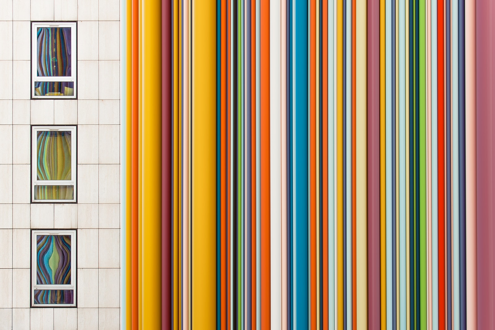
2. Saturation is important to consider.
Saturation, or chroma, refers to how vivid a color appears. A color with low chroma seems washed out; a color with high chroma will look rich and vibrant. Low chroma is more relaxing; high chroma is stimulating. Therefore, changing the saturation of a hue can create a vastly different experience for the viewer. Think about a travel company that wants to make you think of a dreamy relaxing escape using low chroma imagery, or, alternatively, encourage you to take the adventure of a lifetime using high chroma imagery.


Use this knowledge: Decide what sort of emotional effect you want to have on your audience and adjust your saturation levels accordingly. Most software programs show you a color wheel with the low saturation colors at the center of the wheel and more saturated colors towards the outside of the wheel. For your web design, packaging, and promotional imagery, use saturation to your advantage. So, for example, a software company might choose high-saturated images if they have created a cutting-edge app that makes life tasks easier, but choose lower-saturation if their app is say, about financial safety or family connections.


3. Brightness makes a difference.
Brightness, or value, refers to how light or dark a hue is. Low value colors are referred to as “shades” and appear dark. High value, brighter colors are called “tints.” Low value colors are more stimulating; high value colors more relaxing.
Use this knowledge: Again, decide if your goal is to stimulate or relax your audience. Also, a McInnis and Shearer experiment showed that women prefer tints, and men prefer shades, so if your audience leans more male or female, keep that in mind. Shades are generally thought to be more mysterious and powerful in tone. Your software will likely allow you to adjust the value of a color by means of a slider bar on a gray scale.


4. Color preferences are influenced by both nature and nurture.
Color preference theories range from evolutionary adaption (for example, women evolved a preference for pinks and reds stemming from their role as gatherers searching for pink and red foods to eat) to cultural influence (boys prefer blue because they’re given blue toys and toys are fun). As a general guideline, women prefer hues of red, yellow, blue, purple, and pink with low value and low chroma. Men prefer blues and greens with high values and color saturation.
It’s important to note that color preferences change within a culture over time—hence the distaste of modern audiences for the dark oranges and avocado greens of the1970s. Different cultures have different color associations, too. If your current color scheme is working in North America, but you want to branch out into the Asian market, you better double check the cultural associations and preferences of your color scheme. For example, in China, red is thought to be a lucky color whereas blue has sinister connotations. A fascinating 2012 study that analyzed half a million Instagram photos of New York and Tokyo found that the dominance of different hues were different in each city. New York photos were predominantly blue-gray, while Tokyo was red-yellow.
Use this knowledge: Consider the gender and culture of your intended customer and do some research to ensure your color choices align with their preferences.


But you can’t just think in terms of what colors your customers like. Again, that’s oversimplifying. Which leads us to…
5. The color has to be appropriate to the product.
In this epic article on the psychology of color, Nick Kolenda uses the example of sports cars to illustrate the concept of color appropriateness. In the minds of most consumers, red is a good color for a sports car. Brown is not because even without seeing a color, even hearing the word of that color, or reading it, our minds assign a semantic meaning to the color—and we react accordingly.

Use this knowledge: Make sure your color choices take appropriateness to the product into account. Red draws the eye on a shelf or a website, but for a medical facility or an aspirin, it can also lead one to think of blood and illness. In short, don’t make design decisions based only on trying to evoke a certain emotion and finding a color to match. Remember to ask yourself if the emotion and associated colors considered are appropriate to the shared cultural expectation of the product or service you are selling.
6. Contrast matters.
A few years ago, Hubspot created a big stir when it published the results of some color testing on a landing page. They created multiple versions of the same landing page, the only difference being one had a green call to action button and one had a red button. Surprisingly, the red button got 21% better results than the green. So, is the answer make all call to action buttons red? Probably not. It probably matters more that the red button provided more contrast than the green in the context of this particular landing page color scheme.
Use this knowledge: When designing your calls to action, make sure you’re using high contrast to call attention to the place you want prospects to take the next step.
7. Color may influence shareability.
Though research is limited, it seems that saturated and warm colors are more shareable. As far as hues, a 2015 study found that images with red, purple, and pink hues were shared more widely than those with green, blue, and yellow. You should definitely take this concept with a grain of salt. More data is needed, and as with so much in the realm of color psychology and the online world, things can shift and preferences can change.
Use this knowledge: If it’s shareability you’re after, you can benefit by creating multiple versions of your content and testing which colors perform best.


There’s no magic bullet
There’s no app where you can plug in a product and it will spit back out the perfect color to use to promote that product (yet). Consider color as an important a part of your marketing toolkit, work hard to get it right, but don’t expect it to be the magic bullet in your marketing strategy. Color preferences in humans are simply too complicated—informed by both biology and experience—to adhere to any foolproof theory. But careful application of sound color psychology theories can get your brand a leg up on the competition.


![[Photo Keywording Tips] How to add effective keywords to help your photos get discovered](https://iso.500px.com/wp-content/uploads/2014/10/500px_blog_photo_keywording_tips-1500x1000.jpg)


Leave a reply