There’s a famous moment in the 2006 film The Devil Wears Prada where Miranda Priestly (Meryl Streep) lectures Andy Sachs (Anne Hathaway) about color trends, explaining how Andy’s seemingly average cerulean blue sweater was, in fact, influenced by years of high fashion. The scene is fictional, of course, but it does have some roots in reality: in 2000, the Pantone Color Institute named Cerulean Blue “the color of the millennium.”
Every year since then, the Pantone Color Institute has forecasted color trends through their much-anticipated “Color of the Year,” influencing choices made by leaders within the advertising, art, tech, and design industries.
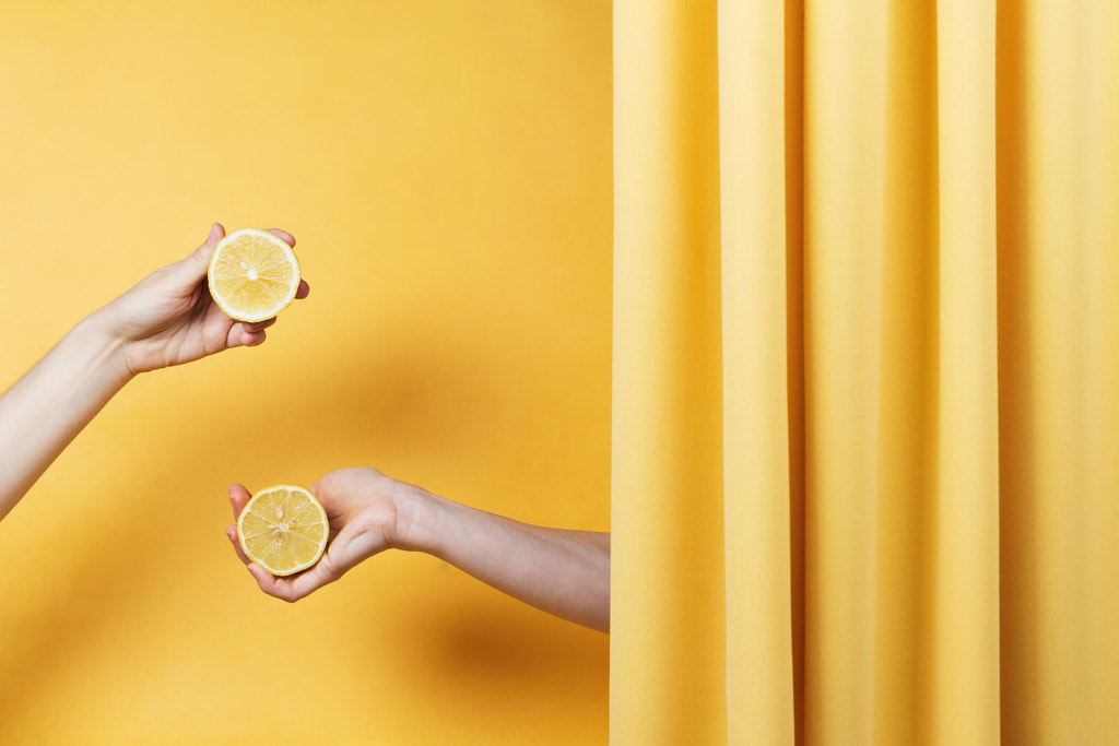
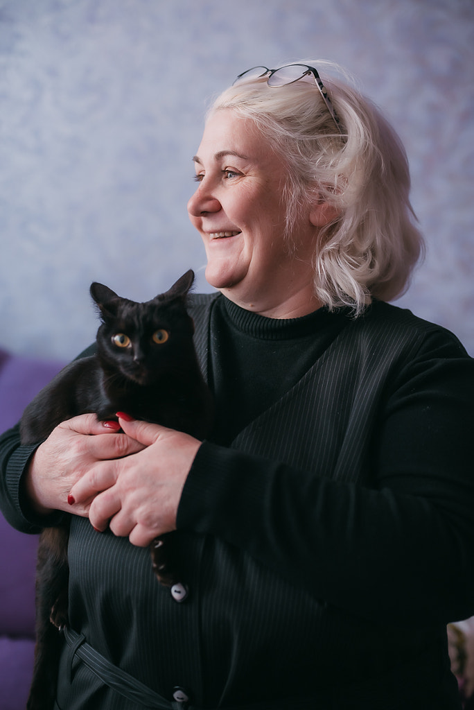
In 2021, for the second time in Color of the Year history, they have selected two colors: Ultimate Gray, the first achromatic shade ever chosen, and Illuminating, a soft lemony yellow. These are two colors image buyers will hunt for in the coming months; this year, commercial photographers around the world can breathe fresh life into their Licensing portfolios by incorporating them into their shoots.
This year’s color choices seem especially metaphorical; as the critic Kyle Chayka wrote for The New York Times, they seem to go beyond mere trends and embody a larger marketing message. While Ultimate Gray conveys a sense of security and endurance, Illuminating—like the sight of the rising sun—speaks to renewed optimism and hope following a difficult year. Together, they are grounding yet uplifting, dependable yet aspirational.
There’s research to back the idea that, for many, yellow can symbolize hope. Leatrice Eiseman from the Pantone Color Institute, for instance, has found that common word associations for the color yellow include “cheer”, “happiness”, “warmth”, and “playfulness”. In 1917, hospital rooms in London were painted yellow in hopes of helping recovering soldiers. Gray, on the other hand, can represent balance, composure, and solidarity.
A quick look at recent photo and video campaigns demonstrates the range and versatility of these two colors; you can find accents of yellow and soothing grays in Fendi’s Spring/Summer 2021 campaign, shot by the photographer Nick Knight. Meanwhile, Nicolas Ghesquière of Louis Vuitton photographed brand ambassador Naomi Osaka against a classic gray background, a pop of sunshine yellow in her dress.
In Versace’s Spring/Summer 2021 campaign, Kendall Jenner, photographed by Mert Alas and Marcus Piggott, appeared against a gray backdrop, her nails painted a vibrant yellow. Christian Dior’s Spring 2021 Couture collection, photographed by Elina Kechicheva, includes a visual feast of grays and yellows. Salvatore Ferragamo tapped Luca Guadagnino to create a short film that also incorporates the two hues.
Part of the beauty of Pantone’s Colors of the Year lies in their massive reach. You can see accents of yellow and gray in Super Bowl commercials from brands ranging from Mercari to Squarespace to DoorDash. Yellow and gray palettes have even shown up on the social media feeds of widely followed brands like Chanel, BMW, and Mercedes-Benz. And of course, the team at Pantone has been sharing photos of the two colors “in the wild” via Instagram, where they’ve amassed nearly three million followers.
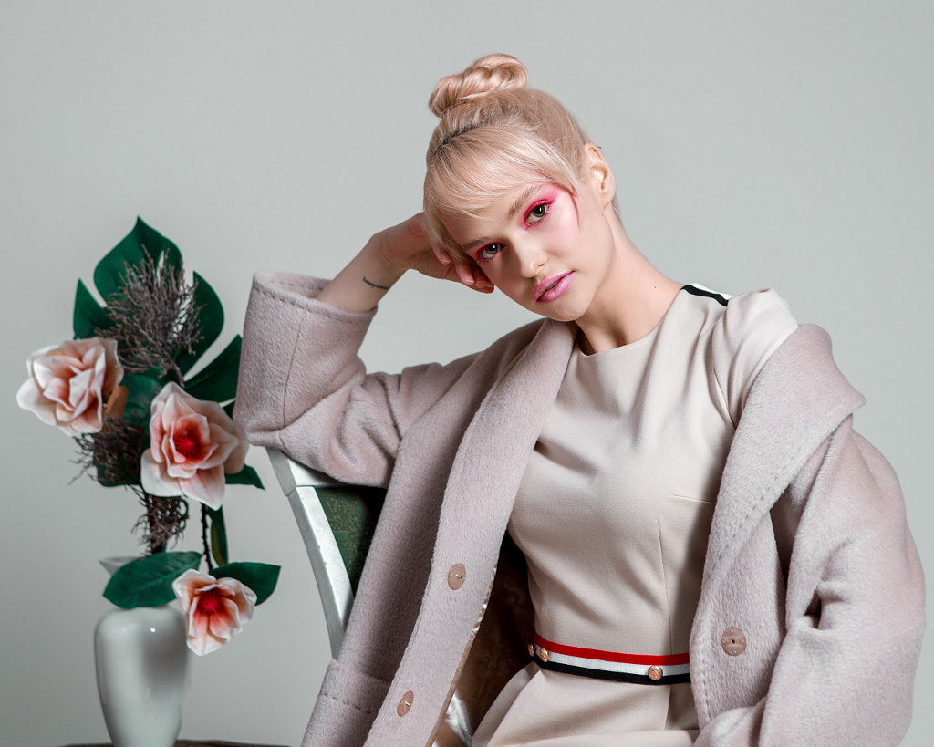
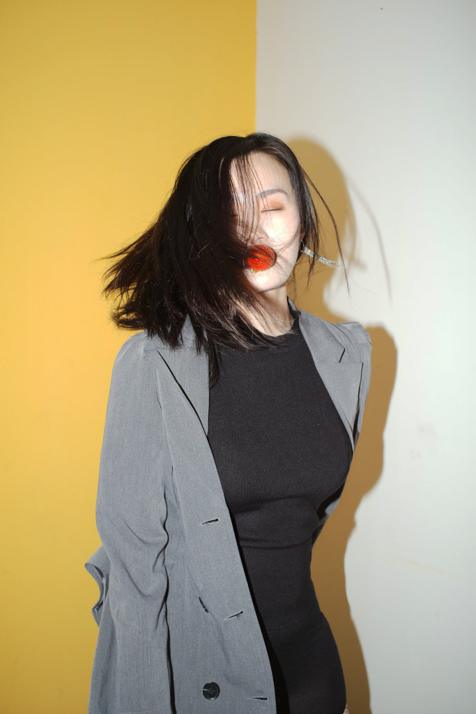
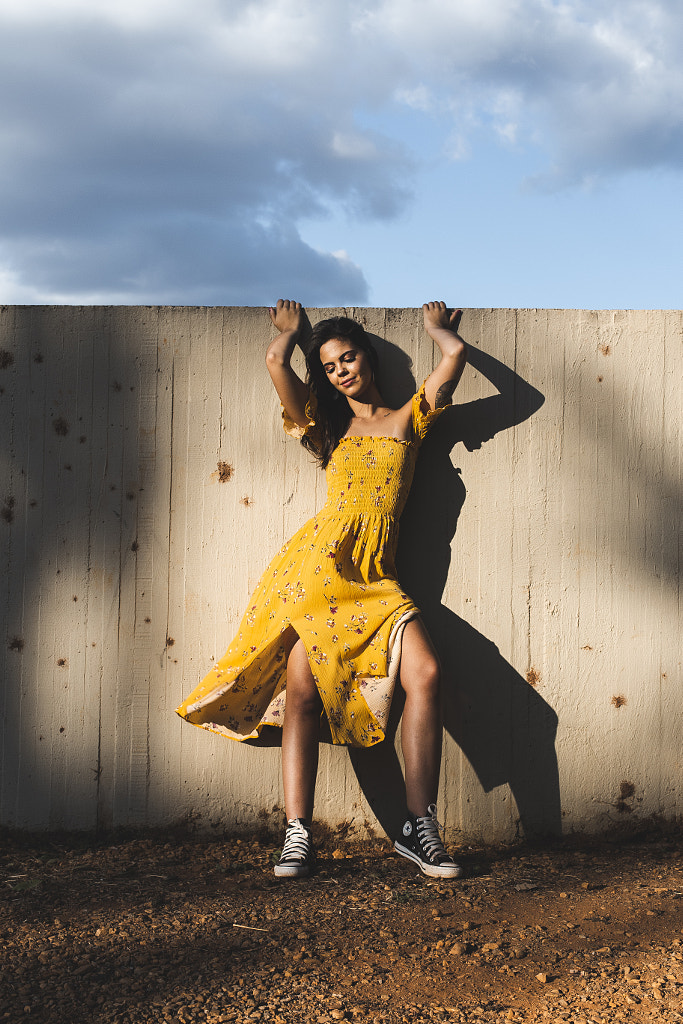
When it comes to Pantone’s influence, commercial stock photography is no exception. “Many image buyers follow the Pantone colors as a way of keeping their content appearing fresh and relevant,” the 500px team tells us. To start, you can go subtle by using gray and yellow accents in your lifestyle shoots, as these trends can help inform your wardrobe, interior styling, and prop selection. A well-placed yellow dress or gray wall can go a long way toward modernizing a classic image.
Similarly, you could go bold and graphic with conceptual still lives that use them as your key colors. Product photography, food photography, and flat lays are all areas where you can get creative through your use of color. Keep your palette limited to just two or three colors, and let your staging and composition shine. You can use gray and yellow together or choose one and pair it with a different color that works well. For instance, yellow’s complement, purple, helps bring out that contrast, whereas grays can help draw attention to a more vibrant, saturated color.
It’s also worth noting that although Pantone might be the most influential, they aren’t the only ones to select Colors of the Year, as companies like Benjamin Moore, Behr, Valspar, Sherwin-Williams, Graham & Brown, Dulux, and more have also rolled out their annual predictions. Benjamin Moore chose “Aegean Teal,” a coastal-inspired, calming blue-green, while Behr selected “Canyon Dusk,” a warm and earthy desert hue evocative of clay or evening sunlight.
Valspar chose cozy, soothing colors with a selection of twelve muted hues, including a gray inspired by natural stones, a soft morning yellow, and much more. Sherwin-Williams named “Urbane Bronze,” a natural gray-brown, as its pick for 2021, while Graham & Brown chose a luxurious plum called “Epoch,” and Dulux went with “Brave Ground,” a warm, organic, and earthy neutral.
All of these colors can serve as a point of departure for upcoming photoshoots, and using the fundamentals of color theory, they can be combined for a modern and contemporary aesthetic. Maybe you combine soft yellows with calming terracotta for a warm and grounded atmosphere, or perhaps you pair grays with plum for a rich, regal vibe.
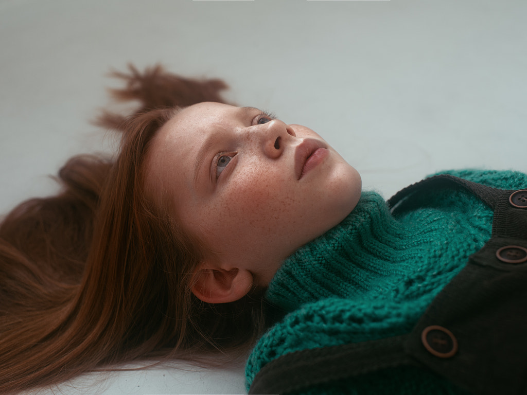
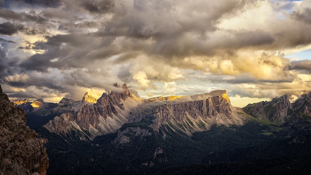
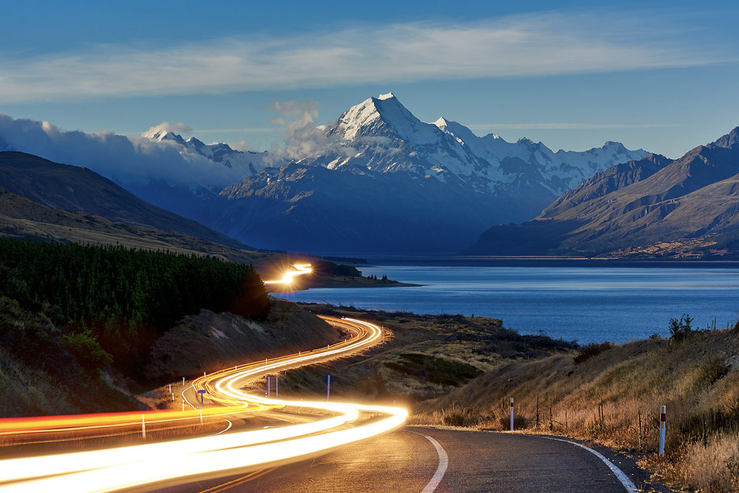
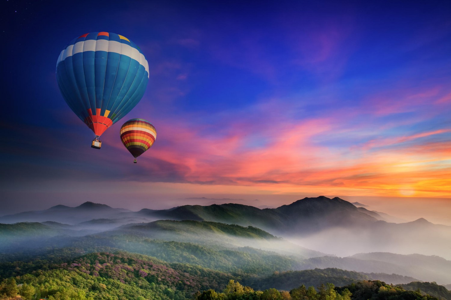
Some of these colors (stone grays, warm clay, coastal blue, and daybreak yellow, to name just a few) can also be found in nature, so they can be introduced organically when shooting in scenic landscapes. Keep an eye on 500px Licensing Galleries for ideas on how to introduce trending colors into your images, and take a look at how your favorite brands use color in their marketing.
While color trends come and go, Meryl Streep’s character in The Devil Wears Prada was right in stressing their importance in capturing and illustrating our cultural moment. Some brands have made certain colors an integral part of their identities; after all, Tiffany & Co. trademarked their robin’s egg blue, and Post-It did the same with their canary yellow. Colors touch almost every corner of art and commerce, and they’re also some of the most important tools in a photographer’s toolbelt; when used well, they can help convey a mood or tell a larger story.
Not on 500px yet? Click here to learn about Licensing with 500px.



Leave a reply