In 1944, the experimental psychologists Fritz Heider and Marianne Simmel of Smith University conducted a now-famous experiment: after playing a video featuring three moving shapes—a small triangle, a large triangle, a circle, and a rectangle—they asked participants to write down what they’d just watched. Most saw it as an animated story, with the abstract shapes representing characters with thoughts, feelings, and motivations.
As with colors, we often assign larger meanings to simple shapes. In advertising, marketers use shapes to tap into our own emotions and desires. While often discussed in the context of illustration or logo design, shapes play a key role in all branded messaging, making them an essential tool for commercial photographers as well. In this quick guide, we’ll take a closer look at the psychology of shapes, how they’re used in advertising, and how you can incorporate them into your work behind the lens.
Squares and rectangles
Found in the manmade world, squares offer a sense of authority, balance, and stability. Perhaps it’s worth noting that in Simmel and Heider’s experiment, many participants viewed the rectangular shape as a “house.” Connecting squares to ideas relating to security, designers often use square logos to represent trustworthiness and professionalism (think Microsoft, the BBC, National Geographic, Chase bank, or American Express).
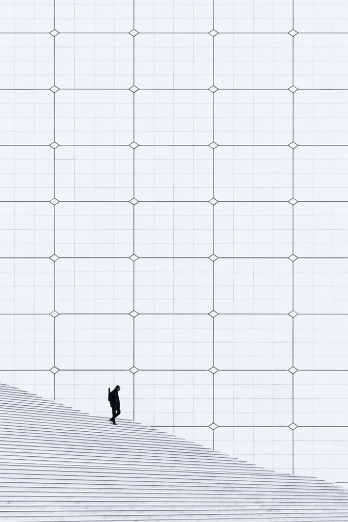
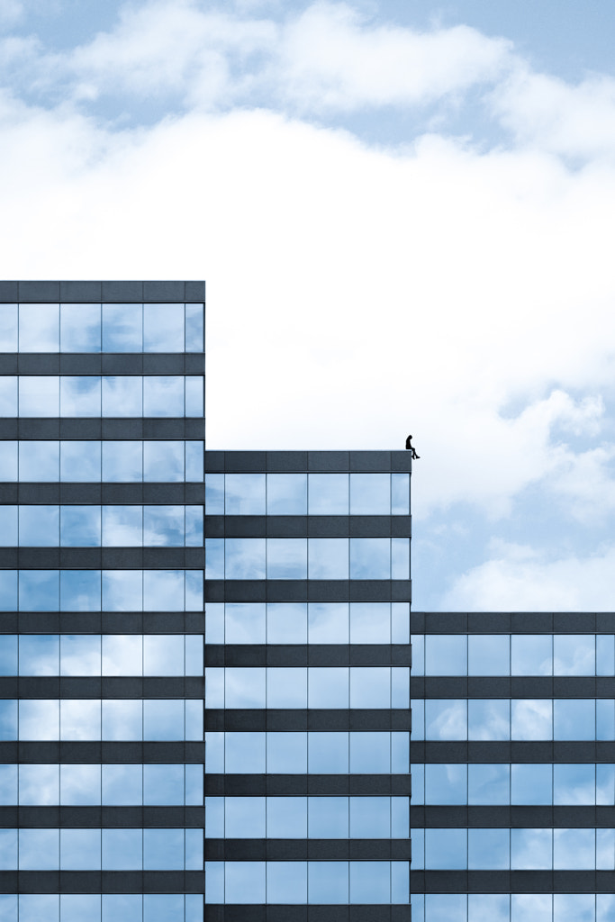
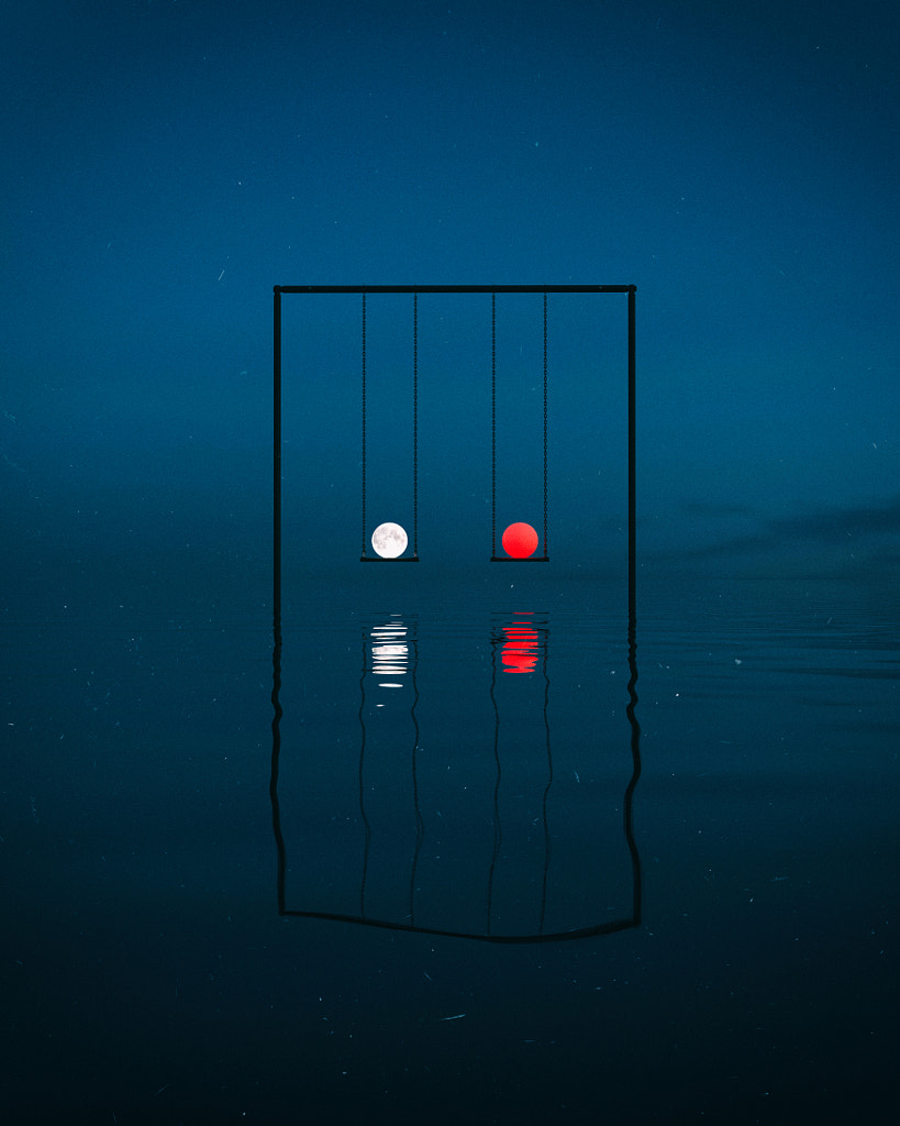
In photography, squares and rectangles can be used to “frame” your subject and create balance. The rule of thirds, often used to create harmony in photographs, also relies on thinking about your images in terms of rectangles, or grids.
Triangles
As with squares, the straight lines that compose triangles can be used to represent stability—with a playful or alternative twist. As we associate triangles with mountains, these shapes can also be used to represent success or growth, at least when they face toward the sky, as in the case of, for instance, the Delta or Hyundai logos.
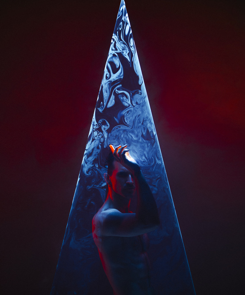
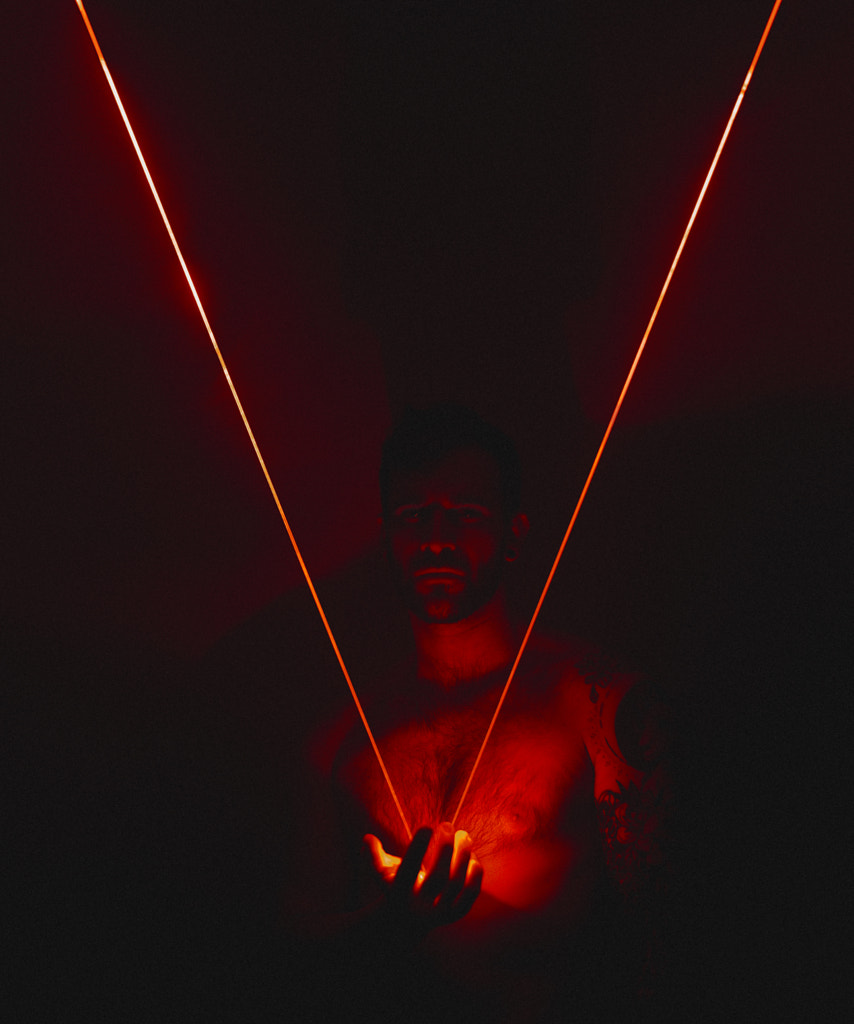
On the other hand, inverted triangles feel precarious and daring. “While upright triangles relate to success, triumph, stability, and balance, inverted triangles might suggest risk,” the 500px team tells us. Finally, sideways triangles suggest forward motion; consider, for instance, the Google Play, FedEx, AOL, or YouTube logos. In photographs, triangles can be employed similarly. In some cases, they can even act as a kind of arrow, pointing us to the most important part of the image.
Hexagons
Reminiscent of bees’ honeycombs, hexagons are sometimes associated with feats of engineering, and by extension, the future. As complete, closed, and symmetrical shapes, hexagons can also represent feelings of professionalism and trustworthiness, much like squares and rectangles. For example, the HSBC logo, inspired by the bank’s original house flag, conveys a sense of strength and security.
Circles
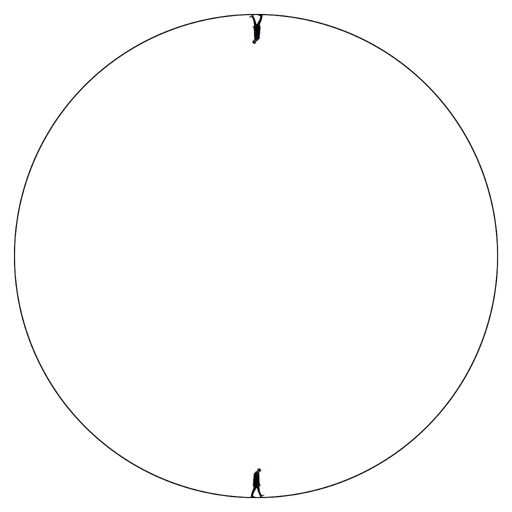
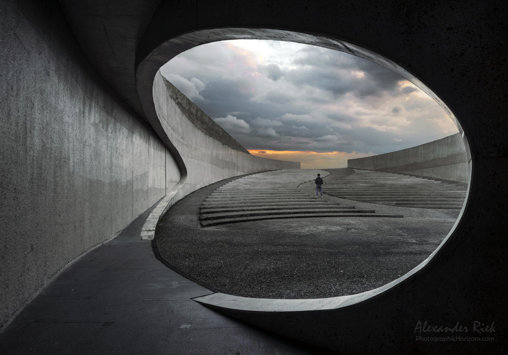
Used to symbolize the sun, moon, and stars, circles have also come to represent unity, solidarity, inclusion, and calm. Circles can also feel spiritual, symbolizing the cycle of life as well as celestial bodies. (The NASA logo, for example, includes a circle, as does the tree-inspired Timberland logo). Circles are symmetrical and complete, suggesting strength, but at the same time, they are sometimes interpreted as playful or even “friendly.” Like squares, they can be used to frame photographic subjects, acting as a kind of “spotlight” signaling the most important part of your image.
Unlike angular shapes, which can feel sharp or hard, circles feel soft. As part of one recent study, Amitava Chattopadhyay and his team at the business school INSEAD investigated the influence of logo shape on brand perception. They showed people ads for sofas and athletic shoes, with some participants seeing an ad with an angular logo, some seeing an ad with a circular logo, and some seeing no logo at all. Their findings: participants who saw the angular logo thought of the shoes and sofa as more durable, while those who saw the circular logo thought of them as more comfortable.
Spirals
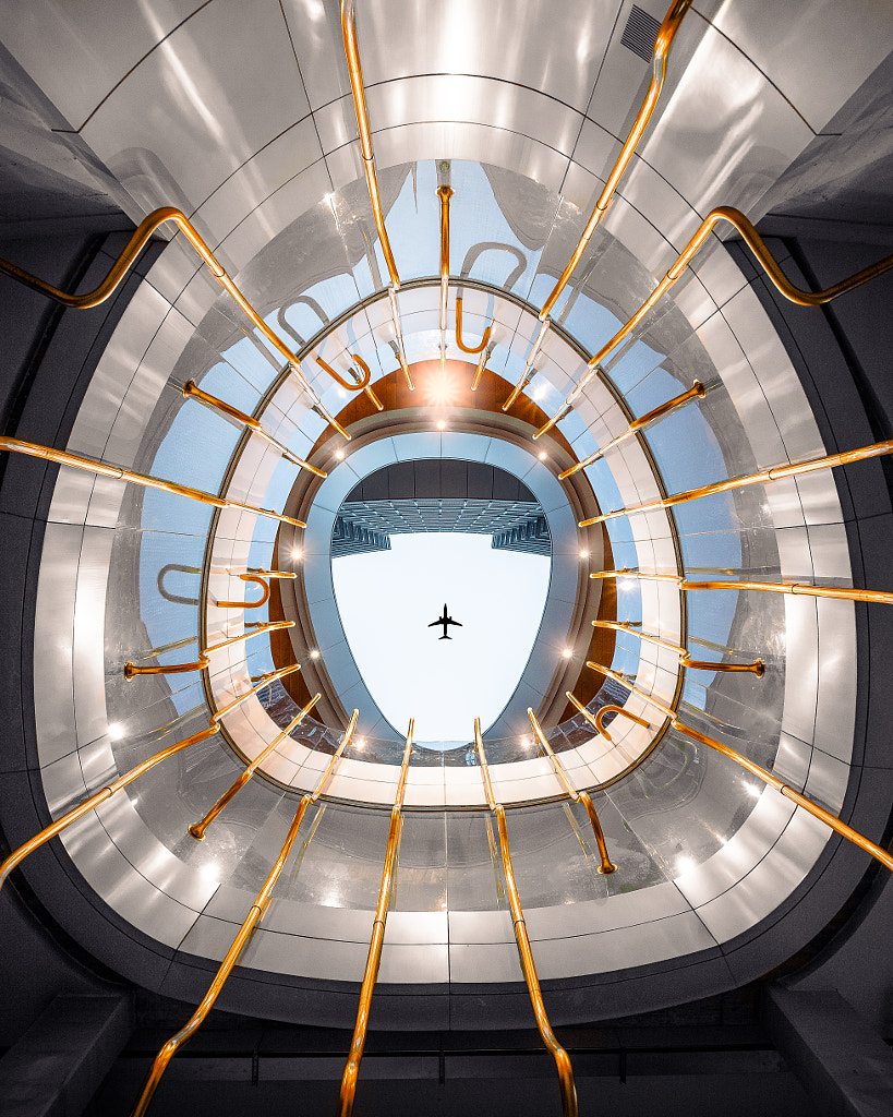
From the DNA double helix to nautilus shells to hurricanes, spirals appear throughout the natural world. When used in advertising, they can evoke a sense of organic energy or vitality. At the same time, spirals can also create a sense of disorientation; consider, for example, Saul Bass’s iconic Vertigo movie poster. “Spirals feel hypnotic, and they carry different meanings in various cultures,” the 500px team adds.
In the photographic realm, spirals can appear in various ways, directly and indirectly. One of the most common techniques would be to use the golden spiral, a mathematical pattern created by following the golden ratio. Compositions that employ this principle are often thought to be more appealing and visually engaging.
Curves and lines
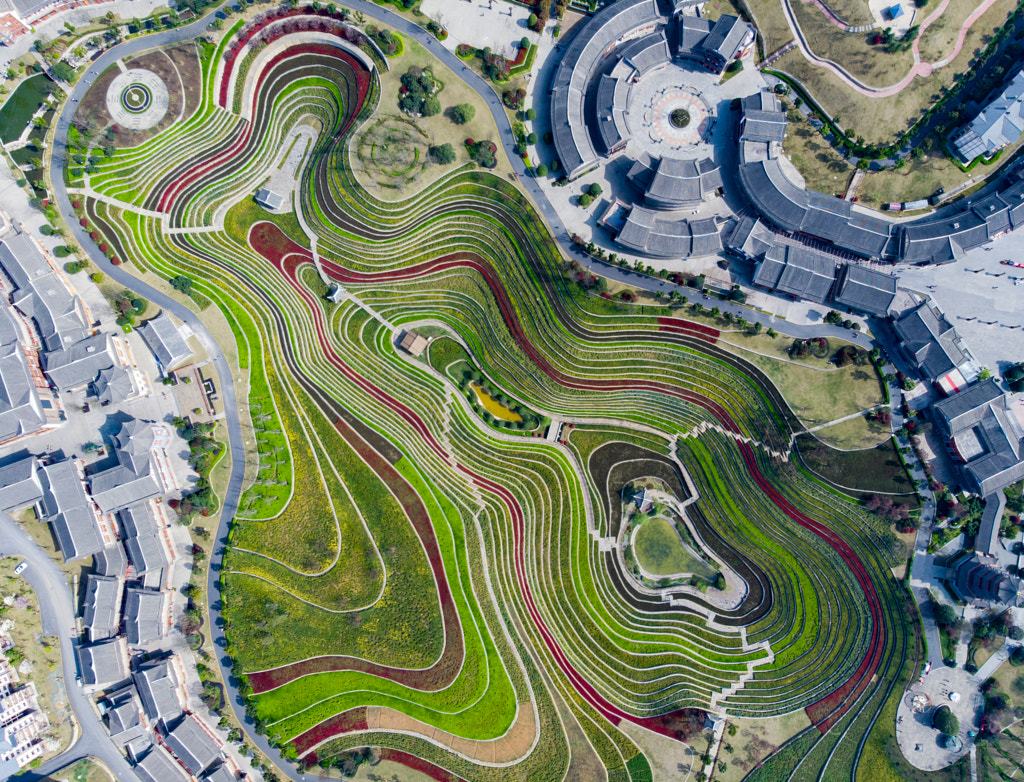
Though not a shape, organic curves can serve as a powerful element in photographs, helping to guide the eye throughout the image and creating a sense of motion. The Coca-Cola logo and Nike swoosh both speak to the power of curves in cultivating a spirit of movement and creativity. “Often seen in interior design, curves feel smooth and welcoming,” the 500px team says. In the right context, they can also feel seductive: “Consider the ‘sexy curves’ in the body or the design of automobiles,” the team at 500px adds.
Lines can also help differentiate your photographs and convey the right message to your audience. While horizontal lines are usually perceived as grounding, vertical lines might evoke feelings of strength and sophistication. Diagonal lines feel dynamic and even sporty (consider the Adidas logo).
When choosing what lines and shapes to use in your photographic compositions, think of your target buyer. If you’re shooting business-themed images for financial brands, for instance, you might choose straight lines, squares, or triangles. If, however, you’re appealing to a creative and sustainable lifestyle brand, curves, circles or spirals might be a better bet. These shapes can be created through cropping, but we also encourage you to think of them when framing your shots. Stepping back and being intentional about your composition, perspective, and angles can breathe new life into your Licensing portfolio.
Finally, shape alone is only one piece of the puzzle, and texture and color will also help communicate the mood or intention behind your photos. Be sure to check out our article on this year’s color trends for an idea of how you can use different hues, in conjunction with various shapes, to elevate your work.
Not on 500px yet? Click here to learn about Licensing with 500px.







Leave a reply