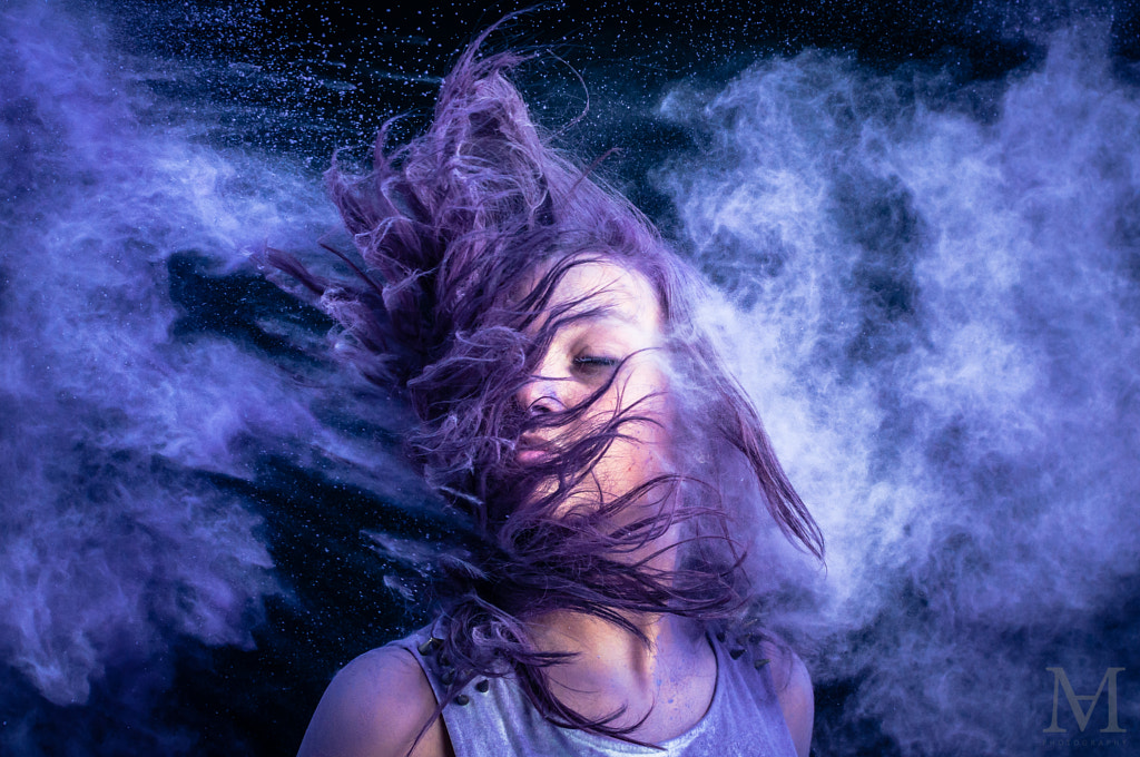
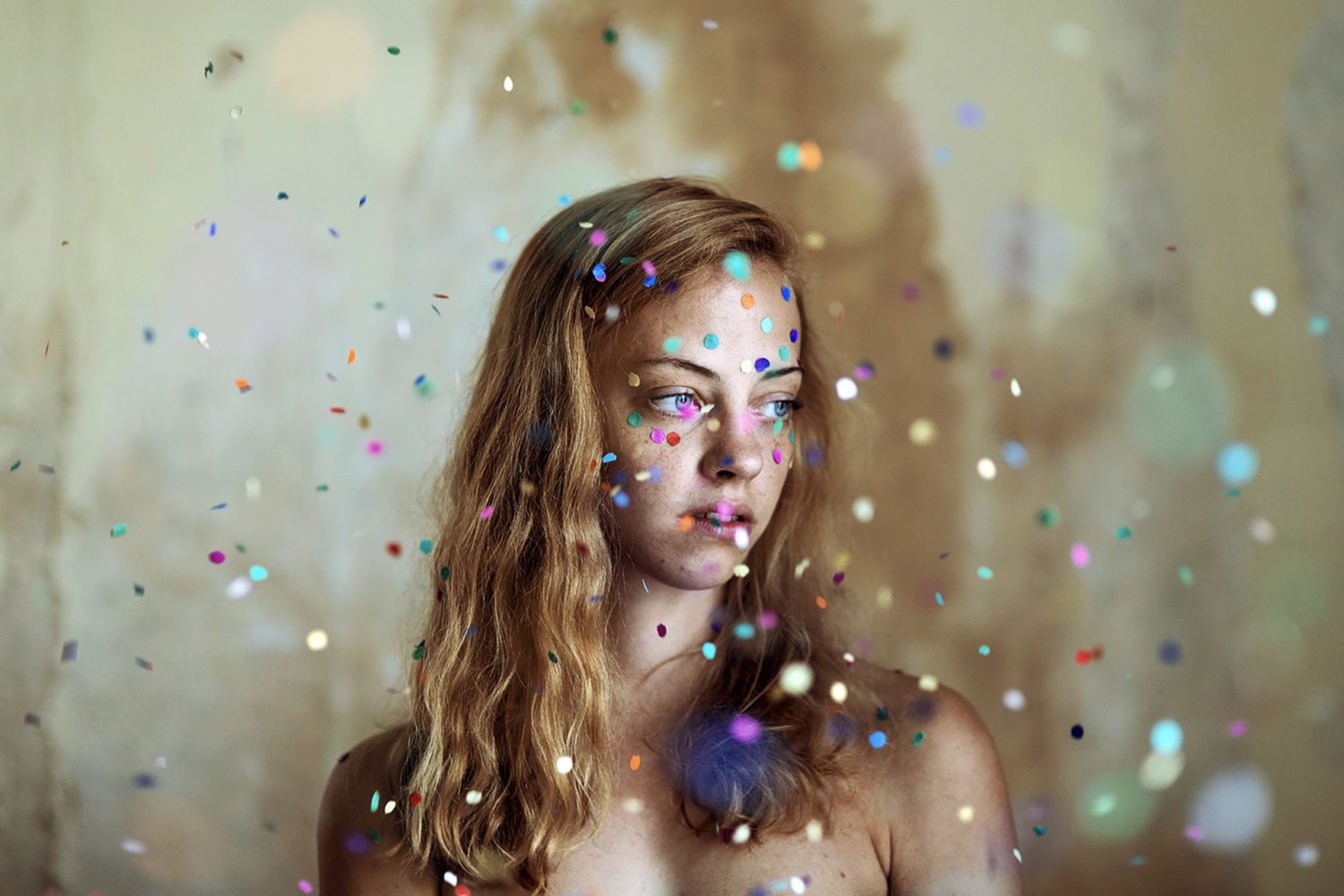
Every year, the global color experts at the Pantone Color Institute select a Color of the Year, forecasting a single color set to define the coming months across advertising, art, pop culture, and beyond. This year, however, something unprecedented happened: for the first time, Pantone created a brand new color rather than selecting one from their existing archive. 2022’s Color of the Year, PANTONE 17-3938 Very Peri, combines trustworthy blue with a touch of curious and energizing red for a hue that feels creative, imaginative, and forward-thinking.
We expect to see fresh periwinkle pop up throughout marketing campaigns, product releases, and much more. For commercial photographers, the announcement of Color of the Year poses new opportunities to create images that resonate with modern buyers. Let’s dive into a few creative ways you can incorporate shades of violet, periwinkle, and blue into your upcoming shoots, while also speaking to some of the emerging trends and movements set to shape this year. We’ve included something for everyone, whether you specialize in lifestyle photography, landscapes, or still lives.
If you have any of your pre-existing images using the color trend submit to our Very Peri Quest for the chance to win $200 US (Submissions are open until Feb 24)
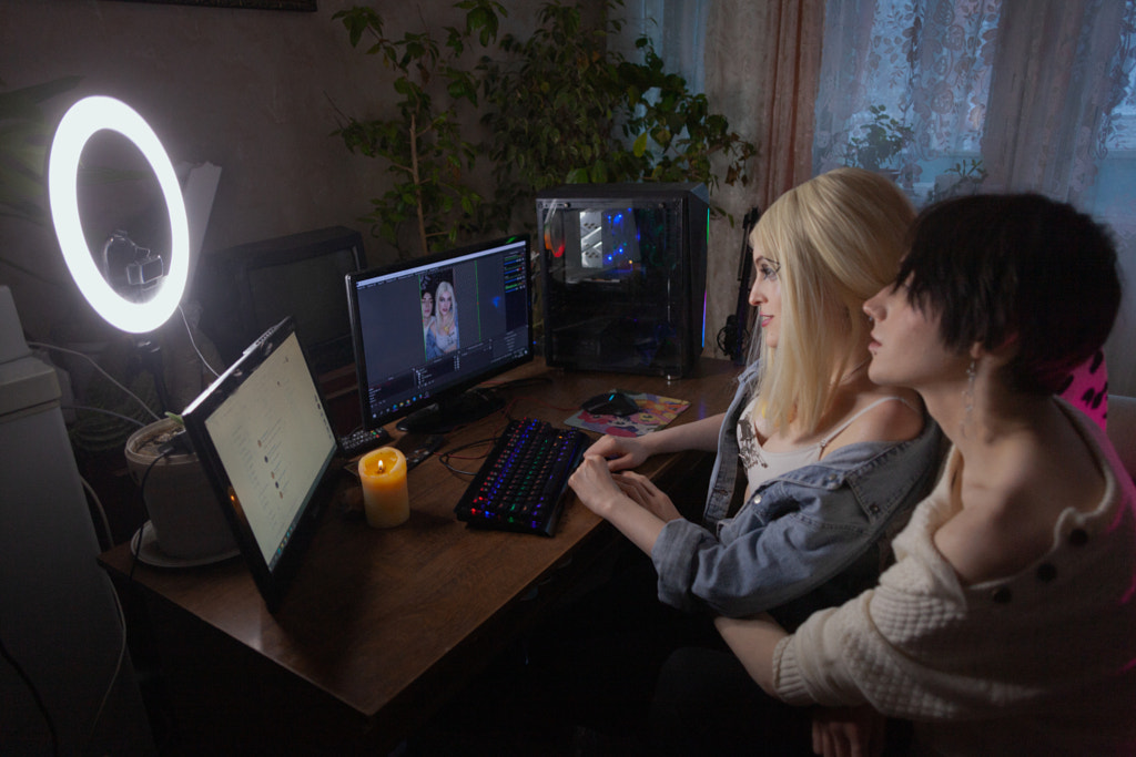
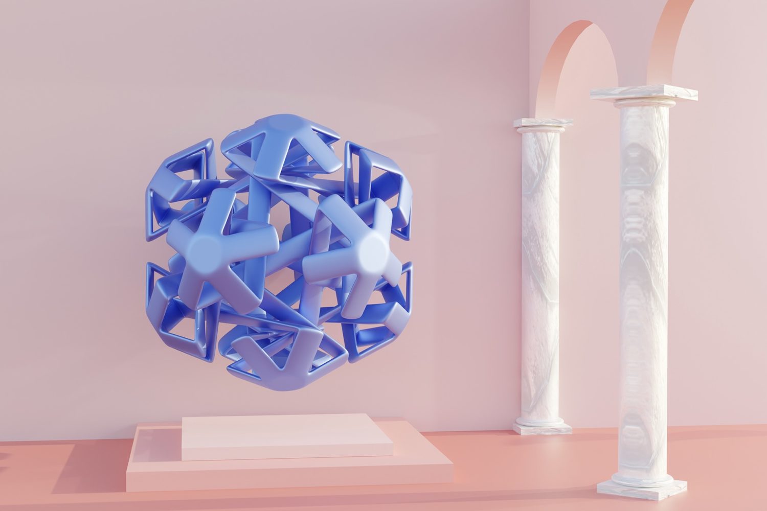
Spotlight on: Technology
Very Peri was directly inspired by digital design, glowing screens, and the virtual world, so it’s perfect for tech-themed photoshoots. Get inspired by color palettes found in gaming and the idea of the metaverse—a 3D virtual world where we interact as avatars. Ideas for photoshoots could include someone wearing a VR headset or other wearable devices (just make sure they’re generic and not branded so you don’t run into intellectual property issues).

The periwinkle hue could also be interpreted as a nod to the online artistic community and the innovative work that’s come out in the crypto space in the last year. You can even pull some digital artworks to add to your mood board as you conceptualize your shoot—there are no limits here. Perhaps you create futuristic portraits using studio lights and color gels, or maybe you use a portable LED on location.
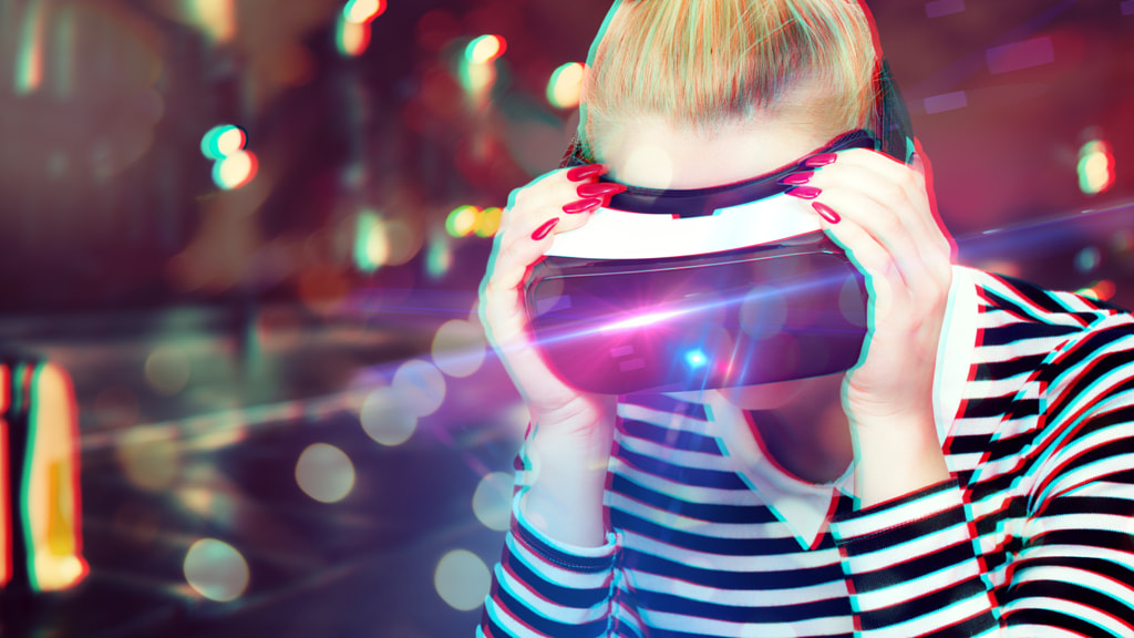
You can add just a subtle touch of color or modify your main light for a dramatic effect. You could even go abstract with light painting. “Think about the blue light our devices produce,” the 500px team suggests. “Think of concepts relating to technology, communication, and the digital universe.”
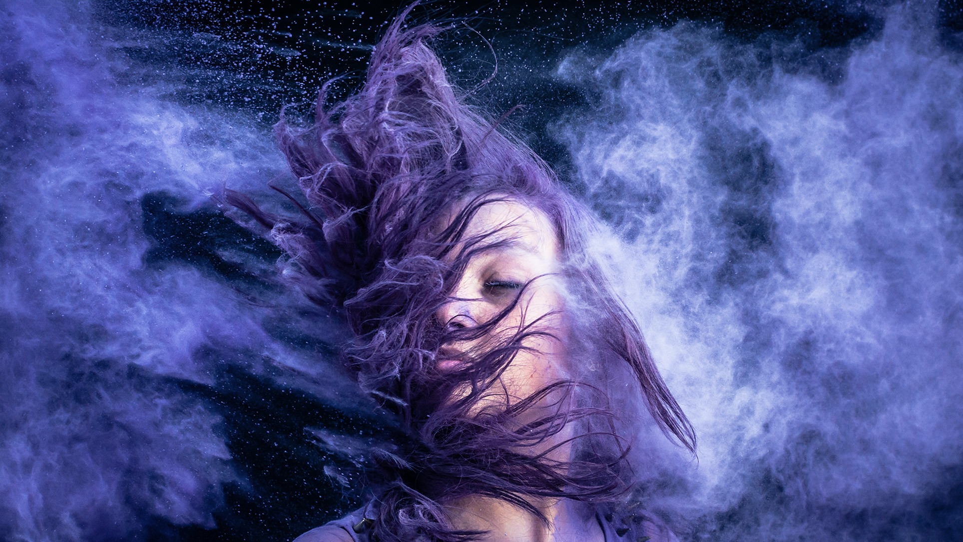
Spotlight on: Transformation and self-care
Pantone chose Very Peri to represent a period of transformation taking place on a global scale, and that abstract idea can be visualized in any number of ways. For example, the 500px team draws a connection between this spirit of innovation and optimism with some of the wellness and self-care movements we’ve observed over the last year, from mindfulness to meditation. As with technology, these topics offer ample room for creativity and collaboration with your models.
You might remember that “manifesting” took over TikTok in 2021, as people struggled after months of pandemic-related lockdowns. To oversimplify, manifestation is based on the basic idea that we can think something aspirational into being. It might look different for everyone; in some cases, it has connections with astrology or celestial events, while many practice meditation, journaling, or other modes of introspection.
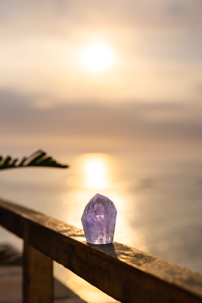
Research from the Pew Research Center indicates that more than 60% of US adults ages 18 to 49 have at least one New Age belief, so think about the details you might be able to include. Maybe you incorporate crystals, a moon aesthetic, or a star motif. “Consider stylized shoots such as still lives and fine art portraiture as well,” the 500px team suggests.
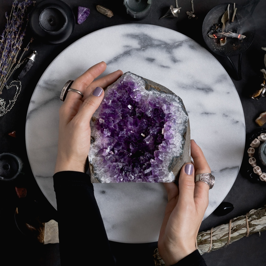
It’s important to photograph whatever it is that’s authentic to you. Do your research, and know the history of any practice you choose to visualize. Become an expert on the subject, or consult experts throughout the process. When brainstorming, find inspiration in your life and the lives of your friends, family, and community.
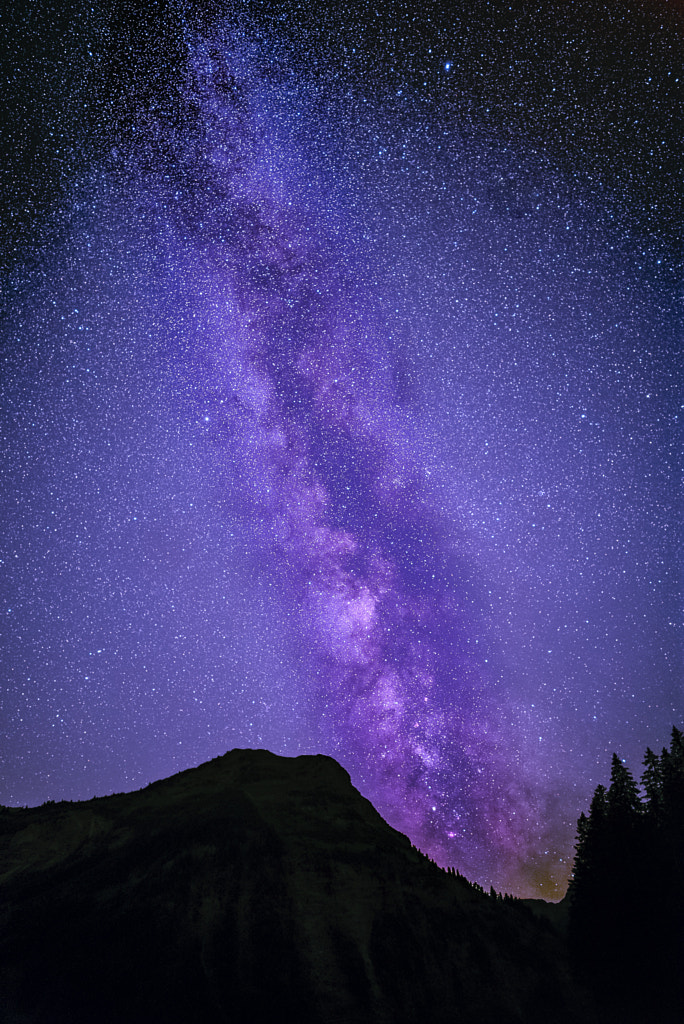
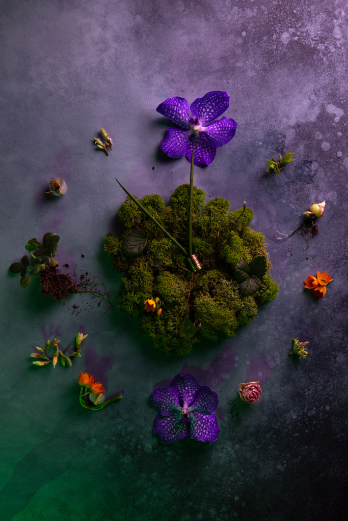
Spotlight on: Nature

The color periwinkle appears throughout the natural world, beginning with the flower that shares its name. It bears a resemblance to lilacs and lavender. Periwinkle is understood as a member of the violet family, and artists and writers have long associated violet with the color of the sky at dusk and twilight.
The team at 500px also draws a parallel between shades of violet and the night sky aesthetic, tying back to the Gen Z-inspired renaissance of the cosmos throughout popular culture. From the rise in apps like Co-Star and Sanctuary as tools for self-care to the boom in searches for “birth charts” on Google, interest in astrology and our place in the universe has hit a zenith since lockdowns began.
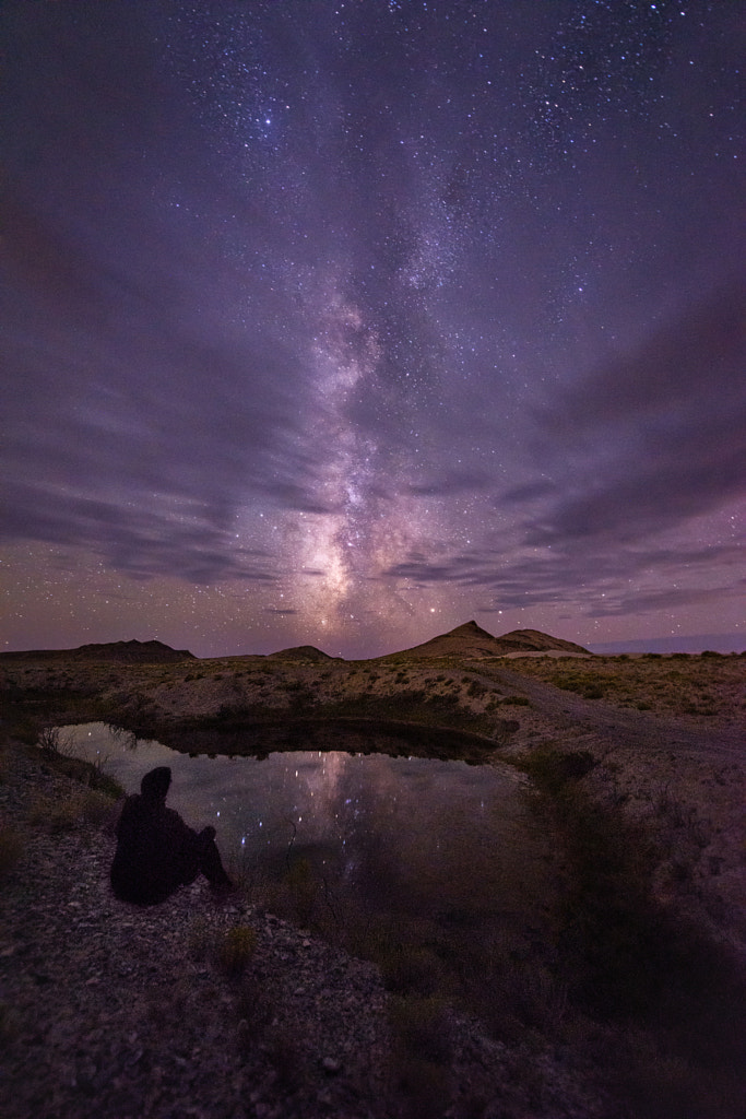
Beyond any astrological or spiritual component, of course, many are drawn to stargazing for the science, while others simply find beauty and meaning in the night sky. During the pandemic, many sites recognized by the International Dark-Sky Association, a conservation organization, offered virtual astronomy programs. Even during lockdowns, science and nature enthusiasts stargazed from their backyards or organized moonrise picnics for an escape that also followed social distancing guidelines. Now, trend forecasters are spotting the emergence of astro-tourism for astronomy pros and newcomers alike.
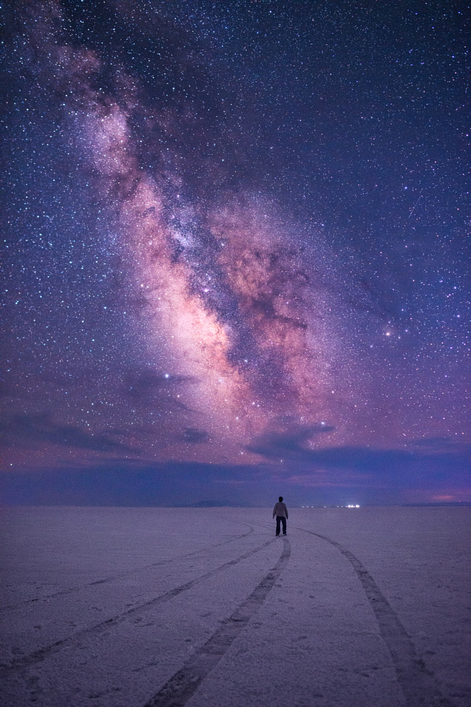
With light pollution contributing to climate change and putting wildlife at risk, it’s no wonder we’re collectively seeking out places where it’s still possible to see the stars. When shooting for your Licensing portfolio, consider championing sustainability through landscape and lifestyle photography featuring the night sky. You can even team up with a conservation organization to learn more about what you can do to help.
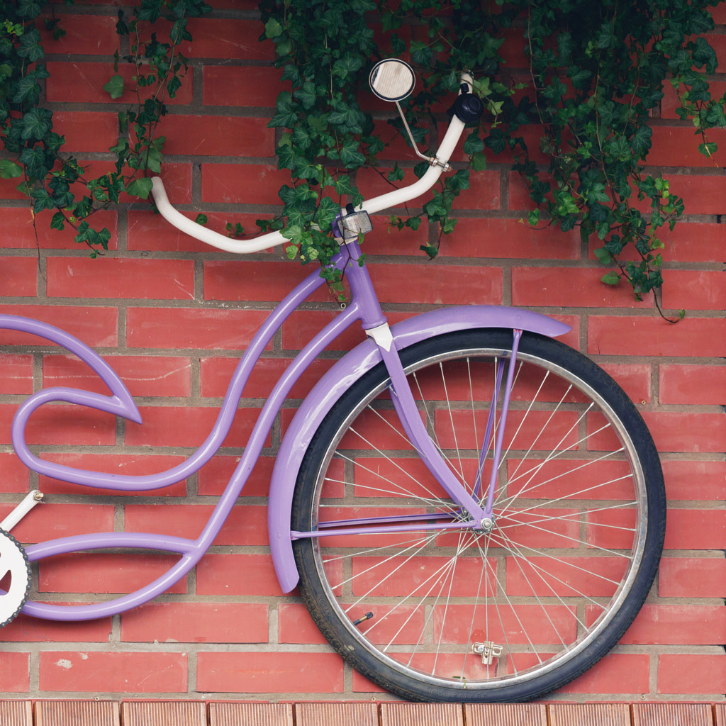
Spotlight on: Design
From the Louis Vuitton Menswear runway to the Cariuma sneakers made specifically to celebrate Pantone’s Color of the Year, Very Peri has already shown up across the world of fashion. According to the Wall Street Journal, data from Pinterest indicates that purple, a close cousin of periwinkle, was the most-shopped color on the platform in the fall of 2021.
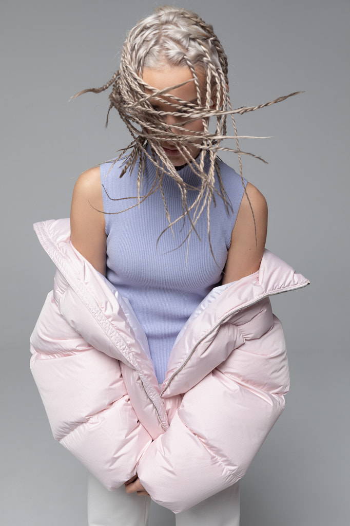
Following the announcement, we expect to see more iterations of this hue in fashion, interior and industrial design, architecture, and beyond. Periwinkle, also dubbed “blurple,” has even been showing up in eyeliners and lipgloss.

When planning your shoots, consider ways to incorporate just a pop of color, whether it’s a blanket on the couch or a swipe of eyeshadow on your model. When shooting lifestyle images, everyday props, like reusable water bottles or mugs, can incorporate this hue. Keep an eye on fashion and interior design photographs in leading magazines, and study the use of color.
Pantone also offers suggested color palettes for designers, artists, and more, based on color theory, so be sure to check those out. Very Peri works especially well, for instance, with warm yellows or greens.
Beyond Pantone: A look at other Colors of the Year
The Pantone Color Institute is not the only authority when it comes to predicting color trends. Since they kicked off in 2000, forecasters at paint companies, magazines, fabric stores, and more have started rolling out their own Colors of the Year. While 2022’s selections include purples (Robert Kaufman Fabrics) and pinks (WGSN), one noticeable trend is the inclusion of greens.
Behr selected Breezeway, a peaceful sea glass green. Etsy gave top honors to Emerald Green, a rich color meant to represent growth and harmony. Sherwin-Williams recognized Evergreen Fog, a green-meet-gray color. Benjamin Moore went with October Mist, drawing inspiration from flower stems. Glidden chose Guacamole, an avocado-inspired hue, and PPG selected the lush, organic Olive Sprig, meant to be paired with soft rose colors.

These choices reinforce our collective focus on a more environmentally sustainable future, while also speaking to themes of resilience and regrowth following a challenging couple of years. As with Very Peri, they speak to transformation and reinvention, so it’s worth considering them for your mood boards going forward.
Even just a touch of vibrant color can go a long way, especially when paired with the right palette. “Neutrals are still trendy but will take a back seat and will be warmer in tone,” the 500px team predicts. “Expect more earth-based palettes, terracottas, warm whites, and browns.”
Not on 500px yet? Click here to learn about Licensing with 500px.

Leave a reply