Perfectly balanced compositions are everywhere these days, with trending hashtags like #symmetricalmonsters, #symmetrykillers, and #symmetryhunters drawing anywhere from hundreds of thousands to more than one million posts online. The hugely popular Instagram account @symmetrybreakfast has a cookbook available worldwide, while @geometryclub—a page with tens of thousands of followers of its own—accepts regular submissions of perfectly-aligned architecture.
Why are balanced compositions so satisfying, and what does it take to create one? Perceptual psychologists like Rudolf Arnheim (1904-2007) have spent decades studying balance in art, but we’ll keep it simple for now. Balance is influenced, in part, by visual weight. An object’s visual weight might come down to its size (e.g., larger objects weigh more) as well its hue (e.g., red objects are heavier than blue ones).
Detailed and intricate objects—like those in focus in a photograph—can have more weight than those that aren’t as sharp or detailed. An object’s weight also varies based on its location within the frame; objects close to the edges of the frame appear to weigh more than objects near the center. Isolated subjects are heavier than those closely surrounded by others, and regular shapes are more likely to feel heavy than irregular ones.
A balanced image is any image with two sides of the same or similar weight, so that the eye is drawn to both sides equally. An imbalanced one will have one side that’s heavier than the other, creating a visual tension that’s hard to resolve. Both are useful, depending on the meaning and style of your work.
In many photographs, a balanced composition represents an ideal, particularly if it’s left-right balance—that is, the photo has equal weight on both sides when bisected laterally. As humans, we’re bilaterally symmetrical, so these compositions “make sense” to us.
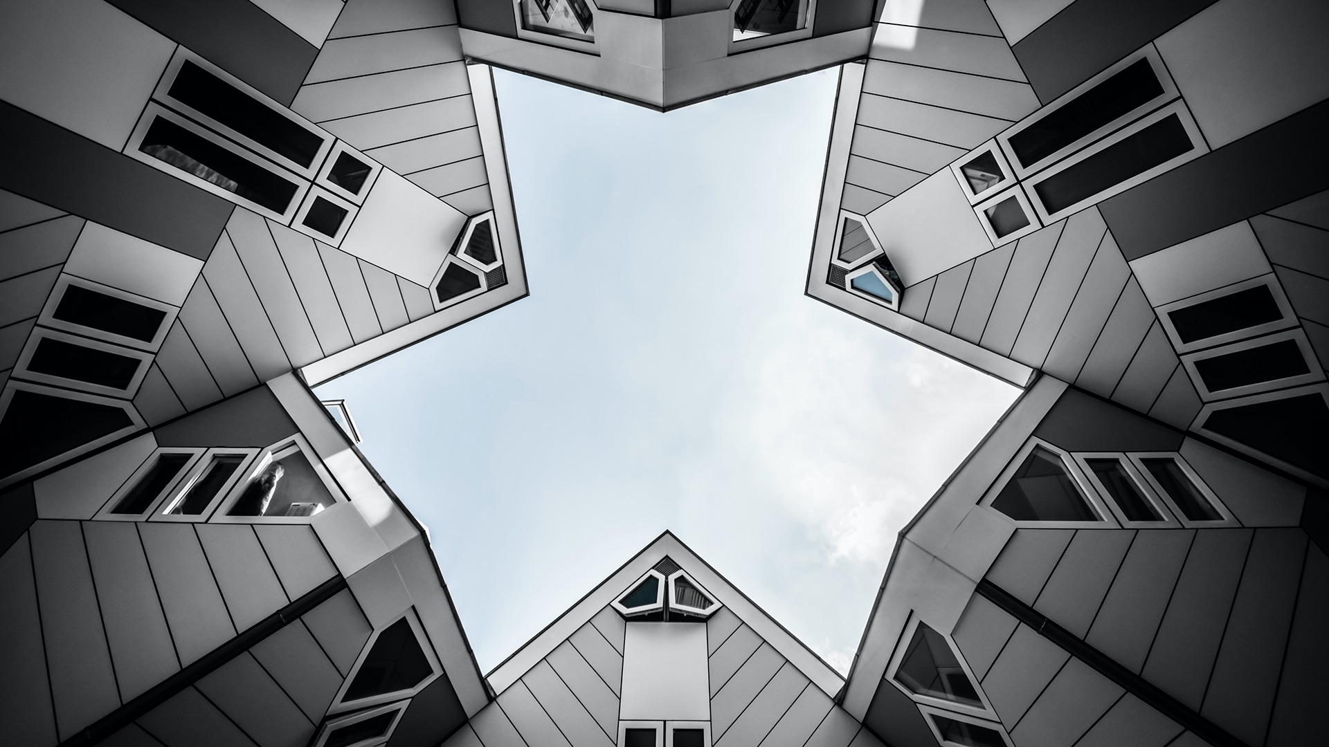
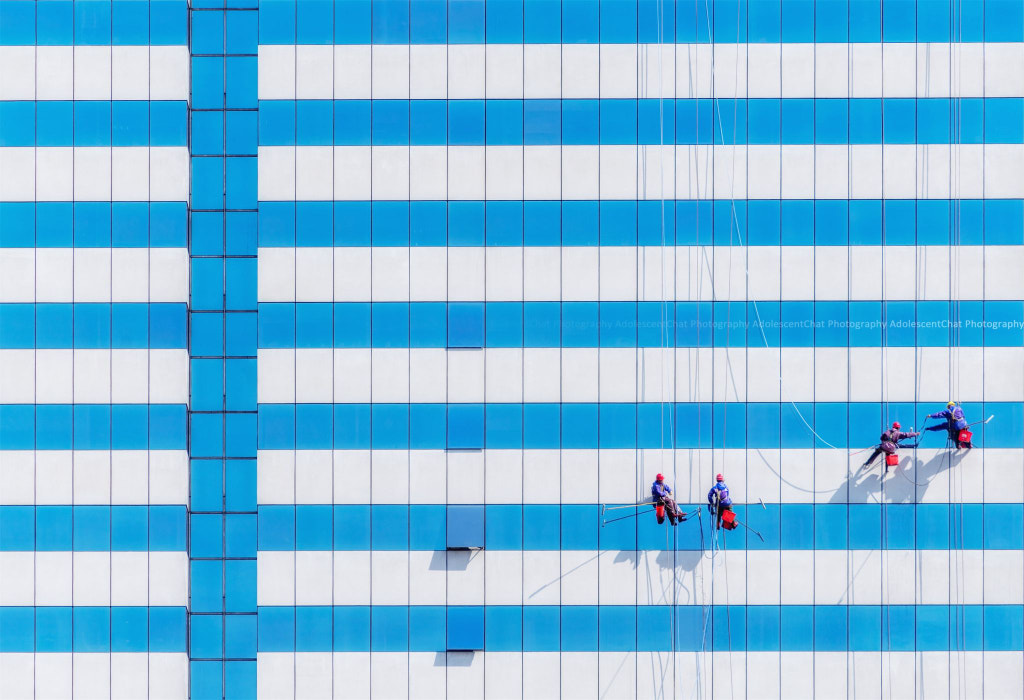
Formal balance—also called symmetrical balance—is a good place to start. In a picture that’s formally balanced, as you might expect, the left and right sides of the frame are nearly identical. Unless you’re cloning elements or creating composites on your computer, it’s unlikely that you’ll get both halves to match up exactly (pixel-for-pixel), but near-mirror images exist everywhere, from the human face to architecture to landscapes.
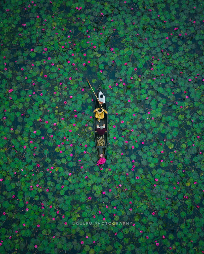
As with any kind of balance, formal balance isn’t a rule to be followed but a creative tool to be implemented as needed. Symmetrical compositions usually result in feelings of calm and tranquility; you can find them often in religious artwork for this reason. In the case of the photo above, the photographer uses formal balance to express the serenity of the scene itself, lily pads and all.
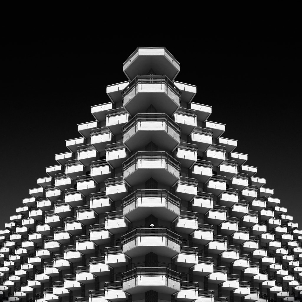
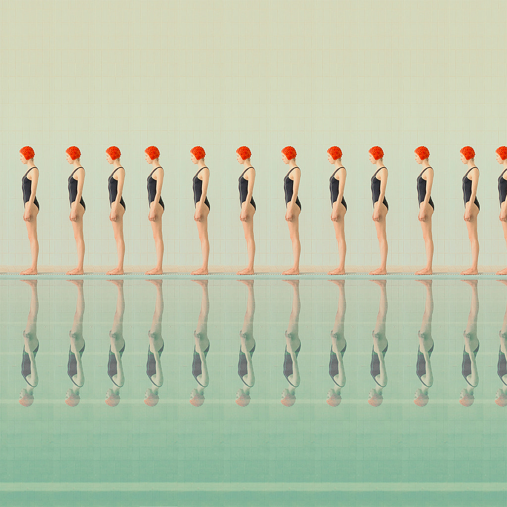
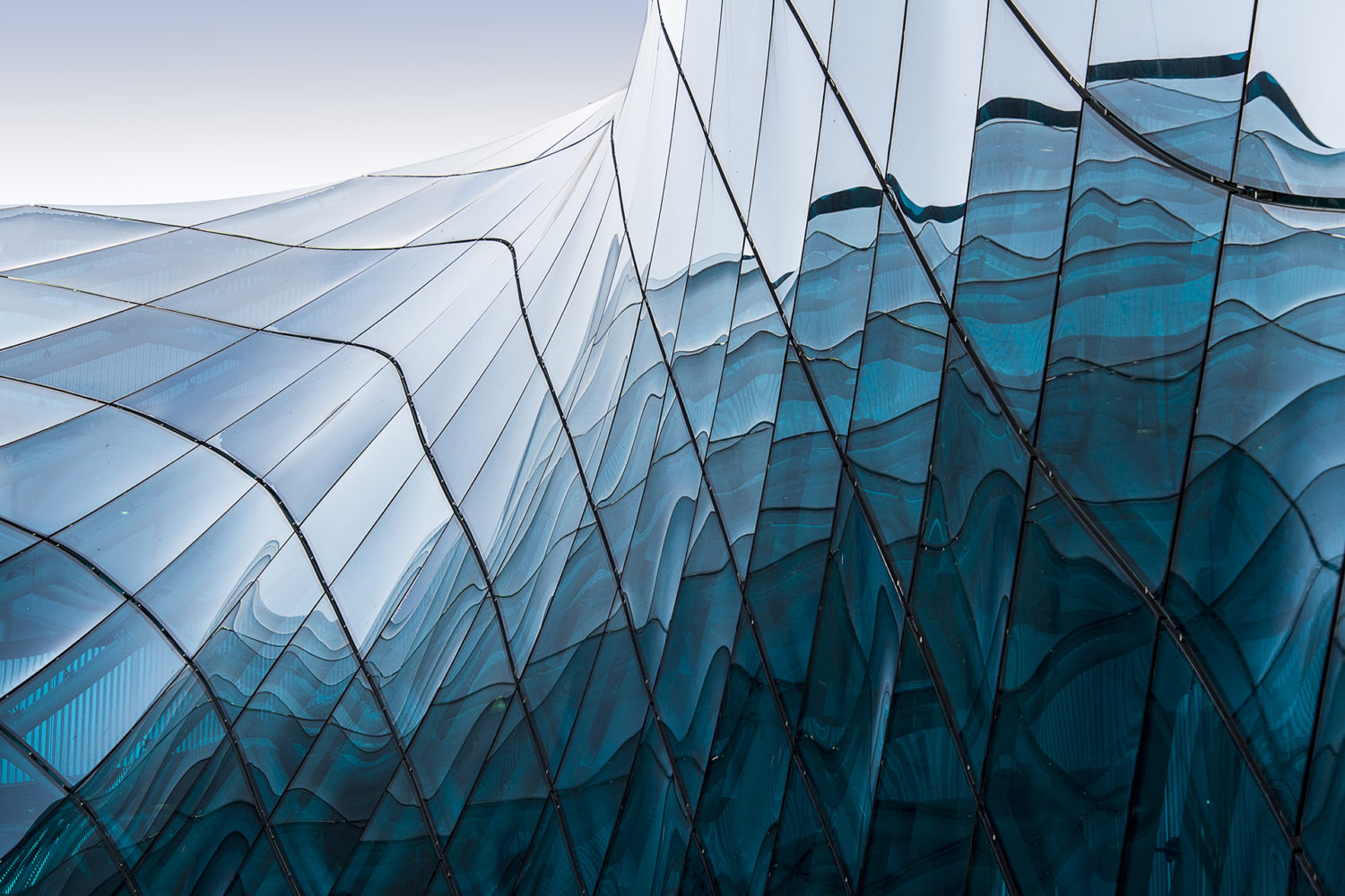
When discussing balance, you might also hear photographers refer to mosaic—or crystallographic—balance. Photographs with mosaic balance tend to look like some kinds of abstract art (e.g., Jackson Pollock paintings) or designs (e.g., prints or wallpaper). They have a mesmerizing “all-over” quality, and the repetition of shapes and colors results in balance.
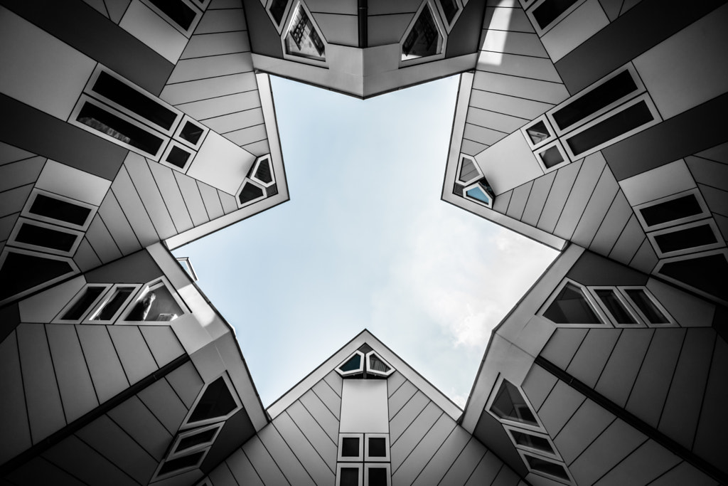
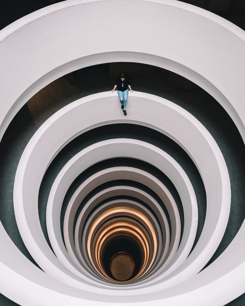
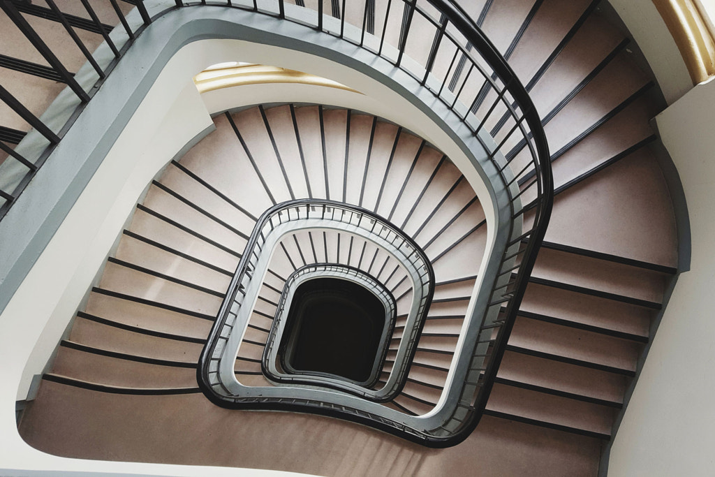
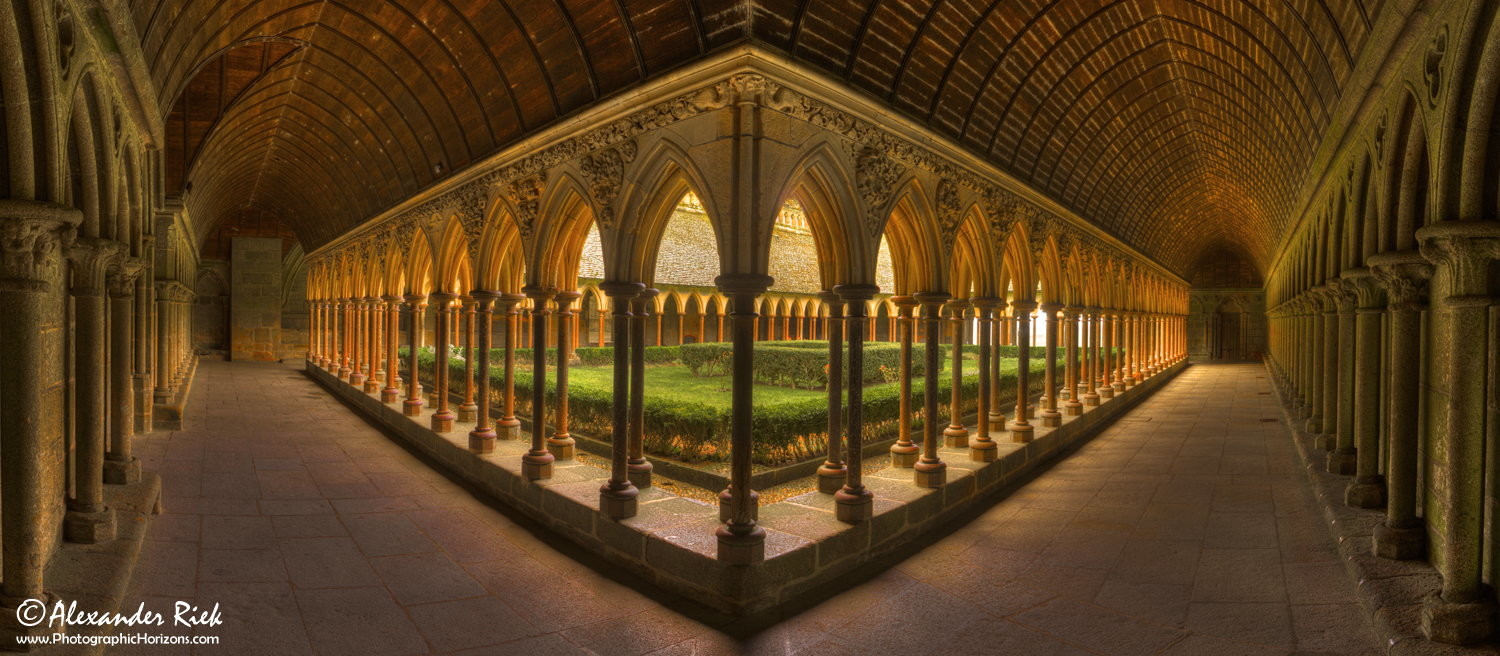
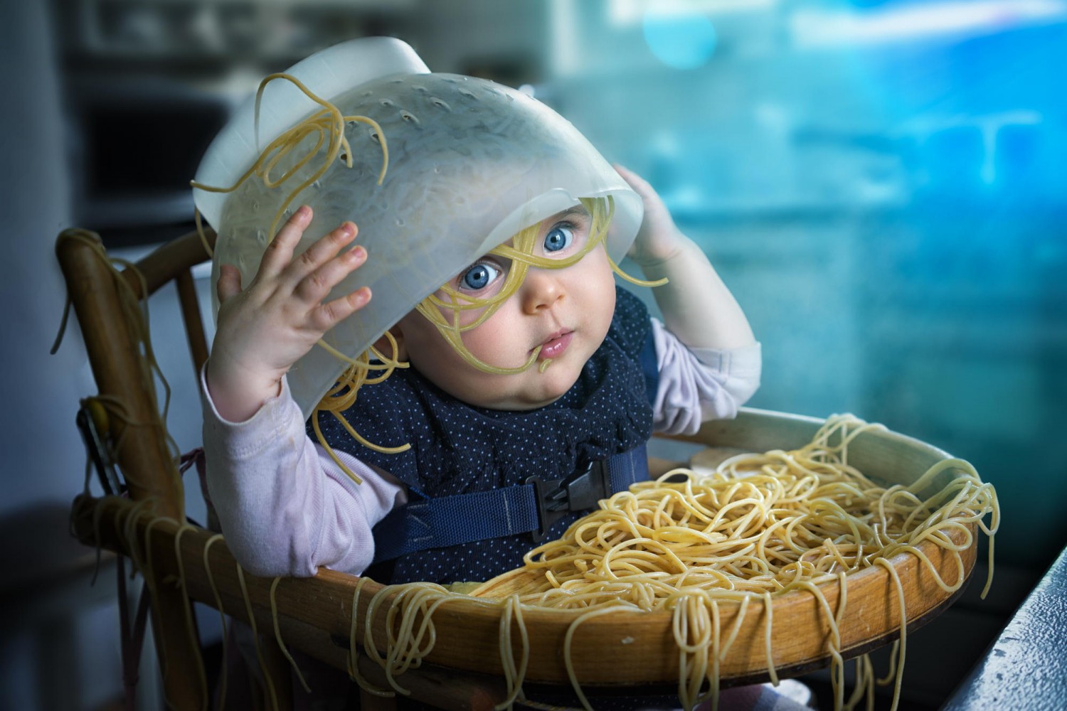
One more type of balance that sometimes falls under the symmetrical category is radial balance, which is exactly what it sounds like: a composition with radial balance includes a circular shape, extending from the center of gravity. It’s found in flowers, seashells, star trails, buildings, and more, so it’s a tried-and-true favorite of nature and architecture photographers.
That all makes sense, but it begs the question: Why does anyone follow the “rule of thirds” when they could go for symmetrical balance instead?
One potential answer is that many classic “rule of thirds” shots are asymmetrically—or informally—balanced. They’re not symmetrical, but both sides might still have equal visual weight. You can achieve informal balance by using any combination of those elements we discussed earlier: size, color, texture, etc.
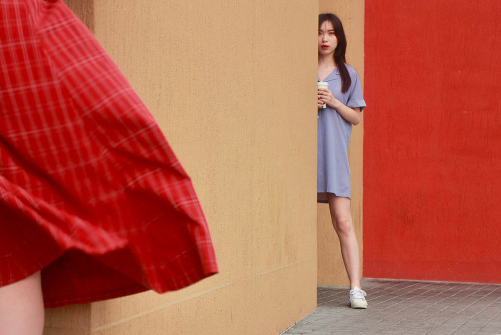
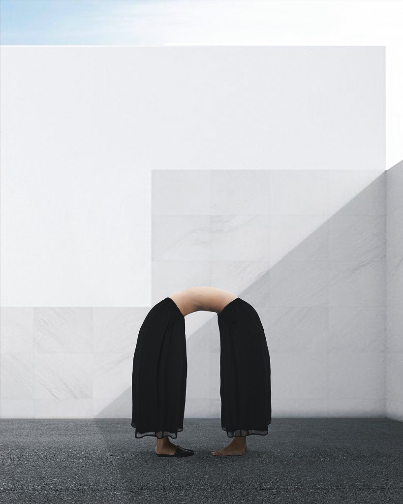
In this photo above, for example, the subject stands to the right-hand side, attracting the eye off-center, but the billowing red skirt in the foreground provides an intriguing counterpoint on the left, resulting in a dynamic but balanced image.
The skirt also provides a nice parallel to the red wall in the back, directly opposite. Were you to clone out that skirt, the photo would be heavily weighted to the right, with both the model and the pop of red drawing our eyes in that direction.
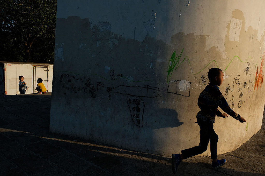
Similarly, in the image above, the child running in the shadows takes up most of the right-hand side of the frame, but by introducing the two smaller, brightly-lit children—seen in the square in the distance on the left—the artist has created a balanced composition.
Crop out that critical detail (the square of light), and the photo would appear to be “tilting” to the right. This is almost always the case with balanced images; every element is necessary and has a purpose; without it, the composition wouldn’t be as strong.
Of course, all this isn’t to say that imbalance doesn’t have a place in photography. On the contrary, it can be just as powerful a tool as balance when yielded properly.
One of the most well-known conflict photographs, The Falling Soldier, created by the photojournalist Robert Capa during the Spanish Civil War, has distinct moments of imbalance: the loyalist soldier, who’s just been shot and killed an instant earlier, takes up the left-hand side of the frame. On the right, there’s nothing by empty land and sky.
The photograph was shocking at the time, and even all these years later, in a world filled with images of violence, it’s just as disturbing. More balance within the composition might help assuage those feelings of fear, but that’s not what Capa did; as the story goes, he didn’t even look through the viewfinder to compose the shot.
There’s nothing in the photo to anchor the soldier or counter his visual weight—no tree, no sun, no birds—but perhaps it would be wrong to create order and balance from such a violent scene. As it is, the soldier’s fate is never quite resolved; he’s suspended in the air, and he will remain suspended forever. This kind of imbalance might be rare in photography, but it packs a powerful gut-punch.
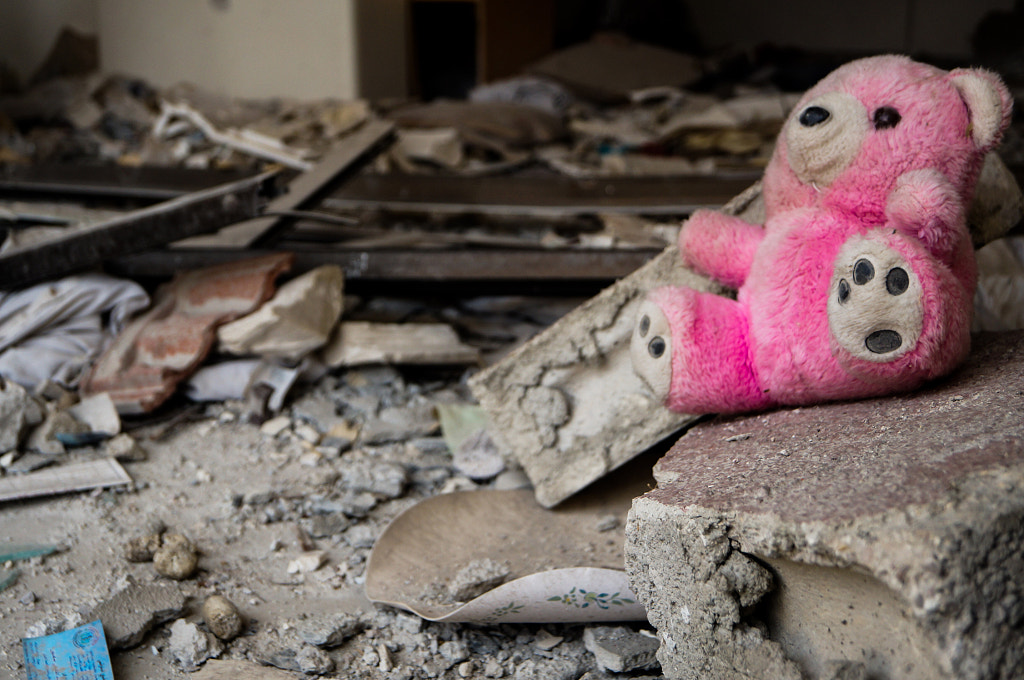
Perhaps the photojournalist Sameer Al-Doumy does something similar in The remnants of childhood (pictured above), part of his documentation of the civil war in Syria. The large, bright pink teddy bear is in focus, giving the right side more visual weight than the left. While various details do provide balance to the overall composition, this moment of imbalance conveys a sense of disruption and unrest; in this case, mirroring the loss of childhood amid ongoing conflict.
Balance in photography is often discussed in absolutes or concrete “facts,” but the truth is that it can be subjective as well. As Arnheim proposed in his seminal book Art and Visual Perception, there could be factors affecting weight and balance that we don’t yet grasp. For example, our desires or fears could influence our perception of balance, and the perceived weight of an object might change based on what frightens or compels us.
Balance—and for that matter, imbalance—aren’t necessarily valuable in and of themselves; they’re important because we can use them to convey a larger meaning. Whenever we look at a photograph, our knowledge and experiences inevitably inform our interpretations of the artist’s visual statement.
As perceptual psychology and photography continue to evolve, we might discover fresh ways to achieve balance or imbalance, making this field fertile ground for experimentation. We recommend trying out several compositions every time you take pictures; study them on the computer, and see what happens as you crop your photo or adjust hues and saturation to draw attention to certain areas. A simple compositional change could ultimately transform the meaning at the heart of your work.
Not on 500px yet? Sign up here to explore more impactful photography.
Leave a reply