Leonardo Regoli was born in Venezuela and currently lives in Germany. He works as a researcher on space physics and has two main hobbies: climbing and photography. His main interests in photography are travel and landscape.
You can find more of his work on 500px, his website, Twitter, and Tumblr. This post originally appeared here and is being republished with express permission from Leonardo.
In part 1 of this series, I went through some of the general ideas and rules for post-processing images. In parts 2 and 3, I want to go through the processing of specific photos step-by-step, trying to explain why I chose specific filters as well as more general choices like choosing color or black and white, cropping, etc.
For all of the post-processing workflow I will be showing through this series, I will mainly be using Photoshop with the Nik Color Efex Pro extension. In general, Nik packages provide a wide range of highly customizable filters with a simple but effective user interface. Even though the filters can help create those final images we want to achieve, it is necessary to take some time to play with them, since it is quite easy to loose perspective and end up over-processing your files.
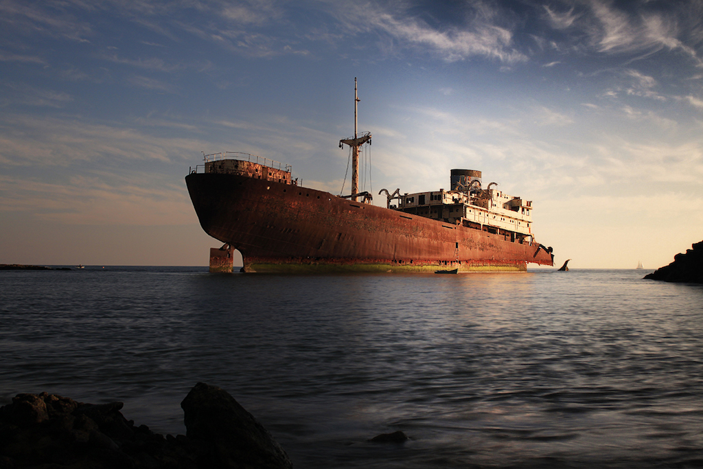
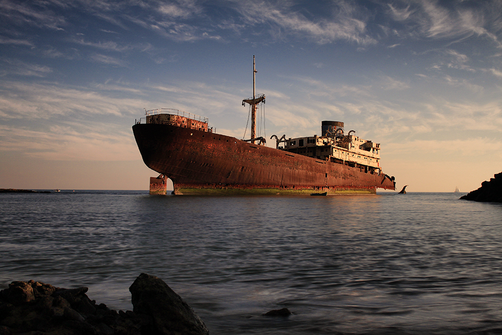
Today’s image is a capture of a shipwreck located near Arrecife in Lanzarote, the easternmost of the Canary Islands in Spain. Shipwrecks are often wonderful photography subjects, and this one is no exception.
This is the original image as it came out of the camera:
I decided to take the picture when the Sun was already low on the horizon (to the right of the image) to get that nice warm light both on the ship and on the clouds. Another advantage of taking pictures before sunset (or after sunrise) is that the more directional light tends to create well-lit sections as well as some shadows that help draw the viewer’s attention to specific parts of the image.
Now, even though I like the SOOC result in general, I feel like there are some factors that are absent and could definitely enhance the image.
For instance, I am missing a bit of sharpness, especially on the ship itself, as well as some contrast all over the image. Finally, I would go for some refinement on the distribution of the light across the image, and some adjustment in the colors.
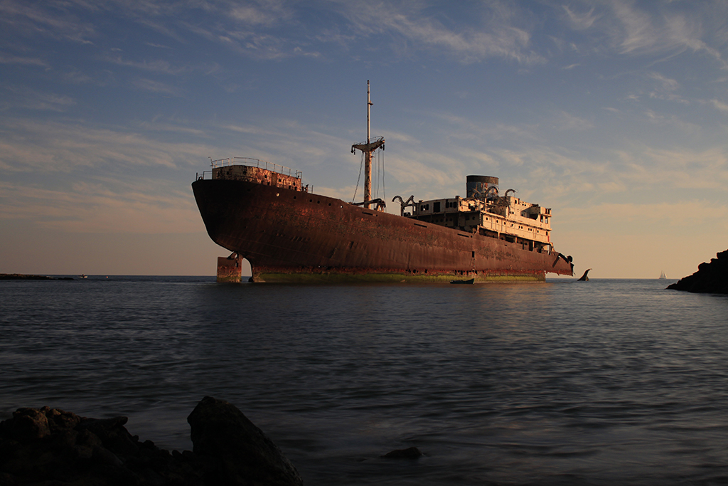
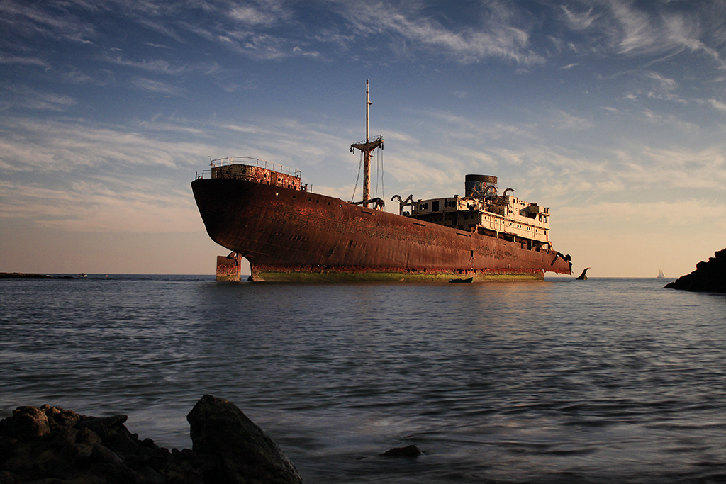
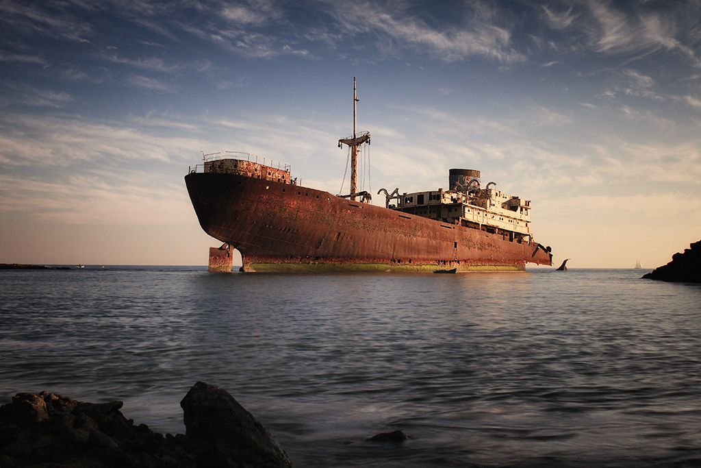
Doing all the processing described above, I obtained this final image:

Now I will go through the process step-by-step so you can get a feeling of my processing workflow.
The first thing I did was select the ship with the ‘Quick Selection Tool’ in Photoshop. This tool works by selecting neighboring areas with similarities in color & contrast and, as you move your cursor over the image while holding the left button pressed, it will keep adding areas to the selection without de-selecting the previous ones.
It is, as the name indicates, a very quick and effective way to select objects, especially when there is a marked contrast between the subject you would like to select and the surrounding areas.
With the ship selected, I duplicated the base layer and applied a ‘Smart Sharpen’ filter to sharpen up the ship a little bit. The amount of sharpening will depend on personal taste, but you have to be careful not to overdo it since it will start to look rather noisy.
That’s actually the reason why I sharpen just the main subject and not the entire image, and this is a good general rule that applies to every image you process: if you apply sharpening to surfaces without a lot of structure (for instance the sky or the sea), you will end up with a very noisy image in those areas, so always try to avoid that by selectively sharpening specific sections of your picture.
The result of applying the ‘Smart Sharpen’ filter can be seen on the following image, comparing a small zoomed-in section of the ship before (left) and after (right) the filter. By comparing both images, it is evident not only the details that are obtained on the ship, but also the fact that the sky remains unchanged.
[twentytwenty]
 [/twentytwenty]
The next step already requires the Color Efex filters. It is important to keep in mind that all the processing can be done with just the tools available in Photoshop, but it would take more work, so it is definitely worth getting some extra help by acquiring some of the available plug-ins.
By using the ‘Pro Contrast’ filter, and specifically altering the ‘Dynamic Contrast’ slide bar, I was able to increase the contrast all over the image while improving also the dynamic range (increase the brightness on the dark areas while decreasing it on the bright ones).
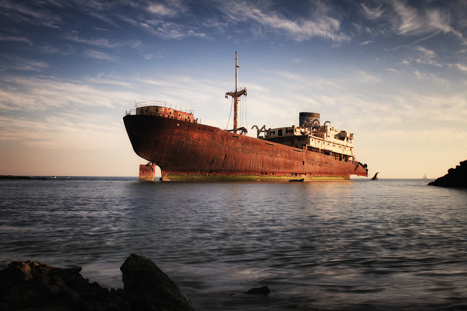
With this filter (and with contrast increase in general) it is also important to keep an eye on the even areas. If you overdo it, a lot of noise will appear. For this reason, it is sometimes necessary to apply a layer mask to remove (completely or partly) the effect on some specific areas. The result after applying the ‘Pro Contrast’ filter already resembles a much more closely the final image:
In fact, the only thing I still feel would be beneficial for the final result is a slight adjustment on the white balance to make the image a bit warmer, adding some vignetting to focus the attention on the ship, and increasing the overall brightness.
The first two steps can be seen in the following images (in the order just mentioned):
As with every choice, the one regarding the temperature of the image is a highly subjective one. I decided to make the whole photo a bit warmer, given that the time of the day actually delivers a rather warm light, so it makes sense to me to have that feeling on the final result.
There are different ways to change the white balance of an image in Photoshop. I usually use another Color Efex filter called ‘Brilliance / Warmth’, but the ‘Photo Filter’ tool under the ‘Image -> Adjustments’ menu will do the same.
For the vignetting, I used the ‘Darken / Lighten Center’ filter from Color Efex. This filter allows you to place a marker where you want the center of your vignette to be as well as the size and the difference between the light and dark areas of your image.
The idea of a light vignette is to put the focus on the main subject of your picture so that all the attention of the viewer is drawn towards it.
A rather annoying effect when creating vignettes in Photoshop is the appearance of some wavy structures on the brightness gradient sometimes referred to as ‘banding’. This is mostly visible in black and white pictures but, in any case, if you notice something like this on your image, convert the file to 16 bit (Image -> Mode -> 16 bit/channel) before applying the vignette. This will give Photoshop many more sub-levels to go from the brightest part of the image to the darkest one, making the banding practically invisible.
The final adjustment I made was to increase a bit the overall brightness of the image. The result is the final image, presented here again as a before and after:
[twentytwenty]
 [/twentytwenty]
The brightness of your pictures is something that you have to be very careful with. One of the difficulties with digital photography is that every monitor will display basic parameters such as color or brightness in a different way, so it may be rather easy to end up with images that are either too bright or too dark, depending on the singularities of the monitor you usually work with.
I’ve found, with time, that my monitor is quite bright, so in the past I tended to produce final images that were just too dark for people seeing them on other monitors. For that reason, most of my photos nowadays get a brightness bump as the the final step in the processing workflow.
I hope you have found this article at least somewhat useful. Processing is a very personal and photo-specific process, so it will always take a while to develop a workflow that works for you; but I find that trying things that other people have already tried can definitely speed-up the whole process.
In the next post I will process an image in black and white, explaining the subtle differences between that and a color image, as well as why I sometimes choose black and white over color.
If there are any points that were not completely clear from this post, please drop me a line and will try to make it clearer for you!

Leave a reply