For our 5th birthday, 500px hosted a massive contest where we asked you to tell us, “all about the memories you’ve made over the years as a photographer and 500px community member!”
The grand-prize winner and 1st, 2nd, and 3rd runners up all won awesome prizes and, as a bonus, each gets a feature on 500px ISO.
We already introduced you to the Grand Prize Winner of our birthday contest, Pauly Pholwises, third runner up, Ayie Permata Sari, and 2nd runner up Sham Jolimie.
Our final birthday feature takes a more artistic turn with the photography of our 1st runner up — photographer Philipp Balunovic.
500PX: Congrats on the win! Can you briefly tell us the story of how, when, and where you found out about the results?
PHILIPP BALUNOVIC: I was working for a bigger company in their office today. One of those modern ones with barely any doors and conference rooms made from glass only. My mailbox kept receiving mails from 500px the whole day. People liking and favouriting. I found that a bit unusual since this usually only happens right after I upload something.
So I went to 500px and saw that the winners have been announced. After I read that I won I could barely hold my feet still, let alone burst out into screaming for joy. So I left everything the way it was, galloped to the next balcony and started my dance of joy there. After I was done and sat back on my seat, apparently people still heard me and looked in agony at me.
I guess it was my face all messed up.
How did you get started with photography?
PHILIPP: Like many others I guess. When I was young I took my fathers Cybershot everywhere. But I guess I really consciously started taking photography serious around 4 years ago.
What are your favorite subjects to shoot?
PHILIPP: Well, if you look at my pictures you‘ll see pretty much only one woman. She‘s my girlfriend and we enjoy shootings together very much. Generally i like shooting humans. Especially in conjunction with architecture. Humans work well to break up straight symmetric lines often portrayed best in architecture photography.
What can we find in your camera bag?
PHILIPP: I actually don’t have one. I do have a modified hoody with one of those kangaroo pockets in front of the stomach. I added some fluff to the inside and stitched it together, so that I have two seperate pockets. The two pockets are filled with a Canon FD 50mm f/1.4 and a 12-40mm PRO lens by Olympus, some Power Bars, lens filters, cloth for cleaning, additional SD-cards, additional battery packs, a flash and cream topping. My camera, either the GH3 or the OM-D EM-5 hangs around my neck and sports a 20mm f/1.7 II by Panasonic.
One of the huge benefits of shooting with an m43 system, even though it does look a bit weird with all that stuff in the pockets.
In a few sentences, can you walk us through your favorite photos in your contest entry? Tell us how you planned and shot each photo in your contest entry, from location scouting to picking the models to getting to the shot to processing.
PHILIPP: This one‘s part of my series “Simple Matter.” Lisa and I were at a flea market in the morning. On our way back we took an odd route through some backyards and saw these black steps with the blindingly bright, white wall. After we went home to grab gear, clothes and booze, I first shot this motive. Framing was difficult due to trees blocking bits of the stairs. The sun told me the direction I’d later go in post and I shot accordingly.
With those strong shadows it casted and that bright wall, the picture almost looked black and white right in camera. In post I removed the trees to the right side of the building, and rebuilt some of the features of the stairs. The sky was similar on location, but I did replace it nevertheless. I thought it would add some mystery as well as a certain distance, which works well with the bright wall and the warmth of the sun, hinted at with the long and strong shadows.
PHILIPP: This was a completely spontaneous shot. We were camping at a lake right next to were the picture was taken. This was the only spot not covered by trees or the house, were I could take a picture. I did think that the water ball would be a fitting addition to the whole scene, so I gave it to Lisa and asked her to look at the sunset. I wanted the picture to tell a story, and that‘s what I came up with spontaneously. Post was just pretty much working with what I got, boosting colors and contrast mostly.
PHILIPP: This one was born out of boredom. Lisa and I sneaked around the university at night, where we found this huge repro table in one of the rooms and also some toys in a box. Thats pretty much it. Again, I thought black and white works best here. Reduce it to what‘s important.
PHILIPP: This ones part of the “Futurism” series, where Lisa and I combined different futuristic-ish clothes on different locations, which we thought had a futuristic touch to them. I knew these places beforehand and knew it was a perfect fit for our idea. In post I tried to create a cool-ish, washed out look, with deep blacks (or better said deep grays, as I lifted true blacks). It‘s kinda what I think futuristic stuff looks like.
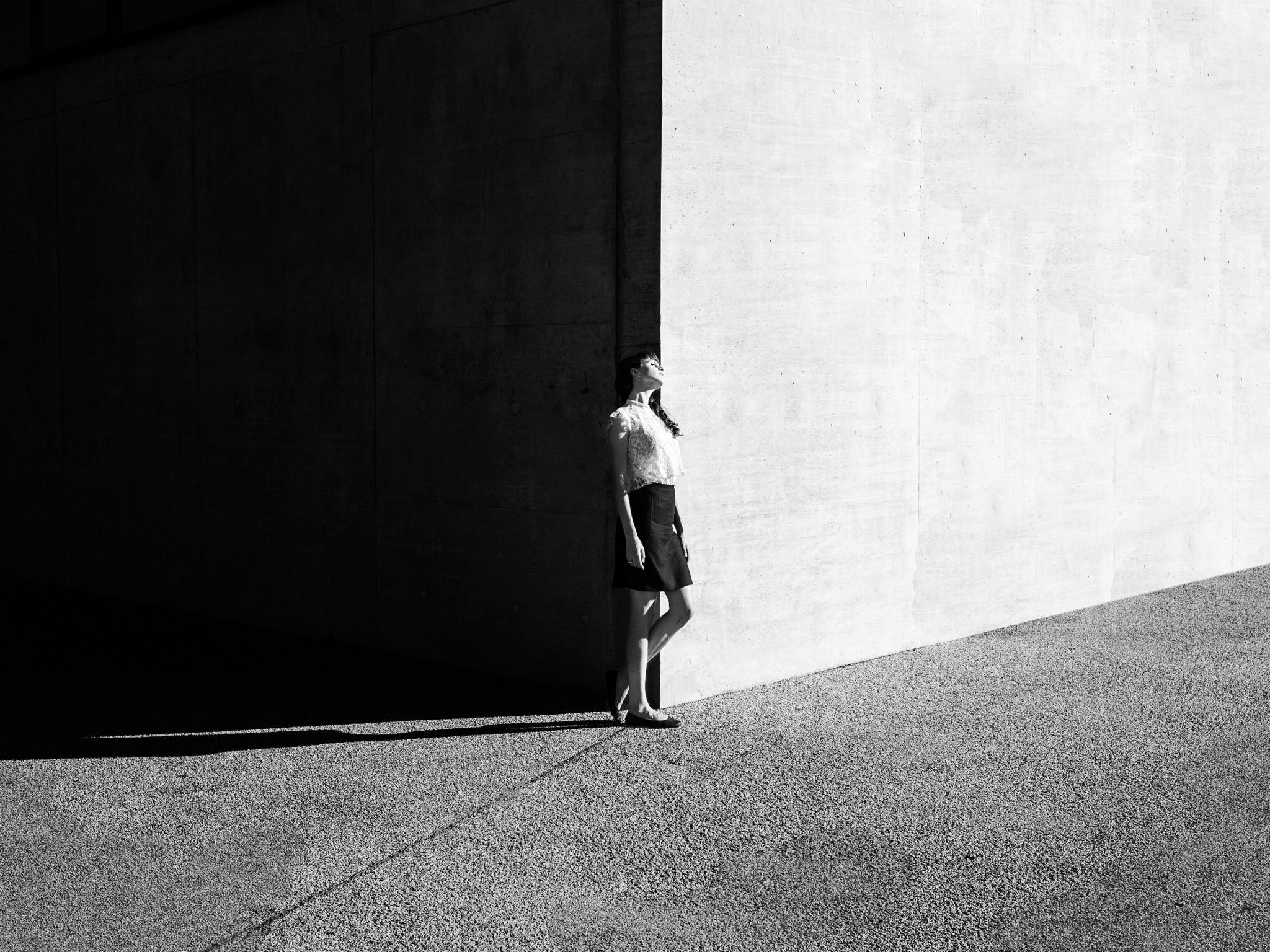
PHILIPP: This is also part of “Simple Matter.” The strong sun, which cast those strong shadows, did most of the job. I just positioned myself in a way that the edges of the building and the shadows aligned perfectly to cut the images in 3 parts.
I like to break symmetry, and positioning Lisa right in the middle of the 2 walls and the floor was perfect, because not only does she draw the attention, but she also gives the picture some warmth. In post, I knew only black and white would work, so that the contents of the images and the idea was clear. I proceeded pretty much the same way I did with the first picture of the series.
PHILIPP: We were strolling through the neighborhood, just to explore locations for photoshoots that might be useful in the future. Just for fun we shot some pictures there. It was in post when I decided to make it black and white to bring out the most of the bike, but I still wasn‘t content enough because I thought it was a bit too “general.” So I started to think of what I could do to enhance the picture, while staying in the setting and urban story which the picture already hints at.
I had an aerial picture of a city lying around and immediately thought: Yes, exactly what I need! It is simple, “shy,” yet strong and enhances the story that the picture tells: A sort of way of life in urban space. I think cyclists can relate.
PHILIPP: Also part of the series “Simple Matter.” So after we spotted the location we scurried back home and selected fitting clothes to fit the stark contrast of the stairs and the wall. I knew I would have to cut into the picture in post, or otherwise Lisa would get lost completely, so I framed accordingly. It was difficult still, because I couldn‘t get any closer to the stairs, or else the perspective would be disturbing, and the sharpest lens I had back then was the 20mm f/1.7 (40mm in full frame).
I thought a lot about that tiny light in the picture, to the right side of Lisa, and if I should leave it there or if I should remove it. I chose to leave it in there, because the fact that it existed got me thinking, and I hoped others would be conflicted with it, too. To some it distracts, others like it. I think that‘s good, otherwise the picture may be too harmonic, which I don‘t like.
We just turned 5, and we’ve gone through a lot of pivots and changes over the years. How about you? What were you like as a photographer 5 five years ago, and how have you grown in your craft today?
PHILIPP: I learned a great deal by looking at other peoples work, getting inspired and sometimes trying to redo photos I liked on my own, just to try to understand what I like and what my “style” is. It is still difficult to say, but I think slowly but surely some sort of “line” is crystallizing and I like where it‘s heading. I want to refine it and make it visible in each of my pictures, so that when people look at it, they may be able to say “This one might be from Phil.”
While that is one thing that just started to become important to me a year ago, I still find it equally important to get out of your comfort zone and do things you think you can‘t do or things of which you know you can‘t do for sure. Because you know you‘ll eventually be doing it right if you fail.
Out of all the photos in your 500px profile, which one is your favorite and why?
PHILIPP: I gotta go with Lisa on the stairs from the “Simple Matter” series. I like it visually, and it was the first picture of which I think that it underlines my understanding of aesthetics. I am also still conflicted by that little light there. Sometimes I want to rip it out there and tell it “go bother someone else,” and sometimes I am just like “shine brighter little fellow!”
I like that.
What’s next for you in 2015? Any upcoming projects, exhibitions, workshops, etc?
PHILIPP: I‘ll be doing what I love and hoping that someone notices. And if not, some day I’ll be sitting in my lawn chair, a delightfully warm and unobtrusively mild breeze blowing through my gray hair. My kids will gather around me, my wife next to me, and we altogether will look at the pictures I created in my life and it will all be good.





Leave a reply