We’re incredibly proud of the Editors’ Choice section of the 500px Discover Tab. More and more when we want to see the best work on 500px, we’re turning to Editors’ Choice where the world-class photographers on the site use their well-honed eye to share photos that might otherwise get overlooked.
We also love getting to know our Guest Editors. And so, each month we sit down with them to ask three questions: what makes a great photo to you, what is your favorite image you’ve shot and why, and what was the best image you picked for Editors’ Choice and why. We hope you find their answers as enlightening as we do!
January’s Guest Editors are an awesome bunch, and today we’ll get to meet three of them: graphic designer Andy Kirby, still life master Dina Belenko, and landscape extraordinaire Matt Kloskowski. Each has a very different perspective to offer, so scroll down and you may just learn something about great photography.

Matt Kloskowski
Matt Kloskowski is a Florida-based landscape photographer who describes himself as a “Photoshop Guy, Photography and Photoshop Instructor, and Professional Photographer.” He’s also a 2nd degree black belt in Taekwondo… so he can most likely kick your ass.
Matt already shared some amazing tips on getting noticed for Editors’ Choice in a blog post he allowed us to republish, but we still wanted to find out what makes a great photo to him, so we sent him our questions and waited with bated breath for his reply. Here’s what he had to say:
500PX: What makes a good photo? Can you share an example?
MATT KLOSKOWSKI: I’m a landscape photographer so I’m going to go with that theme in mind for my answer. When it comes to landscapes, for me, the first thing is color. I admire and respect many black and white photographers and even see many great B&W photos here on 500px. But for me, I love color. It’s what gets me about landscapes and it’s the first thing I look for. Great color in the sky, on the rocks, trees, foreground, where ever. But the color is always what grabs me first and sets the mood in the photo.

MATT (continued): From there, I’d say clouds are a must have in my landscape photos. I don’t always get them, but most of my favorite landscape photos have clouds in them (preferably with the above element, color, as well) 🙂
Finally, foreground… to me, foreground is essential. Again, I see many great vistas of beautiful scenes from above. But I love foreground in landscape photos. It’s a way to help put a person in that place and make them feel like they were standing right there. Whenever I get to a landscape location, the first thing I do when I find the direction I want to shoot (again, usually based on color from above), is find a foreground. What can I put in front of this photo to really bring people in to it.

What is your favorite photo from your archives? Would you mind sharing the story behind it?
MATT: My favorite photo is Flåm Reflections in Norway. I have photos that were more popular on 500px, but I think this is my favorite. Partly because of the story behind it. See, I was traveling in Norway and arrived in the beautiful town of Flåm. I really had no idea what to shoot, so I got a rental car for a couple of days and set out to find some photo spots. Well, one evening I found some great areas to shoot and got some wonderful photos I was really happy. I went back to my room, parked the car, and never saw the sign that said the parking lot wouldn’t open again until 7am the next morning. Well, in Norway this time of year, the sun rises around 4am. So when I woke up the next morning to shoot sunrise, I wasn’t able to get the car out of the lot — so I had to set out on foot. I ended up walking through the town of Flåm and was just amazed at the beauty I had within hundreds of yards from my hotel room. That’s when I captured this photo.

MATT (continued): My favorite part about it is how it all happened. Because had I gotten in the car in the dark, at 3am, I probably would have just gone where I was the night before because that was the only place I knew about. And I would have gotten very similar photos. But instead, I ended up walking nearly 6 miles that morning (3 miles out and 3 miles back) and photographed some of my favorite photos from that trip, just because my car was locked in the parking lot.
What was your favorite Editors’ Choice pick and why?
MATT: I love “Face to Face” by Dylan Gehlken.

MATT (continued): I love photos that show the scale of where you’re at and this one does it so well. He puts you right in to the photo with that rock in the foreground. Then you see the climber (in the perfect red jacket) in the middle, and then you’re treated to an incredible mountain peak with gorgeous color off in the distance. Love it!
To see more from Matt, give him a follow on 500px, visit his website, or check him out on Facebook and Twitter.

Dina Belenko
Dina is an incredibly talented Russian still-life photographer who loves telling stories about the inanimate objects she makes her subjects. There’s a story inside of every object, and puzzling this story out — and then capturing it on camera — is something she is both passionate about, and very good at.
Here’s how she answered our questions about what makes a photograph great.
500PX: What Makes a Good Photo? Can you share an example?
DINA BELENKO: I think, a good photo should tell a story. Even if you capture not people but inanimate things, they still can tell us what they saw, who held them, who accidentally broke them, who lovingly gathered the pieces and put them back together.
I love when an artist doesn’t just document the reality, but creates tales of his or her own. You can perceive these images like a movie. Something happened and you caught the culmination or finale. It does not have to be a big story, it could be a metaphor, an interesting finding or “what does it look like” game, but you should have something to say. That’s why I love every single work of artists like Peter Lippmann or Oleg Oprisco. Images like the one below:

What’s your favorite photo from your archives? Could you share the story behind it?
DINA: At the moment it is Avoir la main verte:

DINA (continued): It is part of a project which is progressing rather slowly. It called “17 words for Wes Anderson.” Here I must say that he is one of my favorite directors, he is absolutely incredible, awesome and wonderful. I would like to make a series somehow connected to his work. So, this is a photo that was hardest to made: I had to grow a lot of sprouts, and for me, who can starve cactus to death, it was quite a challenge 🙂
What was your favorite Editors’ choice pick and why?
DINA: This is a tricky task. I think I will make it easier by a) choosing three pictures instead of one, and b) narrowing down the search to still life and architecture. Photos of inanimate objects always get less attention then, say, portraits, so let’s give them some credit.
First, The Door by Alfon No:

I love everything here: the effect of motion, shadow, plasticity of stairs, dimensional depth, color contrast. And most of all I love that you can think about this image, you can answer the question, “What does it mean?” Perhaps your answer will not match what the author thought, but it still will be important and worthwhile.
Next, After the blaze… by Catherine MacBride:

It’s incredible that Catherine could make this out of simple paper. Actually, I can feel the very air of this place as if I were there.
And, of course, there is a story. There are events before (obviously very destructive), events after (probably quite sad), and you stand right in the middle of them.
And finally, IceCreamSplat by Darryll Jones:

Usually broken food looks unattractive. But this “exploded” ice cream is absolutely perfect! You can watch the physics of falling, although the ice cream is no longer moving. And this lovely nod to Jackson Pollock! Clever and beautiful.
To see more of Dina’s work, or follow along as she creates more still life awesomeness, follow her on 500px, visit her Live Journal and DeviantArt profiles, or give her a follow on Twitter.

Andy Kirby
Andy describes himself as a, “Graphic Designer, delusional wannabe Photographer, and an absolute bloody hoot!” We’re not sure about the last bit, but that “delusional wannabe” part is pure humility and nothing more.
Based in Shoreditch, London, Andy’s work ranges from architecture, to still-life, to product shots — and all of it benefits from his designers’ eye. Here’s how he answered our three questions:
500PX: What makes a good photo, and can you share an example?
ANDY KIRBY: For me a good photo creates an instant reaction for the viewer. This can come from a number of qualities ranging from composition, to subject matter, to light, to inventive processing. Often a good photo will represent all of these qualities.
I generally find myself drawn to imaginative photos taken in and around places I have visited and shot. It’s always fascinating to search 500px for photos of places I’ve personally taken photos of and see how other photographers have interpreted the same subject matter.
I’m a big Photoshop fiend and love to push the processing of photos as far as reasonably possible. For me as a photographer it’s not just about taking photos, it’s about creating images and seeing how other photographers process their shots is endlessly fascinating and a constant source of inspiration.
That being said, the below example is a photo I love because it represents great composition, light and processing combined to make a great portrait.

What’s your favorite photo from your archives? What’s the story behind it?
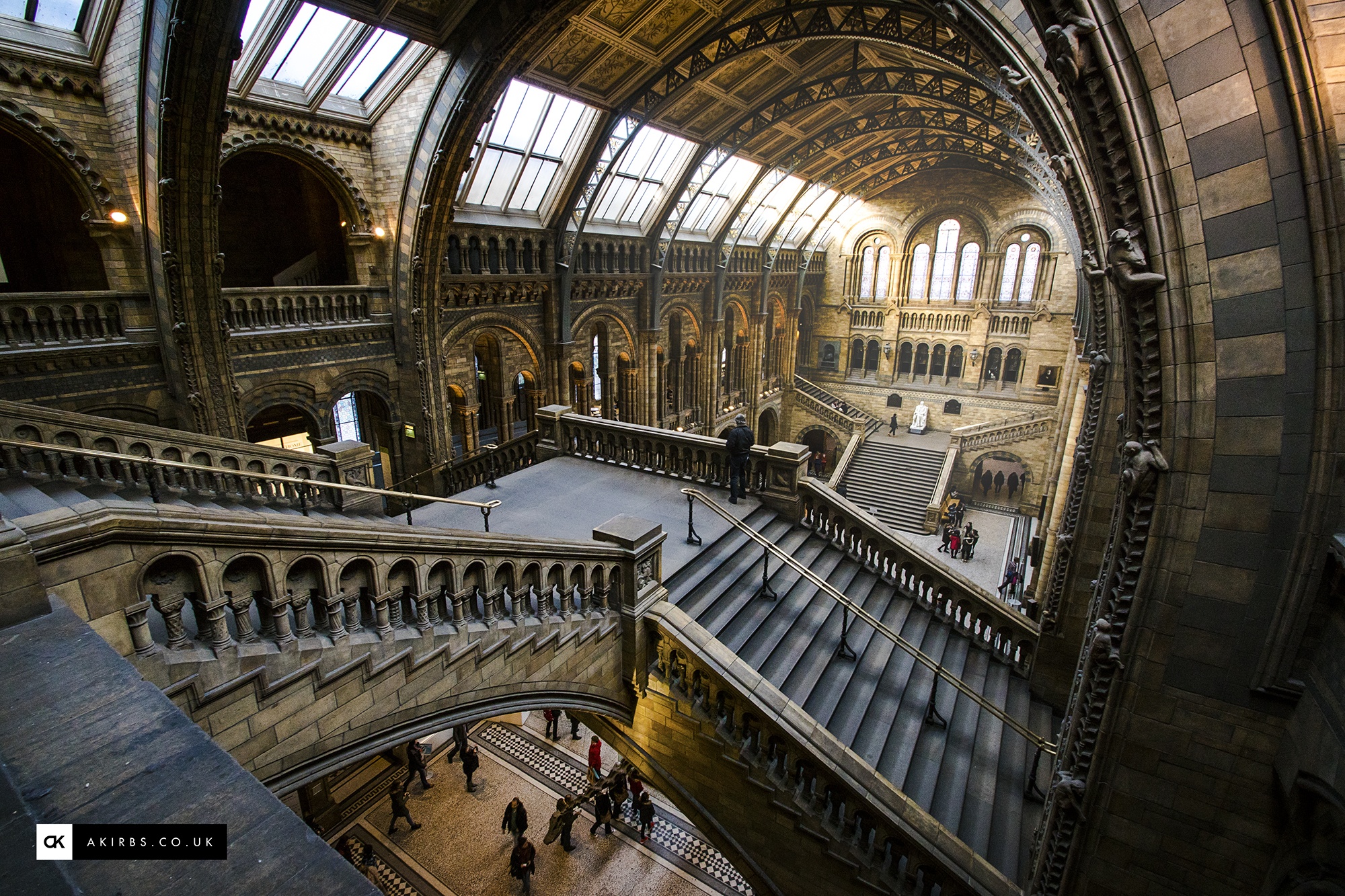
ANDY: I’ve spent years wandering around the streets of London, camera in hand, looking more like a lost tourist than a lifelong Londoner. Irritating busy commuters as I stand in the middle of the pavement looking up at seemingly nothing.

ANDY (continued): Looking up when taking a photo is a great way to hide my biggest problem as a self-declared delusional wannabe photographer: I have very little imagination when it comes to photography, I struggle to see the interesting angles and subjects that so many of the photographers I follow on 500px capture with apparent ease.
More often than not I find myself visiting the same places time and time again, always seeing the same photos I’ve previously taken with increasing frustration at my lack of imagination.
So I simply look up and instantly there is a wealth of interesting photos just waiting to be taken. Usually of seemingly mundane building facades that struggle to catch the eye at any other angle — hence the bemused looks and exacerbated sighs from passers by as they are forced to take evasive action to avoid walking into me. Most it would seem love a photo but not the photographer.
What was your favorite Editors’ choice pick and why?
ANDY: My favorite pick is The Bowler Man by Sean Byrne:

It’s an interesting take on an extensively photographed part of London. I love the black and white processing, and the subject matter combined with the location gives the photo a great sense of the solitary in a crowded and popular London tourist spot.
To see more of Andy’s work, check him out on 500px, pay his website a visit, or follow him on Twitter and Tumblr.

Leave a reply