A great photograph not only grabs your attention, but also keeps it. One way to ensure that your photo is irresistible to look at is to have a killer composition. Wildlife photographer Ian Plant‘s 500px Class “Visual Flow: Mastering the Art of Composition” challenged photographers to think beyond the rule of thirds by identifying design elements like shapes, leading lines, foreground, and negative space to create dynamic compositions.
As part of the 500px Class, Ian asked photographers to submit photos to the Class Quest that showed dynamic composition. “I was especially looking for photos that showed a strong and coherent design, where every visual element was chosen for a reason, and was used harmoniously with other visual elements.” Check out some of Ian Plant’s favorite photos along with his feedback below.

“This photo is very amusing, but I really love how the shapes radiate around the main subject, and help pull visual attention into the center of the composition.”

“This composition shows very effective use of leading lines – including lines formed by clouds streaking during a long exposure. The eye-catching vanishing point is reinforced by the bright source point of light, helping to pull the eye into the center of the composition. This is a very compelling use of the “visual vortex” technique.”
“I love how the two primary visual elements here have been placed in an opposing diagonal relationship. This creates an effective visual “tug-of-war” that keeps the eye deeply engaged.”
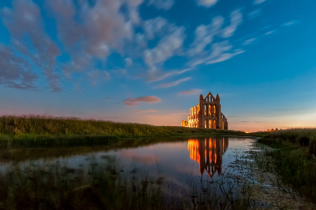
“A simple and elegant composition, that has nice visual balance. The lines formed by the pond lead to the distant castle in the upper right, while the lines formed by the clouds lead the eye to the left, creating visual energy in this otherwise balanced and harmonious composition.”

“This photo shows a very effective progression of visual elements, creating an attractive s-curve that leads the eye into the scene.”
“Okay, I love this one because the resulting shape looks like a frog! And who doesn’t love frogs? Seriously, this composition encourages viewer curiosity, which helps build engagement.”

“Leading lines work best when they actually lead to something important. Here, the lines lead to a central element (the plane passing overhead). Even though the plane is small, its visual importance is enhanced because of its placement at the point where all the lines converge.”

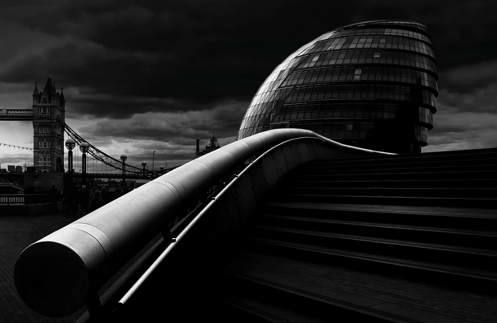
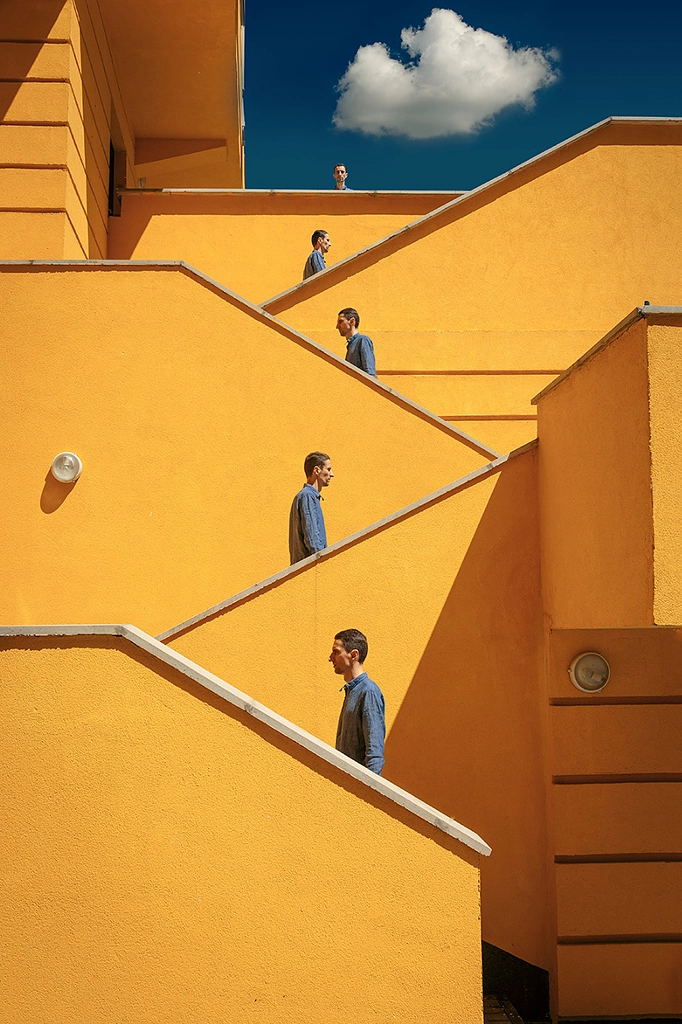
“I really like the energetic placement of the various groups of people walking up the stairs. The stairs create a structured, patterned background to the composition, giving it harmony, and the placement of the people breaks up the symmetry and adds energy.”

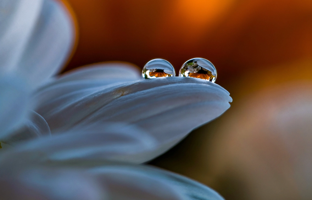
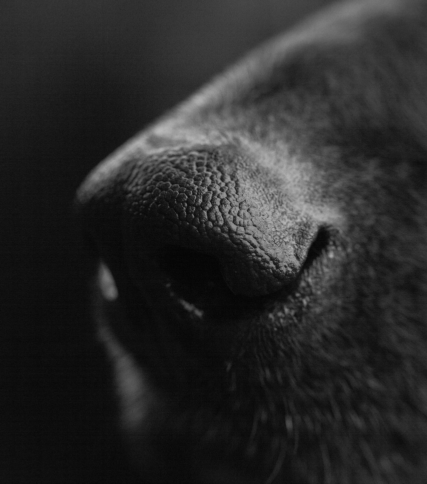
“I love how the foreground clumps help frame the subject, and the cloud pointing to the subject makes this even better. Even though you can’t see the eyes, line of sight is implied, pointing down to the foreground, encouraging the viewer to start their visual journey all over again.”
“This amusing composite shows effective use of the zigzag shape to get the eye moving back and forth as it travels deeper into the composition. The lone cloud in the sky completes the visual progression.”

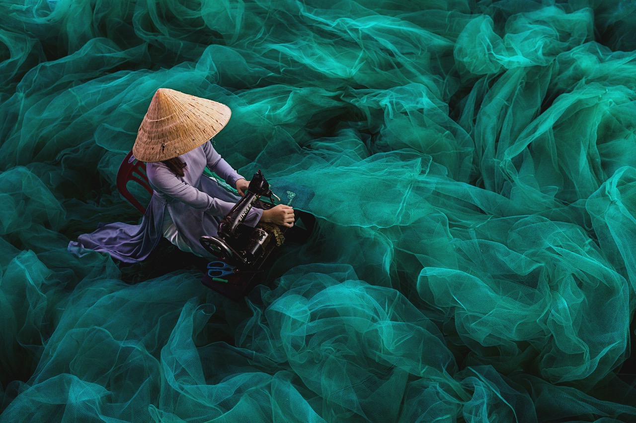
“I really like the pattern of the fishing net that radiates from the main subject. This is a very elegant composition, pared down to the essential elements.”
Want to improve your photography and connect with professional photographers? Join a 500px Class and participate in our live webinars, tutorials, group discussions, and Class Quests.


Leave a reply