At 500px amazing photography is at our core, but these photos would not be possible without the talented people behind the lens. The 500px Spotlight series highlights the global and diverse photographers that are part of the 500px Community.
This week we are very excited to introduce you to Teddy Tavan, a Kenyan photographer who uses his own intimate connections and found objects to create dramatic images. Enjoy the interview!
Q: Growing up in a small town, better known for safaris and skilled athletes than the creative field, how did you discover photography and come to develop work with such a signature fine art feel?
A: I grew up loving movies—animations and those of superheroes. I kept a lot of movie posters, and as time came to pass by, I wanted to make my own movie posters. I started out photoshopping photos taken by phone, using apps like PicsArt. That was not enough as it was not perfect. It was during this period that I discovered Adobe Photoshop. I purchased a few books online and later discovered good YouTube channels that helped with learning. It took me about a year to realize that good photos contribute to a better composition, I dug into photography.
During that period, I was working on a few art projects (digital art and traditional painting). In an attempt to fit all of these fields into one, I decided to create “art like images”—in my point of view art has a deep meaning and I wanted that in my work.
Q: As an architecture student, what parallels have you drawn between design and photography?
A: Principles of design was the best thing I ever learned from Architecture to put towards my photography, it diversified my style. I started applying hierarchy and other principles that took my composition to the next level. I understood color and contrast as a communication method in my work—I cannot mention it all, but I have applied a lot of design skills in my work.
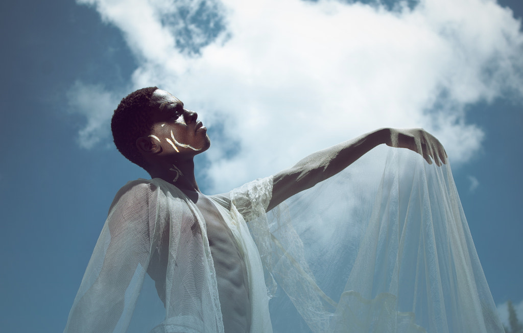
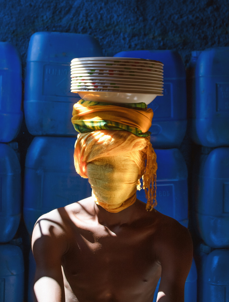
Q: You have described yourself as a thrifter, often using found objects and props in your shoots. Can you take us through your process and tips you would give to other photographers when working with props?
A: Props can either compliment work or take it over. Some props are extra, in nature it’s best to understand how to either tone them down to avoid busy compositions or use them to your advantage. It’s not wrong to have props that make up a big part of the composition, as different images portray different feelings.
It is also important to know that photography is about what you choose to show, and you should not be afraid to paint your props a different color to bring attention to them. I once spray painted a hat in gold spray paint to bring out a metallic feeling.
Some props have life and cultural connection, say artifacts, and adding them to a composition brings an emotional connection. Also, elevating emotions with props works to my advantage.
When working with props, another important factor to remember is ergonomics (objects around us are designed to work with our body, a hat is designed to fit a human head, a guitar’s shape looks like a female body). Incorporate these ideas into the work to your advantage.
Also, think outside the box—use what everybody encounters every day differently as your prop, and nobody will see that coming.
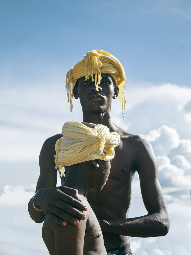
Q: Working with family can be hard when there is a specific concept in mind. How have you negotiated this when shooting your brother, and what have been the benefits of working with someone you are already so close to?
A: Some concepts present a challenge, and we end up taking a long time to make them work. Flexibility and availability is one advantage I get from working with my brother.
We do have difficult moments where we end up scrapping a project. These are not the easiest moments as there is always a lot of input before a project comes to life, and that calls for a lot of patience—something he gives because he understands the language I have assigned to my work. Where a concept does not work at first, we always redo it until it comes to life
Q: How have you kept your photography practice alive during the pandemic?
A: At one point I was not able to work on anything for three months—I did not feel I was in the right mindset and physical condition to make art. We had to travel back for school and there was a lot of fear in the new atmosphere due to the pandemic, but after settling and figuring out school we got back to creating.
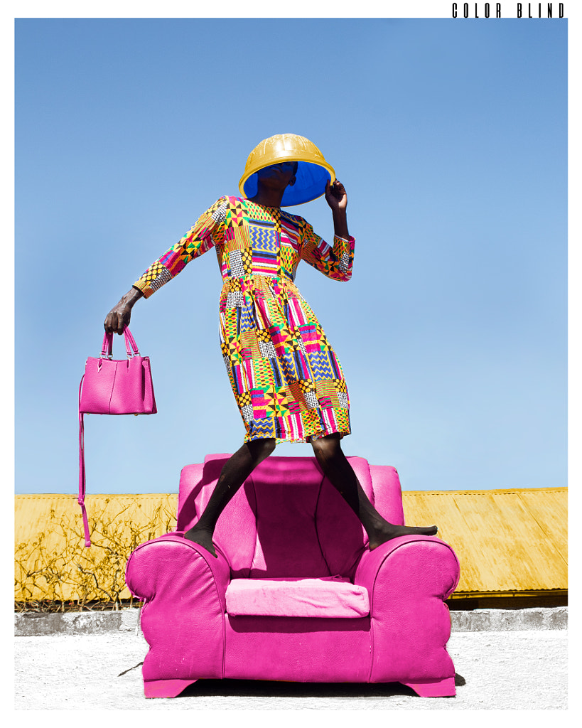
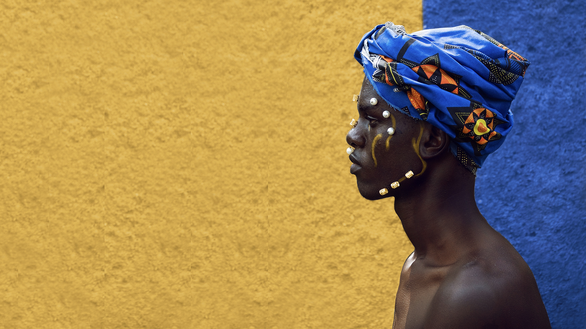
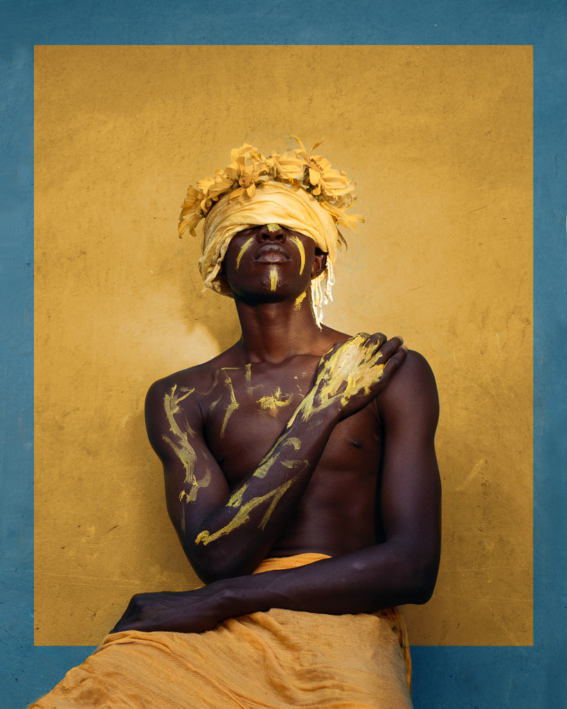
Q: Your images often use bright high contrast colors. We would love to know the thought process behind this choice, and how you see it helping the narrative.
A: I started using colors based on how they make people feel. Growing up, some colors were too feminine, say pink. Yellow makes our thoughts happy. Blue is calming. The same colors can be put in a composition and feel totally different. Other colors are not often thought of, and nobody knows how good they look together until I blend them.
When I pick a color, I always have to think of its addition or subtraction. I play around with colors to achieve harmony, complement, contrast (where I have to show difference on subjects), or to trigger an emotion. Red is too striking, and red on pink is just awkward for people, so I would bring those colors together to make sure the viewer understands the awkward situation of the photo,
Q: What is a photo from your 500px Profile that you are particularly proud of and why?
A: A photo named “Lean on”, which is a photo of my two younger brothers together. During the pandemic period I got to stay close to them for the longest period in my life, and we bonded. I understood their struggles and eventually shared mine. I felt a strong support coming from them, and I always feel like that photo captured it. My brothers supported my photography spree and that’s how I got here.
Q: Photoshop was where you got started in photography, how do you navigate editing in what some photographers feel is a daunting interface. Any top tips?
A: Arrange your interface to favor you, a lot of tools exist in Photoshop, but most can substitute each other. Create several layers—they help with experimenting as far as you can go, and I prefer to do my adjustment in layers. I would also advise mastering the masking tool, opacity, and layer blending modes.
Despite being substituted by Lightroom in most ways, I find camera raw on Photoshop just as important as it’s a quick way of applying adjustments.
Always zoom in and out, both are important in cropping, identifying errors, and making adjustments.
Q: What advice would you give when compiling an engaging portfolio?
A: Tell a story—I get personal in some of my stories, narrating my own experiences, and in some, I talk about other peoples’ experiences. Stories with relatability are engaging.
Aesthetic appeal is also of importance, I think of aesthetics and visual appeal in equal amounts to the narrative, even when the story does not overtly ask for it. Aesthetics are a controllable way to enhance your story.
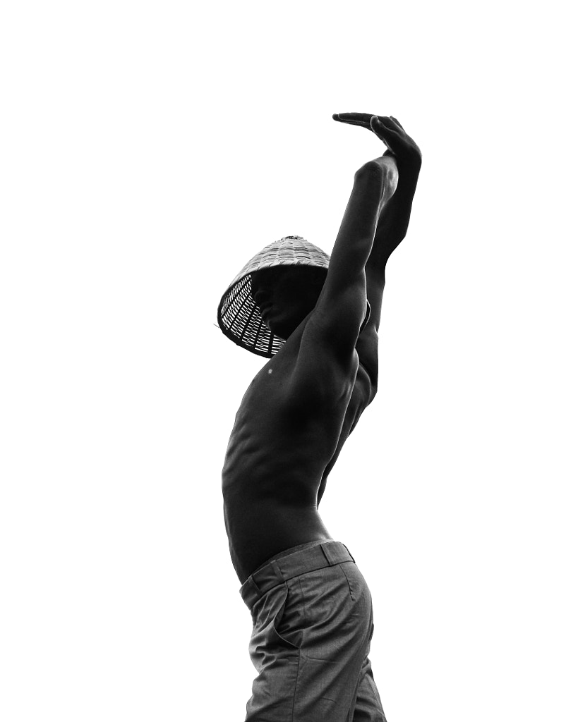
Break the monotony. I have some images in black and white because of the story behind them. Doing them in black and white was a decision to break away from monotony.
Q: Are there any projects you are currently working on? Can you share some details with the 500px community?
A: Yes, currently I am working on a project called “IDentity”. The title comes from our identification documents or “ID”. I figured for every ID number there is a human going through something, maybe happy, sad, or devastating, however, I would not want it to be purely sad, for we also all have our moments of celebration.
Not on 500px yet? Click here to sign up

Leave a reply