We teamed up with the talented 500px Ambassador, Julia Wimmerlin for a Quest that asked the 500px community to submit their best harmonizing colors images.
Inspired by painters like Van Gogh and Matisse, this Quest was all about focusing on colors that achieve visual harmony. The result? An amazing selection of eye-pleasing and colorful photos, that made selecting the winners a rather difficult task.
A message from Julia:
Color combination can make or break a photo, so I was very excited to see the creative takes on color management from 500px photographers across different photographic genres. I was blown away by the quality of submissions and different universes they allowed me to visit. Needless to say, choosing the winners was extremely difficult, and I had to use both an emotional and logical approach to narrow down to the winner and the runners up.
First Place Winner
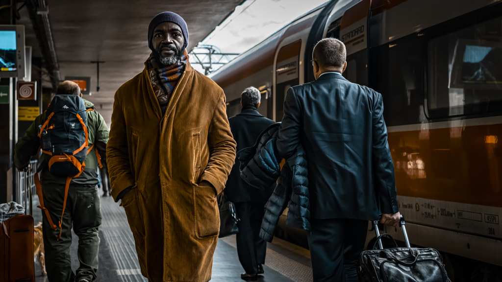
Photo by Roberti Di Patrizi
This image could have been just a regular street shot with an interesting stranger if it was not for the color harmonization and grading. Any train station has a lot of conflicting colors with signs, travelers’ clothes, and luggage all contributing to the cacophony of color. What I love in this photo is that by removing the distracting colors and creating a dramatic complementary teal and orange theme, so very popular in low key cinematography, Robert created an intense movie scene with a strong narrative. With the colors setting the mood the impression is intensified by the posture and eye contact of the protagonist moving directly towards the viewer. A great way to turn a documentary recording into a personal work of art!
Runners Up
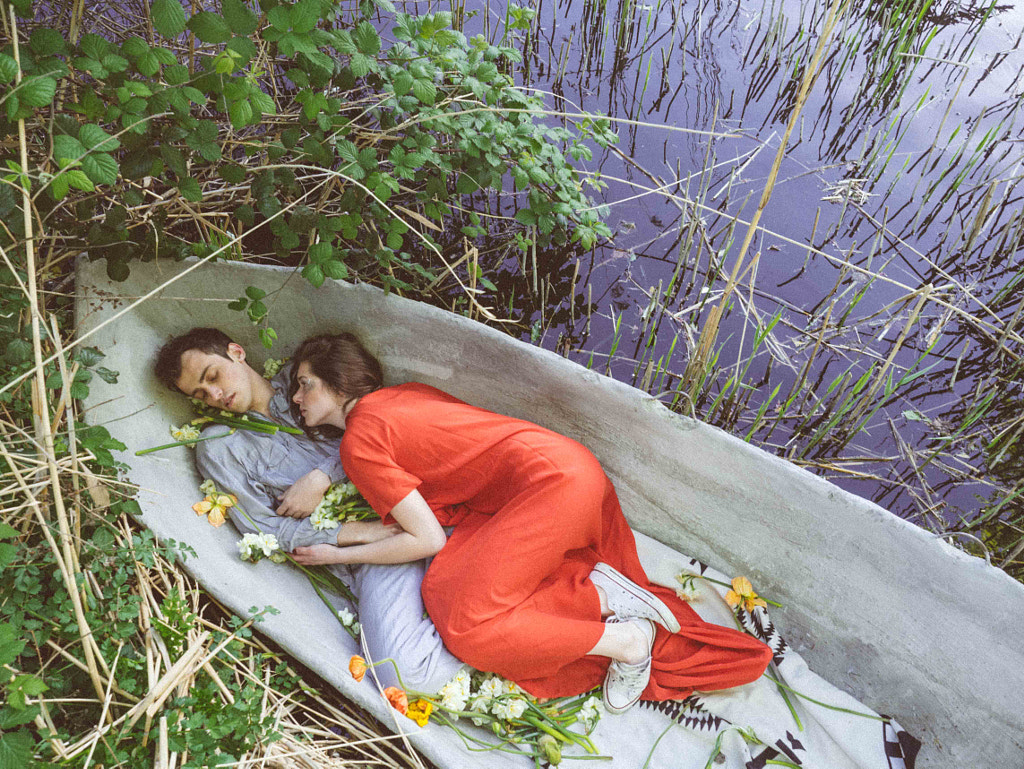
Photo by Aks Huckleberry
I love this delicate story playing with concepts of fairy-tales and contemporary storytelling. Despite being subdued, color plays an important role in the narrative. Since it’s a staged shot we can assume that colors were chosen for a reason and have a particular meaning, with red being the color of passionate love and seduction, blood, and anger whilst purple/lavender/lilac representing caring, spirituality, mystery, and daydreaming. It’s a very clever twist on tradition where one would imagine a man to be standing behind the red and behaving more actively with a woman daydreaming in lilac. The remaining colors present in the natural scene were adjusted to suit the chosen color palette.
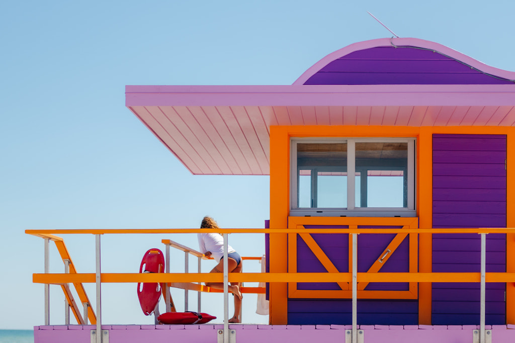
Photo by Dom Piat
This double split complementary color harmony is very aesthetic and combined with a great composition makes this image an absolute delight to look at. I assume that the colors of the scene were already close to the final version we see here but masterful tweaks, playful adjustments of hues, and selective saturation made this photo a true art piece that stood out for me amongst other graphic shots.
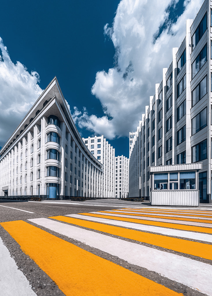
Photo by Anastasia Mazureva
A fantastic example of how complementary color harmony of blue and yellow can accentuate strong graphic composition. By eliminating all other colors (most probably greens, green-yellow, cyan, magenta) and by aligning all the blues to the same tone, Anastasia achieved a very impactful minimalistic image. Beautifully done!
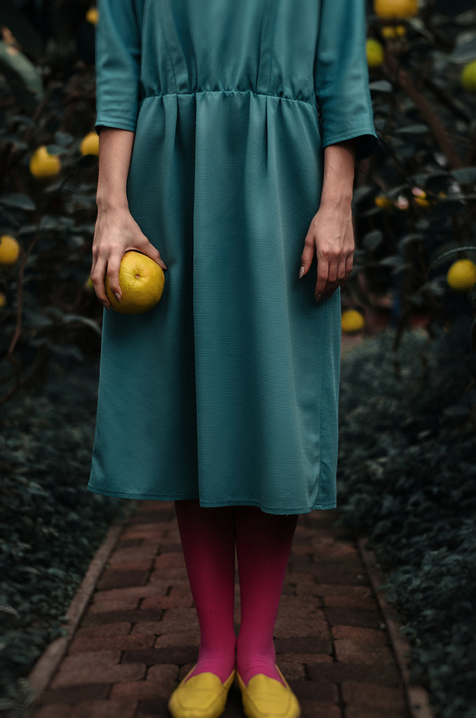
Photo by Inna Mosina
This triad color harmony of teal, magenta, and yellow is absolutely exquisite to convey the message of mystery, femininity, and expectations. A very beautiful conceptual shot!
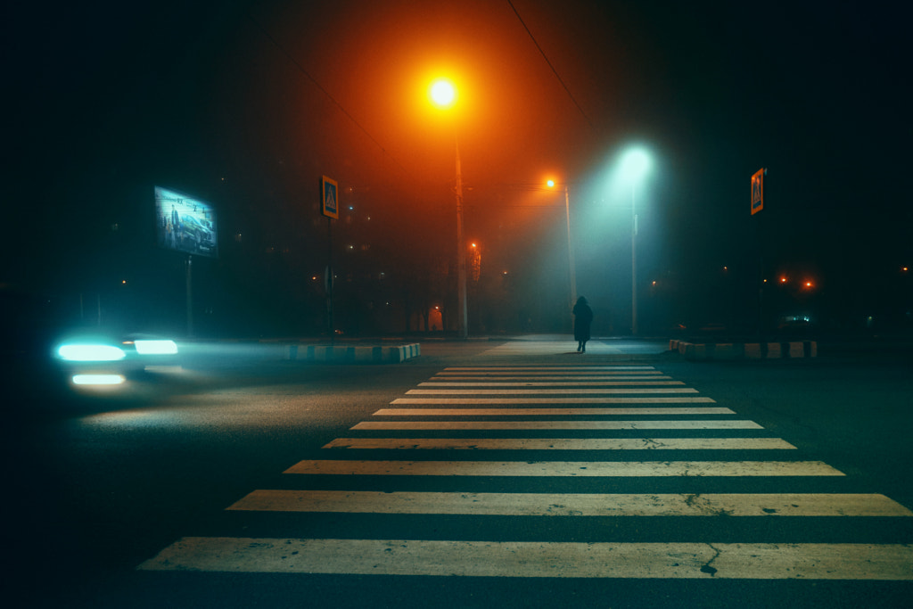
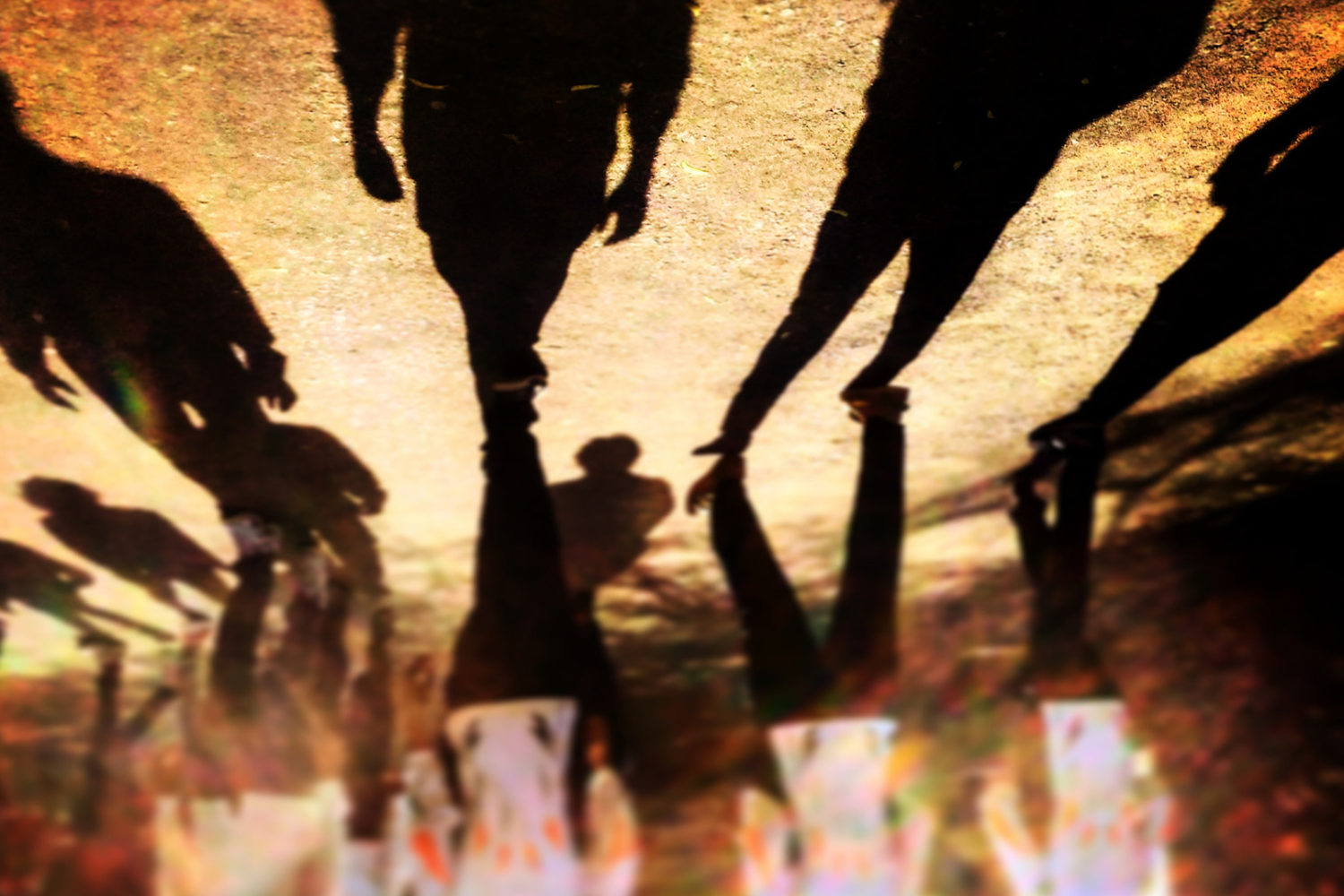
Photo by Anastasiia Zapselska
Another great example of using teal and orange to achieve a cinematic effect and turn a beautiful street shot into a bigger story.
Check out the entire Shortlist here
If you’d like to see more of Julia’s work, check out the following: