UPDATE: Thank you to everyone who has been offering considerate, constructive feedback on the new design! We’ve been listening to you and working around the clock to make the new design better. In fact, we just brought back two highly requested features! Click on that link to find out what’s back.
Get excited, because we’re about to reveal some major changes to the pages you use most on 500px!
Starting today, we’re going to be rolling out a brand new profile page, photo page, and discover page experience to all 6+ million of our loyal users—the next step in the evolution of 500px as an amazing place to discover and share amazing photography.
But before we do, we wanted to give you a heads up, explain why we’re making these changes, and assure you that we’ve been listening to the feedback we’ve received from the users who have been testing the new layout-in-progress over the past few months.
What’s Changing and Why
First off, it’s important to note that the 500px design is never finished. We’ll never stop innovating, evolving, and changing to better display your photos and live up to our mission here at 500px: enabling and rewarding visual creativity.
That, at its core, is what this new design is all about. So, let’s take it one piece at a time.
New Profile Pages
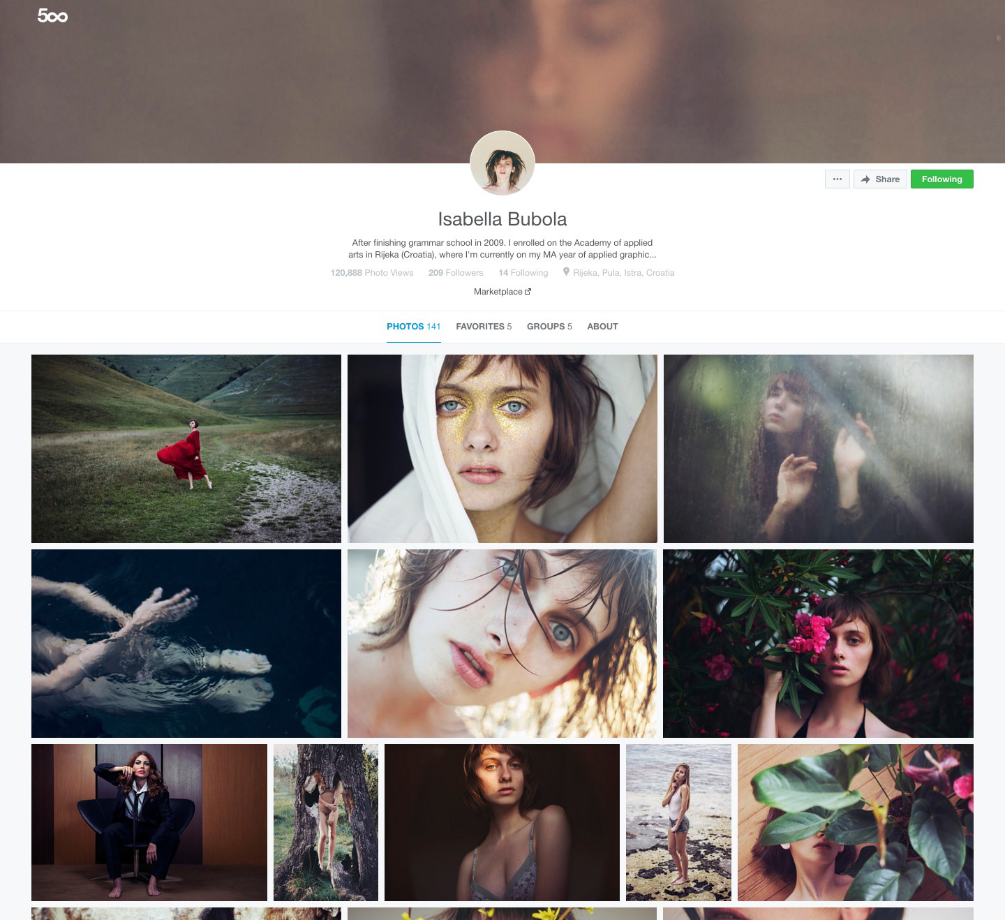
Your profile page has gotten a lot of love from our world-class team of designers, and we’re so proud to be unveiling it to everybody over the next week.
First, you’ll notice that the square cropped thumbnails are gone gone gone. Full aspect ratio thumbnails make sure that panoramas, portraits, and landscapes alike are displayed the way you always intended.
We’ve also reorganized the top of your profile to put the focus on you. The avatar image is now in the middle, a little bio snippet is placed front and center for everyone to read, and tabs leading out to your About page, Sets, Favorites, and Groups are easy to access but don’t steal any attention.
Finally, the Follow and Share buttons are also very prominent, making sure anybody that likes your work can show their appreciation without digging around.
New Photo Page
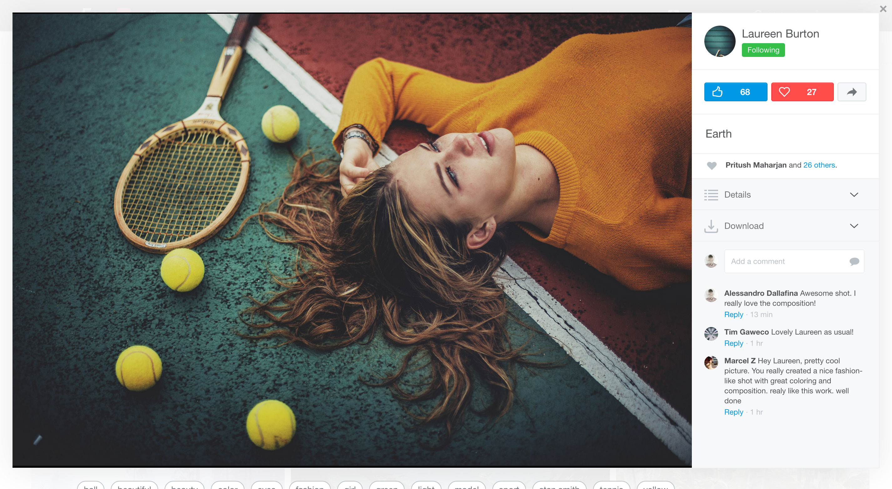
We’ve been working around the clock to tweak, improve, and simplify the new photo page design ever since we first began user testing a few months ago, and we think the photo page we’ve created makes 500px more beautiful and intuitive.
Note: Nobody has seen the newest version of the Photo Page. If you were part of user testing, hang tight and you’ll notice that we addressed a lot of the feedback we’ve received (more on that in a second).
So, what’s new in the photo page? Only everything…
First and foremost, your photos are now displayed ever bigger—portraits are 12% larger and landscapes are 15% larger than before. And since the page is build as a “modal,” photos are displayed in a pop-up that allows you to keep your place in the background while you enjoy and interact with the image you clicked on.
All of the info about the photo and the comments section has been moved up and into a sidebar so you don’t have to scroll down and back up every time you want to find out something about the image or leave feedback and praise. Comments are always displayed, while the rest of the info can be found in a collapsible “Details” tab; and if your photo is available for purchase through the 500px Marketplace, buyers can license it right away through the “Download” tab.
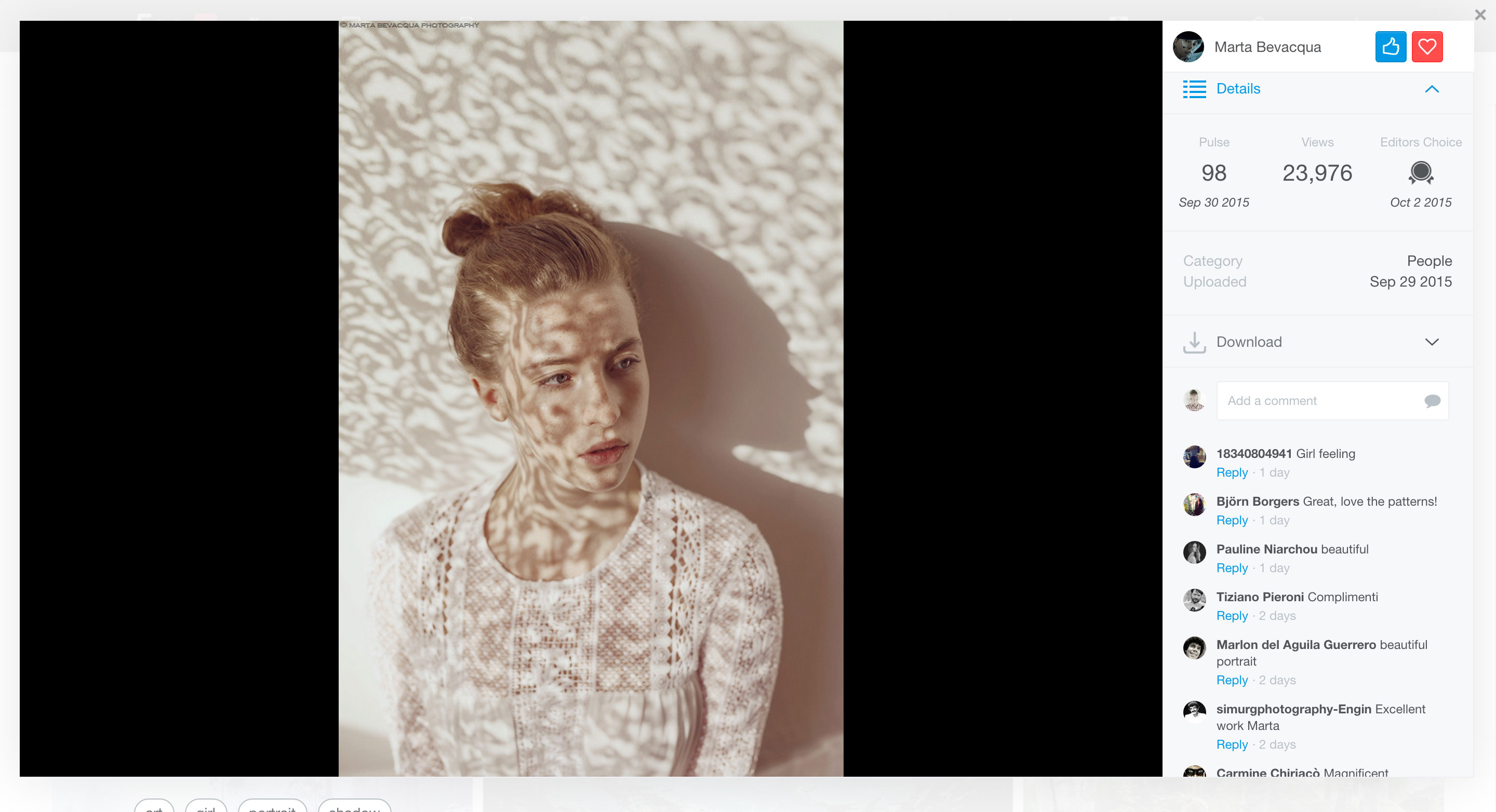
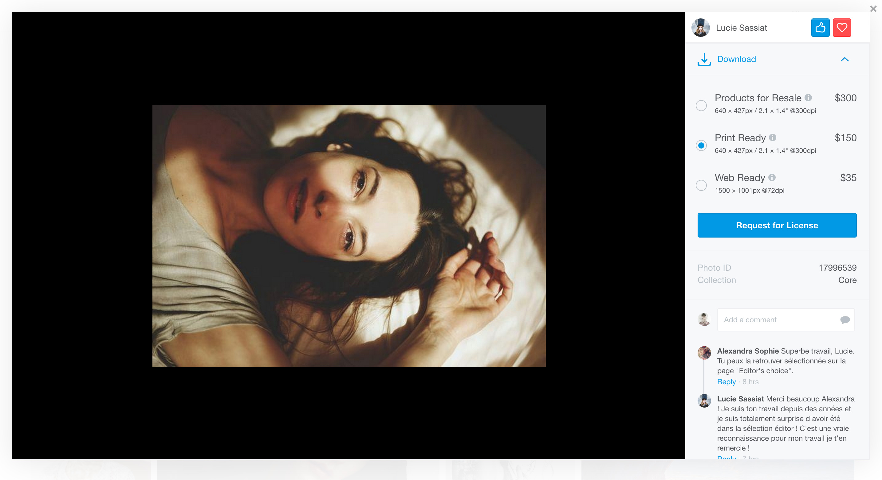
Your photos themselves are always displayed against a black background so they look their best, the set your photo appears in is listed below the image so fans can quickly find more of your work, and a low-res version will preload so even those with slower connections can quickly enjoy and interact with your photo while the full-res file loads.
Finally, this photo page learns! If you always view the Details dropdown to see what camera gear was used to capture the photo, or check out the photo’s pulse, the page will make sure Details is always open for you. If you don’t, it’ll stay closed.
So much has changed about this page that it’s impossible to cover it all. Check out the screenshots and keep an eye on your 500px account starting today. We hope to have the changes rolled out to everyone by the end of the week.
New Discover
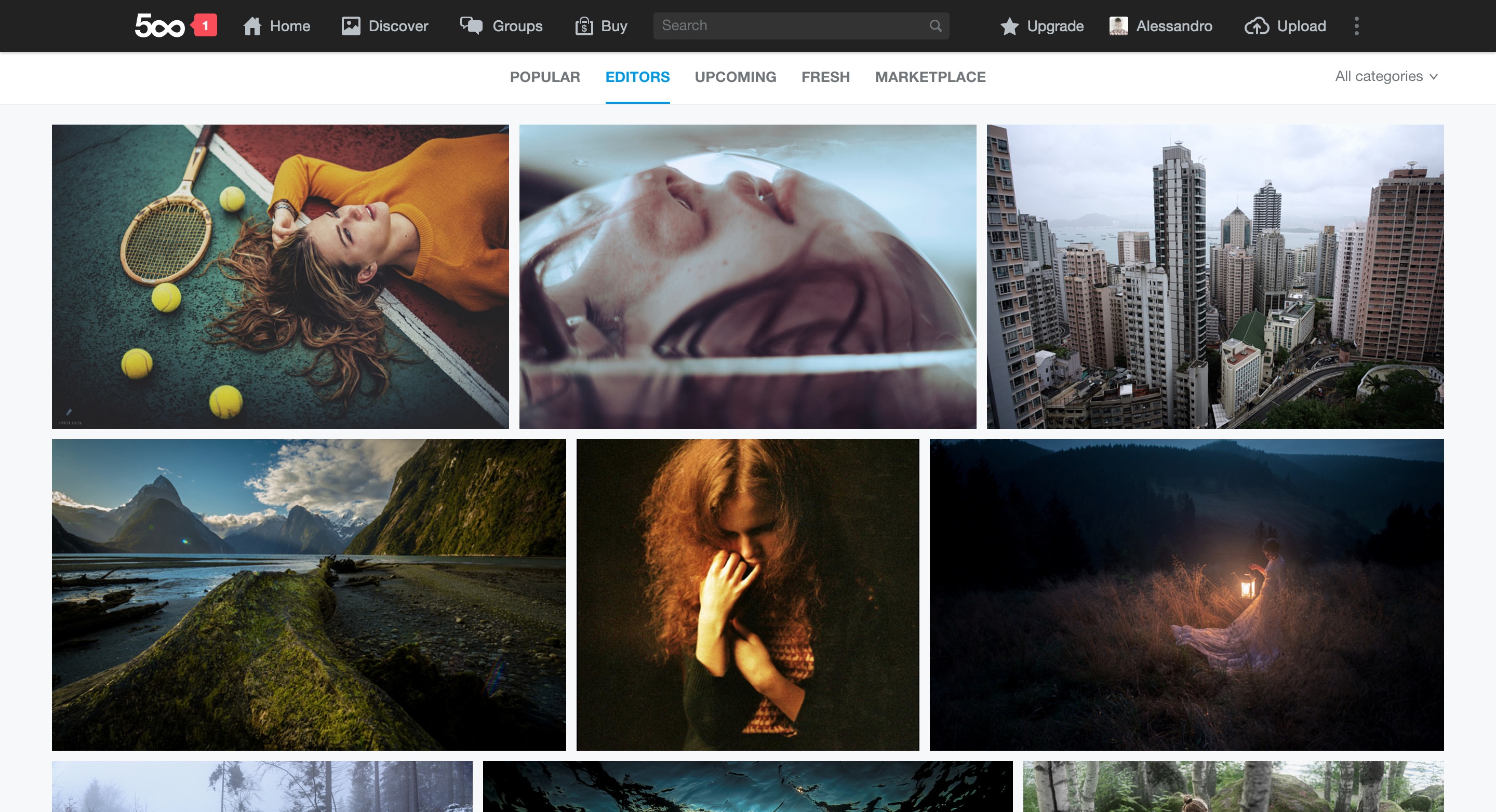
Last, but certainly not least, the famed Discover section of 500px has also been overhauled to be smoother, more beautiful, and easier to use.
The page features a sleek new design complete with full aspect ratio images that load smoothly as you scroll… and scroll and scroll and scroll. Yes, we’ve also done away with pagination and introduced infinite scrolling so you don’t have to stop and reload the page every 50 photos.
We’ve Been Listening, We’re STILL Listening
Many changes both large and small have been made to the new design thanks to user feedback, and more changes will no doubt continue to be implemented as we learn what works, what doesn’t, and find the best possible way to serve YOU.
The way the sidebar behaves, how Comments, Details, and Download options are displayed, and even the way we display your photos were all adjusted in major ways in response to some of the most compelling feedback we received from the community over the past few months.
But we’re not finished! If you have feedback on what you read or saw above, and especially once you’ve had a chance to play with the new design, please fill out this typeform and let us know what you think!
We said it at the top and we’ll say it again here: the 500px design is never finished. We’ll never stop innovating, evolving, and changing to better display your photos and live up to our mission of rewarding visual creativity. If you can think of a way we could be doing this better, please let us know.
One More Thing…
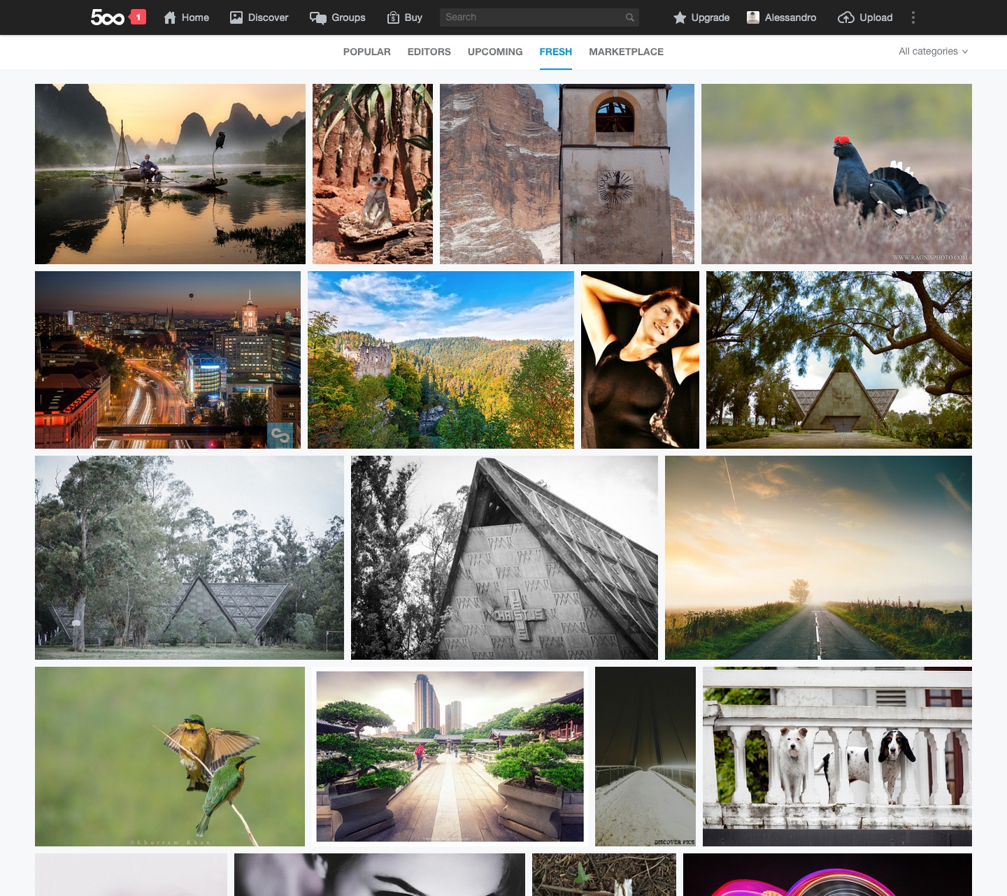
We’re also addressing a concern we’ve heard from many of our users, to “fix” images displayed in Fresh. With the launch of bulk uploading, some people complained that single photo sets were taking up entire pages of Fresh and pushing people out of the limelight too quickly. We’ve heard you, and have created a solution.
You can still bulk upload—we’re not fans of taking away features that make the site more usable—but if you upload more than 3 photos at a time, only the first three will go to Fresh. That way, everybody’s photos get a chance to be seen, appreciated, and liked/favorited right up to Upcoming and Popular.
Thank you all again for your support, feedback, and the passion with which you share both of those things. With our 6th birthday coming up at the end of this month, we’re feeling incredibly positive and pumped up here at 500px.
We’re growing again, trying new things, and putting your photos in front of more people than ever before in the history of our community. As we do this, we’ll keep making sure that they look the best they possibly can. Help us won’t you?



Leave a reply