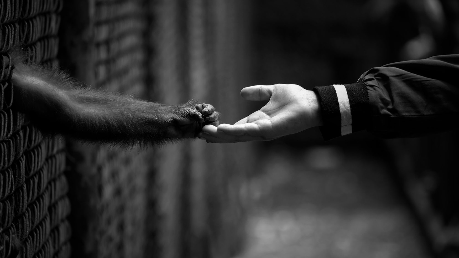
Expert Chorale Miles, a Boston-based photographer, guest curates this week’s Editors’ Choice, sharing eye-catching lessons in contrast.
What do you think of when you hear the word contrast? Of course, we’re all familiar with the little “contrast” slider in our favorite photo-editing program. We’ve seen the results of strong differences in light vs. dark and black vs. white in photos. But what about the less obvious types of visual contrast? My favorite kind of contrast to play with is “mental contrast,” as I like to call it.
I work primarily as an event photographer, but I like to create visually-striking images and push my boundaries on the side. Once a week, I work at a nightclub, taking photos of the crowd. I love capturing calm, serenity-filled moments of individuals getting connected to the music, a partner, or a thought. The contrast between their tranquility and the background of a hectic nightclub makes me feel something. To further demonstrate the idea, I’ve selected some photos that drew me in on a similar level.
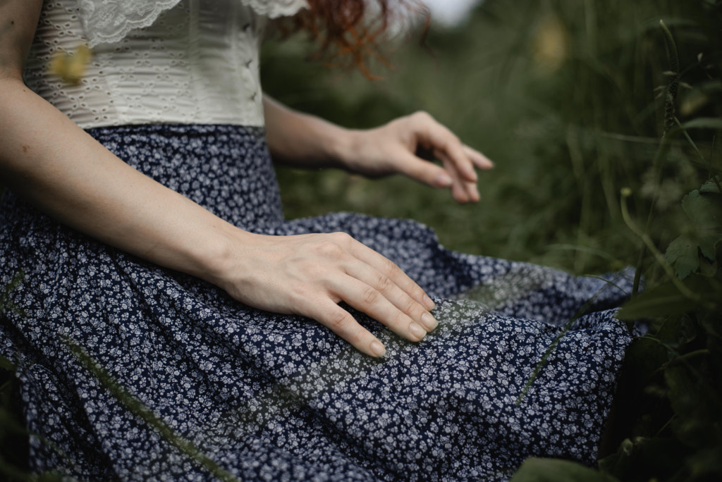
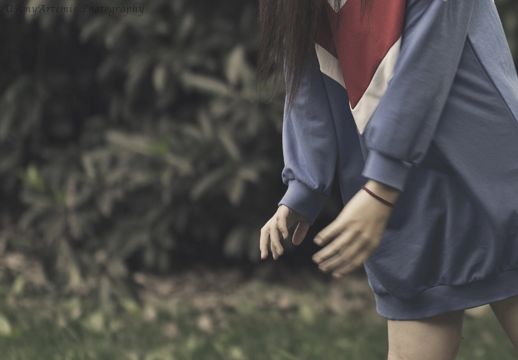
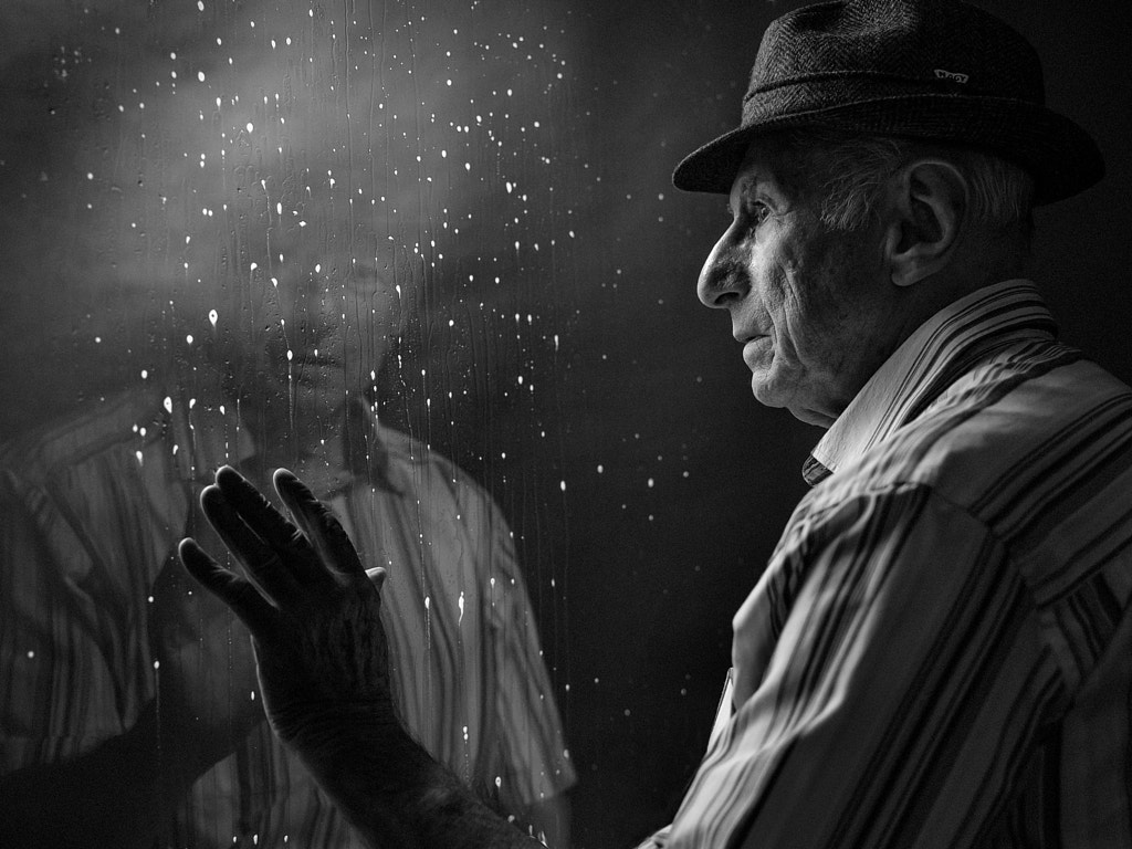
‘Margo’ by Anna Kim, for example, gives me pleasing “cognitive dissonance” feeling. The colors are muted and make me feel at ease. The subject’s right hand (the one closer to the camera) seems to be comfortably rested.
But the background hand is being held in a somewhat-unnatural position, as if the subject were using it for something. Maybe to pick a flower? Or maybe to warn someone else about something that’s about to happen? I’m intrigued by that hand. The tones are soft, but also make me think of a potential storm. The cropped face is also making me feel a little uneasy, in the best way. I’m curious and drawn in.
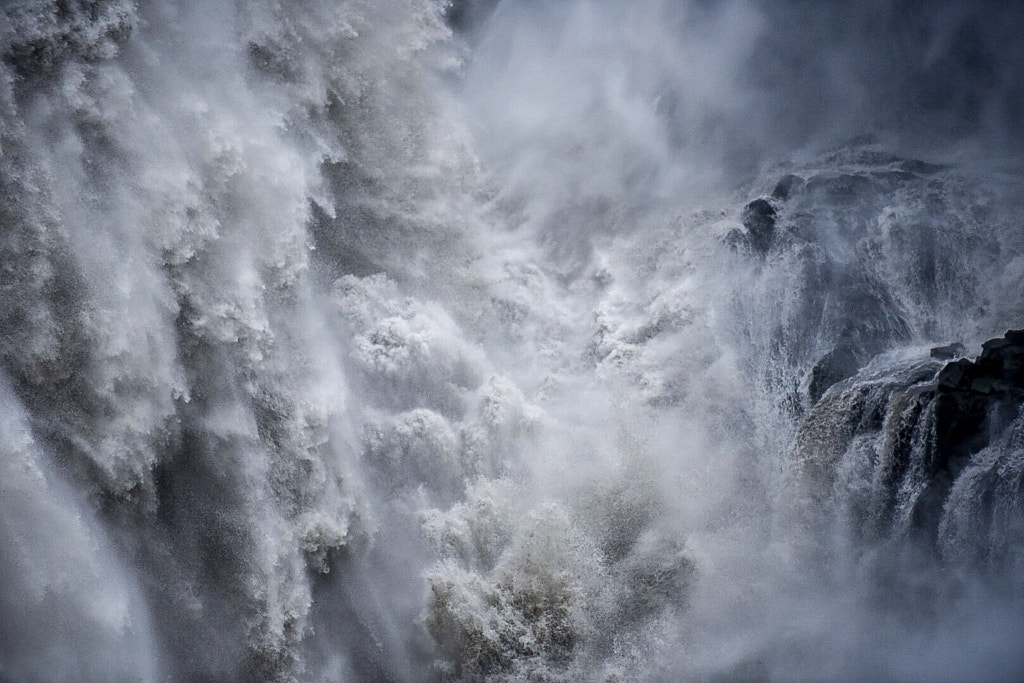
Here is another example of a “mental contrast” image that I find interesting and beautiful: ‘Dettifoss’ by Steve Robertoy. The water in this image seems very heavy; the left side in particular. It is so stormy, I can almost hear the noise it’s making. The right side is quieter; the water flows more seamlessly than the left side, where the water is crashing, splashing, and going in multiple different directions. There is also the obvious visual light vs. dark contrast in the water. Despite the contrast between the two sides, I still get a “symbiotic relationship” feeling between the two waterfalls.
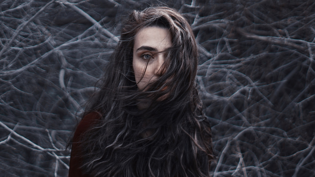
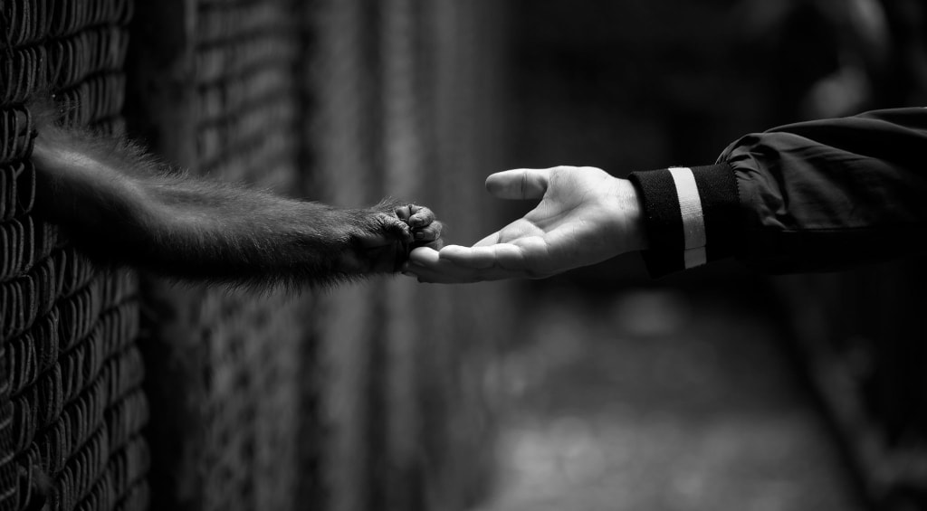
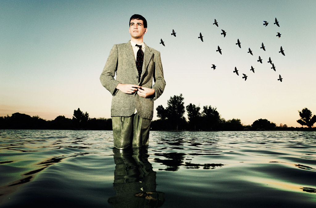
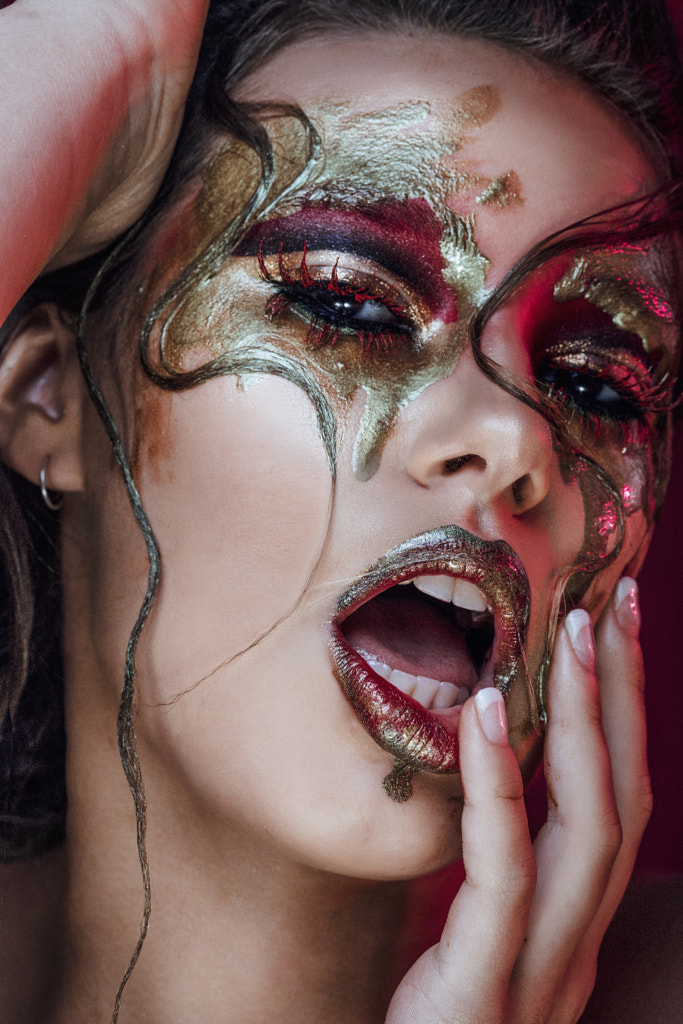
Conflicting feelings make an image so interesting to me. I hope my picks have encouraged you to start looking for them, as well.
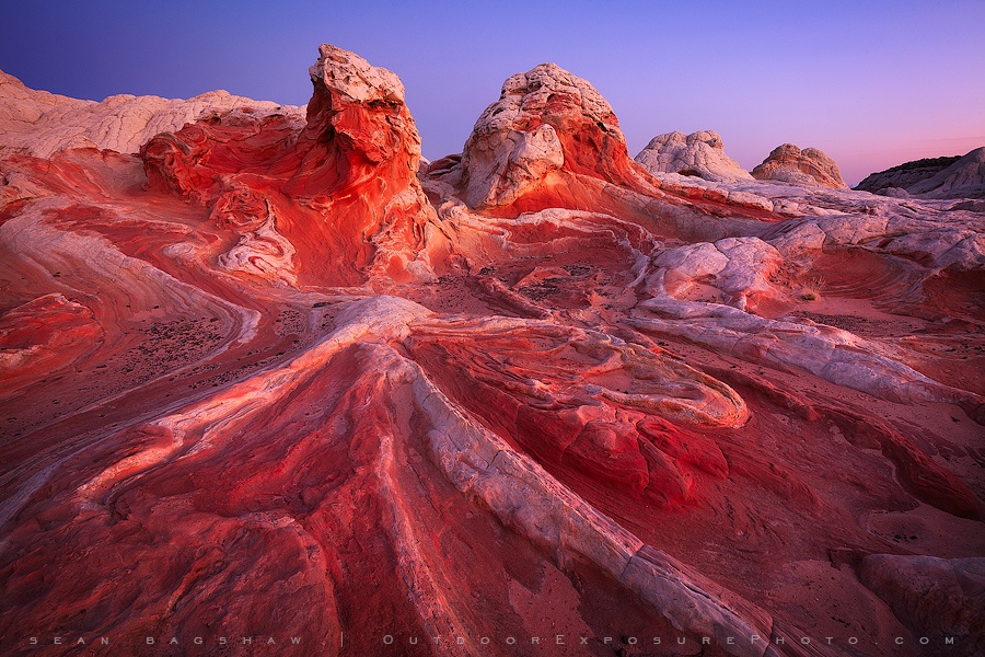
See more of Chorale’s Editors’ Choice selections below, and check out the full 500px gallery for more of her favorites.


Leave a reply