Leonardo Regoli was born in Venezuela and currently lives in Germany. He works as a researcher on space physics and has two main hobbies: climbing and photography. His main interests in photography are travel and landscape.
You can find more of his work on 500px, his website, Twitter, and Tumblr. This post originally appeared here and is being republished with express permission from Leonardo.

After looking at an example of post-processing workflow for a color image in Part 2 of this series, in the third and final part I will focus on the processing of a black and white photo.
A good piece of advice for digital photography in contrast to film photography is to always shoot in color.
When I started taking photos with a DSLR, being used to analog photography, I would change the settings of my camera when I felt that the image would benefit from a B&W look and shoot directly in that mode. This, of course, gives you the feeling of how an image will look in B&W at the end, but it has the disadvantage that, once you’ve switched to monochrome, you will never be able to get the colors of the scene back.
This might sound rather obvious, but since it took me a while to get it, I thought it would make sense to write it down. Bottom Line: always shoot in color and only convert to B&W once you’ve reached the post-processing step if you feel it will help convey the feeling you wanted to achieve.
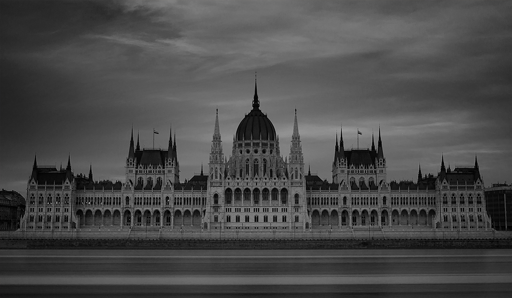
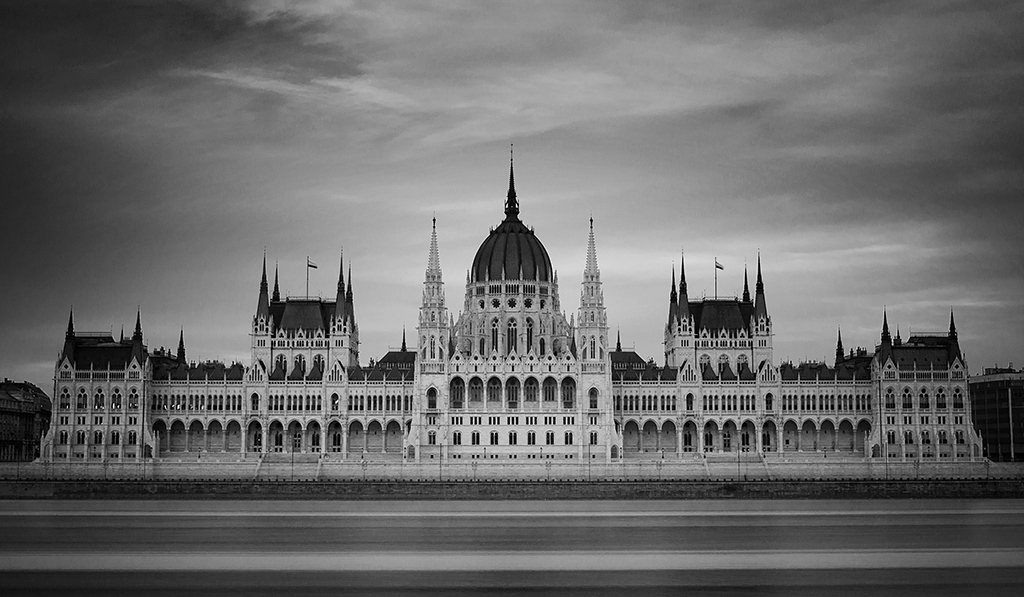
Now, back to the processing. The image I chose for today’s post is a long exposure of the Parliament building in Budapest, Hungary with the trail of a passing boat on the Danube river in the foreground.
This amazing building (the largest one in Hungary with a facade of 268m) is certainly a popular subject for travel photography, something not very surprising given its position on the bank of the Danube and its impressive Neo-Gothic style.
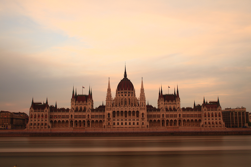
The original image looks decent, but some aspects can obviously be improved. First, given the size of the building and that the image was captured with a single shot (no panorama), there are large areas of the photo without any interesting information, making an image crop a sensible choice.
Also, thinking of a color image, the white balance settings on the camera where not the best ones at the time I took the picture, giving as a result an image that is rather too warm.
Finally, the overall dynamic range, sharpness and contrast of the original picture can definitely be improved.
Note: The image shown is the .jpg file produced by the camera; I usually process RAW files and thus the white balance settings of the camera are not that important. Still, for illustration purposes, I thought it would make sense to show the process starting with the original .jpg as it came out of the camera.
When I started processing the image, I was still not sure whether I would go for a color or a B&W image. Actually, it is fairly common that I make the choice at the end, only after processing the color image and evaluating the final result, even though architecture shots tend to benefit from the ‘fine art’ look that monochrome sometimes offers.
With the first step, I cropped the image to get rid of those parts without interest like small sections on both sides of the building as well as a small part right below the boat trail on the lower border and a bit of sky. This also helps position the building approximately on the lower third of the photo (rule of thirds!).
I then adjusted the white balance to make the photo look a bit cooler. For this particular purpose, I used the ‘Brilliance / Warmth’ filter in Color Efex. The result is shown in the following image.
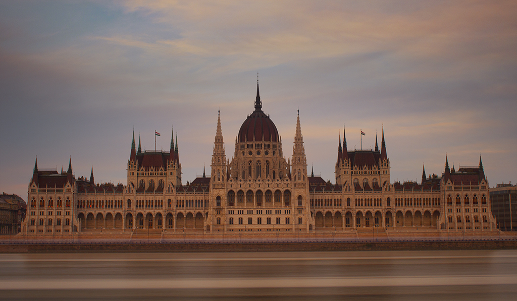
One thing that is more obvious after the cropping is that the image is not completely straight. This is particularly noticeable on the lines left by the passing boat, which don’t look completely parallel to the lower border of the photo. To correct this, simply select the ‘Ruler Tool’ in Photoshop (same button where the ‘Eyedropper Tool’ is located), take two points along a straight line, and click on ‘Straighten Layer’ on top of the window.
Note: the locations of the different tools and buttons I mention correspond to Photoshop CS6 for Windows, which is the version I work with; the tools should be present for any of the recent versions but their location may vary according to the version and the operating system.
Additionally, I applied a bit of sharpening (‘Filter -> Sharpen -> Smart Sharpen’). In order to capture the boat trail with daylight, I used an ND 1000 filter. ND stands for ‘neutral density,’ meaning that the filter should not alter the overall color balance of the scene, while 1000 means that it will reduce the amount of light reaching the sensor by 1000 times.
In any case, while using these filters, there is usually a shift in white balance towards the red and, more importantly for this post, it tends to make pictures look a bit less sharp and thus some sharpening during post-processing is usually needed.
The result of these two steps is shown in the image below:
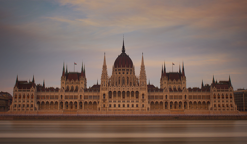
At this point, the only thing I am missing from the image is probably some vignetting and contrast adjustments.
However, this is also when I converted the image into B&W, primarily for the reason I explained above: architecture photos tend to look nice in B&W due to the ‘fine art’ look can give to the whole scene.
The result of reducing the saturation of the photo is depicted below:
Now, I really liked the result in B&W so I decided to leave it that way. Nevertheless, and something that is almost like a general rule for monochrome images, when compared to color, B&W photos tend to look rather dark and, for this reason, it is necessary to increase both the brightness and the contrast.
When posting pictures to the Internet, it is important to keep in mind that people who are going to look at your image will have different monitors. And different monitors can have very different luminosities, making a photo that looks nice on your monitor look rather dark (or bright) in other people’s screens.
For this reason, I highly recommend that you get an idea of where your monitor lies and while adjusting both the brightness and the contrast of your images always push them until you feel the dark areas are overexposed and leave them at a level a bit lower. Then, for the bright areas, apply a layer mask with a low opacity (around 20% works well most of the time) and mask the effect applied.
The above process (using ‘Image -> Adjustments -> Brightness / Contrast’) plus some vignetting to highlight the center of the scene (using ‘Darken /Lighten Center’ from Color Efex) gives the following result.
As a final step, I applied what is called an ‘Orton effect’, which is basically blending an image with a blurred version of itself.
The process can be carried out with Photoshop, but I once again used a filter from Color Efex called ‘Glamour Glow’. This is another delicate filter which can easily be over-used and thus one has to be careful with it.
With that filter, plus some new adjustments in brightness (the ‘Glamour Glow’ filter tends to darken the image), the final image is ready.
[twentytwenty]
 [/twentytwenty]
The final image has that ‘fine art’ mood and, even when some interesting features such as the reddish color of the roof goes missing, I think the B&W together with the long exposure that introduced the boat trail gives a very appealing look.
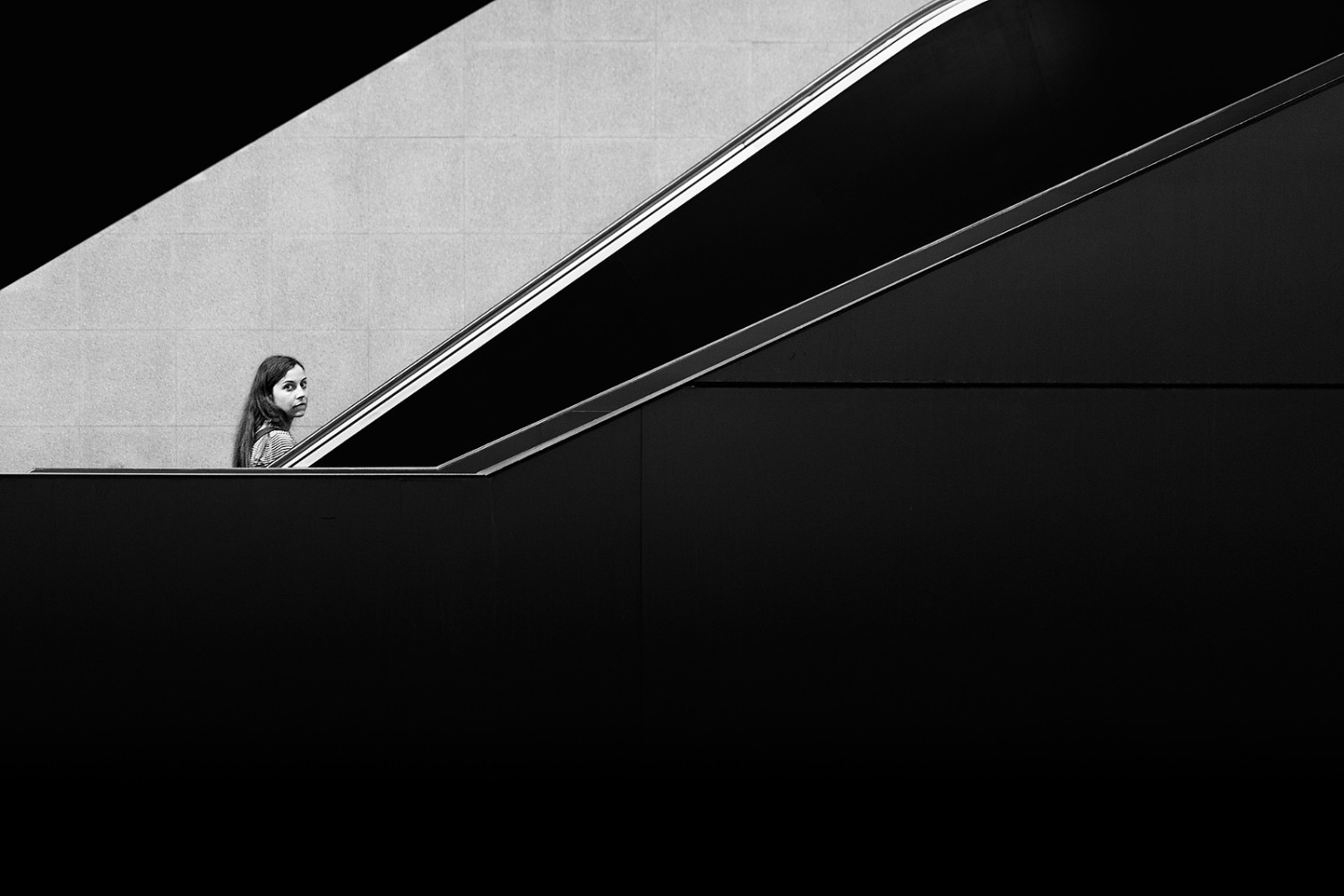
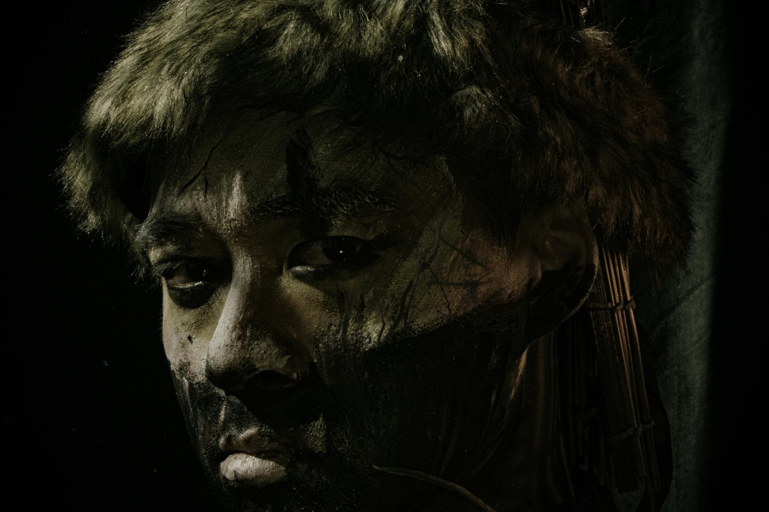
There are other situations where it makes sense to consider converting images into B&W. Even though the choices are always subjective, I find that, as a general rule, photos in which the sky is lacking structure like on overcast days, portraits, street photography, and some landscapes (especially when there are not too many elements) are some of those scenes where it is a good idea to at least attempt a conversion and decide from there what you prefer.
As usual, if you have any question regarding some of the steps or the overall process, please drop me an email. I will be happy to answer and try to help you.