Advertisements come in all shapes and sizes, each optimized for print in magazines, subways, and billboards or for digital consumption on our phones, tablets, and desktop computers.
Instagram thumbnails are displayed as 1:1 squares; link previews on Facebook are cropped to an aspect ratio of 1.91:1; photos on Pinterest feeds tend to have a 2:3 ratio. Standard website banner formats range from tall “skyscrapers” to wide leaderboards. Magazine photos can run full-page at 8.5×11” or as a double-page spread at 11×17”.
That’s just the tip of the iceberg, but you get the idea.
When paired with a specific client, you can tailor your photos to suit their needs. The framing and cropping will vary based on where they plan to use the images. But when you’re licensing your photos, you don’t know where or how your photos will ultimately be used. Ideally, you’ll make an unlimited number of sales over time, and each of those clients might have a different application in mind.
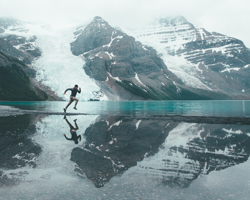
These photos, the ones that sell over and over again, tend to have something in common: they’re croppable. Buyers can crop off the edges, adjust your composition, and make it work across several different platforms. There’s no “formula” for taking a best-selling photo, but one of the easiest ways to boost its commercial appeal is to provide plenty of room for cropping.
Tip #1: Familiarize yourself with popular crops
You don’t need to know about every potential crop a buyer could choose, but it is worth understanding a handful of common aspect ratios used in print and digital advertising. Of course, you should also know the aspect ratio of your camera (or cameras) and how it relates to these popular crops.
Using the crop tool in Photoshop, you can use the ratio drop-down menu to see how various crops might look on your photos. Lightroom also has a dedicated crop guide overlay for aspect ratios to help you see how these formats might look. Use your time in editing and post-production to experiment with a bunch of possible crops, and see if your photos still work when cropped into these formats.
With practice, you’ll notice what kinds of compositions are the most versatile and frame your shots accordingly; those compositions tend to have subjects towards the center or third of the frame, rather than far off to the edges, and have plenty of background space. On the other hand, tight, close-up shots tend to be less forgiving when cropped.
Finally, keep these common ratios in mind when you’re shooting and composing, and visualize all the different applications your photo could have for the end-user.
Tip #2: Take a step back
Photographers are taught to “fill the frame” for a compelling composition, and it’s a handy rule of thumb, but it doesn’t hurt to take a step back every once in a while. By adding negative space or extra lead room around your subject, you give buyers the option to crop your photos however they want, and you also give them valuable real estate for their copy, logos, and other text or graphics.
Successful stock photos are adaptable, so when in doubt, go wide and shoot horizontally to get that extra breathing room. Think of it as a “buffer” that ensures important elements (like feet or arms) won’t be cropped. Clients can always cut down the image to focus on a particular subject in the frame, but they can’t always add borders to make your photo fit a wider format.
Tip #3: Avoid clutter
The “go wide” tip doesn’t necessarily mean including more elements—just more space. For the most part, you want your background to be clean and uncluttered so that it can be cropped horizontally, vertically, and any which way. Your composition still matters, even if the end-user plans to cut it down, so beware of distracting elements in the edges of your frame.
If, for example, stepping back results in phone lines, buildings, or branches that don’t help your composition, you might want to move around so those elements are excluded or use a shallow depth of field to hide them from view. Alternatively, you can clone them out in post-processing if they happen to be small and easy to fix.
In short, compose your shots so that the whole image could be used by the buyer if they wish—but also leave the door open for crops. If you like to follow the rule of thirds or the golden ratio while shooting, that doesn’t necessarily need to change; the final image just needs to work with different aspect ratios.
Tip #4: Submit your photos at full size
This one’s easy: the higher the resolution of your file, the closer the buyer will be able to crop the image. They’ll be able to pull a portrait from a full-body shot or go in tight and focus on a specific detail. While it might be tempting to save your photos at low resolution to save space, remember that any JPEGS submitted for Licensing on 500px must be at least 3MP. Buyers should be able to crop the image without sacrificing its quality.
Tip #5: Make it sharp
Sharpness is always important in commercial photography, but it’s essential when we’re discussing croppability. Use your exposure triangle (aperture, shutter speed, and ISO) to make your photos as sharp as possible, and make sure your subject is in focus. Any blurring or noise will become more apparent as the photo is cropped and enlarged.
Tip #6: Only crop when you have to
As a photographer, you’ve developed an eye for what kinds of compositions work best, and unless you get it right in-camera every single time, you have a preference for how you like to crop your images. However, in commercial photography, the decision to crop usually goes to the designer or marketer who has licensed the image, so remember to give them as much leeway as possible.
In some situations, cropping is inevitable, like when you get something in your frame you don’t want or that detracts from the commercial value of your photo. In those cases, crop away, but try to get it as perfect as possible in-camera so you don’t have to cut it down later. Of course, tight photos are still okay to shoot and submit, but a wider frame gives more flexibility, and more flexibility can mean more opportunities for sales.
Commercial trends might come and go, but versatile and croppable photos will always be invaluable for any Licensing Portfolio. The best way to get these kinds of images is to put yourself in the buyers’ shoes; imagine how a graphic designer or marketer might use your photo, cut it down, or add text and overlays. With time, these considerations will become a natural and organic part of your creative process.
Not on 500px yet? Sign up here to explore more impactful photography.


Leave a reply