It’s easy to assume that the best photographers among us were born with a camera in one hand and a light meter in the other. We see incredible work by professional photographers on 500px and us beginners are tempted to just give up… there’s no way these pros were ever as mediocre as we are now, right? Wrong!
Humble Beginnings is a new feature in which we ask the best photographers on 500px to share the story of their own “humble beginnings” in photography. Then we reveal one of their first images, so you can see how far they’ve come since they first picked up a camera.
Today we join incredible still life photographer Dina Belenko to have a look back at one of her first photos, complete with a breakdown of what is wrong with it and some solid advice for beginners.
Because remember, skill like this doesn’t develop overnight:
Dina Belenko’s Humble Beginnings
When I was asked to show some of my old work, I came up with two conflicting solutions:
1. I could choose the nicest picture… but that wouldn’t be fair.
or
2. I could choose the weakest picture… but that would be dishonest and harsh.
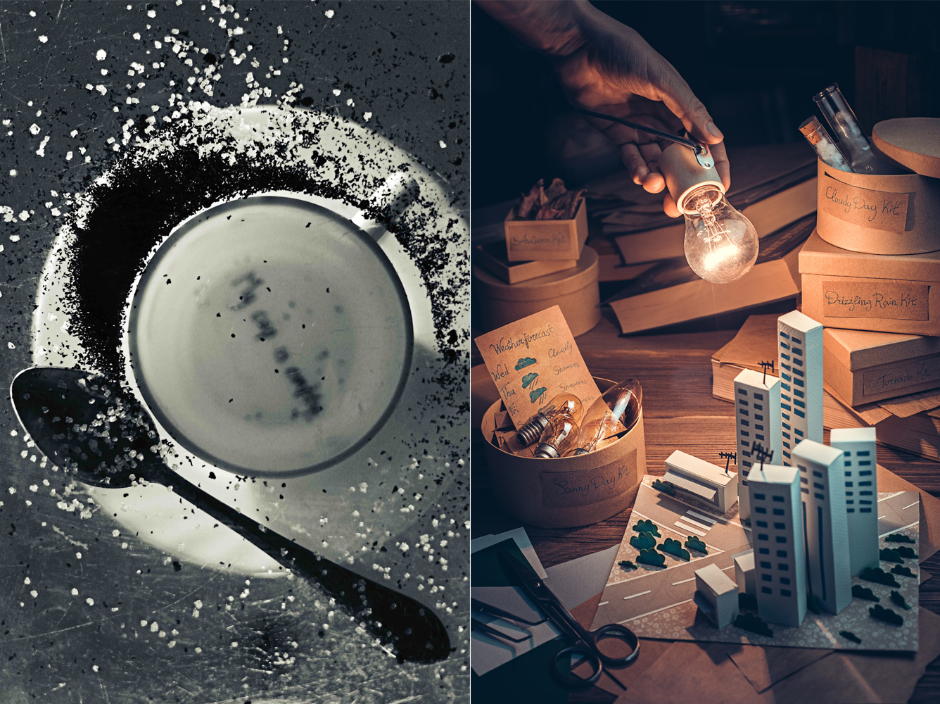
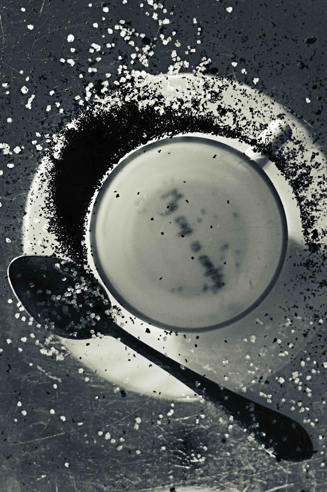
So I decided to choose an average image that was not good — at the time I probably would have though it was a good shot — but not completely terrible. It’s called “My cup is empty”:
Let’s see what’s wrong with it.
Idea and Preparation
I’m not sure that there was any idea other than the thought of an inverted cup. A photo from below through the glass could be an interesting shot if it had been a high-speed shot with splashes of coffee and milk. But, alas, it was not a high-speed shot. So what’s the point? There’s no reason, there’s no story behind it.
I think the cause for this fail is shooting without a preliminary sketch. It seemed to me at the time that the idea, props, and composition could be dealt with while shooting. This is not the way to shoot still life work.
There are genres where the absence of the sketch is a decision of principle, and spontaneity is an asset. But this is not the case in still life photography. Here, the initial sketch would help to structure your thoughts and figure out what you want to say.
At the time, I just didn’t know that it was possible to plan the shoot in advance. I’m certainly glad I know it now.
Inscription
It seems that I used to have a nasty habit of inserting unnecessary text into photos. There are many interesting and natural ways to put text into your image: make an inscription from flowers, print travel stickers, make a road sign from wood, or just sign a Christmas card.
All this may look good, and even become the center of the image. But the felt pen inscription on the bottom of the cup is, hmm, just unappetizing.
Light and Colour
I did not take care of the lighting in this image. The light is just what was there… It was enough to take a photo that does not look like a dark square.
Also, I find myself asking why the picture was converted to black and white. Was this done on purpose? No, nothing here was done on purpose. The photo is black and white only because it helps to hide the inability to work with color, because it made the image look more “professional.”
I was probably thinking something like, “Josef Sudek‘s photos are black and white. Make your photos black and white, and obviously you will be like Josef Sudek.” Unfortunately, it doesn’t work this way.
Conclusion
The main thing I learned can be boiled down to this: pay more attention to the preparatory work.
If you’ve painted the desired image in your head, it’s a lot easier to manifest it in reality. It is not hard to formulate the idea, prepare the necessary things, and draw a sketch with approximate composition in advance. All these little preparations help you not only get more beautiful and meaningful pictures, but also more pleasure from your work.
To see more from Dina, head over to her 500px profile. You can also license her images on 500px Prime, or visit her Live Journal and Twitter feed to keep up with her as she creates more awesome Still Life work.


Leave a reply