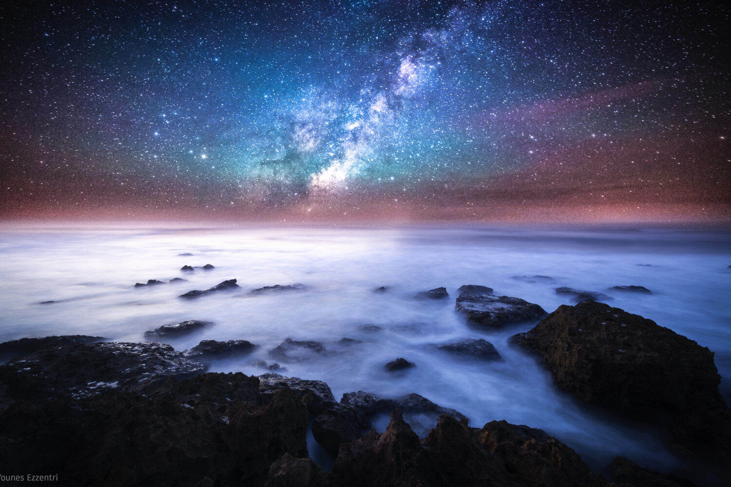
Summer hands photographers a gift: saturated skies, electric greens, bold florals, and light that practically begs to be photographed. The temptation, once you’re in post-processing, is to push all of it further, more saturation, more vibrancy, more pop. But the images that endure aren’t the loudest ones. They’re the ones that feel true. Learning how to capture vibrant summer colors without overediting is one of the most valuable skills you can develop as a photographer.
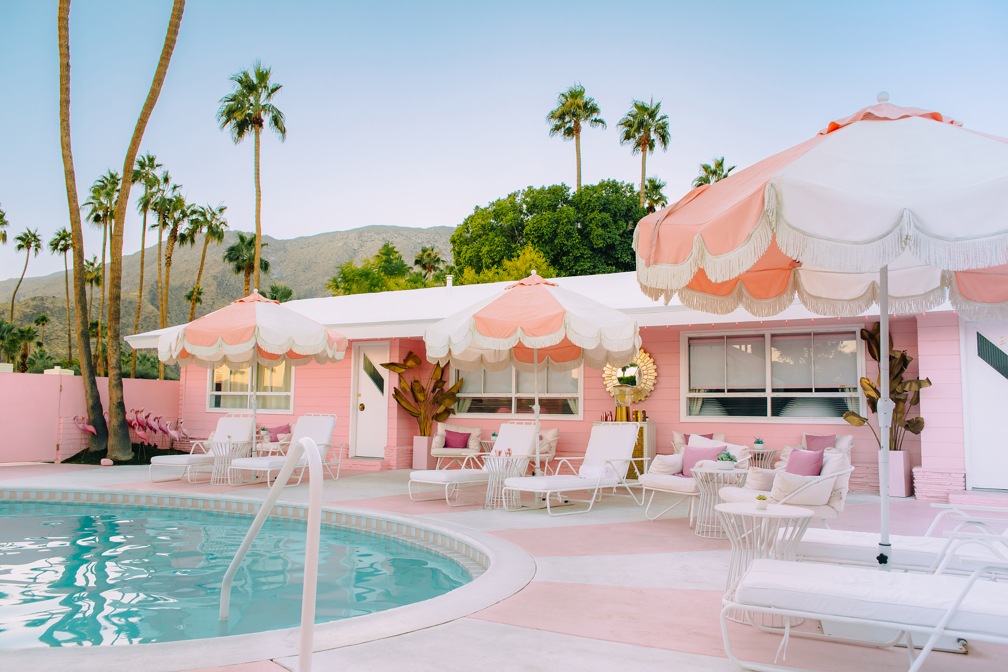
Get the color right in camera first
The best editing decision you can make is needing less of it. Capturing vibrant summer colors starts with how you shoot, not how you process.
Shoot in RAW
JPEG processing bakes in your camera’s color interpretation and discards data. RAW preserves the full color range your sensor captured, giving you far more room to work with in post — without degrading quality when you push or pull tones. RAW files also give you clean, noise-free color at higher ISOs, which matters as summer light fades in the evening.
Set a custom white balance
Auto white balance is convenient, but it often neutralizes the warmth that makes summer light so distinctive. Try setting a manual white balance, or shooting a slightly warmer preset (like “Cloudy” even in sun) to preserve that natural richness before you ever open Lightroom.

Expose for the highlights
Overexposed summer skies lose their color completely; a blown-out blue becomes white. Protect your highlights and lift the shadows in post. You’ll retain far more color depth across the frame.
The overediting trap and how to avoid it
“Vibrant doesn’t mean saturated. It means alive.”
The most common overediting mistake is reaching for the global saturation slider and dragging it right. The result is muddy skin tones, neon foliage, and a plasticky quality that signals “heavily edited” to anyone who sees it.
Instead, work with the HSL panel (Hue, Saturation, Luminance). Bumping the saturation of blues and greens independently, while leaving reds and oranges closer to natural, gives you a vivid summer color palette without blowing up skin tones or flower petals. Small, targeted adjustments almost always outperform broad ones.
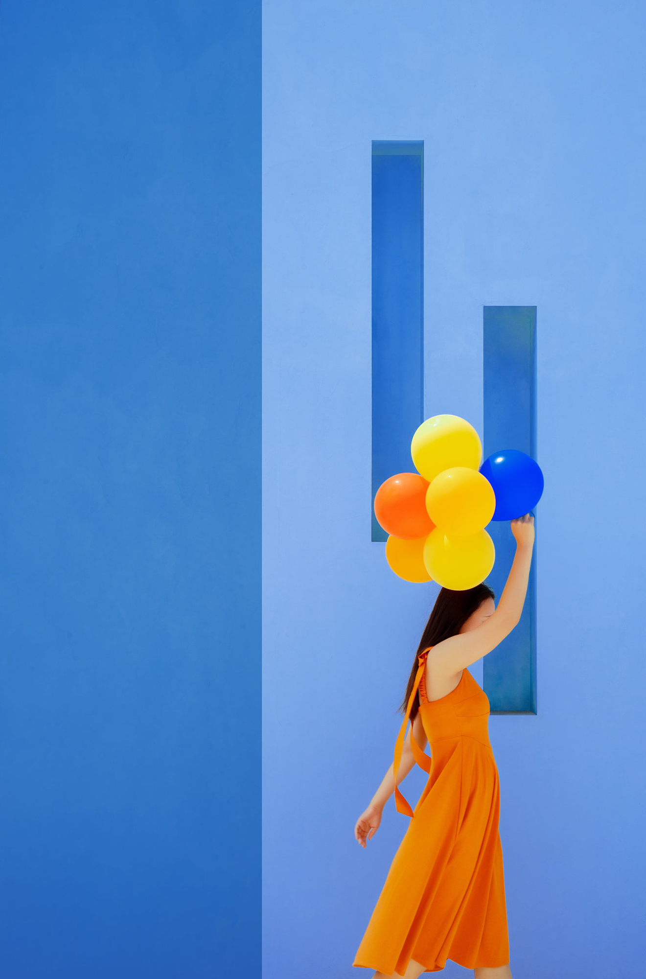
Three editing moves that keep color feeling natural
- Lift luminance, not just saturation. Making a color brighter often reads as more vibrant than simply making it more intense. Try raising the luminance of your key colors before touching saturation.
- Use a subtle S-curve on individual color channels. A gentle curve on the blue channel, for example, can deepen a summer sky far more convincingly than a saturation boost.
- Pull back before you export. After editing, step away for a few minutes and look at the image fresh. What seemed punchy in the moment often reads as overdone with fresh eyes. When in doubt, dial back 10–15%.

Trust the light you captured
Summer light is already doing the work. A sunlit field at 2pm, a backlit subject against a blue sky, a bowl of fruit on a bright windowsill, these scenes contain more natural color than almost any other time of year. Your job in post-processing isn’t to add color. It’s to protect what’s already there and let it breathe. The photographers whose summer work looks effortlessly vivid aren’t pushing harder in post, they’re learning how to capture vibrant summer colors with better technique from the start.