The Association of Registered Graphic Designers (RGD) is a Canadian based hub for the graphic design community, promoting knowledge sharing, continuous learning, research, advocacy, and mentorship. In this interview, we partnered with the organization as they explored how some of their senior creative members incorporate imagery into their day-to-day work. The original post was published here, and has been edited for 500px ISO.
As cheesy and cliché as it is, we stand behind the saying,”A picture says a thousand words.” Powerful imagery can take design and storytelling to the next level. A strong image can tell an entire story, or enhance the one you are trying to tell. We asked Certified RGD Members to reflect on their use of photography in design projects, and share strategies for selecting the most effective photos and capitalizing on current trends.
Contributors:
RANDAL BOUTILIER RGD, Principal at 12thirteen
CAROLINE BRUCKNER RGD, Creative Director at Deloitte
EVELYN CSISZAR RGD, Owner of Evi Designs
ROBERT FARRELL RGD, Principal and Creative Director at Maximum 60 Design
RAJINDER SIDHU RGD, Communications Designer at Vidyard
When do you use photography?
EVELYN CSISZAR: I use photography for corporate communications, brochures, websites – any project where the goal is to prompt a deep emotional response from the audience.
ROBERT FARRELL: Almost every project I work on includes some photography. When developing a brand identity, photography plays a significant part in bringing the ‘story’ together.
RAJINDER SIDHU: Our content marketing team uses stock photos on a daily basis for things like blog posts, guides and reports.
RANDAL BOUTILIER: We use photography for most of our projects – both in print and on screen. Our clients are in the not-for-profit sector, so stock photography offers them more for their budget. We have used original photography in a few instances, but only when budget allowed for it.
What are your main considerations when selecting photos?
EVELYN CSISZAR: My main objective is to ensure a photo matches a client’s brand. Then to ensure the photo is communicating the right message with its subject matter, style, mood, etc. Finally, it’s to find a photo that is professionally done, has good lighting, composition, colors.
RAJINDER SIDHU: It all starts with our tone guidelines, which are used throughout all written and visual communication. On the content marketing side, our main objective is to teach, so we go for a light-hearted, fun style. We also often use visual metaphors for blog posts to add interest. On the product side, we focus on the power and intelligence of our product so photography has a technical feel.
RANDAL BOUTILIER: Our main consideration for selecting a photo is ensuring that it speaks to the subject matter and works well within a particular aspect ratio. We find that web-related image sourcing draws our attention more to landscape-oriented photos, while print heads in a more portrait-orientation.
What features make photos especially effective?
CAROLINE BRUCKNER: Photos that allow the viewer to draw their own interpretation tend to be more attention-getting and memorable.
EVELYN CSISZAR: Lighting communicates mood and emotion (light and airy is positive; drastic shadow or contrast is dramatic, dark). How well a photographer uses lighting to their advantage plays a big role in which photos I choose.
ROBERT FARRELL: With so many stock photography sites, it’s easy to go through hundreds of photographs. When you find the right one, you just know because it’s closest to what you had in your mind!” Robert Farrell
RAJINDER SIDHU: So much stock is so staged. Little imperfections make photos seem more real and easier for viewers to relate to.
RANDAL BOUTILIER: We find that photos with negative background space are particularly effective, as this allows us to extend the image without intricate production work. We tend to select photos that aren’t too stylized, as it gives us the freedom to handle our own visual treatments and corrections.
What are your challenges when selecting photography?
CAROLINE BRUCKNER: Usually you need the image to communicate many things on different levels. On top of having a particular subject in mind, with a single image you might want to project a feeling of security and trust, while not looking overly traditional, with a high-tech feel that’s still warm and friendly. When dealing with stock images, you might need to find a series of images to use in a single piece, so finding a set that works together stylistically while achieving all of the communication goals can be like putting a puzzle together.
EVELYN CSISZAR: Often stock photos will be full of stereotypes and cliches that might communicate a message quickly, but also add bias or are even discriminatory. I like photos with modern depictions.
RANDAL BOUTILIER: The biggest challenge for selecting stock photography is ‘diversity’. While many sites have made strides to reflect a range of people, there is still a lack of examples representing visual minorities, women and seniors.
What best practices do you recommend for using photography in design projects?
RAJINDER SIDHU: Planning and mood boarding work wonders. Establish the art direction to help narrow down your search. When downloading, always work in the highest resolution possible. You never know when your website photography might be needed in a print project. The last thing you want is to double up on your post-production work.
RANDAL BOUTILIER: Avoid overuse – try not to select the ‘most popular’ photos that come up in a search result. Check out other terms that come up when searching for photos – using other search terms can yield other images that work great but weren’t tagged with the specific term you were searching for.
What are your sources of inspiration when working on projects that incorporate photography?
ROBERT FARRELL: I am inspired by photography that allows me to develop a successful design around it; a photograph that works well with the brand’s style, colour palette and font.
EVELYN CSISZAR: Pinterest is the resource I most turn to.
RANDAL BOUTILIER: I look to the fashion world for inspiration – they seem to push the envelope for interesting compositions and integrations with typography.
What design trends are you most excited about?
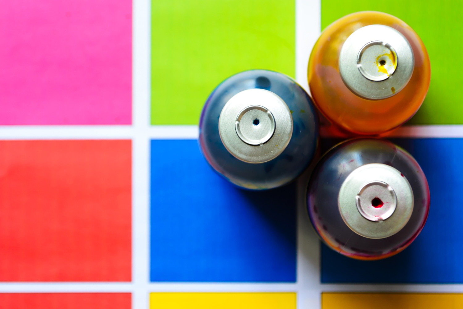
RANDAL BOUTILIER: I see some fantastic “modern”/retro design, as well as the use of bright, big splashes of bold color.
RAJINDER SIDHU: I’m excited that people are excited about typography again. Hand-drawn type, using objects for typography and just the basic ability to do more with web type is great. I’m also excited about the use of colour and shadows. Flat design still has its place, but I think google material design did a great job of taking it to the next level.

RANDAL BOUTILIER: I’m really into the refinement of flat design into an illustration style rather than for icon-driven navigation.
Thanks to RGD and all participants for making this article possible. For more image inspiration, check out the 500px Marketplace.
Leave a reply