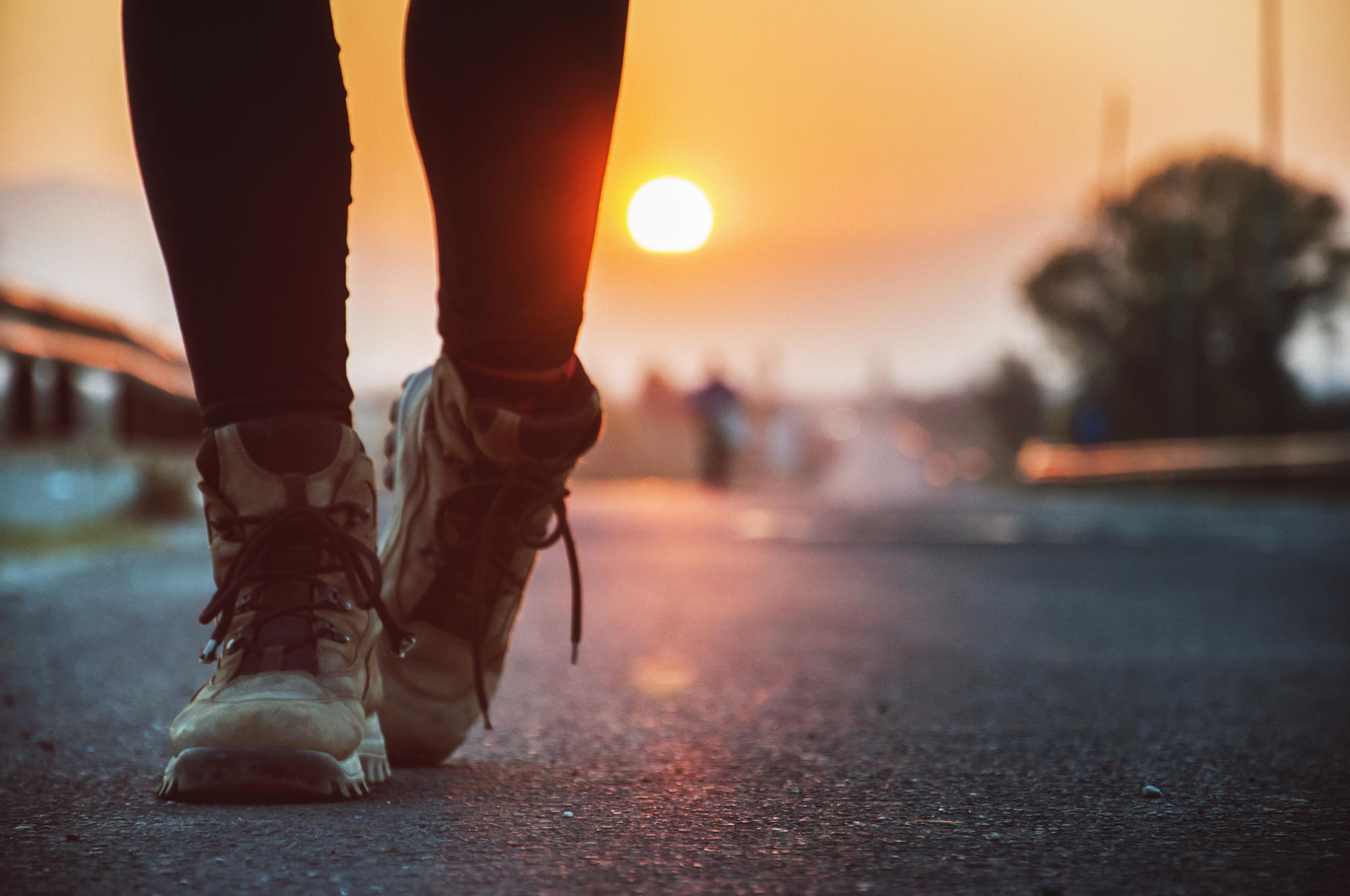
Keep Exploring by Marjan Petkovski
Hey photographers, designer here. Just wanted to let you know we love you. We love what you create. Without photos, our job would be very boring. And since you make our jobs so much better, we’d like to do the same for you and pass on some tips on how to get more out of your licensable photos.
1. Proper Keywording
We can’t license your photo if we can’t find it, and we don’t want to browse hundreds of pages if we don’t have to. Having a well-keyworded photo will help us discover it.
Include more than just the physical properties of the subject (like “tree” or “women”), add keywords of what emotion the photo conveys as well. We often search for “calm” or “adventurous” when we need a little extra inspiration. Try to have least 15 keywords on each photo (use multi-photo editing to add tags to a bunch of photos at once).
2. Photos that Tell a Story
Gone are the days when photos of people in business suits shaking hands on a white background were the norm. Now more than ever, we want photos that help tell a story. Photos that have emotion and style. Something that really captures the viewers imagination. And, selfishly, we want to find a photo that allows us to write less copy. Let the photo do the talking.
3. Natural People, Natural Environment
One of the best ways to set the tone of a product or site is to use a photo of a person who represents your target audience. We are always looking for great photos of natural people in a natural settings. While photos of models in a studio are fine in some situations, nothing beats a candid (but professional) shot.
4. Negative Space
Full screen photo backgrounds are a very popular design pattern. They require an amazing photo to help shape the message (see: #2); however, we still need to have room for headlines, bylines, and buttons.
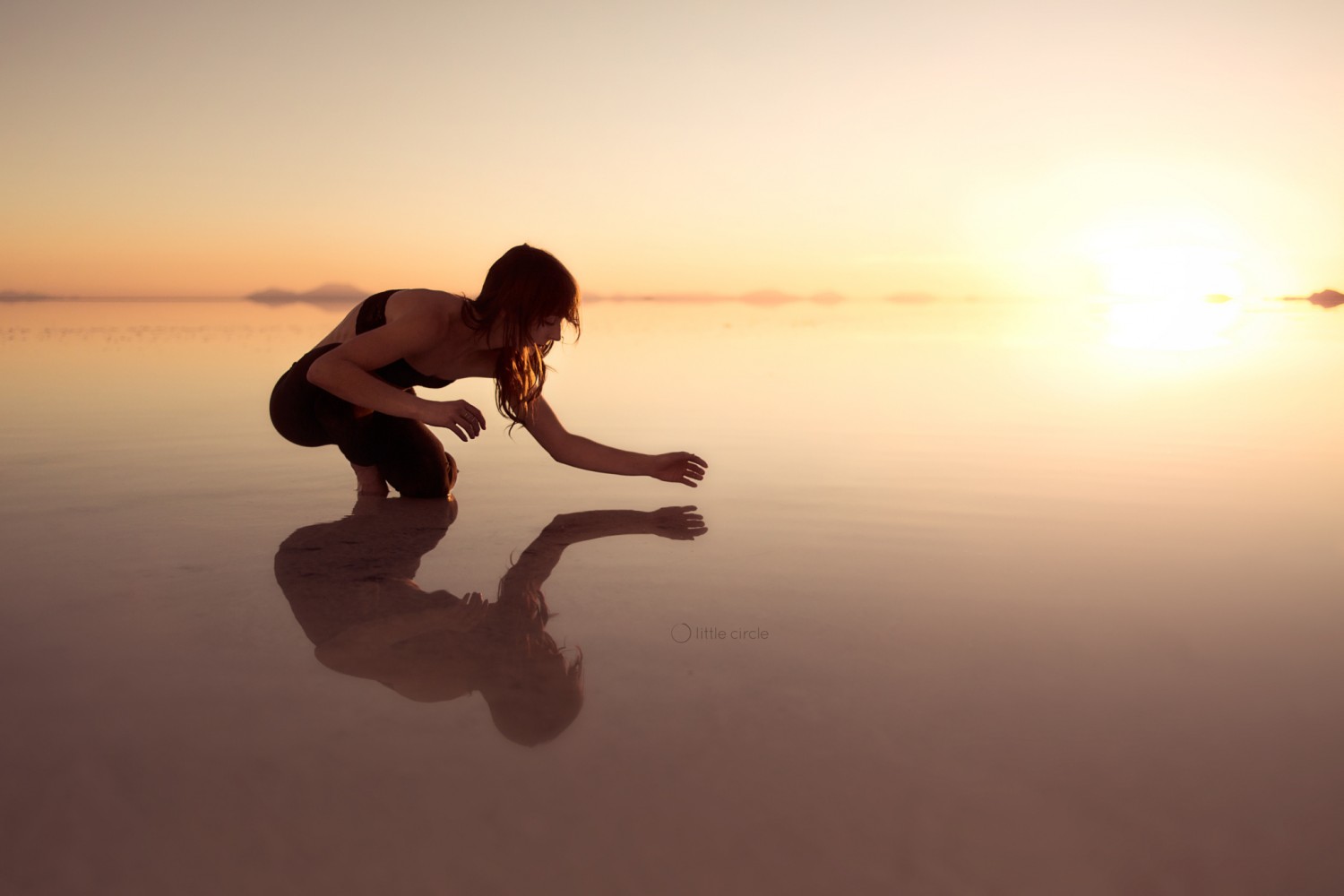
It’s great when a photo has been composed by the photographer to have the subject offset to one side, leaving the opposite side free to place those other elements. It’s always better than a designer trying to re-crop a photo to match their needs.
5. Minimal Colour Palettes
When we’re looking to use a photo to support some other content, we love to use photos with a minimal colour palette. It allows the photo to integrate into the design instead of standing out too much. They also make for great full-screen backgrounds.
6. Similar Photos
Sometimes, when we’re looking for photos, we find ones that are almost perfect… there’s just something missing. Maybe it’s cropped too tight, or we need the model in a different pose. Don’t be afraid to upload different angles of the same subject.





Leave a reply