Amelie Satzger is a conceptual and fashion photographer based in Munich, Germany. She’s been sharing impactful, thought-provoking work with the 500px community since 2015, and recently published a series inspired by Stephen Hawking’s works. Amelie shares how she came up with the series, her start-to-finish process, what she hopes viewers get from it, and more.
Q: Tell us a bit about yourself as a photographer—how did you get started?
A: I am a 24-year-old photo artist from Munich, Germany. I just finished my bachelor’s degree in photo design at the University of Applied Sciences and am now a freelance photographer.
I started taking photos when I was about 19. I was going through a rough time back then, and after a while, I realized that my camera and self-portraits were a good way to express feelings that I was not able to talk about.
During my studies, I developed my style a lot. I also started to work a lot with different people, such as models, designers, stylists, and hair and makeup artists. Today, I am shooting colorful, conceptual series and fashion editorials.
Q: How did you get started on 500px?
A: A photographer friend told me about 500px about 4 years ago. I found it really interesting, as it was mainly for photographers, and I started posting my photos.
From the very start until today, I experience the platform as a really supportive community. As there are mainly photographers on 500px, I feel that the comments have a higher quality than on other social media platforms, these people know what they’re talking about.
Also, the team behind 500px has been really supportive. The first few images I posted were chosen as Editors’ Choice, so more and more people got to see my work. Over the years, a couple of magazines have also reached out to me because they found my work on 500px.
Q: Why did you choose to do a series around Stephen Hawking’s works?
A: I was always interested in two very opposite fields: on the one hand, I love photography and art, but I have also always been interested in sciences like physics and biology.
As I chose to study photo design, I was not learning more about these other fields I am interested in, and missed them. So, when I had to choose a topic for my final bachelor’s degree project, I thought: why not combine them? I have always worked with words for my images, like lyrics, stories, and myths. I figured I could also work with the physical statements in Stephen Hawking’s books and visualize them into artworks.
Q: What inspires you about Stephen Hawking?
A: I think what inspired me to work with Stephen Hawking’s books were the first chapters of The Grand Design. I borrowed the book from the library just to read it, but the way the book was written and the way he compared complex physical processes with things we all know was genius.
The analogies instantly conjured images in my head and I was fascinated by the content. I think the simplicity of how he explains physics, coupled with his great sense of humor (which he proves quite a lot in his books) and his reflections of our worldview made me an admirer of his work.
Q: How did you go about translating complex scientific theories into art?
A: I have always been very much a visual person. When I read Stephen Hawking’s books, I would often already have images in my mind, which I scribbled on the side of the page so I wouldn’t forget. Also, while reading, I marked all the text passages to try to visualize them. The way Stephen Hawking describes complex physical processes by comparing them to simpler analogies made it so much easier for me to visualize the theories.
Q: This series has such bright pops of color, which seems like the opposite of space. Was that deliberate?
A: For this series, I still wanted to keep my own set of colors and aesthetics. Before I started to even make the colored sketches, I made a color palette as an orientation for all images, as I wanted all the pictures to fit together in the end as a series. The choice of the colors didn’t have much to do with the theme of space itself, but with my personal taste in colors. I am a really colorful artist—you can hardly find any black and white images in my portfolio. The images should not only refer to the physical theories but represent me and my style as an artist.
Q: The production of the series seems pretty elaborate. Can you walk us through how you created the shots?
A: First, I marked all the passages in the books, which were interesting for me to visualize. I often scribbled my ideas while reading. After finishing the books, I selected 15 text passages that I wanted to visualize and collected all the ideas I had for every thesis by making little scribbles.
After that, I selected the idea that fit the most and created a more detailed, colored sketch. That was important for me, as I had to see which colors to use, so that all the images fit together as a series in the end.
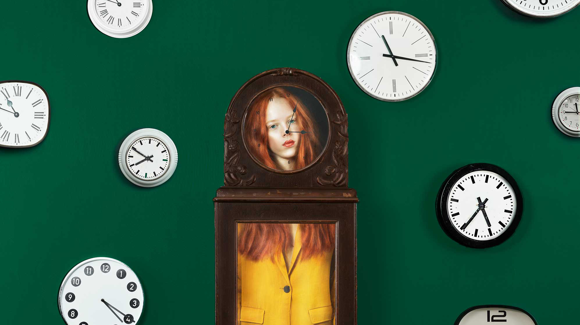
After I made all the final sketches for my 15 images, I started to collect all the backgrounds and props I needed for the photos. I had to buy a lot of different fabrics for the colorful backgrounds and buy or rent a lot of equipment, such as the grandfather clock, a huge mirror, the giant goldfish bowl, giant balloons, etc.
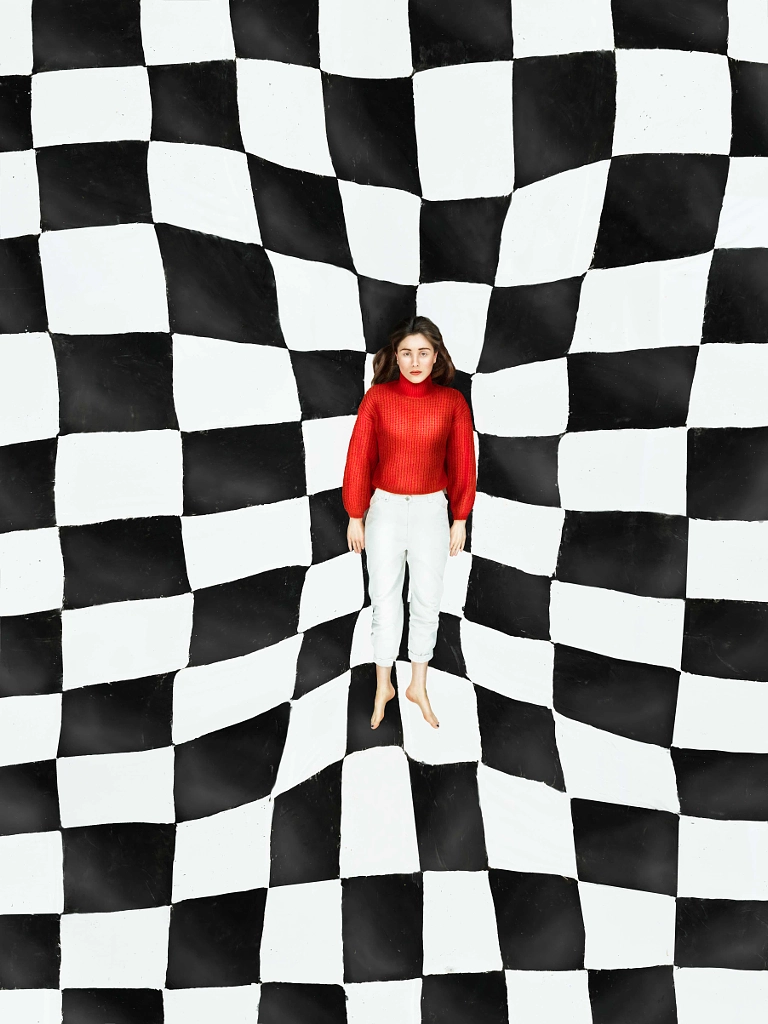
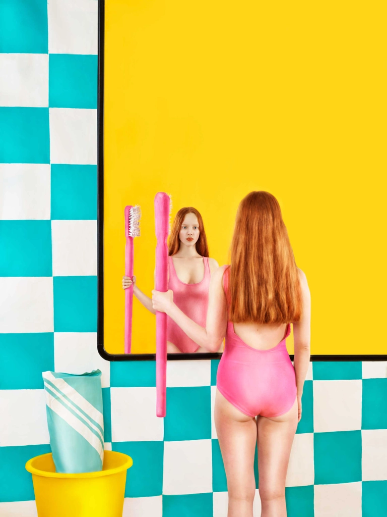
Other props I had to create myself, as they didn’t exist the way I wanted them to be. For example, I built the giant toothbrush and toothpaste. I painted a giant chess pattern on a huge flexible fabric, a blue chess pattern on a white tablecloth for the “bath tile” in the toothbrush image, a frame with the “fences” for the antiparticle shot, etc.
Also, the choice of the people in my photos was important to me. I wanted the images to have a surrealistic touch and therefore I chose a red-haired model, a bright blonde, and a black-haired girl.
Once everything was prepared, it was pretty easy: I had three different shooting days, each one with one of the girls. The post-production took quite a while and included adjusting colors, stitching images together, etc. In the end, I now have a series of 15 artful, composed images.
Q: Tell us a bit about each shot in the series and the meaning behind it.
Dimensions
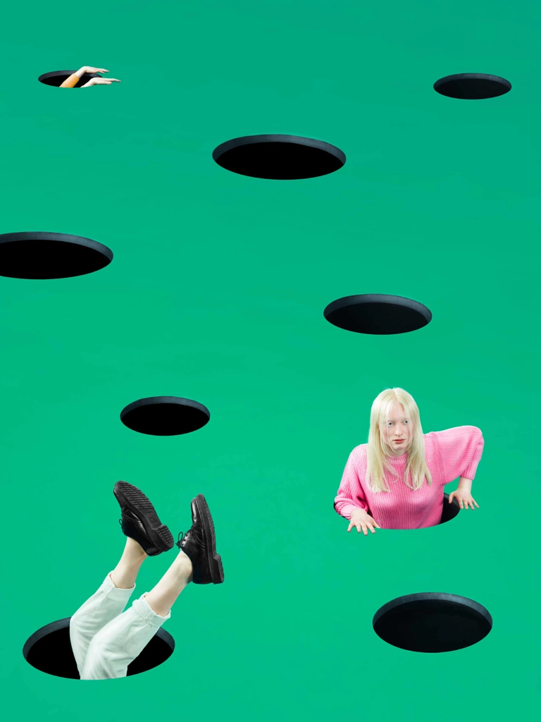
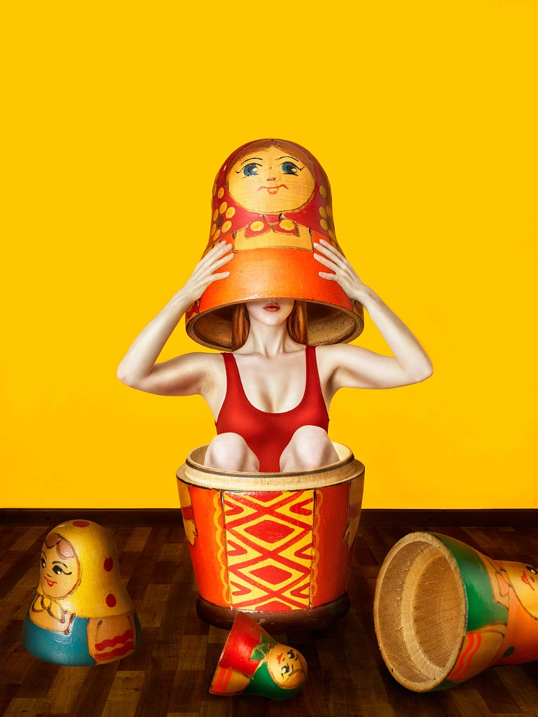
This image is about dimensions. We exist in a world with four dimensions: one time and three space. Physicists were thinking about whether our universe has more, like potentially five or seven dimensions. This question is answered by the anthropic principle, which says that only in a universe with four dimensions would it be possible to have intelligent life, like human beings.
In my image, I visualized the dimensions in the form of a Matryoshka. Three heads (a.k.a. “dimensions”) are already off, and underneath, the fourth dimension is the human crawling out.
Cosmic microwave background radiation
This image refers to the cosmic microwave background radiation. This radiation was more or less randomly found by scientists and is proof that the universe is not static: it had a “beginning” and has been expanding since then.
This radiation is nothing more or less than the radiation we have in our microwave—but this one comes from the universe itself. Even a small percentage of the noise on our television screen is based on microwave background radiation. That’s why I visualized this theory with a wall of noisy television screens and a girl who is searching for the source.
Time dilation
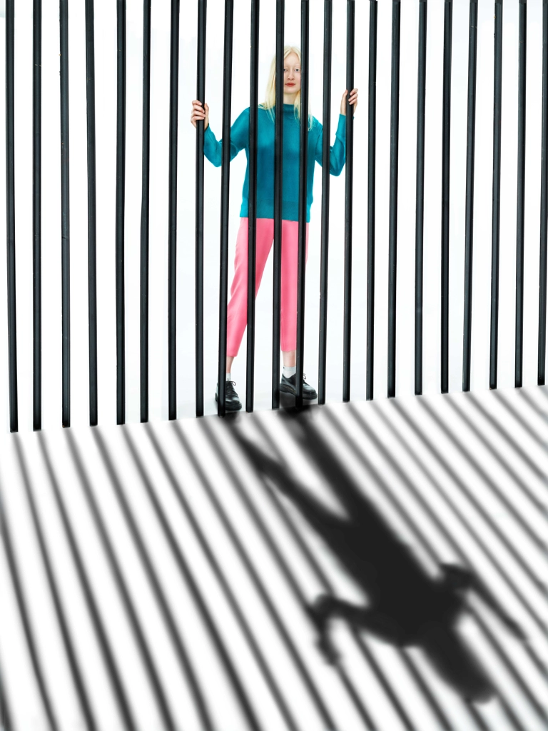
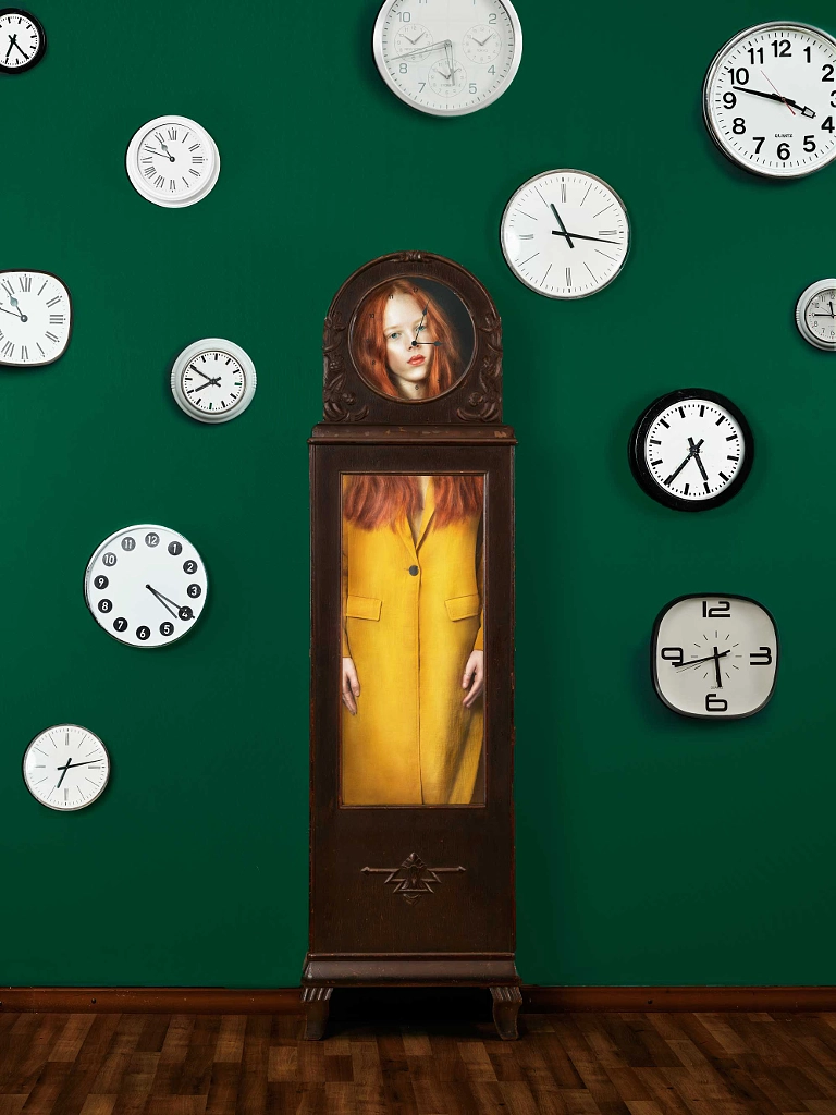
Time is relative. That’s what we’ve known for about a century now. It slows down near a huge body like the earth. We are caged in the time speed that exists on earth, but that doesn’t mean time goes by the same way in the universe. This theme of time is what I captured in this image. The human is caged in earth time, but around him, time is going by differently.
Distortion of reality
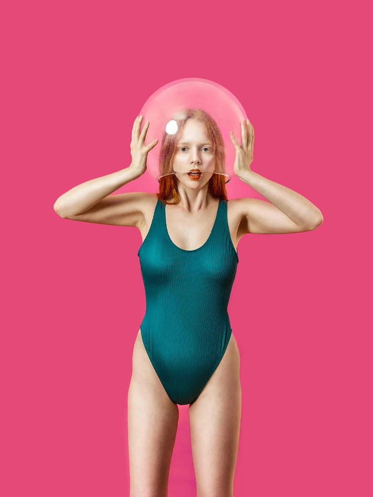
In the beginning of his book The Grand Design, Stephen Hawking describes the way we see the world as if we were all goldfish in a fish bowl.
All of our theories and mathematical formulas are based on the way we see the universe, but what if the way we see the world is distorted?
This picture references this statement and shows a person who is trying to break out of the way we perceive the world.
Q: Do you have any advice for photographers interested in creating their own series?
A: I am a big fan of being intuitive and spontaneous. But before you start shooting a series, I think it helps a lot to take a couple minutes and ask yourself how you want the images to turn out: what is your intention? It often helps to create a mood board, just as an orientation for yourself and to get some inspiration. After you’ve made that clear, I think you’re good to go. Maybe the first few times it won’t turn out exactly how you want it to be, but just keep going, practice makes perfect.
Q: What do you hope people take away from your photos on 500px?
A: I hope that people take a deeper look at my pictures on 500px. They all have a story behind them, whether it’s a physical theory or lyrics they are referring to. I hope the images motivate people to look up the books or the songs that inspired them and listen and read more carefully. And—of course—I hope my pictures inspire people to create photos themselves.
Follow Amelie Satzger
500px: 500px.com/ameliesatzger
Website: ameliesatzgerphotography.com
Instagram: @ameliesatzger
Facebook: facebook.com/ameliesatzgerphotography





Leave a reply