The photographer’s job resembles that of a magician. We tell our viewers: look right here, here is the hero of this story. A magician will use gestures and attractive assistants to guide their viewers’ attention. We have our own methods.
I like calling them the Four Horsemen of Viewer’s Attention.
- Scale
- Sharpness
- Brightness
- Color
The eye usually catches something big, sharp, bright, and warm. Let’s see how it works.
Scale
Scale is the relative (!) size of an object within a shot. Place a small object at the front, and it will make it more prominent. Put a bulky object in the back of a shot, and it will stop looking so bulky.
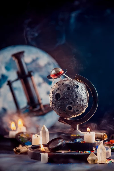
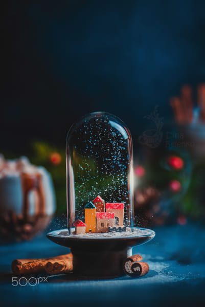
A large kaleidoscope is placed in the background. If you put it on the same plane as the asteroid and UFO, it would take up too much space and probably wouldn’t even fit within the frame. But in the background, it looks perfectly harmonious.
The scale is measured against other objects as much as against the frame of the shot itself. Here, the composition is framed too tightly, almost touching the edges. This leaves the shot feeling suffocated, as if you need to step back and take a breath.
In contrast, this one could use a tighter crop. Otherwise, the donut seems to be floating in an infinite, cold, indifferent space.
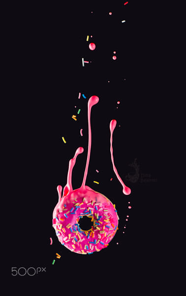
And here’s a better crop!
Sharpness
This should be really obvious. What should be in the focus? The main character, of course!
The real question here is the extent to which we can blur the background.
If you have an obvious hero that you want to separate from the background, you can work with maximum blur. However, if you have a hero working with an ensemble, it’s important to set sharpness in a way that doesn’t turn the support team into indistinguishable blots.
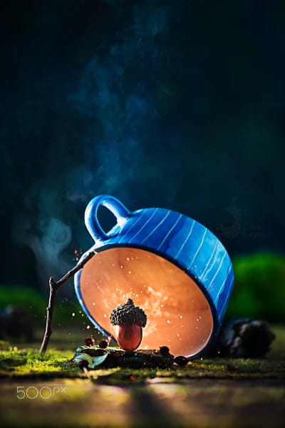
Here I don’t want the background to blur into bokeh, making all the objects in the back completely unrecognizable. I want the viewer to be able to make out the outline of the cup of hot chocolate and the pine branches. The fine details on these objects aren’t important to me, so I need a fairly strong blur, but not 100%.
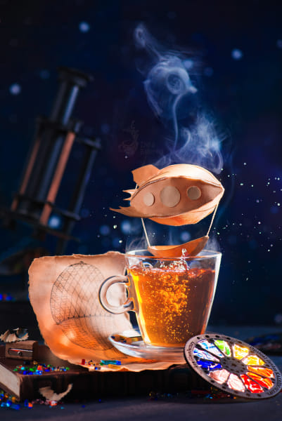
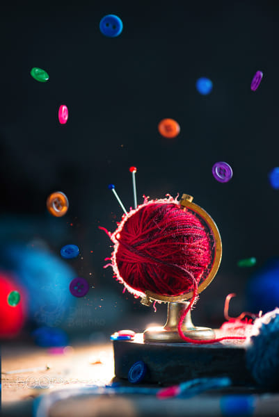
There’s a kaleidoscope in the background. Its details are blurred, but the shape is still easily recognizable. Why do I need it in the frame? It adds dynamic upward movement and clarifies the identity of the colorful disk in the foreground.
When building a composition, we work with tangible objects that eventually become pixels on the screen. Even when blurred, we see these objects—like books or a kettle—because we know what they are. But the viewer, lacking this context, only sees a blurry blot, which can be distracting, causing the main subject to get lost in the scene.
In this case, the stack of books on the left isn’t just bright on its own; it also creates a rhythmic structure of parallel lines that distracts the eye. It would be much better without it.
So, sometimes if the object gets turned into an unidentifiable blot, you may want to remove it from the shot entirely.
Brightness
Obviously, the brighter the object, the easier it is to see. That doesn’t mean, though, that your main objects must shine. It simply means that if your main character gets lost in the shot, you can either aim some light towards it, or cut some lighting from the back, putting any distracting objects in shadow.
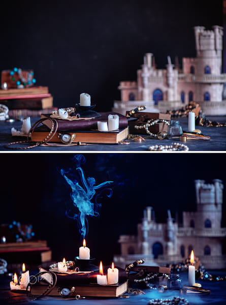
In this example, the lighting in the foreground stays the same, but it looks brighter thanks to a black flag that darkens the castle in the background. This makes the candle and the ballerina look brighter.
Here, the backlight doesn’t make the main object overall brighter, but accentuates the outline drawing our attention to it.
If you want to take this technique to the extreme, try creating a bright glowing spot with smoke or a sparkler.
Color
The warmer the color is, the easier it is to notice. This effect can be further amplified by adding contrast with the background.
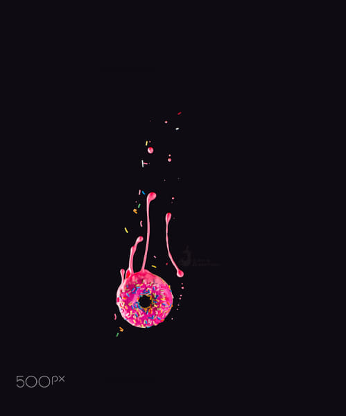
Compare these two donuts:
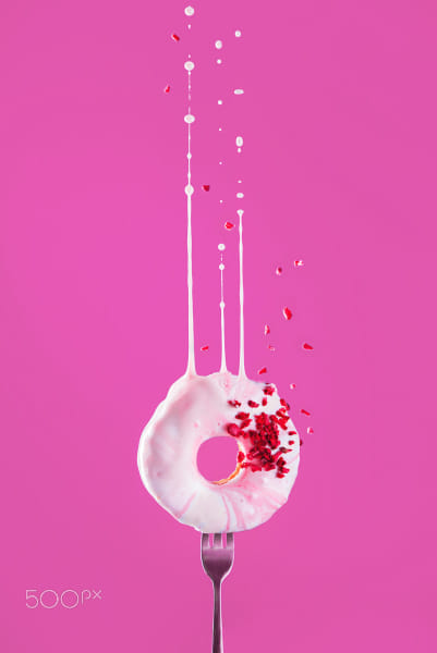
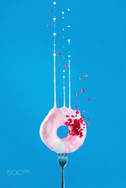
The donut looks more harmonious on a pink background, but more active and prominent on a blue one.
If you want a multi-object setup to look less chaotic, group your props based on color.
A photo palette is called that because it is, in fact, a palette, it does not feature all the colors of the spectrum, only the ones that you chose for your shot.
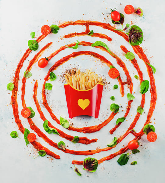
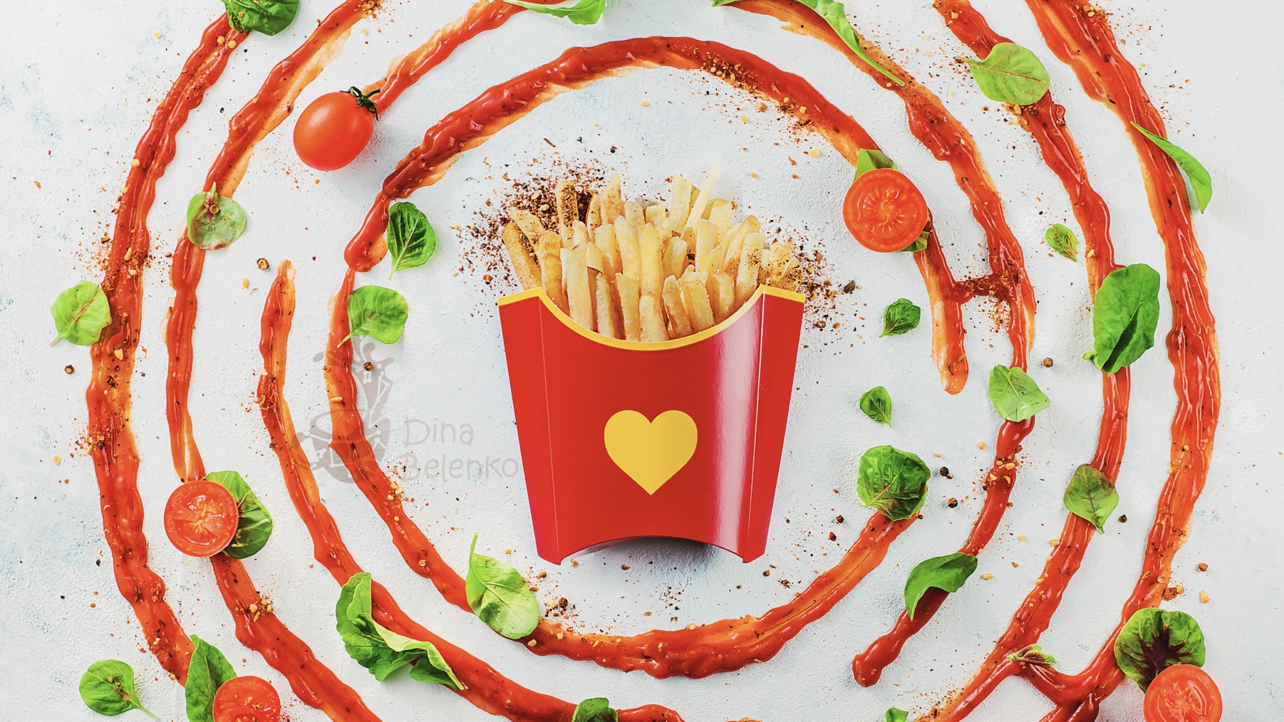
There are many small objects here: tomatoes, leaves, and scattered spices. But they easily group into two clusters: red and green. As a result, the image doesn’t feel overly busy or cluttered.
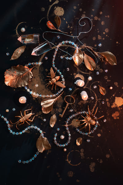
The entire photograph is done in two colors: gold on black. There’s no color contrast, but there is a contrast in brightness (light, shiny objects on a dark background).
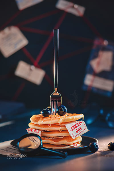
Here, colors are rhyming. The “Top Secret” label is red, so the threads of the mind map in the background are also red. The color of the paper is close to the color of pancakes. And the blueberries echo the blue shadows and highlights in the background.
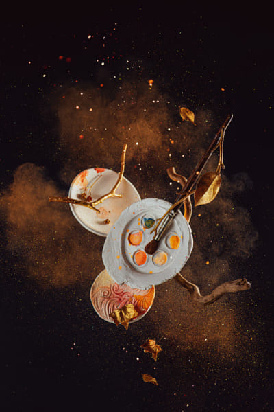
Here, the choice of color has a narrative significance. Gold, orange, and brown are the colors of autumn. Red is also an autumn color, but it seemed too bold for this shot. The calm palette is balanced by the explosive (literally!) movement.
It’s like coordinating an outfit. Wearing all your best pieces at the same time might not be a good idea. As in any outfit, colors need to go well together. In photos they can either rhyme or be in contrast with each other.
There’s a lot to be said about the Four Horsemen of Viewer’s Attention, but this is a quick outline to get you started. Hope it is helpful and motivational—stay inspired, and good luck!
Not on 500px yet? Click here to learn about Licensing with 500px.
Leave a reply