Matt Kloskowski Matt is the Vice President of Photography for onOne Software and a Tampa-based photographer. He’s a best selling author of over 20 books and teaches Lightroom and Photoshop at seminars and conferences around the world. In his spare time he practices as a 2nd degree black belt in Taekwondo and manages to sweat his ass off at Crossfit 5-6 times a week. When not working you’ll find him with his family in Tampa, FL.
You can find out more about Matt at his personal blog, as well as more of his training and videos at onOne Software. This article was originally published here, and is being reprinted with express permission from Matt.
Over the holiday break, Evgeny Tchebotarev (co-founder and Chief Photography Officer of 500px) asked a small group of people to be “guest” editors at 500px for the month of January. Being a HUGE fan of 500px for many years (here’s a link to my portfolio there), I was honored and jumped at the chance.
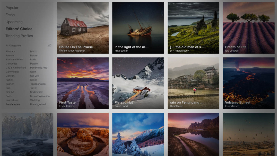
See, if you didn’t know, 500px has an Editors’ Choice section of the site. It’s just another way to kick-start the photo browsing experience when you first hit the site, and it’s a really great way to help photographers get their work out there.
My only real task as Editor for the month, is to go through and pick photos for the Editors’ Choice section. So far, for the first 7 days it’s been a hugely inspirational experience. It’s really forced me to spend some time going through the photos a couple of times a day, and looking at a lot of different photographers. If you want to see the Editors’s Choice section, you can of course go here. But rather than just show off photos (because 500px already does that really well), I thought I’d write about what I’ve learned so far by looking at the site in a different way than I used to.
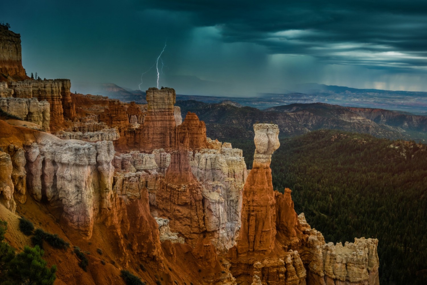
1. Naming Photos — I’ve never been one for naming my photos. I see photos all the time with really corny names. Like one time I saw a waterfall photo named “As she weeps softly” (ugh! I’m gonna be nauseous just saying it) 😉 So I’ve stayed away from naming my photos. But as I look through hundreds of photos at a time, I’ve realized that a well named photo actually shows you what to look at. Often, especially in landscape photos, there’s a lot going on. But a simple name can really help the photographer, help move the viewer in to seeing what they want them to see in the photo. Now, I still think “As she weeps softly” is a horrible name. But something like “A Silent Path” (by Takahiro Bessho), really works for a photo like this. There’s a lot to look at, and as soon as I see the title I settle down in the path.
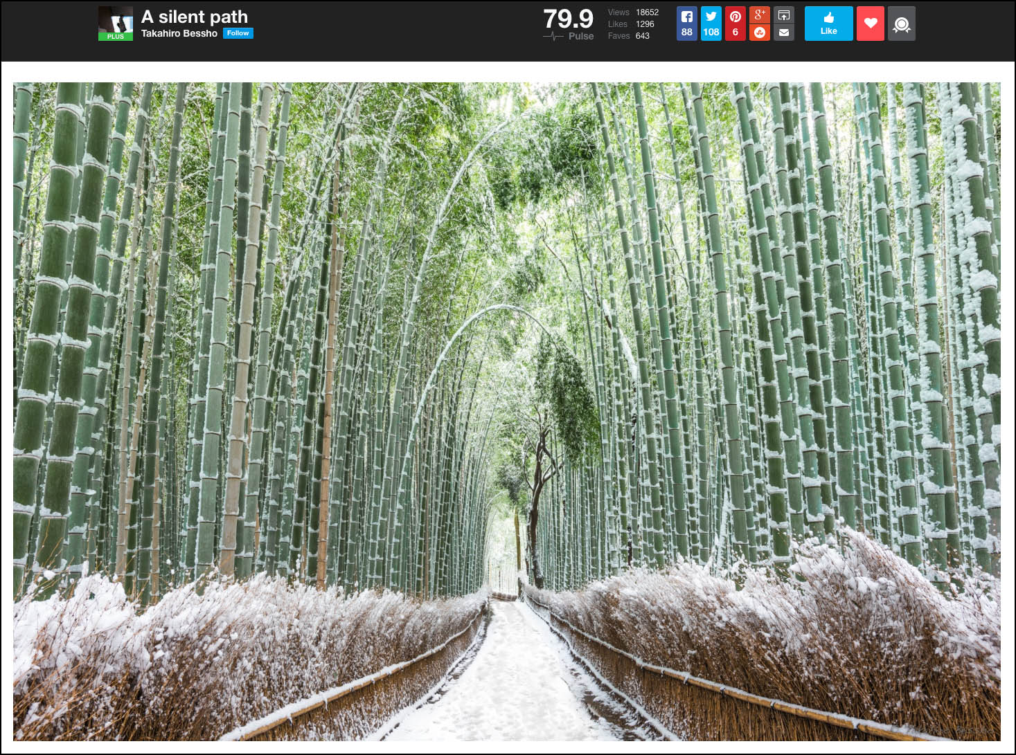
Long story short… name your photos. It doesn’t have to be a very witty or creative name, but “Sunset at Mesa Arch” is better than “Untitled” or worse, “DSC_4032.NEF” as your photo name (yes, there are photos that have the original camera-given name as their title).
2. The Importance of Small Thumbnails — From now on, I any time I post a photo somewhere that shows a small thumbnail, I will resize my photo and look at it at that size. There’s been so many times where I think I’m gonna love the photo (based on the small thumbnail), and I don’t. Then, the opposite happens. I don’t think I’m gonna like the photo, and when I see it larger, I love it.
Also, there’s one huge advantage of seeing your photos as a small thumbnail. It deals more with post processing than anything. See, photographers today LOVE detail/contrasty effects and plug-ins. Dynamic Contrast from onOne, Clarity in Lightroom, you name it. We love to add it. But the downside is that sometimes you get a glow around things. Believe it or not, sometimes that glow is hard to see on the large image. But for some reason when you see the image smaller, the glow appears. I’ve noticed this a bunch of times so far on 500px and I’ve even seen it in my own work. So from now on, I’ll make sure I look at my photo as a smaller thumbnail before posting it.
On a semi-related note, just a few minutes ago I was looking at a conference website in our industry. I noticed the instructor bio headshot were smaller (like the size of 500px thumbnails) and was amazed at how many looked weird. A lot of eyes were over whitened, and skin over retouched. When you clicked to see the larger version you could still tell, but it was way worse when it was small.
3. Details! — You’d be amazed at how many people miss the details like spots and crooked photos. Here’s how I can relate this to you. You know that song that’s out right now by Taylor Swift? “Blank Space”. Everyone thinks she says something about Starbucks Lovers. I know I did at first. But then some one told me what she really says (“Got a long list of ex-lovers”). Now when I hear the song I can’t hear anything but what she says. I’ll be sitting right next to my kid who swears she says “Starbucks Lovers”, but I don’t even hear it now. (please don’t make fun of me for knowing this… I have teenage kids) 😉
Well, it’s kinda the same thing with dust spots and crooked (both horizontal and vertical) photos. Once you “see it” in a photo, it’s hard not to look at every photo again without seeing that stuff immediately. So… my advice to anyone posting a photo (anywhere for that matter).
- Use the Spot Remove Tool in Lightroom or Photoshop — Lightroom even has a “Visual Spots” checkbox that’ll help you see them more clearly.
- Use the Straighten tool on your photos. If there’s a horizontal surface, then drag the tool along that surface. If there’s a vertical surface or object (like a tree, fence, or house) then drag the tool vertically along it.
4. Time of Day — This one is simple. I see so many photos of beautiful places taken at the wrong time of day. I’m looking at the photo and I want to click on my little “Editors’ Choice” button so badly because I know the potential of the photo. But I just can’t because right next to it is a gorgeous photo shot at sunrise or sunset. I know it’s not always possible to shoot these places in the best light, but it really does make a difference.
5. Expression — I don’t shoot a lot of portraits, but I have a huge appreciation for them. And one thing I’ve learned over the years is that it’s all about expression. Now, there’s a lot more to a portrait. Lighting, posing, background, etc… But what I’ve learned by looking through a lot of photos is that you’ll tend to forgive lighting that may not be perfect, or something in the background that isn’t quite right, if there’s a great expression on their face. Everything else becomes less important when you see that genuinely happy smile, or that truly contemplative look.
If you’re not already a member of 500px, I’d encourage you to check it out. And make sure you check out the Editors’ Choice section. It is definitely the first place I go to whenever I need a little inspiration for a photo shoot or I’m traveling somewhere. Most photographers not only post photos, but they post a little story to go along with it and you can usually see where the photo was taken.
Oh, and a big thanks to Evgeny for inviting me to be a guest Editor this month. He’s got a beautiful portfolio too so make sure you check his page out.
Have a good one!




Leave a reply