Stock photographs are everywhere — billboards, magazines, brochures, and websites. They can be found in viral memes and even political ads. Even Bliss by Charles O’Rear, the background for Windows XP — often called the most “recognizable” photograph in history — got its start on a stock photography website.
Stock photographers often work without clear-cut assignments and with full creative control over their work. As a result, stock photography collections like the 500px collection on Getty Images are astonishingly diverse and dynamic. And while there is no “formula” for creating a profitable stock photo, there are certainly some tried-and-true traits and themes best-selling images all seem to share.
Top Licensing Contributors anticipate the needs of image buyers, and they approach every shoot backed with a keen understanding of how the market works. Here are eight tricks for creating commercial images that hit the mark, whatever your subject or style.
Tip 1: Aim for the unexpected
These days, buyers can find images for almost any subject imaginable, so those generic stock photos of decades past won’t cut it anymore. Run some searches on 500px and Getty Images to see what other photographers have done before you, and brainstorm different approaches. The more creative you can get, the better.
Brotherhood, a picture by Burak Kiliç pictured above, is a great example. Almost anyone can take a cute photo of their pet, but by capturing the friendship between species in a fun and quirky way, this photo provides the element of surprise. Searches for “dog” and “cat” bring up 346,369 and 255,382 images on Getty, respectively. Search for “dog cat,” however, and you’ll find only 5,215 images. As you might have guessed, Kiliç’s photo takes the top spot.
Tip 2: Shoot what you know
The best-selling photos you see on the web should serve as an inspiration and a point of departure, but you don’t want your photos to look exactly like everyone else’s. The secret to selling photos isn’t emulating but innovating. You know your town, village, or city better than anyone, and you understand what makes it special. Give your portfolio an edge by staying close to home and photographing things others can’t access. Consider the shot above from the Erma River Gorge by the Bulgarian photographer Tsvetelin Pavlov. There are already countless shots of famous landmarks available for Licensing, but few people can say they’ve ventured into an eerie tunnel like this one.
Tip 3: Leave room for interpretation
Even if you’re working with a specific theme or subject matter, keep things broad enough to apply to a variety of campaigns and projects. 500px Contributor Devesh Tripathi captured his stunning photos at Holi DC — a Hindu festival marking the start of spring — and that local appeal is part of what makes them unique. But at the same time, the images have massive appeal across the map.
“It’s not the recognition it got that amazes me, but the number of interpretations people have presented for the same photograph,” Tripathi wrote on his blog last year. “While my friends in the advertising business called it a great material for marketing, non-profit organizations saw a positive vibe, hope, and a representation of strength.”
Tip 4: Get trendy
Top Licensing Contributors spend a lot of their time researching creative briefs, following the news, and staying plugged into social media. Some subjects, like cats and dogs, are evergreen in stock photography, but others are on the rise, like climate change and vegan food. The 500px Content Team is on the lookout for images that represent the global public, so tap into subjects that are affecting people around the world in real-time.
If your friends are talking about the election, water scarcity, or the gender pay gap, find ways to illustrate those topics in your photography. Above is a beautiful and fascinating wildlife photo by Brenda Passchier, but beyond that, it also speaks to pressing concerns about endangered species like the proboscis monkey.
Tip 5: Think like an art director
Use color and composition to make your photos “pop” off the screen. The difference between great stock photography and user-generated content is a level of professionalism. Combine vibrant colors, impeccable styling, and the classic rules of composition to create images that feel high-end and polished.
You’ll notice that top stock photographs sometimes use a shallow depth of field to separate the foreground from the background — a handy trick for minimizing distractions and bringing focus exactly where it should be. Aim for simple, clean compositions that feel effortless and uncluttered.
Tip 6: Find interesting ways to photograph mundane things
It’s not always the most beautiful images that sell well, but the ones that have practical purposes. While it’s true that top-selling photos are often aspirational, they also need to be practical. Buyers need photos of ordinary objects and products, so think about the things you interact with every day. Apply the same technical standards to everything you shoot, whether it’s an awe-inspiring landscape or a cup of coffee.
Tip 7: Use people to tell a story
Stock photographers talk a lot about “storytelling,” but what exactly does that mean? While there are countless ways to suggest a narrative, one classic technique is to incorporate a real-life character or hero. If it feels appropriate, include that personalized, human touch in your work.
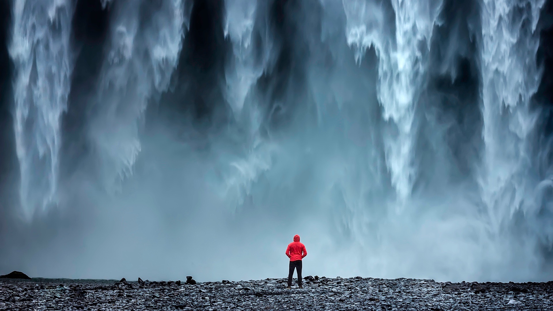
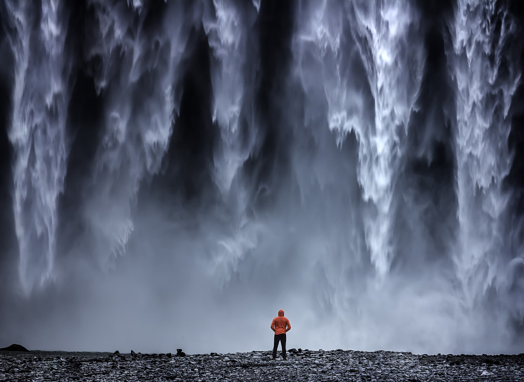
Iceland is a popular destination for photographers, and there’s no shortage of landscapes for buyers to choose from, but by asking his wife to stand in front of this massive waterfall, 500px Contributor Shutter Chemistry has given his photo above an advantage. This image could easily appear on a travel brochure for Iceland, but it would also be at home in a magazine article about conquering your fears and reaching your potential.
Tip 8: Mind the details
Stock images depict people, places, and things, but they also capture emotions and sensations. The Atlantic’s Emma Green once described looking at stock photo of hot chocolate and marshmallows and instantly and inexplicably “knowing” it was about wintertime. So how do photographers tap into our feelings?
It all comes down to the details. This whiskey photo above by Maksym Fesenko immediately transports us to an old-fashioned, upscale bar because the artist has paid close attention to the placement of each and every prop, from the ice to the spoon to the wooden table. If any of those details were missing, we’d lose some of that unforgettable mood and atmosphere.
Click here to learn more about Licensing with 500px.












Leave a reply