Daniel Stavro Girizd is an artist based in Novi Sad, who is into writing about himself in third-person… Or maybe not.
I am 27-year-old digital/visual artist from Serbia, finishing studies that have something to do with graphic design, and during last 5 years I have been into photography and retouching, fire performing, costume designing, stilt walking, and video producing.
My passion is creating badass images. Not out-of-the-camera photos, but images. That means I will use whatever means necessary to achieve the final look I have in mind, even if it requires setting my head on fire. And if that doesn’t help, I still get to keep the thrill of the moment.
The Story
Here is a not-so-short story behind post-processing and shooting of this image:

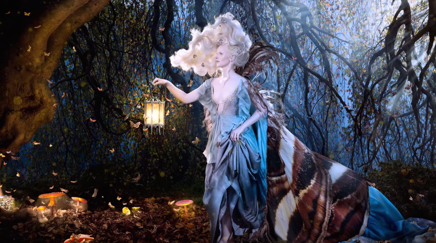
Yesterday, I went out for location-scouting with Jana Zurovac, a girl that is going to be featured in a new music-video for the band Wolfram, for a song she is also being featured in (A Different Kind Of Sleep).
She was dressed up in a beautiful dress by Nataša Vraneševi?, and while we were taking a break from shooting test-videos, I told her to stand on a spot where sun was coming through nicely, and shot few shots with my 5mp cameraphone (Nokia Lumia 520).
I love shooting with this phone. I broke two Lumias because I am reckless, this is now my third one, heh. It is more of a personal challenge to post on Instagram shots that are made by phone-only.
I usually shoot with Sony a6000 or D7000, with variety of Samyang and Nikon lenses, and although I had my Sony with me, I only had the 16-50 OSS 3.5-5.6 kit lens with me (good for video, not really sharp enough for stills), so I decided to use my phone.
Most of these decisions are made when I decide I would like to re-shoot the same shot with more production value being put into it. So basically, those great shots you may see on my Instagram are all just mock-ups of shots I wanna get back on to and capture better with proper gear.
But really, for web purposes, a 5MP phone camera is good enough if you know how to handle exposure in the beginning and fiddle with it in post.
Post-Production
Speaking of post-production, this is the original shot here:
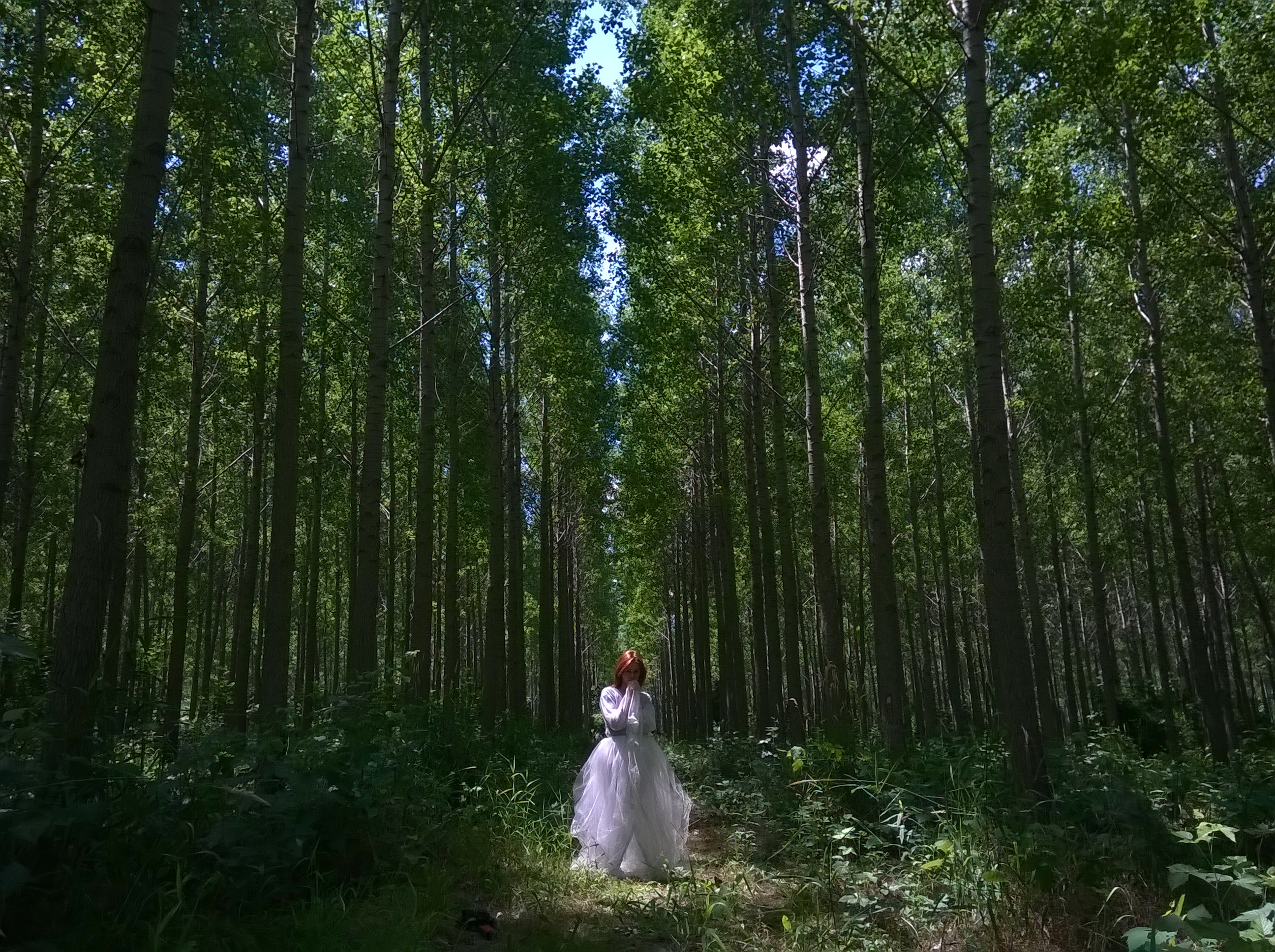
There were two shots I decided to use and photomerge them via bridge/photoshop, since my initial idea was to make a square image (vertical panorama).
So I selected them both and did a basic edit in Adobe Camera Raw, with a bit of selective color adjustments on the model’s hair, skin tones, and dress.
I also raised the saturation, sharpness, and clarity on the hair, and warmed it a bit so it stands out among all those greens:
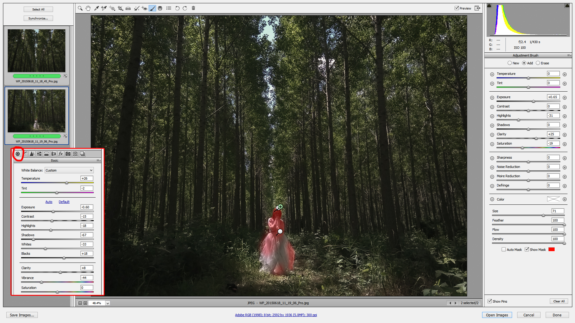
With jpegs, you have to be careful to make nice transitions between blown-out parts and parts that still have some info in them.
After merging pics with PS, and trying out a square format, I decided to try and go with 3:2 format instead (this Lumia shoots 4:3 which covers wider area than its default 16:9 mode).
I cropped the image in ACR, opened it as Smart Object in PS, and did some enlarging (10%, then 10% of enlarged pic, then 10% of enlarged pic… you get the idea). I just randomly click on my pre-made Action for 10% enlargement, 5-6 times.
The reason I do this is that many settings in ACR and Photoshop treat different-sized images differently, and I’ve found that with (forcefully) enlarged images, I have more control when editing them—10% by 10% preserves the most details (kudos to the article about this that I read some time ago… cannot recall the original source unfortunately).
Also what I love doing, and did here as well, is saving the enlarged image as a TIFF, and continuing to edit it in ACR before the final color correction. I do these steps also when shooting with Sony and Nikon in higher res.
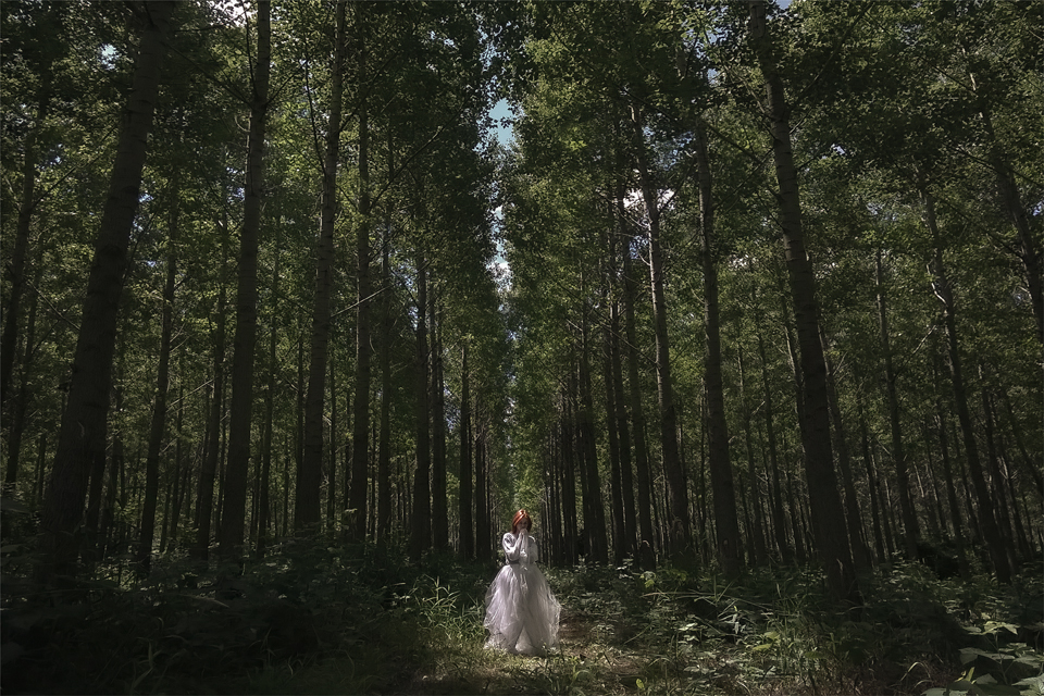
Here is the merged pic after enlarging and cropping:
After doing some more selective sharpening on the model with brushes in ACR, I opened the image in PS (as Smart Object, of course), and messed around with Adjustment Layers, mostly focusing on Selective Colors—changing greens, yellows, and blacks, toward blues and cyans on this particular image.
This is the tricky part, and there is much more to it that I could write actually, but let’s leave it at this.
Now, vignettes. Vignettes are important. They focus your attention on what you want to pop-out. I do them mostly via Adjustment Layers, using Levels and Curves, by darkening everything to my likeness, then “deleting” the parts on mask that I want to leave brighter with Radial Gradient (if there is banding in gradient, just add a bit of Noise on that mask).
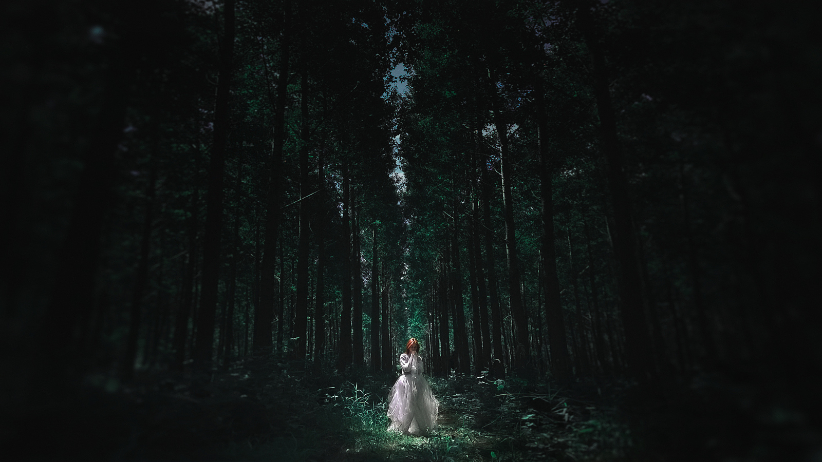
After I did all of those corrections and came up with final colors, I decided that 16:9 would give more drama to the look of the image, so I just selected and stretched out the sides of the image with Free Transform.
For a bit more focusing on subject, and hiding those ugly stretched trees, I used Iris Blur in PS.
Then I merged all the layers, saved the image as a TIFF again, added some noise in ACR for a more organic look (I always do this last), did conversion and resizing to JPG for different web purposes, and here is the final image that I have put on Instagram, my FB page and 500px:
This is the look I will strive to get in the video as well, so you could consider this a teaser.
For some more sweet pics of mine, here is my website with narrow selection of works: http://www.stavrography.co
And FB page, with widest selection of works: https://www.facebook.com/stavrography
You can also find me on 500px: https://500px.com/stavrography
I am into photography for about 5 years, but have been doing design and digital retouching for more than 10 years now, so as weird as it may sound, I will fix it in post-production. 🙂
Cheers,
S.
P.S. I don’t like giving names to images. I prefer when images are able to introduce themselves.
Leave a reply