“Minimalism” has been a photography buzzword in recent years, coinciding with larger movements like the “decluttered lifestyles” popularized by cleaning gurus like Marie Kondo. From Apple’s elegant, stripped-back approach to product design to minimalist lifestyle and fashion bloggers like Ivania Carpio, minimalism has helped redefine visual culture—and it doesn’t look like it’s going anywhere anytime soon.
Last year, Getty Images named “Clean Slate” as one of their top trends in commercial photography, noticing increased interest among buyers for crisp, clean photographs. In our cluttered world and social media feeds, images defined by open space and clear lines feel like a breath of fresh air. This trend is all about pared-down color palettes, graphic compositions, and simple beauty. Read on for our top tips for using it to your advantage.
Watch your background
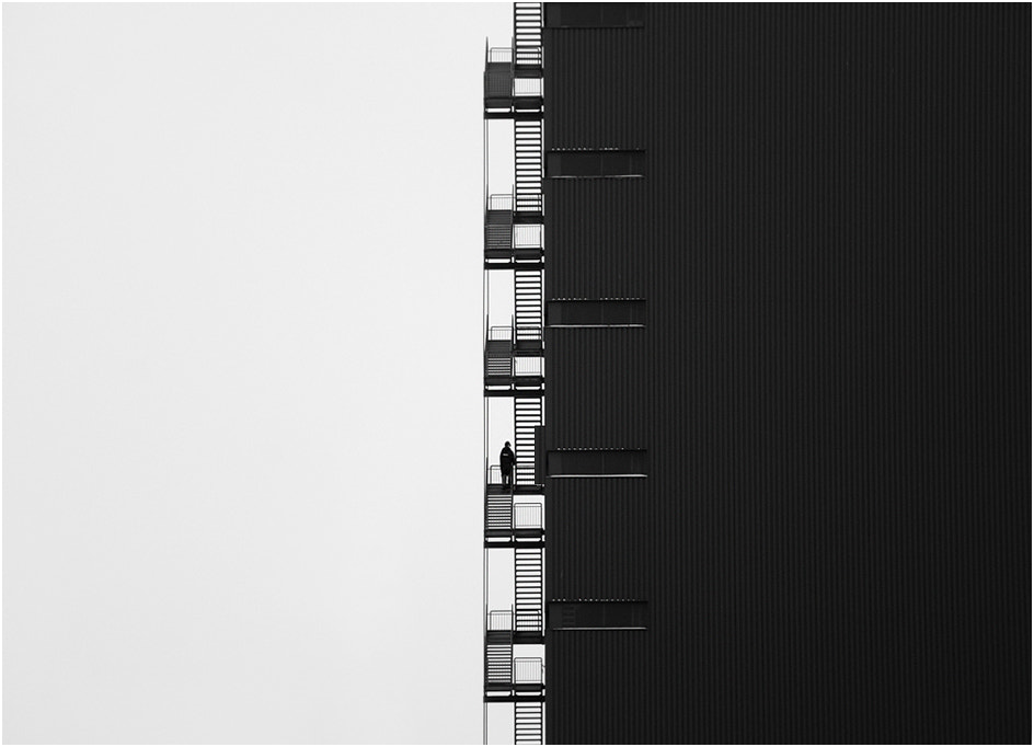
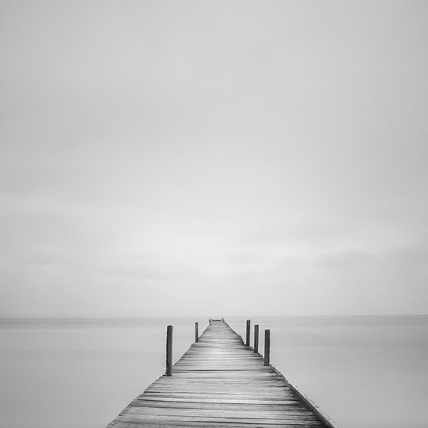
In minimalist compositions, the negative space is arguably just as important as the subject itself, so keep an eye out for clean, uncluttered backgrounds. A cloudless sky, blank wall, or solid color tabletop will do the trick, but watch out for any distracting details (smudges, powerlines, people, etc.). Remove everything you can from your background until only the essential elements remain.
Of course, another option would be to open your aperture for a narrower depth of field; by doing this, you’ll throw everything but your subject out of focus, minimizing distractions. You can also use long exposures to create blur and remove non-essential details. With a longer exposure, for example, waves will become smooth, silky, and unified.
Incorporate simple shapes
Minimalist photography has its roots in the minimalist art movement of the 1960s, so take a look at the work of Frank Stella, Robert Morris, or Agnes Martin. You’ll find that they tend to use extremely pared-down shapes like rectangles and squares, which you can also incorporate into your photographic frames. Prioritize simplicity, balance, and harmony.
Choose the right subject
Minimalism and abstraction go hand-in-hand, so your minimalist images don’t have to literally represent your subject. If you look at Edward Weston’s photographs of peppers and seashells, for example, you’ll find that he’s abstracted them almost beyond recognition, transforming them from everyday objects into formal studies.
With that being said, your subject should be visually strong enough to stand on its own, without too many supporting elements. It doesn’t have to be anything extraordinary, but if you can find a subject with an eye-catching color, texture, or contrast, you’ll add interest to your photo.
Think like a perfectionist
Minimalism relies on the “less is more” principle, so put time and effort into perfecting the few details and elements you have in-frame. Every line, from the horizon to leading lines, should be internationally placed, without any distortion. “Mistakes” that might otherwise go unnoticed are immediately apparent in minimalist photos.
While you can fix uneven lines in post-production, we recommend getting it “just right” in camera to hone your eye. Change up your framing until the details align; a prime lens works well because it encourages you to move around and “zoom with your feet.” The rules of composition, like the rule of thirds or the golden ratio, can be doubly important for minimalists because they allow you to achieve more with less. You don’t have to follow them, but they can be helpful.
Limit your color palette
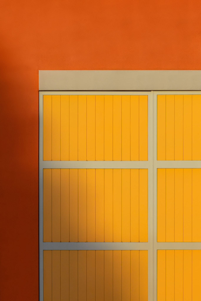
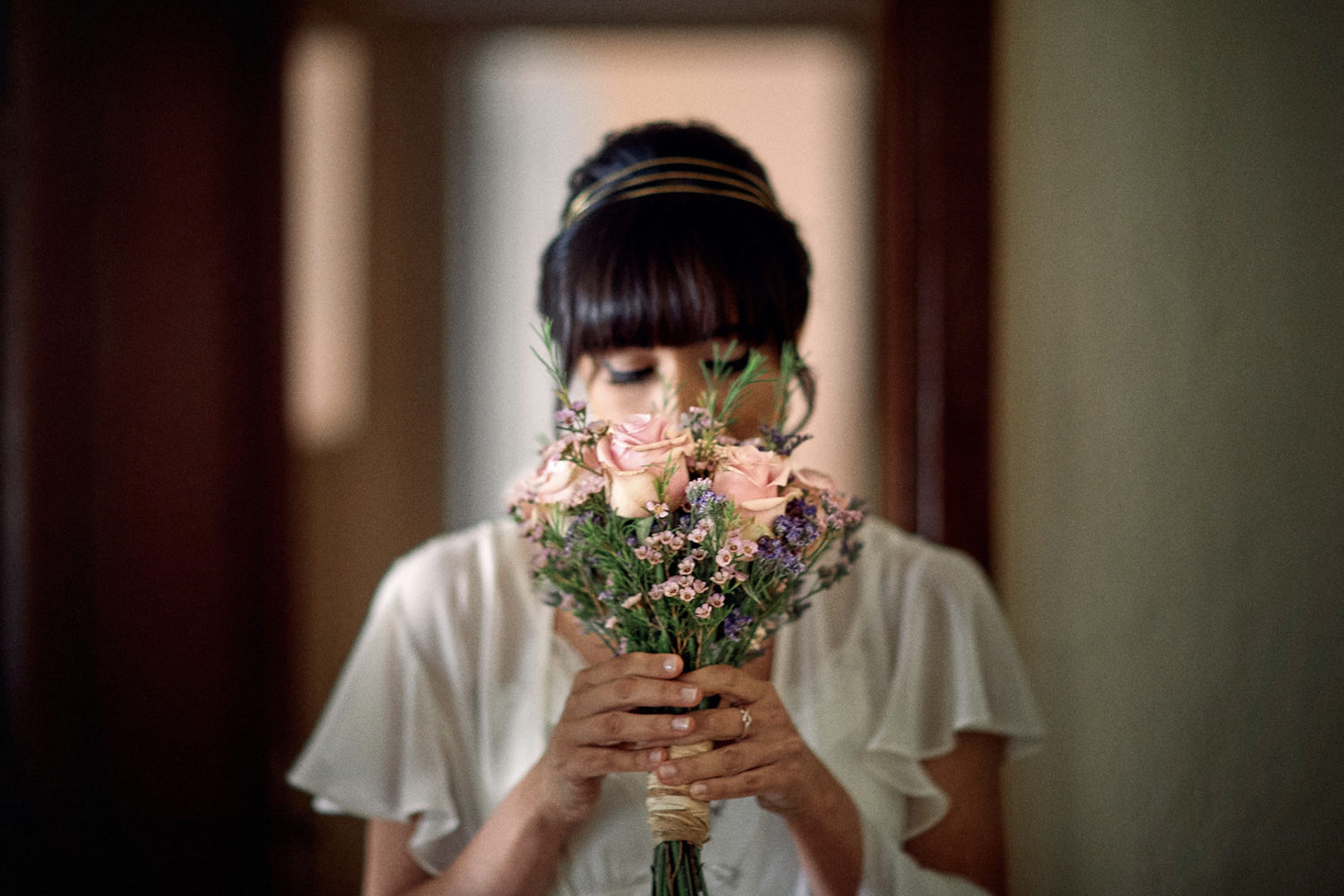
Minimalism is about subtraction, so use restraint when it comes to color. Even in minimalist artwork where color plays a major role, as in the paintings of Frank Stella, you’ll usually find only a handful of different colors, often complementary to one another. Using these pairs—blue and orange, yellow and purple, red and green—can help your subject “pop” from your background.
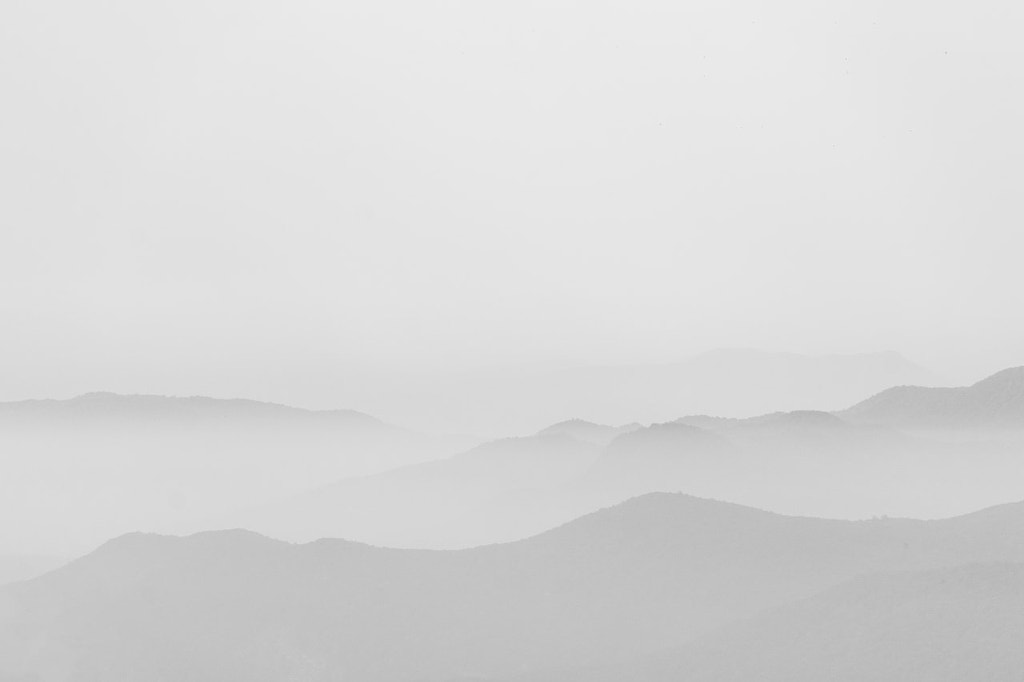
Pastel color palettes are also popular in minimalist photography, but there aren’t any rules here. Of course, you can always go monochromatic with minimalism if you prefer; if you’ve ever doubted the power of black and white, for example, check out the minimalist landscapes of Michael Kenna.
Use repetition to your advantage
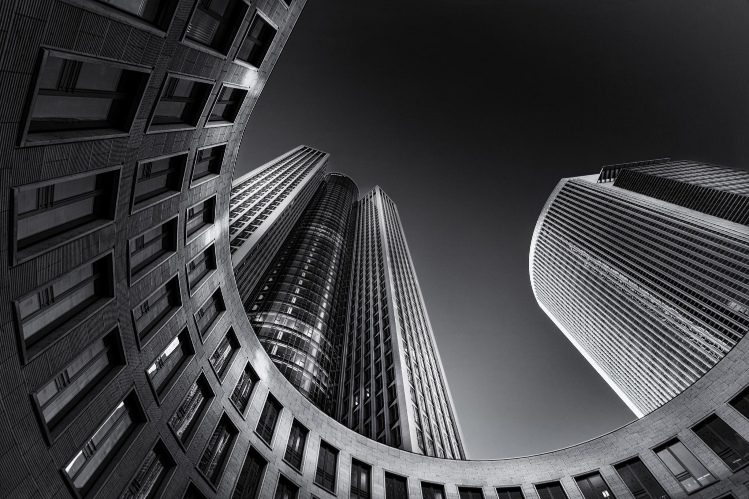
The geometric forms that make up your composition can stand alone, but they can also repeat to form a pattern. The minimalist sculptor Sol LeWitt frequently used repeating forms in his creations, so consider doing the same in your work. You can find repeating shapes “in the wild” in works of architecture or create them using shadows; a prime example of the latter would be André Kertész’s famous photo The Fork, which used a shadow to reinforce the shape of the subject (a fork).
Sketch it out
Some minimalist photographers sketch their ideas before they shoot to ensure everything is in the right place. If you work in a genre that lends itself to sketching, like food or still life photography, bring out your sketchpad and brainstorm some compositions. You don’t have to be the world’s best sketch artist—if it’s minimal, it should be easy to draw.
Step back (literally)
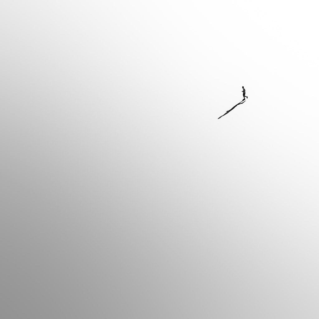
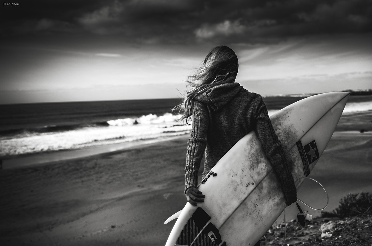
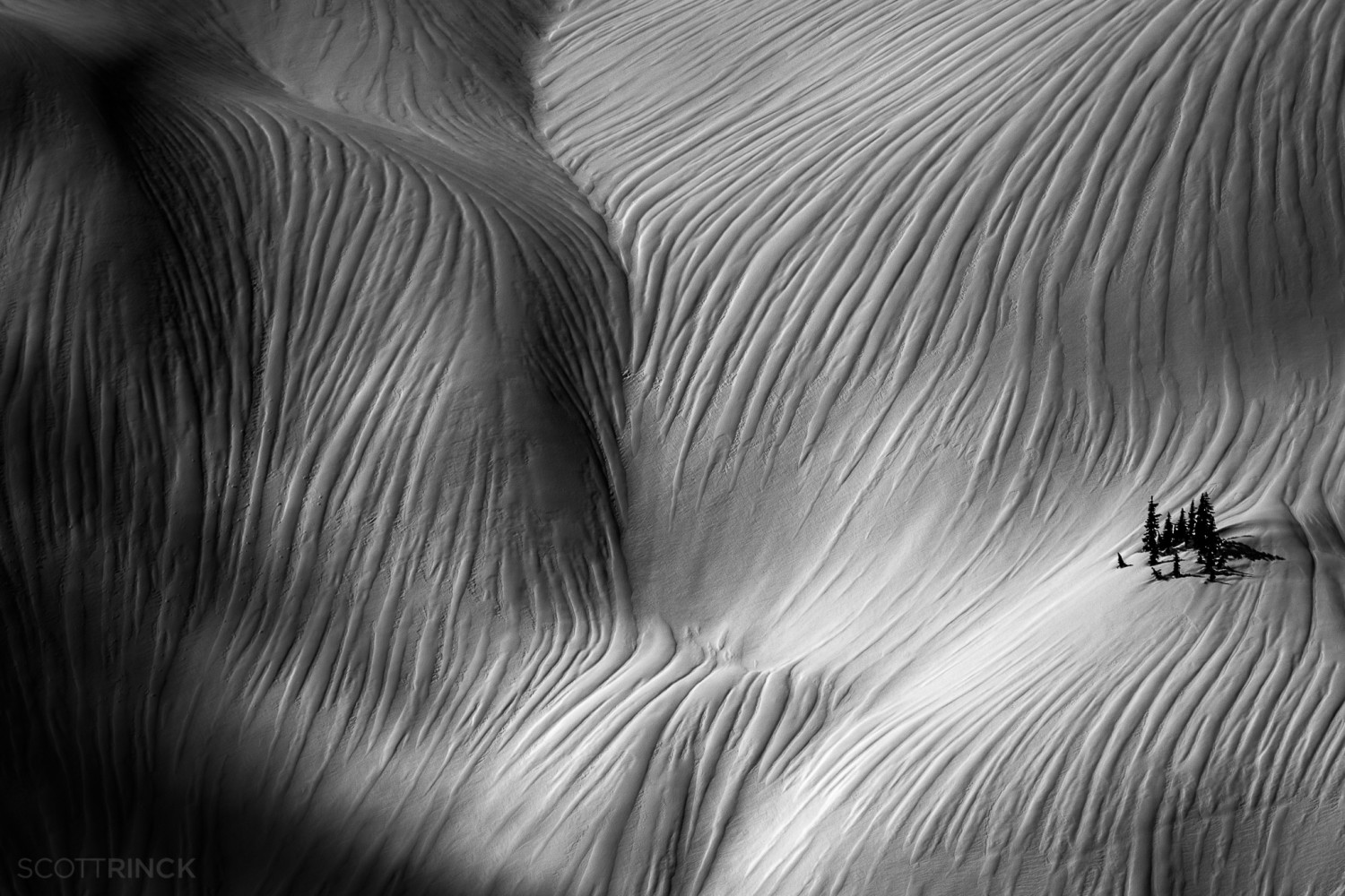
Negative space is key in minimalist photography, so it can help to put some distance between yourself and your subject while incorporating more “breathing room” in the background. It’s okay if your subject takes up just a small fraction of the frame. There’s a reason the “tiny person, big landscape” motif has been trending in recent years; negative space can work beautifully for providing a sense of scale.
Practice
Learning to “see” like a minimalist can be difficult, especially in today’s over-saturated world. For that reason, one of the best things you can do for your minimal photography is to shoot as much as possible. The more you train your eye to find graphic shapes and clean compositions, the better you’ll get at spotting them in unexpected places.
Take your time
For the minimalist photographer Hengki Koentjoro, who is based in Indonesia, crafting an image takes time; he often sits and waits in nature until the right composition becomes clear. His goal is to look at the world from an uncomplicated perspective, without judgment or hurry.
Practicing minimalist photography can serve as a reminder to slow down and get back to the basics. There’s no need to complicate things; it’s enough to stay present in the moment and appreciate it without adding unnecessary layers of meaning. As Frank Stella once said of his paintings, “What you see is what you see.”
Not on 500px yet? Sign up here to explore more impactful photography.


![[] [] [] ¦ [] [] [] by Nina Papiorek on 500px.com](https://drscdn.500px.org/photo/1015512275/m%3D900/v2?sig=8ed92b10a4d951dc1631286fa1efc3234fb46936e178688905ec9bcdfdb09c89)





Leave a reply