The question we get asked more than almost any other here at 500px is a deceptively simple one: “What kinds of photos sell?”
People want to take advantage of the 500px Marketplace to start making a bit of cash on the side, or maybe even a substantial revenue stream, but they don’t want to waste their time submitting work that just won’t sell; so they ask us great questions like “what do buyers actually want?” and “what kinds of photos sell?”
Simply Sellable is our attempt to answer this impossible question… weekly.
Since the answer to this question changes week in and week out as trends, seasonality, and other factors continue to shift, we are answering the question regularly. Every week in fact. Each week one of our expert Content Editors picks one of their favorite photos that has sold recently, and explains exactly WHY it sold—what makes that photo “simply sellable.”
Simply Sellable #5 features a beautiful, snowy landscape photo that appeals to us even more this time of year than most. And explaining exactly why this photo has sold well is 500px Content Editor Heather Balmain. Lets find out what’s special about it.
Simply Sellable #5: Winter Wonderland
by Heather Balmain
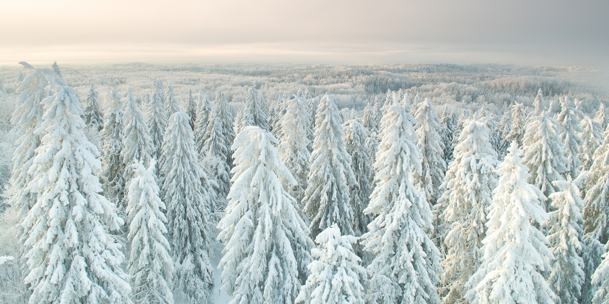
“On the Roof of Estonia” is an epic landscape captured by freelance nature/wildlife photographer Ragnis Pärnmets. This photo has tons of commercial potential for a multitude of reasons, but let’s start with that stunning view.
Shot from atop Suur Munamägi, the highest peak in Estonia, the wide crop shows a seemingly endless expanse of forest stretching to the horizon, which provides a wonderful sense of scale. The snow covered treetops appear delicate, while the atmosphere remains fresh and crisp. Early morning light washes the landscape in muted tones, preserving the calm and peaceful mood.
There are no people, and yet the scene certainly evokes emotion in the viewer. That’s the difference between a good photo and a great one. Buyers often purchase pictures that serve a conventional purpose or simply fill a basic need, but much more thought is given to imagery used for promotional campaigns that represent the client on a wider scale. You want to grab the buyer’s attention and keep it; they’re putting more thought into the image they choose, so should you. If you were to ask Ragnis, I’m sure he would tell you he didn’t capture this moment by chance—the light, composition, and point of view were all intentional because these things matter.
Imagine how a buyer might use this photo, and then ask yourself, “why?” For example, photos like this are often used to promote travel in the region or to sell holiday packages. This is the expected use, but many people don’t consider that it could easily be used to represent various business and lifestyle concepts using keywords like ‘Solitude, Peaceful, and Freedom’, all of which Ragnis wisely included in the tags.
From a technical perspective, the rule of thirds is also in play here. The fluffy treetops fill the bottom two thirds of the image, leading your eye up to the valley and sky in the top third. There’s also lots of room for clients to crop the image to suit multiple layouts: from long skinny web banners to a vertical full-page spread. And, of course, there’s plenty of space for adding copy or product placements.
Finally, the image is also perfectly exposed and technically sound, and quality is consistent throughout the whole file. Quality is crucial, and buyers can and do notice! The bottom line? Think like a buyer.
And that is why this photo is ‘simply sellable.’ Technically well-executed and beautiful, the photographer didn’t stop there: he thought like a buyer by picking appropriate keywords, leaving room for copy and cropping, and ensuring quality was consistent throughout the frame.
If you have any more questions for Heather about the photo above, don’t hesitate to drop them in the comments below. And don’t forget to check back in next week for the next installment in the series.






Leave a reply