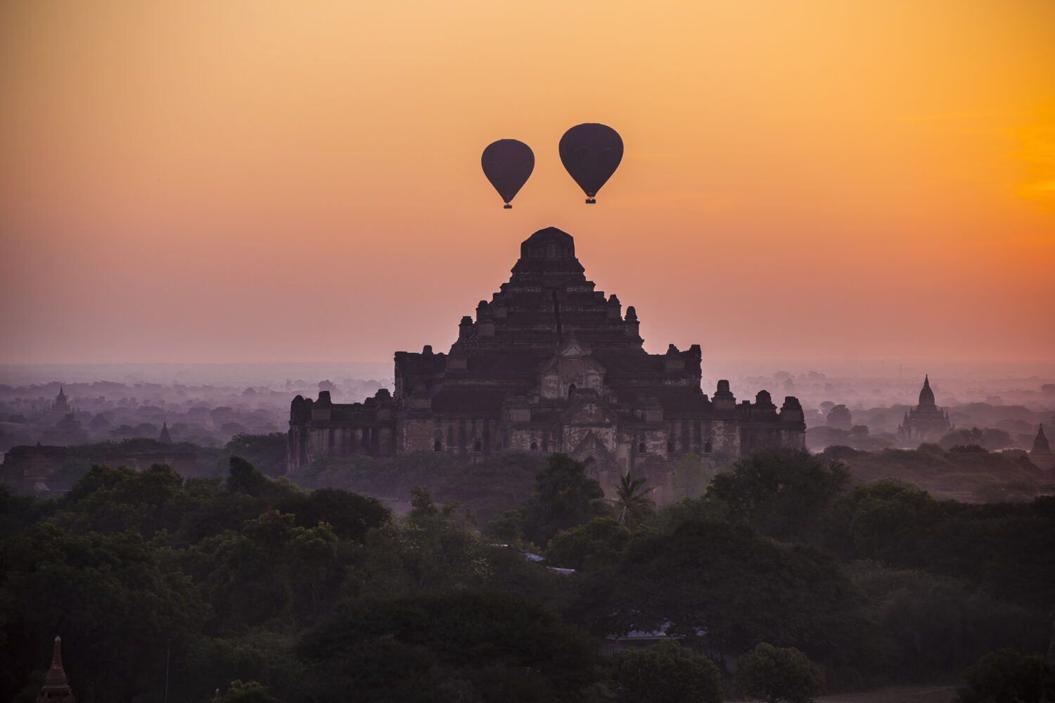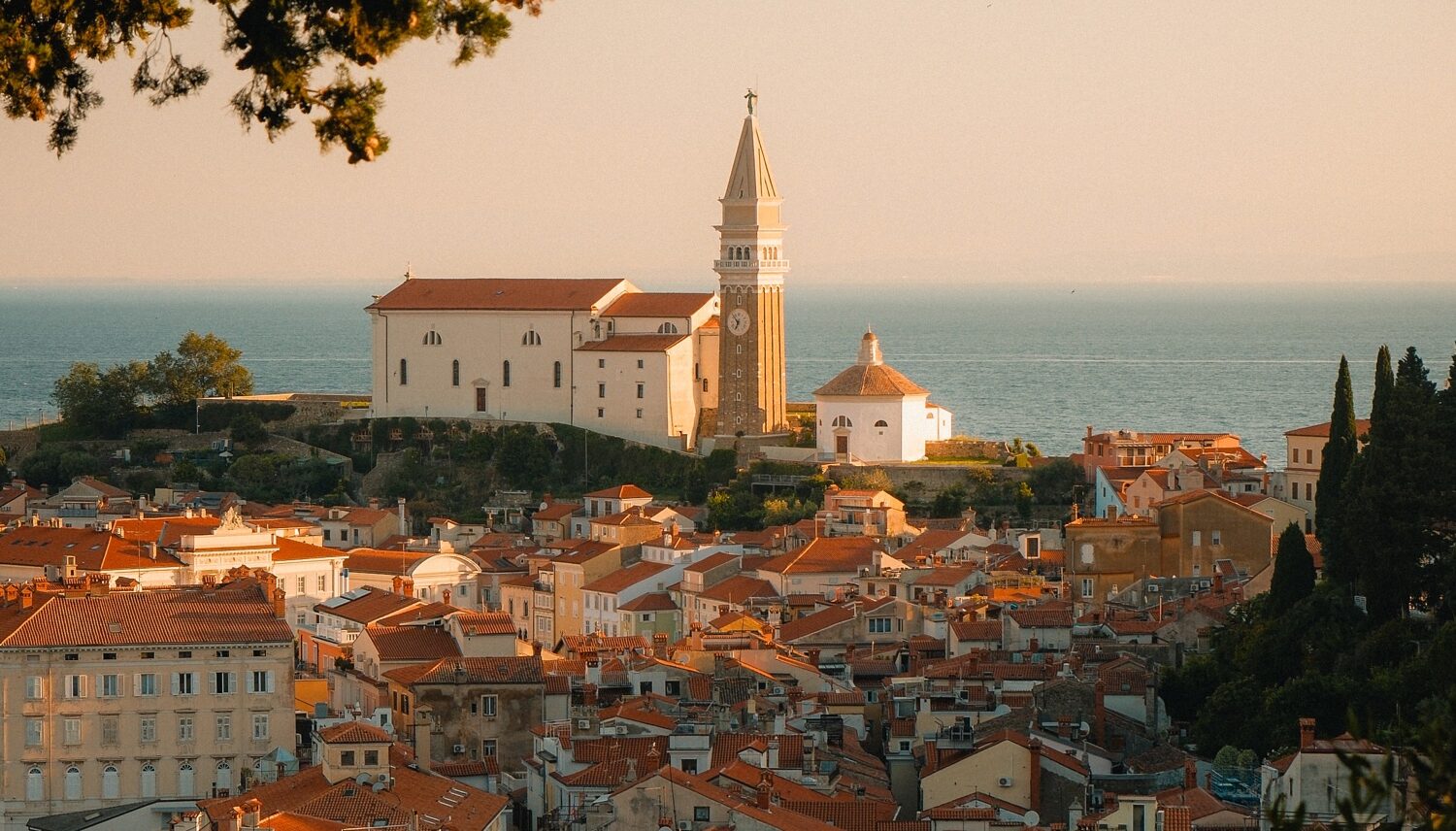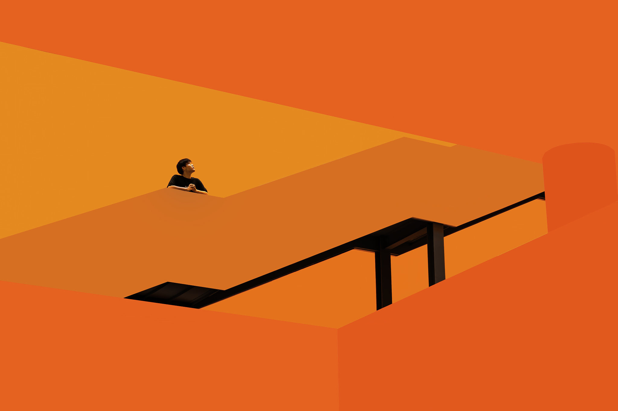
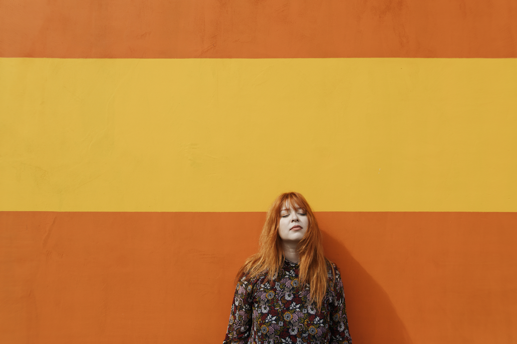
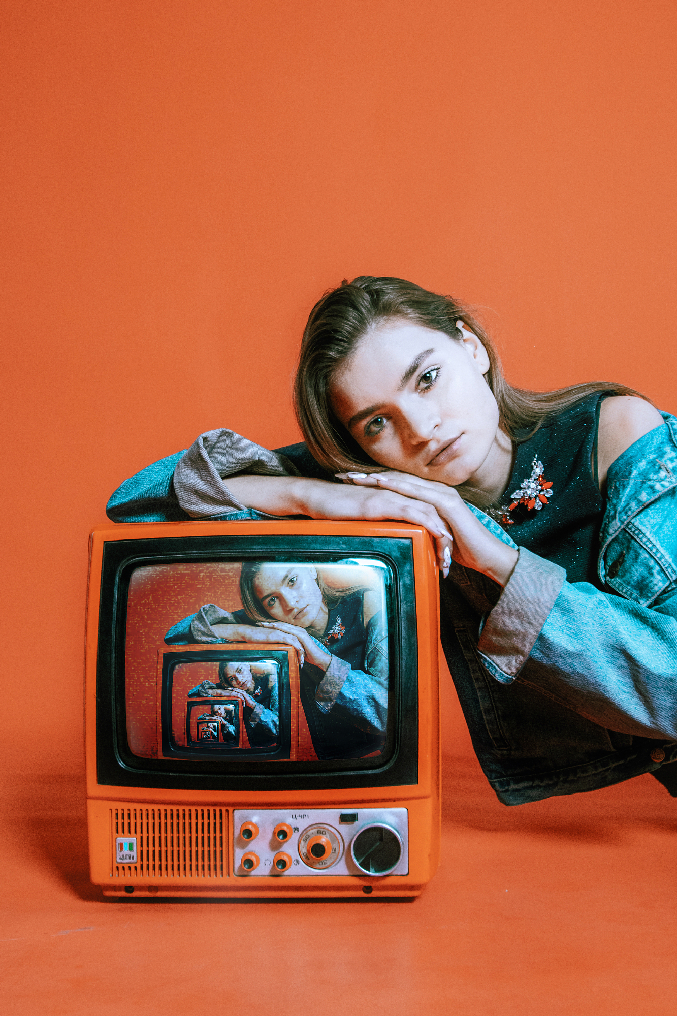
Orange is the loudest color in the photographer’s palette. It carries warmth, urgency, and energy in equal measure, and it photographs with an intensity that few other colors can match. Learning to see in orange means learning to spot it before you raise the camera: the last light on a brick wall, a market stall piled with fruit, an autumn canopy catching afternoon sun. Orange color photography rewards photographers who train their eye to find it and have the compositional sense to use it well.
Why orange works so hard in a frame
Orange sits between red’s intensity and yellow’s brightness, which makes it one of the most visually active colors in photography. It reads as warm, immediate, and energetic. Placed against cool tones like blue or teal, orange creates some of the strongest natural contrast available in a photograph without any artificial enhancement.
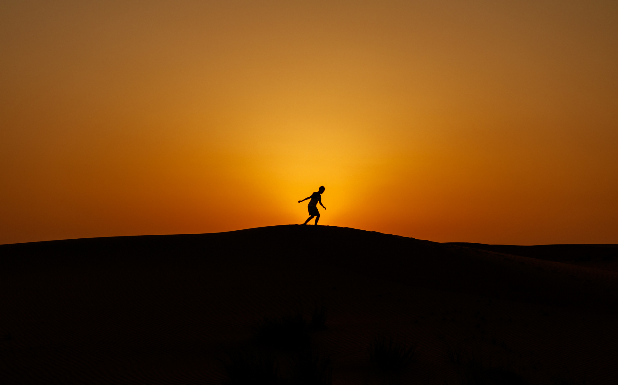
It’s also the dominant color of the two best times to shoot: sunrise and sunset. Golden hour isn’t named for nothing. The warm orange cast of low sun transforms ordinary subjects into something richer, and orange color photography at these times of day requires almost no effort beyond showing up with a plan.
Where to find orange
Natural light at the edges of the day
The hour after sunrise and the hour before sunset produce the most concentrated orange light available. Look for subjects that catch this light directly: weathered walls, open fields, reflective water, human skin. The color doesn’t need to be in the subject itself. The light alone can turn a neutral scene entirely orange.
Architecture and urban environments
Brick, terracotta, rusted metal, worn timber. Cities and towns are full of orange surfaces that become dramatically more vivid in warm directional light. Orange color photography in urban settings often comes down to patience: returning to a known location when the light is right rather than shooting it in flat midday conditions.
Nature and seasonal color
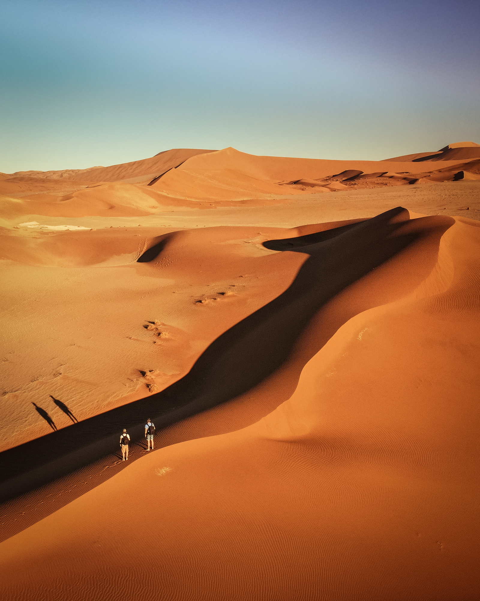
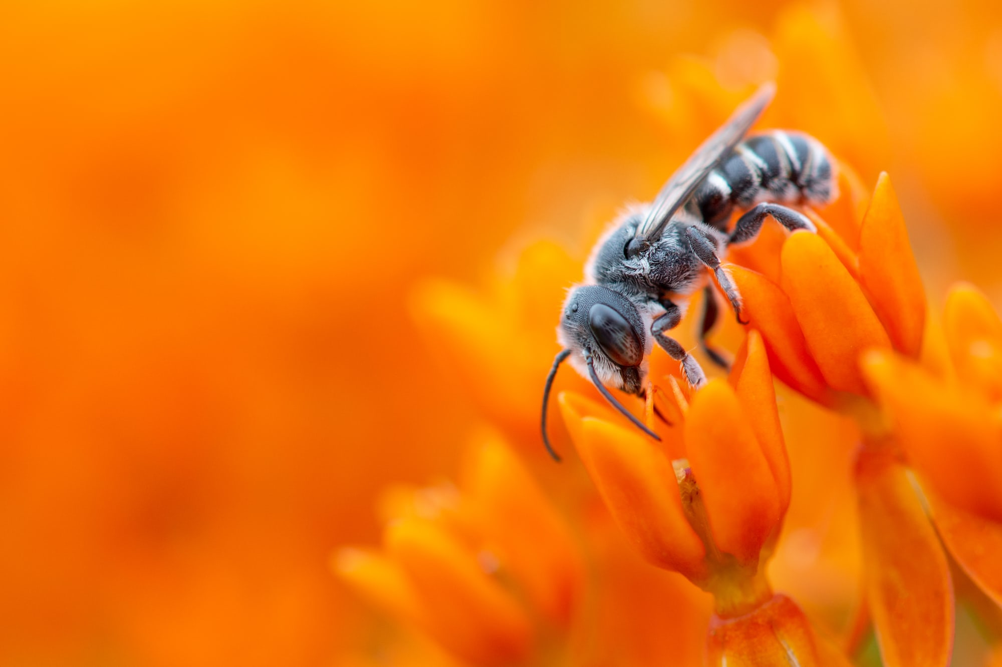
Autumn is the obvious season, but orange appears throughout the year in flowers, fruit, lichen, fungi, and desert landscapes. Look for concentrated patches rather than diffuse orange spread across a wide scene. A tight frame on a cluster of orange berries is stronger than a wide shot where the color gets lost.
Using contrast to amplify orange
Orange’s greatest compositional tool is its relationship with blue. On the color wheel, blue is orange’s direct complement, which means the two colors intensify each other when placed in the same frame. A burnt orange wall against a deep blue sky. A sunset reflected in blue water. A warm-toned subject against a cool shadowed background.
This contrast is why the teal-and-orange color grade became so dominant in cinema and photography. It’s not a trend or a filter. It’s a response to a real perceptual phenomenon: those two colors push against each other in a way that makes both feel more vivid.
To use it intentionally, look for scenes where orange naturally occurs against cool backgrounds, or position orange subjects against blue sky, shade, or water. The contrast does the compositional work for you.
A few practical reminders
Expose carefully around strong orange light. The warmest tones at golden hour can clip quickly, losing detail in the brightest areas. Expose to protect the highlights and recover shadow detail in post. Shoot RAW for the most control.
In post-processing, resist the urge to push orange saturation aggressively. A small lift in luminance often reads as more vivid than a heavy saturation boost, and keeps the color looking like light rather than paint.