A balanced composition can make or break a photograph, and when it comes to portraits, one of the easiest ways to balance a composition is to take advantage of gazing direction.
This is no secret, but it’s not often I run across this tip on the Interwebz where many of us get our basic photography education. So listen up because this simple tip can make a big impact.
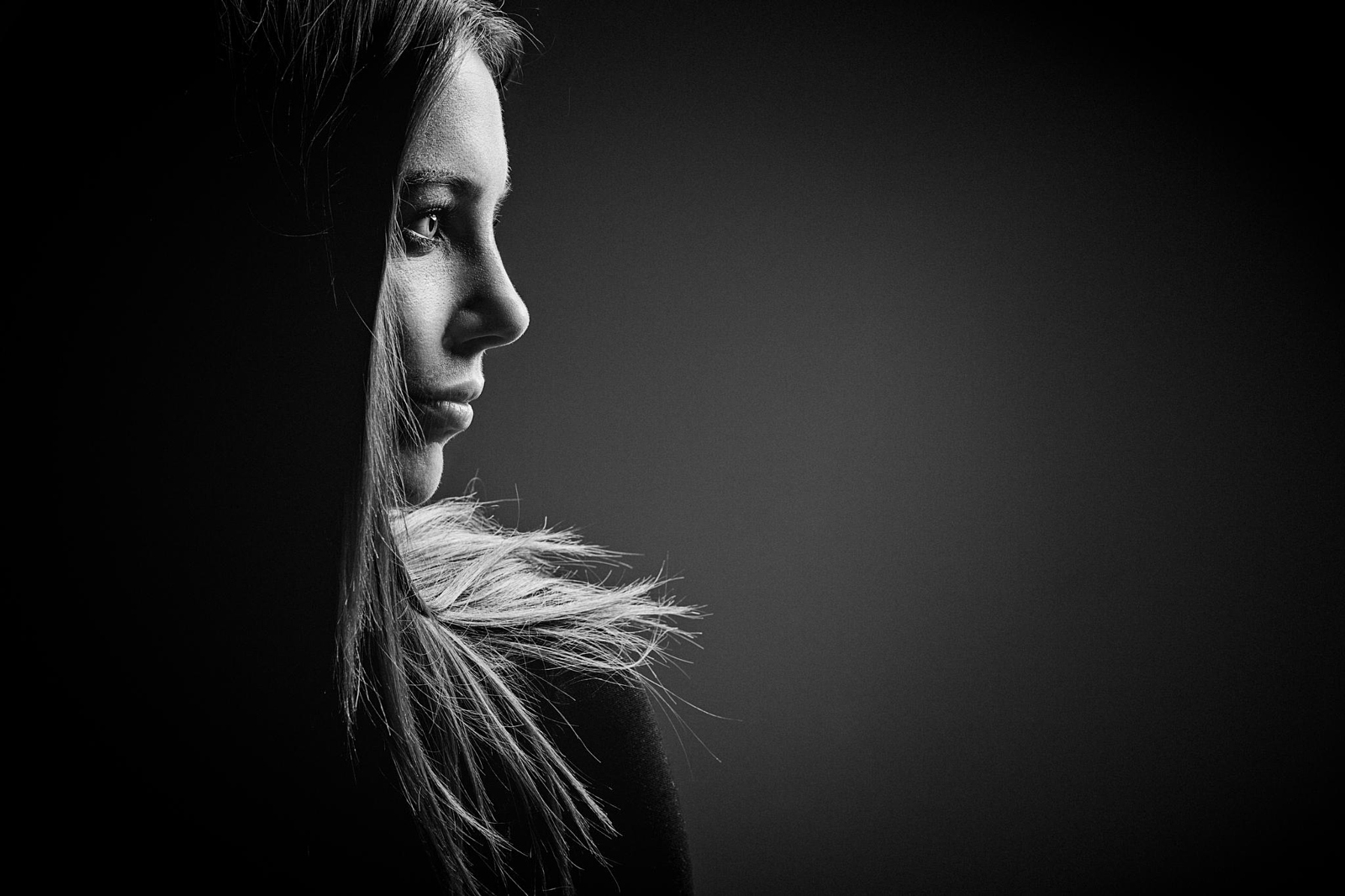
When you compose a portrait according to the rule of thirds or golden mean, your composition will naturally be weighted to one side or another by your subject. Here’s the tip: Once your basic framing is set, try having your subject look out of the frame in the direction of all that ’empty’ space to their right or left.
You’ll end up with a portrait that looks something like this:
Keep in mind that this works best when there isn’t already a lot going on in that space.
What your subject’s gaze does is grant importance: what they’re looking at is obviously important, as is the space they’re looking through… this gives that space compositional “weight.” What they’re not looking at is less important and more likely to be ignored by your viewer.
Here are some more examples of gazing direction being used to great effect. Notice that other elements (a leaf or train tracks) are sometimes used to give weight to the ’empty’ two thirds of the composition, but gazing direction adds the final touch:
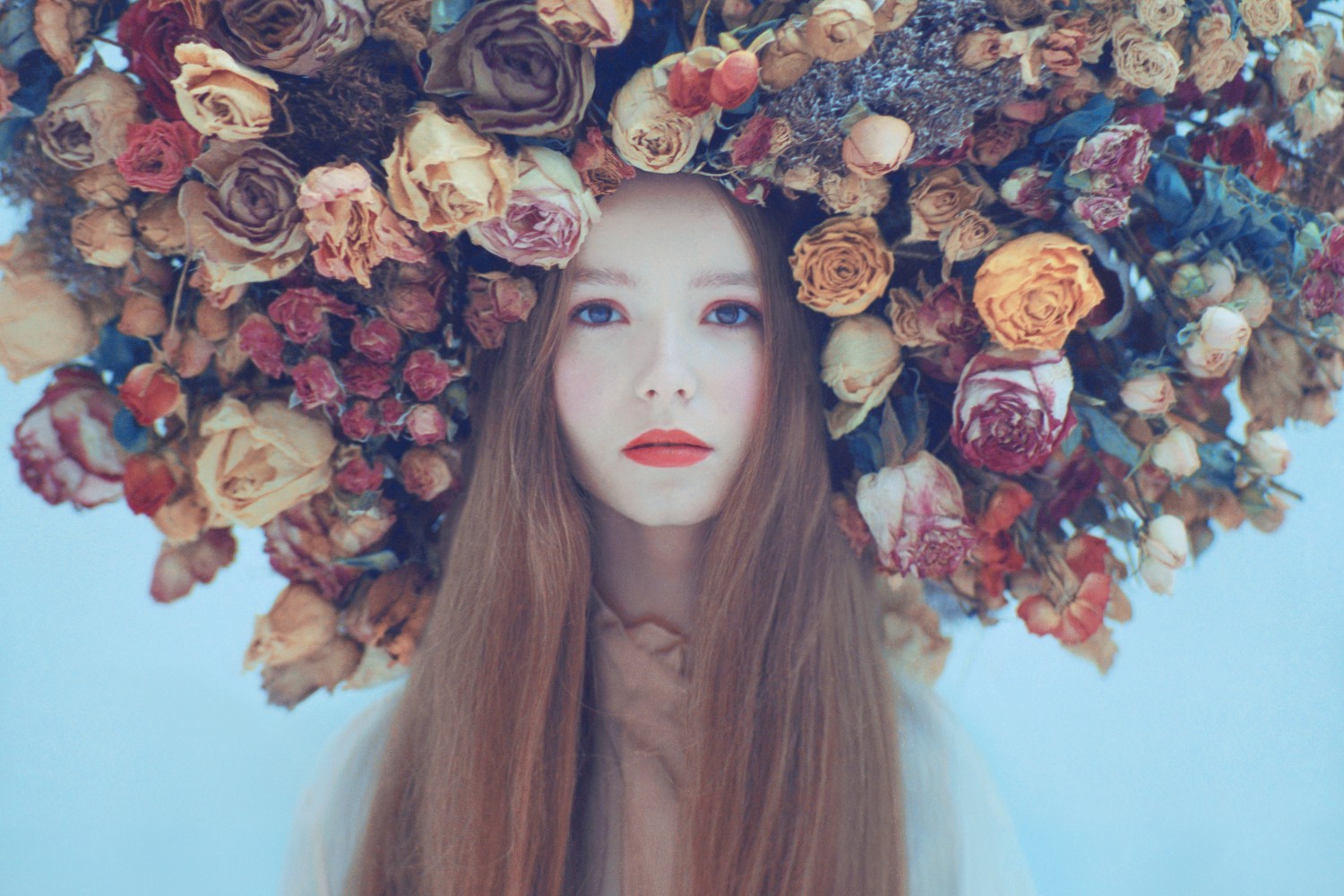
Of course, as with any rule, breaking it can also be a good idea… just understand what your composition is saying. If a subject is gazing away from the majority of your frame, it can communicate indifference, and without enough “weight” in that two thirds, the gaze can significantly unbalance the shot.
This is a great example of the rule being broken. The lights in the background fill the ’empty’ two thirds of the frame, and the ballerina’s gaze says something about her state of mind and the message the photographer is trying to communicate.
Found this tip helpful? Let us know! Your comments help me shape the kind of content we create here at 500px ISO. And, as always, if you have some great examples of this composition tip being used or ignored to great effect, upload to 500px and drop a link in the comments!






Leave a reply