As the colors of autumn emerge in full force, using contrast in your photography becomes a powerful tool for creating images with depth and impact. The interplay between warm and cool tones, combined with the shifting light, allows for unique opportunities to highlight your subjects in creative ways. Here’s how to make the most of seasonal color contrast in your fall photography.
Understanding color contrast
Color contrast refers to the juxtaposition of different colors that stand out against one another. In autumn, the natural contrast between warm colors (reds, oranges, and yellows) and cool colors (blues and greens) creates a dynamic scene that draws the viewer’s attention.
Warm vs. cool tones
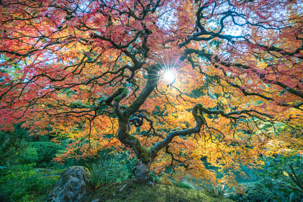
Warm tones, like the fiery reds and oranges of autumn leaves, evoke feelings of warmth and comfort. In contrast, cool tones, like a crisp blue sky or green foliage, bring balance and calm to your images. When these two are combined thoughtfully, the resulting contrast can create a striking composition.
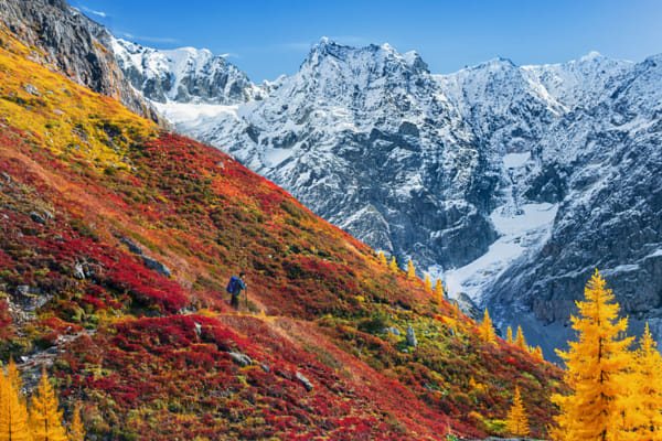
Complementary colors
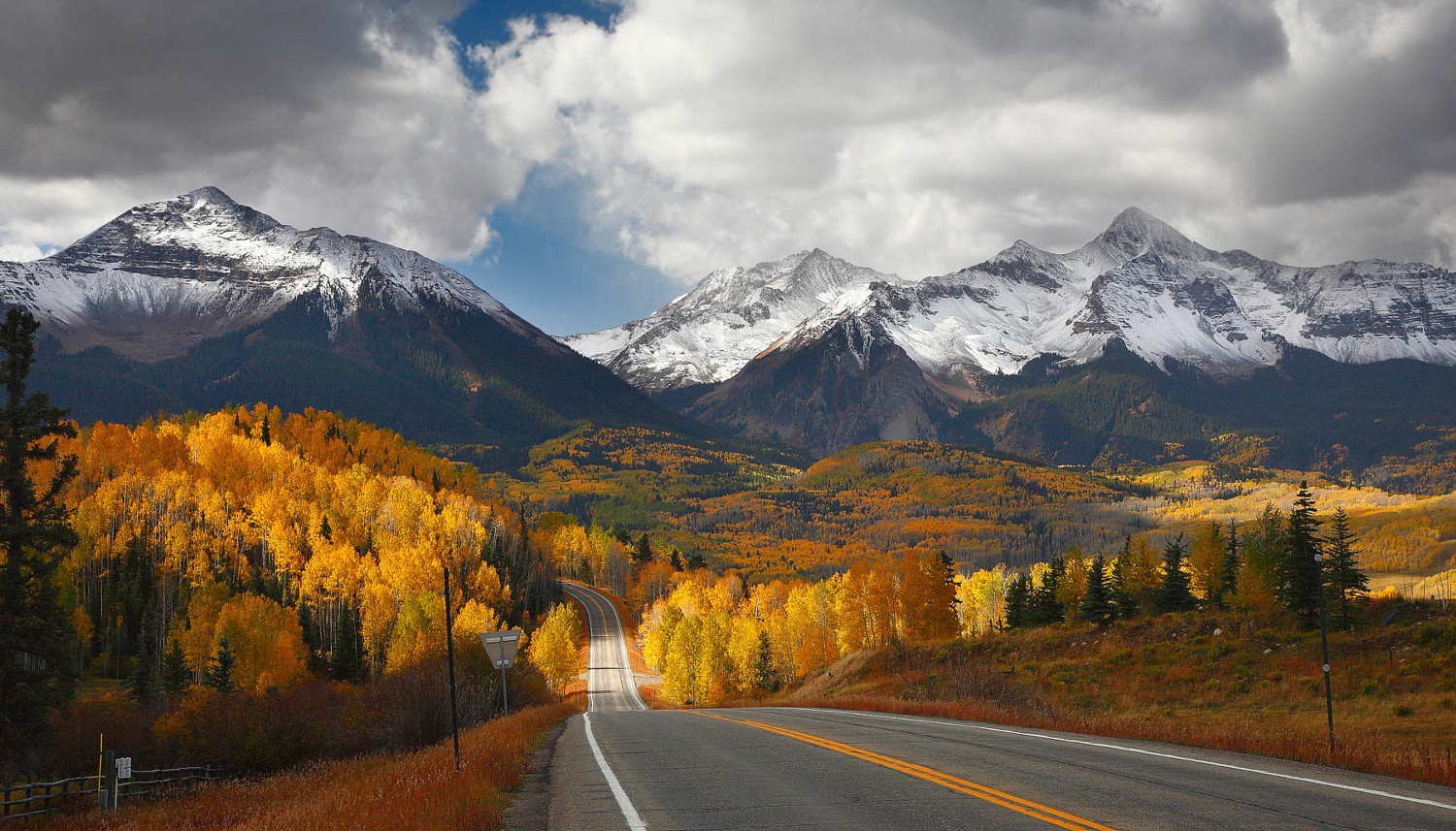
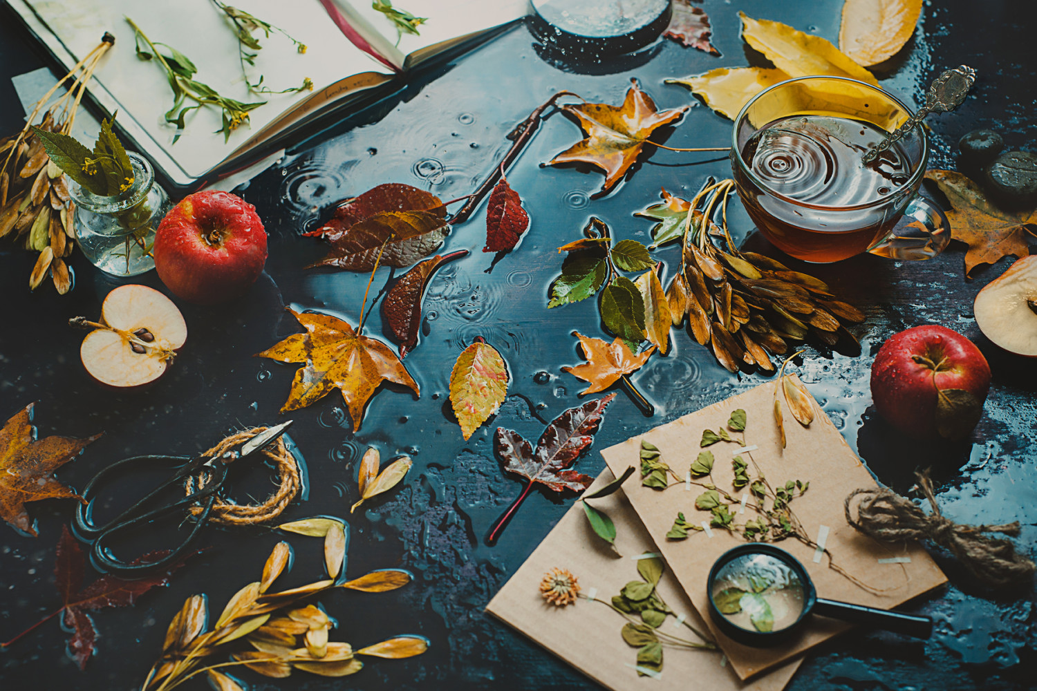
Incorporate complementary colors to enhance the contrast in your photos. For example, capture the bold contrast between red autumn leaves against a clear blue sky or golden foliage reflected in a cool, blue body of water. These color combinations are visually stimulating and naturally guide the viewer’s eye to your subject.
Composing with color contrast
Once you’ve identified the colors in your scene, it’s time to compose your shot to maximize the impact of the contrast.
Use natural divisions
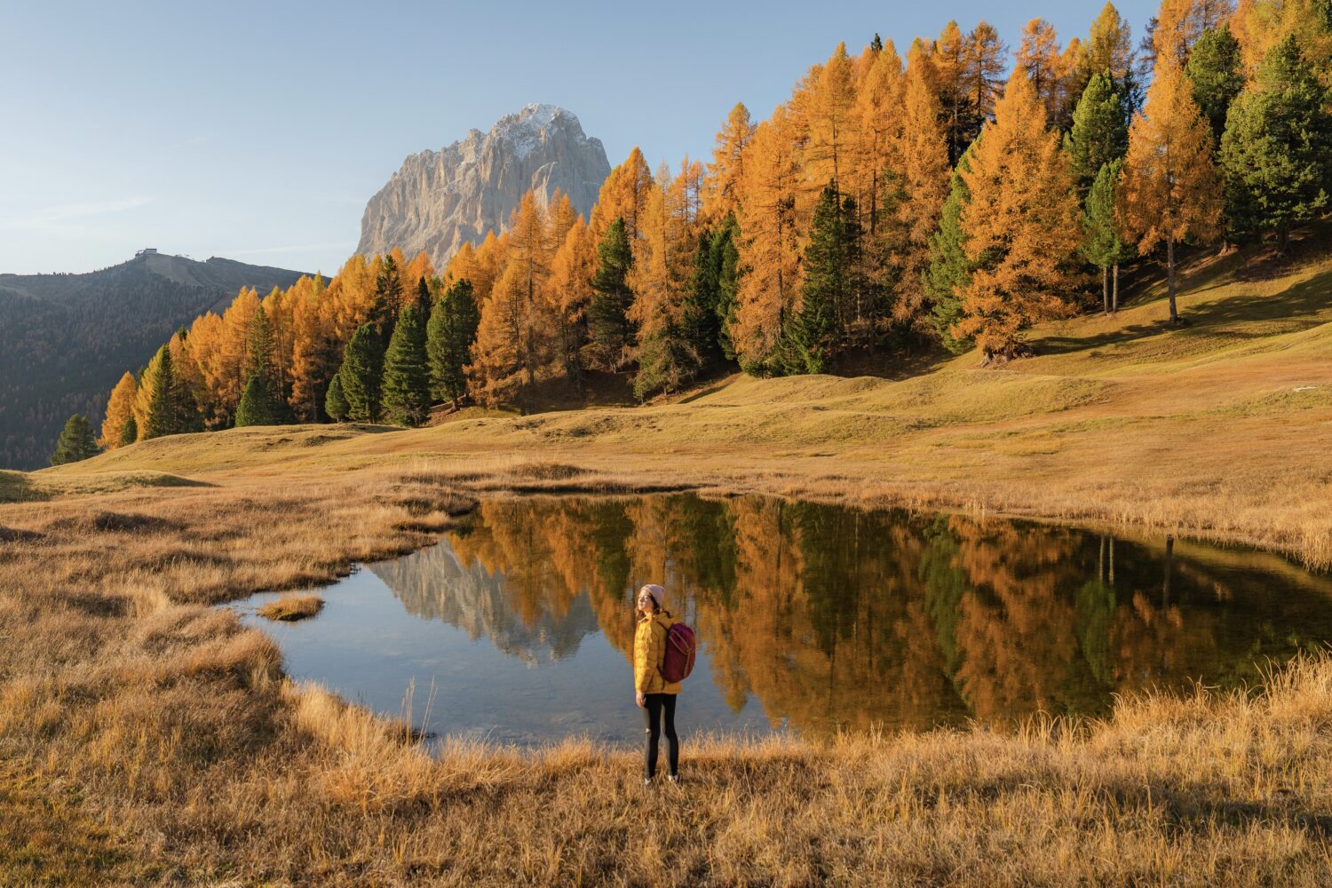
Look for natural divisions in the landscape where warm and cool tones meet. This could be the line where golden trees meet a green field, or where warm sunlight cuts through a cool shadow. These natural divisions help balance your composition and add visual interest.
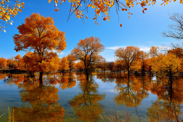
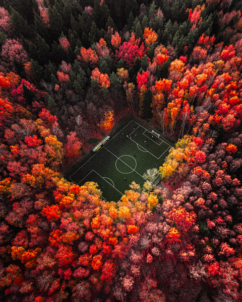
Layering colors
Add depth to your photos by layering warm and cool colors in the foreground, middle ground, and background. For instance, a photo with a yellow tree in the foreground, a blue river in the midground, and a forest of red and orange trees in the background creates a layered image full of contrast and depth.
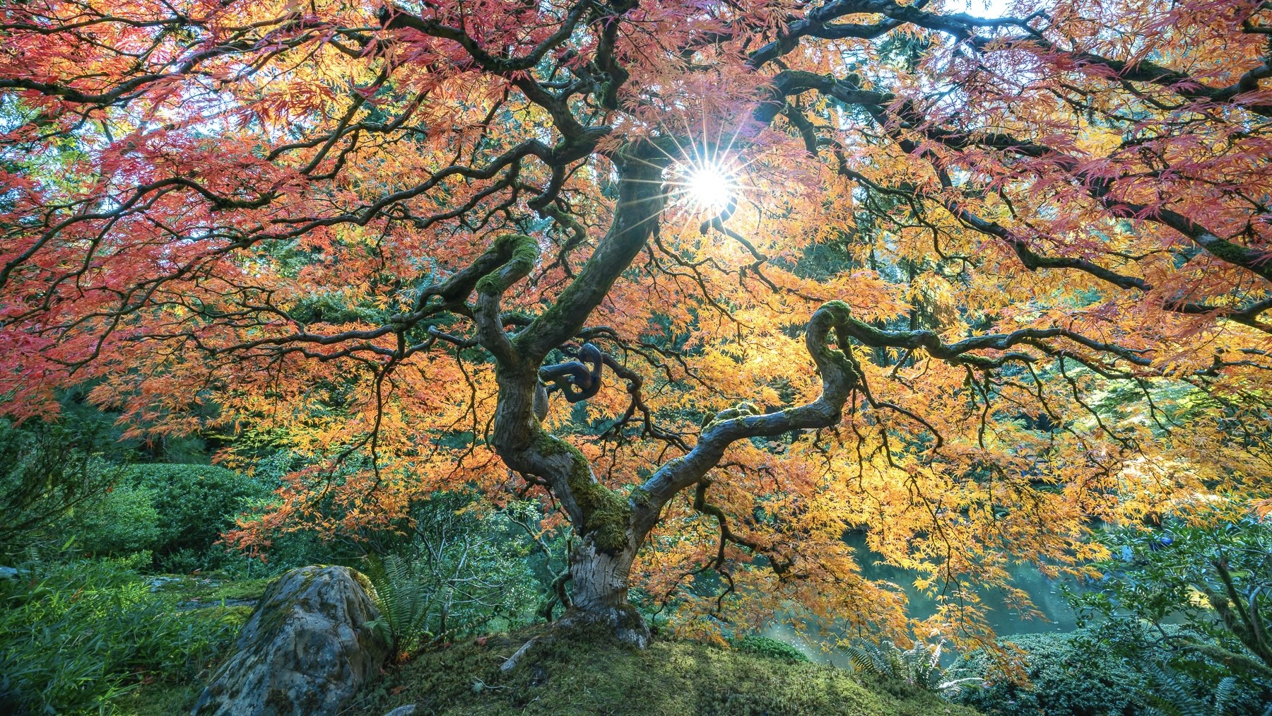
Contrast in lighting
Fall light often comes in softer and lower, providing long shadows and gentle highlights. Make use of this lighting to add contrast to your photos. Warm, golden-hour light enhances the reds and oranges of fall foliage, while the cooler shadows create a dynamic contrast within the same image.
Techniques for enhancing color contrast
Understanding how to work with color contrast is just the beginning. Here are a few techniques to help you maximize the impact of seasonal colors.
Polarizing filters
A polarizing filter can enhance color contrast by deepening blue skies and reducing reflections. This is particularly useful when shooting landscapes with both warm autumn leaves and cool skies or water. It also helps eliminate the glare on wet surfaces, making colors appear more vibrant.
Adjusting white balance
Tweak your camera’s white balance to either warm up or cool down your shots. For example, you can make an autumn scene feel cozier by slightly warming the white balance, emphasizing the natural glow of the fall colors. Alternatively, you can cool down the background to make the warm tones pop even more.
Shooting in overcast conditions
While sunny days might seem ideal, overcast conditions are perfect for bringing out the richness of fall colors. The diffused light softens harsh shadows, allowing the vibrant hues of the season to stand out without the distraction of stark lighting. The contrast between soft, gray skies and bright autumn foliage is naturally compelling.
Techniques for capturing seasonal color contrast
To truly elevate your autumn photography, it’s essential to understand how to make color contrast work in various settings.
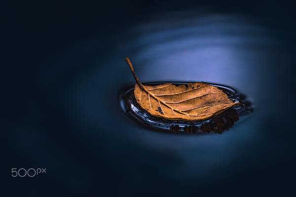
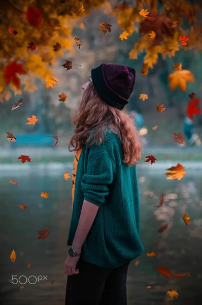
Include a pop of color
If you’re working in a scene dominated by one color, such as a forest filled with red and orange leaves, find a way to introduce a contrasting element. This could be a person wearing a blue jacket or a river running through the scene. The single contrasting color will grab attention and create focus in an otherwise monochromatic image.
Focus on simplicity
While color contrast is visually stimulating, too much can overwhelm the viewer. Keep your compositions simple by focusing on a few key contrasting colors. Use the natural fall palette of reds, oranges, and yellows against cooler blues and greens to create balanced yet impactful images.
Autumn’s vibrant and varied colors make it one of the most exciting seasons for photographers. By harnessing the power of color contrast, you can create images that are not only visually striking but emotionally resonant. Experiment with warm and cool tones, play with light and shadow, and let the natural contrast of the season elevate your photography to the next level.
Not on 500px yet? Click here to learn about Licensing with 500px.

Leave a reply