
Complementary colors, found directly opposite each other on the color wheel, offer a powerful way to add visual interest and energy to your photos. Here’s how to effectively use these colors to make your images stand out, with tips from professional photographers who’ve mastered the technique.
Understanding complementary colors
Complementary colors are pairs of colors that, when combined, cancel each other out by producing a grayscale color like white or black. When placed next to each other, they create the strongest contrast and reinforce each other’s intensity. This principle is widely used in various art forms, including photography, to make certain elements of a composition stand out.

Common complementary color pairs
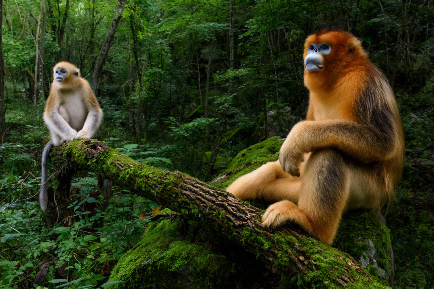
- Red and green: This pair is highly effective in nature photography, where you often see green foliage and red flowers or berries.
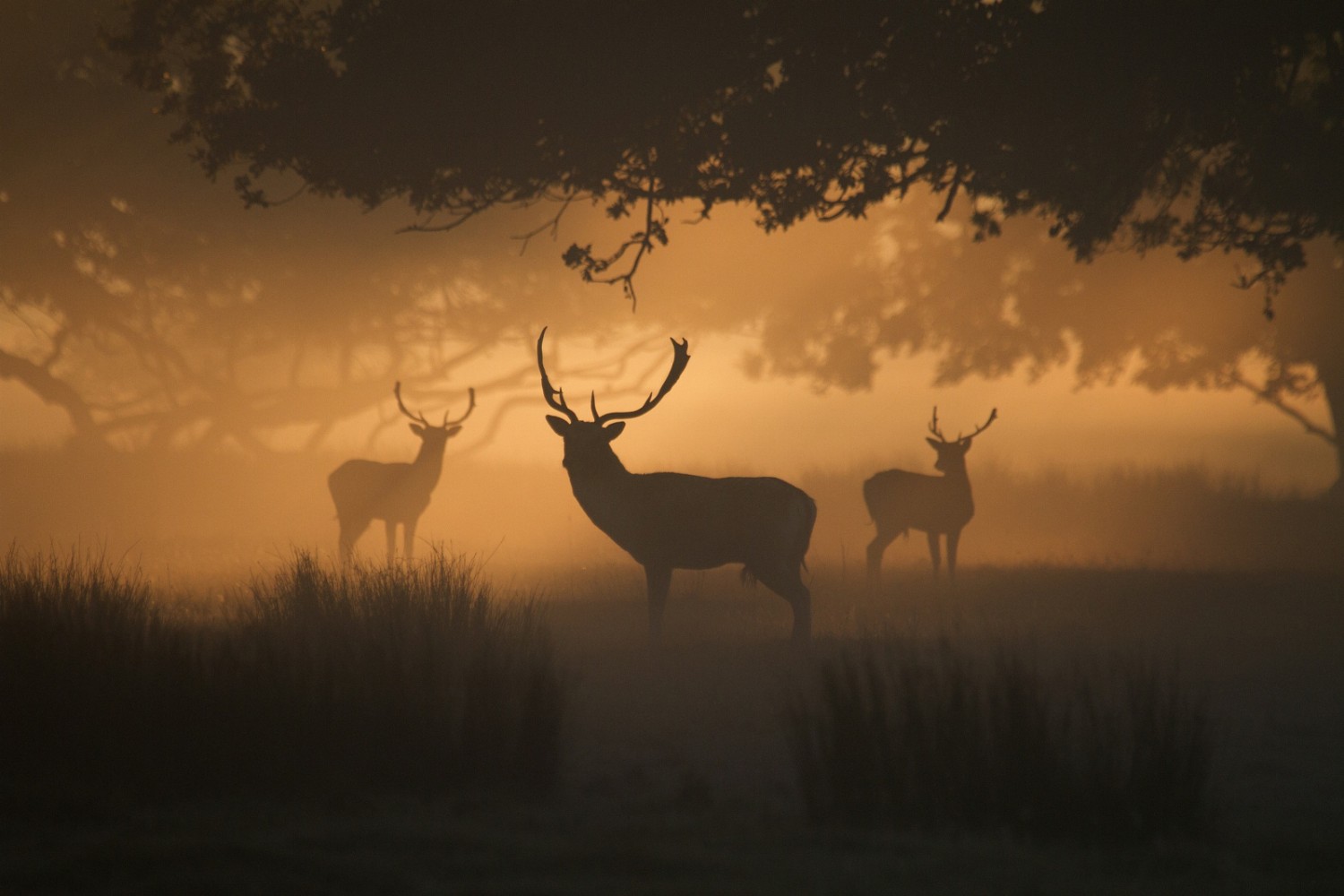
- Blue and orange: Frequently seen during the golden hour when the blue sky contrasts with the warm tones of the setting sun.
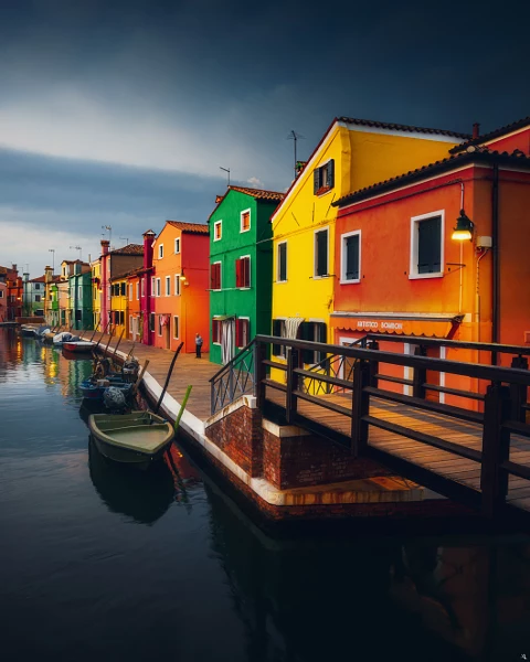
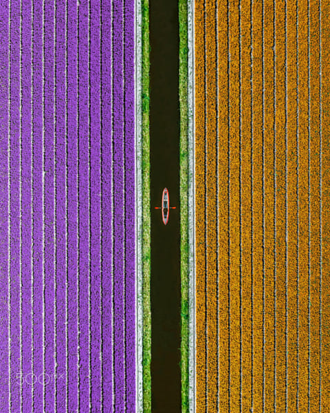
- Yellow and purple: Often used in flower photography, where purple flowers stand out against yellow backgrounds or vice versa.
Practical application
- Red and green: This pair is highly effective in nature photography, where you often see green foliage and red flowers or berries.
- Blue and orange: Frequently seen during the golden hour when the blue sky contrasts with the warm tones of the setting sun.
- Yellow and purple: Often used in flower photography, where purple flowers stand out against yellow backgrounds or vice versa.
Practical application
Creating depth and focus: By using complementary colors, photographers can draw attention to the subject and create a sense of depth in the image. For instance, a red subject against a green background will pop and appear more three-dimensional.
Balancing colors: While using complementary colors, it’s important to balance the composition. Too much of both colors can overwhelm the viewer, while subtle use can lead to a harmonious and striking image.
Adjusting in post-processing: Even if you can’t find natural complementary colors in your environment, you can adjust hues in post-processing to create or enhance this effect. For example, you can tweak the colors of a sunset to bring out the blue and orange contrast more vividly.

Techniques for using complementary colors
Natural occurrences
- Find in nature: Look for natural pairings, like red flowers against green leaves or a blue sky with an orange sunset. Nature provides some of the best examples of complementary colors.
- Seasonal colors: Picture orange autumn leaves against a blue sky, or purple spring flowers against yellow-green grass. These combinations are naturally harmonious and striking.
Incorporating props and wardrobe
- Styling: When shooting portraits or still life, plan your subject’s clothing and props to include complementary colors. For example, place a subject in a blue dress against an orange backdrop.
- Accessorize: Small accessories like scarves, hats, or even makeup can introduce complementary colors subtly yet effectively.

Background and foreground
- Urban Settings: In urban environments, look for graffiti, painted walls, or signage that offers a complementary color to your subject’s clothing or skin tone.
- Foreground Elements: Use flowers, leaves, or other objects in the foreground to add a complementary color to your subject.
Practical tips to try
Lighting and time of day
- Golden hour: This time provides naturally warm light, which can enhance complementary colors like blue and orange. Plan your shoots during this period for the best results.
- Artificial lighting: Use colored gels on your lights to add or enhance complementary colors. This is particularly useful in studio settings.
Shooting in RAW
- Flexibility: RAW files retain more color information, allowing you to adjust and enhance complementary colors in post-processing without degrading image quality.
- Adjustments: You can fine-tune white balance and individual color channels more effectively with RAW files.
Field tips
- Experiment: Don’t be afraid to experiment with different combinations and settings. Sometimes the best color combinations are found through trial and error.
- Practice: Regular practice with complementary colors will improve your eye for spotting these opportunities naturally in your environment.
Complementary colors can transform your photography by adding depth, contrast, and visual interest. By understanding the principles of the color wheel and experimenting with various techniques, you can create stunning images that captivate and engage your audience. Practice incorporating complementary colors into your compositions, and watch your photos come to life with vibrant energy. Remember, the key is to experiment and find what works best for your style and subject matter.
Not on 500px yet? Sign up here to explore more impactful photography.

Leave a reply