No matter how remarkable your image may be, if it isn’t keyworded correctly, it’s unlikely to be found by any potential clients.
It’s important to apply only as many keywords as are relevant to your image. To judge whether a keyword should be added, ask yourself whether you would want to get the image returned in your results when searching for that keyword. Clients can get frustrated if they’re continually getting a large pool of results but very few of the images showing up are really what they’re looking for.
To help you decide which keywords should make the cut for your photos, we’ve compiled some of the most common keywording mistakes. Check out our examples of what incorrect keywording might look like for the Editors’ Choice photos below.
Mistake #1: Visually-irrelevant keywords
This is a low section image of a woman pulling up her sheer stocking. The woman’s belongings and clothing are retro, possibly 1940s in style. Lighting is soft and the feel is vintage.
Suitable keywords for this image might include low section, retro style, brogue, beret, nostalgia, unrecognizable person. But an unsuitable keyword for this image would be paint: the wall behind the subject is indeed painted, but this is unlikely to be the kind of image a user searching for “paint” would have in mind.
Mistake #2: Tangential keywords
This is a tranquil image shot from the viewpoint of the canoe’s occupant, as they travel through still water in a Norwegian fjord.
Suitable keywords for this image might include canoe, tranquility, fjord, ship’s bow, scenics – nature. An unsuitable keyword for this image would be oar. Sure, the occupant of the canoe is probably using a paddle or oar to navigate the fjord, but it is not visible and is tangential to the image, so this wouldn’t be a relevant result for a searcher if they entered “paddle” or “oar.”
Mistake #3: Inappropriate concept terms
This is a low-lit image of a young man sitting in a relaxed way and looking directly at the camera with a quiet confidence. Suitable keywords for this image might include one young man only, confidence, relaxation, looking at camera.
An unsuitable keyword for this image would be loneliness—although the man is alone, he’s not displaying any emotions that would suggest a lonely feeling, and there is no context within the image to suggest that. Adding a concept keyword to irrelevant images dilutes the results for the concept as a whole.
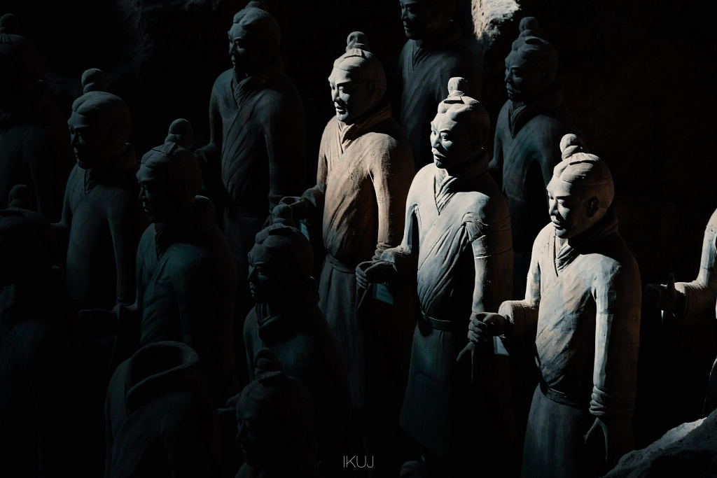
Mistake #4: Human terms on non-human subjects
This is an image from the Terracotta Army in Shaanxi, China. The lighting is dark and most of the warriors are in shadow, however, some natural light highlights three of them. Suitable keywords for this image could include male likeness, high angle view, shadow, no people. An unsuitable keyword for this image would be mid-adult men: this type of keyword should only be used where there is an actual man in the image, not a stone carving of one.
Mistake #5: Lack of concept terms
A person looking for an image will often have a concept in mind, like for an advertising campaign, but they might not know exactly what they are looking for, so they’ll be open to many settings, styles, and content. Applying appropriate concept terms to your image can open up the image to be seen by these less specific, more abstract searchers.
This is an image of an isolated hilly landscape at dusk. A small tent is visible in the foreground of the image, glowing warmly from the lights within. Suitable keywords for this image might include remote location, cozy. But you could also include conceptual keywords like getting away from it all, adventure, or security.
Mistake #6: Not flagging copy space
Copy space is a highly-searched term. Having room for copy on the image is very important to certain types of searchers, like ad designers, for example, as text will often need to be added to an image to deliver a brand message.
This is an image of a cat taken from behind obscured glass, possibly a window, licking the glass. To the top left of the image is a large white-to-pale-gray area of copy space. This image should have the keyword copy space applied to it.
You Might Also Like These Articles:
- Simply Sellable: Keywords Are Key
- How Good Is Your Photo Keywording?
- The Most Common Photo Keywording Mistakes (And How To Avoid Them)
- Capturing Love: Posing Ideas for Incredible Couples Photography








![[Photo Keywording Tips] How to add effective keywords to help your photos get discovered](https://iso.500px.com/wp-content/uploads/2014/10/500px_blog_photo_keywording_tips-1500x1000.jpg)


Leave a reply