Color profile support has long been a tough technical challenge – and doubly so, it would seem, in the world (wide web) of browsers. There have been several advances that have made the team at 500px re-evaluate how we handle color profiles on the site.
In the past, to be the most consistent, the most widely supported, and the most space efficient, we did two things:
1. Convert any image not using an sRGB color profile to sRGB
2. Strip the color profile from the image
Why did we do these things?
The first step is fairly obvious. Until recently, most screens were sRGB calibrated, or weren’t calibrated, but were close enough to sRGB for most purposes. This meant people with wide gamut displays wouldn’t get to see the images uploaded in wide gamut profiles (Adobe RGB, ProPhoto RGB, Display-P3, etc) in their full glory, but it also meant the most people would see something close to what the photographer intended.
The second step is a little more subtle. The default sRGB color profile is about 3KB when attached to an image (we’ve also seen non-standard profiles take 20KB). For a 5KB thumbnail, that needlessly increases the file size by more than 50%. The W3C consortium states that an image without a color profile should be assumed to be sRGB, so all should be good when an sRGB image is stripped of its profile. Stripping the color profile from the image turned out to be a pretty big deal, as it saved 25-30% in data transferred, which translated into tens of thousands of dollars in bandwidth savings per month and – most importantly – drastically sped up image downloads (especially the thumbnails). Life was good… but as we know, it’s rarely easy.
| Browser | Color Profile Support |
|---|---|
| Safari (MacOS & iOS) | ✓ |
| Chrome (Desktop) | ✓ (except bug, noted below) |
| Internet Explorer | ✓ |
| Edge (Windows 10) | ✓ |
| Firefox | ✓ (make sure it’s on!) |
| Android/Chrome on Android | ❗ |
Color profile browser support is now decent across the board.
Enter Google Chrome, stage left. It has a long-standing bug – one that affects photographers disproportionately. Google Chrome renders untagged images as the display profile rather than sRGB. That means photographers with expensive wide-gamut displays (or custom profiles) using Chrome see the images with the wrong associated profile, while those using cheap default sRGB displays see what was intended. Not a great experience for the pros in the crowd. After many years of waiting, it looked like Google was going to finally fix the bug, but things seemed to have ground to a halt again.


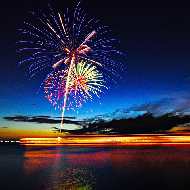
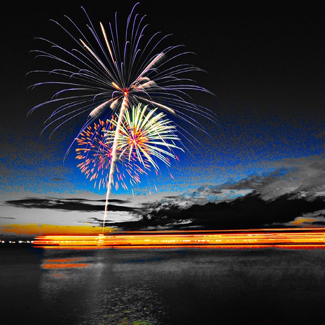
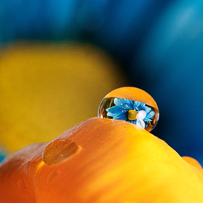
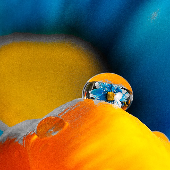
The color bars above demonstrate the Chrome issue. The top bar is an sRGB file. The bottom is the same file untagged. They should look exactly the same. They won’t if you’re on Chrome with a wide-gamut display.
We got tired of waiting, so we moved on to find another solution. As it happens, other companies had run up against this issue as well. Facebook had a novel idea – they optimized the sRGB profile down to its bare minimum, mathematically proving it generated the same results. They managed to get it down to just 524 bytes and dubbed the profile ‘TINYsRGB’. We tested it internally and didn’t notice any difference at all, so we started rolling it out slowly, then more broadly about a month ago. There were no issues raised by the community, and it fixed the Chrome rendering issue.
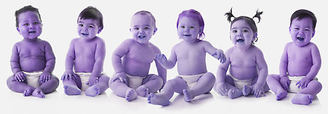
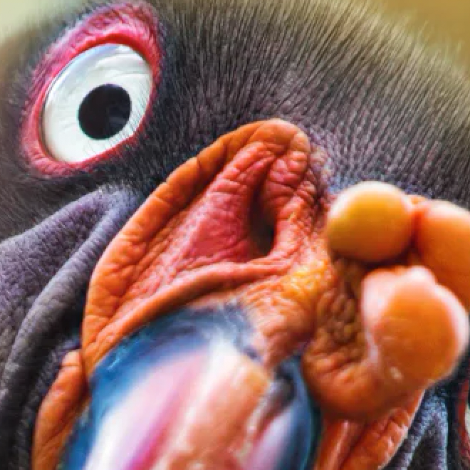
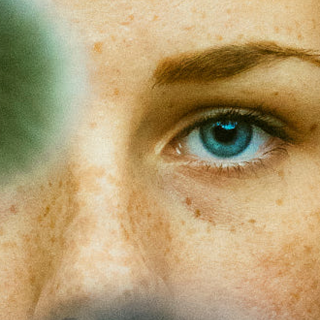
Does your browser fully support color profiles? If you’re seeing purple (or green) babies, then no, and you should check your settings and upgrade your browser if haven’t.

The image above should be the same as on left, not the one on the right. Image by Gable Denims
With the Chrome problem out of the way, we moved on to the bigger issue: full wide-gamut color support. Whether you know it or not, we’re now surrounded by wide-gamut displays, from our iPhones and iPads, to the iMac and MacBook Pros, to the Microsoft Studio, to amazing new Dell displays, to epic new Android phones (this one is a little complicated – we’ll get to it later). With such a high rate of availability and you, our photographers, shooting in wide-gamut formats, we felt now was the time to implement full wide color support.
So we stopped converting all images to sRGB.
Most people think that when they upload a file to 500px, we just deliver that file back when requested. The reality is much more complex. When you upload a file, our image resizer can generate any conversion required. There are generally about 20 different variations delivered in different circumstances that we use most often. As an example, these variations will depend on items like:
- The final size at which the file will be displayed
- The platform (TV, mobile, desktop browser, etc)
- Watermarked or not
- Quality level required
The system first checks to see if the required image is already cached. If not, it requests the correct version from our resize service. It also gets cached globally, so if the same image is requested again, it doesn’t have to be reprocessed.
To support wide color, we updated the pipeline to stop converting non-sRGB images to sRGB and allow the wide-gamut ones through – mostly Adobe RGB, ProPhoto RGB, and P3. People with wide-gamut displays finally started seeing those images in all their glory. Except, of course, when they didn’t.
[/twentytwenty]
[/twentytwenty]
You might have noticed that big red ❗ in the chart above. Android doesn’t currently have a color management system – which is a shame. Many of the high-end Android phones have pretty great wide-gamut displays, but with no easy way of displaying anything other than sRGB content on them. We started investigating ways to deliver a better experience to those members. We looked at doing the conversion from wide-gamut to sRGB on the device as we delivered the file, and we looked at updating our resizer to deliver a specific non-wide version. Then something interesting happened. When Google announced Android O, we were happy to spot one of the tentpole features: wide gamut support. We know there is a slow adoption rate of the latest Android releases, but now there is a solid path for photographers using the platform and wanting to see images as best as the displays can deliver them.
We’ll continue reviewing options for those Android users who won’t be able to make the move to ‘O.’
We also have a great new feature you might have missed – it allows you to easily find wide-gamut images on the site. Once you perform a search, you can filter by color profile as shown below.
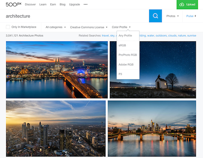
A new filter on search allows you to find images with specific color profiles
We then moved on to file formats. We’d started making changes to our rendering pipeline to allow us flexibility should new and interesting file formats arrive in the future. Cough. Cough. This allowed us to very easily test other formats that we’d previously passed on.
Google’s WebP format is an interesting beast. Introduced in 2010, it never widely caught on outside of the Chrome/Android ecosystem. It’s also optimized for highly compressed images – not the high quality, lightly compressed images 500px tends to deliver. Much more so than with JPEG, we struggled to get the best ratio of quality and file size across the bulk of our images. We compress our thumbnails more aggressively than the large images, so they tended to fare better in terms of size reduction over JPEG.
All that being said, the vast popularity of Chrome makes Google’s WebP a logical place for us to pursue some efficiencies.
We’ve rolled out WebP support to Chrome users about a month ago. After many rounds of tweaking, the results look pretty decent. We got to the bottom end of Google’s claim of 25%-34% reduction, seeing an average 25% reduction in file size with similar or better image quality. Our most recent Android app is also using WebP files.


[/twentytwenty]
Since WebP uses a different compression algorithm than JPEG, images tend to have a different feel. Gone are JPEG’s terrible artifacts along the edges of objects – WebP does a much better job on these. On the flip side, we struggled with WebP losing fine detail and texture in smooth and slightly textured areas of an image. As well, it’s good to keep in mind that compression levels aren’t directly correlated: i.e 80% JPEG quality is not the same as the 80% WebP setting.
[twentytwenty]
[/twentytwenty]
[twentytwenty]

[/twentytwenty]
So what do we consider best practices at 500px? For image size, we continue suggesting no less than 2048 pixels per side. That gives us the flexibility to generate any image sizes we need to deliver at optimal quality (and resizing from a large file hides any JPEG artifacts from the original upload to us). If you have a wide gamut monitor and are happy with the results, by all means upload those photos. Remember that if you shoot in RAW and buy an Adobe RGB or P3 calibrated display, you can reprocess your images to take advantage of the better display and the extra bit depth in the original files. Remember than when working in color spaces with large gamuts, use 16-bits-per-channel color depth mode to avoid posterization and banding.
Apple has a short video on getting started with using the P3 Color Space. If you’re using our app to upload photos taken on your iPhone 7 or 7 Plus, you’re already delivering us Display P3 photos). They’ll look great on every current device – and all those awesome ones yet to come.
Our system is now ready for any new compression and file format options that may appear. We can quickly test them, and if effective, roll them out to the community. As the cache empties of the old files, you’ll always start seeing the latest and greatest.


Leave a reply