Joel Tjintjelaar is well-known for his long exposure black and white images, so it might come as a surprise that he is now also working in color. In this article, Joel shares his stunning images and explains how he developed his unique approach to color photography.
Make sure to read until the end for a special surprise just for ISO readers!
Why do so many people prefer creating fine art images in black and white rather than in color? Do colors distract from the subject, like most people would say, including me in the recent past? Now I would say no, not when color is used thoughtfully and to emphasize the subject.
Last year, when I first started experimenting with color after having produced black and white photographs exclusively for many years, I wanted to explore my creative options and to investigate why “colors don’t work as well as black and white” in fine art photography. Because I was sure that it was just a myth. Why else are almost all paintings from master painters in the history of art created in color and why did they speak to so many people, including me?

Here’s where I started my investigation: by studying the painters that I love to understand more about how they used color.
Over the centuries, master painters have used colors in a very deliberate and effective way based on color theory. If you’re familiar with the color wheel and color schemes, then you’ll know about harmonious color schemes, such as complementary, triadic and analogous colors.
As photographers, we can learn a lot from studying the master painters. You might already know about Rembrandt lighting, which is a very distinctive triangle of light just below the eye in a portrait, named after the Dutch master painter Rembrandt. And perhaps you’re familiar with the term “chiaroscuro”, which is the dramatic use of contrast in light and shadow introduced by Italian master painter Caravaggio. But have you ever noticed the limited color palette in Rembrandt’s paintings? Or how Da Vinci used “sfumato”, which is to deliberately make the outlines fuzzy and the colors faded to create a sense of depth? Many more ideas can be gleaned from the master painters, such as Van Gogh’s use of vibrant, complementary colors placed adjacent to each other to draw the eye and Vermeer’s use of split complementary colors to achieve a more subtle effect.
Since I’ve always been an admirer of the limited color palette of Rembrandt, my use of colors is most inspired by his work. That doesn’t mean it’s the only right way, it’s just my personal preference, so if you prefer other color palettes, feel free to try those.
After studying Rembrandt’s and other master painters’ works, I identified three secrets to both enhance the composition and to lead the viewer’s eyes effectively within that composition using color:
First, use selective contrast in light. (This rule also applies to black and white photography.) If your main subject in the composition has the highest contrast in light, then the eye will be drawn there because the human eye is always drawn to areas with the highest contrast in light and shadow.
Second, use selective contrast in color. Use the highest contrasting colors in your main subject to lead the eye there effectively. The eye seeks contrast, so placing contrasting colors next to each other draws the eye to that specific area. If you use complementary colors (colors sitting opposite each other on the color wheel), this effect will be increased.
Third, use selective saturation. The more saturated a color, the more the eye will be drawn to that area in your image. That means to make the area where you want the viewer to look more saturated than the rest of the image.

In photography, as in painting, there are ways to finely control different parts of an image, using post processing. By making sure the highest contrast of all three elements (light, color and saturation) is on your main subject and the area directly surrounding it, you ensure that the viewer’s eyes are drawn to that area in the same way you would use leading lines to lead the eye within a composition.
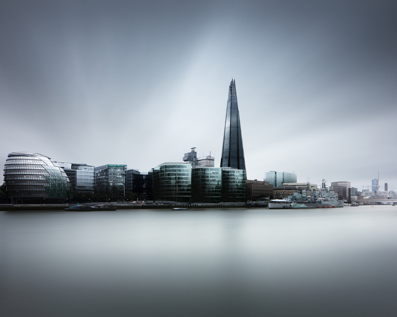
What’s my approach to color photography, based on my preference for a limited color palette? If you look at my color photographs you will see that I use an analogous color scheme with just a few split-complementary colors to enhance the composition. The highest contrast in saturation, light, and color is always in and around my main subject. Furthermore, I use “sfumato” — colors farther away from the viewer’s standpoint look more faded and less contrasty. That makes details appear less detailed, to the point of almost fuzziness, and creates an atmospheric perspective and more depth. You will also see that I use a lot of neutral colors.

Looking at Rembrandt’s paintings you will see that the saturated, more vibrant and contrasting colors are in the faces of his portraits (the areas where he wants you to look). He uses many shades of brown with black and gray in his backgrounds and, to a certain extent, in the clothes of the people in his portraits. This is because the eye moves away from neutral colors. Using neutral colors can also give a calm, tranquil look to your image as well as a place for the eyes to “rest”. Black, white, grey and brown are considered neutral colors. Grey with an undertone or a hint of another color is also considered a neutral color.
Using neutral colors and contrasting, saturated colors adjacent to each other in areas in your image will effectively lead the viewer’s eyes to those areas and cause tension on the edges of such areas. This is what Rembrandt did so well. On the other hand, using very specific and saturated complementary colors next to each other in your image will create a certain uneasiness for the eyes, and Van Gogh used this to great effect in many of his paintings.
In conclusion, avoid the temptation to globally saturate all of your colors. Instead, develop a color concept for your image and be like a master painter who uses light, color, and saturation wisely.
Want to learn more? Joel shares all his secrets in his new Fine Art Color Workflow video tutorial, produced in collaboration with Armand Dijcks. For 500px ISO readers, the tutorial is only $49 instead of $59 using promo code ISO500PX, valid until January 15, 2016. Get it here: http://armanddijcks.com/fine-art-color-workflow
To see more from either Joel or Armand, find them at the links below:
Joel
500px: https://500px.com/joeltjintjelaar
Website: http://www.bwvision.com
Facebook: https://www.facebook.com/BWVision
Google+: https://plus.google.com/+JoelTjintjelaar
Armand
500px: https://500px.com/armanddijcks
Website: http://armanddijcks.com
Facebook: https://www.facebook.com/armanddijcksvisuals
Google+: https://plus.google.com/+ArmandDijcks

Leave a reply