
Color is a powerful element in photography that can evoke emotions, set the tone, and enhance the story you’re telling. By understanding how to use color strategically, you can guide the viewer’s emotions and create more impactful images. In this article, we’ll explore how you can effectively incorporate color into your storytelling, drawing from the practices of experienced photographers.
The Emotional Impact of Color
Understanding Color Psychology
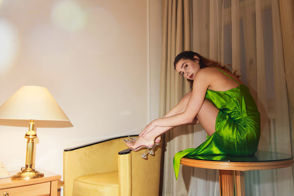
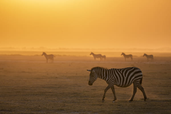
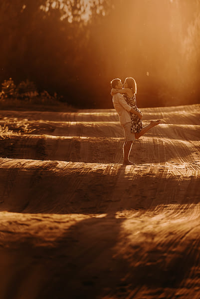
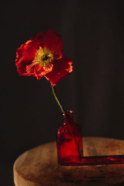
Warm Colors: Red, orange, and yellow are considered warm colors. They tend to evoke emotions ranging from warmth and comfort to anger and hostility. In photography, these colors can be used to create a sense of energy, excitement, or even tension.
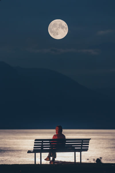
Cool Colors: Blue, green, and purple are cool colors. They are often associated with calmness, serenity, and sadness. Use these colors in your photography to create a tranquil, peaceful atmosphere or to convey melancholy.

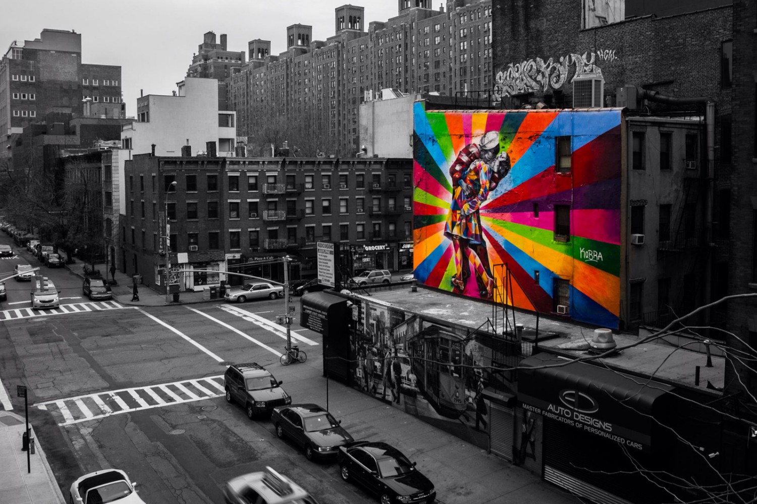
Neutral Colors: White, black, and gray are neutral colors that can be used to balance your composition or emphasize other colors. These colors often serve as a backdrop, allowing other colors to stand out more vividly.
Using Color to Tell a Story
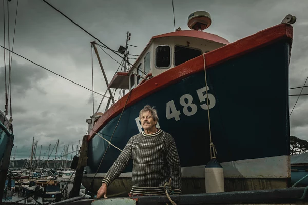
Highlighting the Subject: Use color contrast to make your subject stand out. For instance, a bright red coat against a snowy background immediately draws the viewer’s eye to the subject.
Creating Mood: The color palette you choose can greatly influence the mood of your photograph. A landscape bathed in warm, golden light feels inviting and nostalgic, while one in cool, blue tones might feel lonely or mysterious.
Symbolism in Color: Colors can also carry symbolic meanings that add depth to your story. For example, red can symbolize love, passion, or danger, while green often represents growth, renewal, or envy.
Advanced Techniques for Using Color in Storytelling
Color Grading
Creating Consistency: Color grading involves adjusting the colors in your images to create a cohesive look across a series of photos. This technique is often used in film to establish a consistent mood or tone throughout the narrative. In photography, you can use color grading to unify your portfolio or a specific project.
Enhancing Emotion: By subtly shifting the colors in your image, you can enhance the emotional impact. For example, adding a warm tint to a portrait can make the subject appear more approachable, while a cool tint can add a sense of distance or detachment.
Complementary Colors
Creating Visual Interest: Complementary colors are opposite each other on the color wheel and create strong contrast when used together. This contrast can make your images more visually striking and can be used to draw attention to specific elements in your composition.
Balancing the Scene: While complementary colors provide high contrast, it’s important to balance them to avoid overwhelming the viewer. Use one color as the dominant hue and the other as an accent to maintain harmony in your composition.
Analogous Colors
Harmonious Composition: Analogous colors are next to each other on the color wheel and tend to create a harmonious, pleasing effect. These colors often occur naturally together, such as in a sunset or a forest scene, making them ideal for creating cohesive, calming images.
Subtle Storytelling: Because analogous colors blend well together, they can be used to tell a more subtle, nuanced story. For example, using shades of blue and green in a landscape can evoke a sense of tranquility and connection with nature.
Monochromatic Color Schemes
Focus on Form and Texture: A monochromatic color scheme uses variations of a single color. This approach simplifies the composition and allows the viewer to focus more on the form, texture, and contrast within the image rather than being distracted by multiple colors.
Creating Unity: Monochromatic images can create a strong sense of unity and cohesion. They are often used in fine art photography to convey a specific mood or theme. For instance, a series of black-and-white images can emphasize the starkness or simplicity of the subject matter.
Practical Tips for Working with Color
Use Color Intentionally: Think about what you want the color to achieve in your image. Are you trying to convey a specific mood, highlight a subject, or create a sense of balance? Use color intentionally to guide your composition and storytelling.
Experiment with Post-Processing: Post-processing tools allow you to fine-tune the colors in your images. Experiment with different color grades, tints, and saturation levels to see how they affect the mood and narrative of your photograph. Remember, subtle adjustments can often have a significant impact.
Consider the Environment: Pay attention to the colors present in your shooting environment. Sometimes, you can find natural color schemes that enhance your story without needing much adjustment in post-processing. For example, the natural blues of the ocean and sky can be complemented by the warm tones of a sunset.
Learn from Film and Art: Study how filmmakers and artists use color to tell stories. Film directors often use color palettes to evoke specific emotions or themes. Similarly, painters have used color theory for centuries to create harmony, contrast, and depth in their work.
Color is a powerful tool in photography that can elevate your storytelling by evoking emotions, setting the tone, and drawing attention to your subject. By understanding the emotional impact of color and applying advanced techniques like color grading, complementary colors, and monochromatic schemes, you can create images that resonate deeply with your viewers. Practice using color intentionally in your compositions, and watch as your photographs transform into compelling visual stories.
Not on 500px yet? Sign up here to explore more impactful photography.


Leave a reply