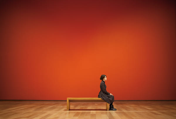
Negative space is the art of using the empty areas around your subject to emphasize its importance and deliver powerful visual messages. By mastering the effective use of negative space, photographers can create minimalist compositions that captivate viewers with their elegance and simplicity. Here’s a guide to understanding and using negative space like a pro.
What is negative space?
Negative space is the empty, or open space around your primary subject in a photograph. The main subject, often called the positive space, occupies a portion of the frame, while the negative space surrounds it and helps direct the viewer’s attention. It offers a sense of scale, depth, and simplicity, bringing a refreshing contrast to visually cluttered scenes.
Why use negative space?
Focus on the subject: Negative space draws the viewer’s attention to your subject by creating visual contrast. It acts as a frame that makes the subject stand out.
Creates minimalist impact: By minimizing distractions, negative space evokes strong emotions through simplicity, emphasizing the core message of your photograph.
Provides room for interpretation: The ample space around the subject allows the viewer to connect more deeply, leaving room for imagination and interpretation.
Elicits emotions: The vast emptiness can evoke feelings like solitude, peace, or loneliness, depending on the subject and overall composition.
Applying negative space to your photography
Choose a simple background: Avoid busy, distracting backgrounds. Select uncluttered backdrops, whether a clear sky, blank wall, or vast landscape.
Frame your subject deliberately: Place your subject in a visually interesting part of the frame. Experiment with different positions—off-center or near the edge—to see how it interacts with the surrounding negative space.
Balance positive and negative space: The negative space should dominate, but not overwhelm your subject. Too much negative space can diminish the subject’s impact, while too little can undermine the composition’s elegance.
Use colors and contrast: Opt for contrasting colors between the positive and negative spaces to make your subject pop. Monochrome backgrounds also help simplify the composition.
Advanced tips and techniques
Asymmetry for impact: Utilize asymmetrical compositions with ample negative space on one side. This adds tension and dynamic energy, emphasizing the direction of the subject.
Pattern disruption: Break repetitive patterns or textures with your subject to make it stand out more. For example, isolate a single leaf among vast open water.
Perspective and scale: Play with perspective by contrasting a small subject against a large negative space. This creates a sense of grandeur or isolation that adds to the composition’s emotional impact.
Textures and layers: Negative space doesn’t have to be empty or featureless. Using subtle textures like gentle waves or layered mist adds dimension without detracting from the main subject.
Negative space is a subtle yet powerful tool that can transform the impact of your photographs. By carefully balancing the positive and negative spaces, and making deliberate choices regarding composition, color, and perspective, you can create images that carry strong messages with minimalist simplicity. Experiment with asymmetrical framing, pattern disruption, and layered textures to enrich your compositions and convey emotions through the art of less. The mastery of negative space not only elevates your images but also invites viewers into a more intimate, evocative visual experience.
Not on 500px yet? Click here to learn about Licensing with 500px.


Leave a reply