Henri Cartier-Bresson did it. Edward Steichen and Richard Avedon did too. Ansel Adams recently went viral for using it. Of course, we’re talking about the golden ratio, the divine proportion, or phi—a seemingly magical number that crops up time and again in the work of master photographers. Whether they used it intentionally or not, the ratio has become a defining principle in the art and history of the medium.
Here’s a brief refresher from math class: two numbers or objects are in the golden ratio if their ratio is equal to the ratio of their sum to the largest number. Numbers in the famous Fibonacci Sequence (0, 1, 1, 2, 3, 5, 8, 13, 21, 34, etc.) come close to the golden ratio, becoming even closer as they progress.
The golden ratio can be represented by the number phi, or approximately 1.618. You can find this number throughout the human face and body as well as in nature, from plants to celestial objects. Many say the ratio is inherently pleasing to the human eye, and some say it’s simply the result of our desire to find meaning and patterns in our surroundings, but the fact remains that it’s been used in art for centuries.
Architects like Le Corbusier and painters like Salvador Dalí incorporated the number into their masterpieces, and it’s been applied by scholars to countless works of art and design, ranging from Botticelli to Michelangelo, sometimes retrospectively. For photographers, of course, it’s become one of many tricks for creating asymmetrical balance within a single frame.
Sometimes, the golden ratio is shifted slightly to become the rule of thirds, though many feel that the latter is an oversimplification. With the rule of thirds, you’ll divide your rectangular frame equally like a tic-tac-toe board (1:1:1 vertically and 1:1:1 horizontally); instead, you might choose to divide it according to the golden ratio: 1:0.618:1. It’s up to you, but many believe that the second comes closer to achieving that perfect harmonious balance.
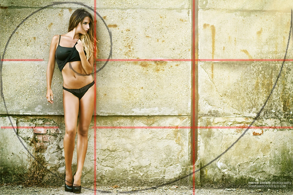
Luckily, you can easily apply a golden ratio overlay to any photo in Photoshop or a similar editing app. In that case, your subject or point of interest would fall a bit further inside those thirds lines, and you might also place your horizon along one of those lines.
This photo by Milos Nejezchleb, for instance, applies the principle to direct the eye to the hands of the women as well as the edges of the door frames, light fixtures, and signage (see a close-up with Photoshop grid lines below); you’ll find that many images in his portfolio use the golden ratio to similar effect.
You might have heard, too, about the golden rectangle, or a rectangle whose sides are in the golden ratio. In geometry, you probably studied the golden spiral—a logarithmic spiral with a growth factor equal to phi—as well. The nautilus shell is famous for following this spiral, and many photographic compositions might also adhere to the curve of the golden or Fibonacci spiral.
This photo by Azim Khan Ronnie, for example, positions various women along the Fibonacci spiral to guide our eye to the main subject—the woman in the foreground—who occupies the tightest coil of the spiral. Every figure is essential, forming a visual map that serves to bring the “hero” into greater focus.
Of course, these are just two ways of using the golden ratio to compose your images, but possibilities abound. When you’re in the field, practice keeping that spiral or phi grid in the back of your mind. The more you use it, the better you’ll get at composing your shots in the moment, rather than having to finesse your compositions on the computer.
You won’t be able to follow the golden ratio using an overlay in your viewfinder, as you would the rule of thirds, simply because all the variations would make it too confusing, but this can actually be an asset rather than an obstacle because you’re forced to visualize it on your own.
Bending down, climbing stairs, and moving to the right or left are all ways to exert control over what’s in your frame and what isn’t; if you’re working with moving subjects, it can also pay to wait until someone enters just the right portion of that rectangle. You can always capture a few shots of the same subject to see what comes closest to aligning with the spiral or grid.
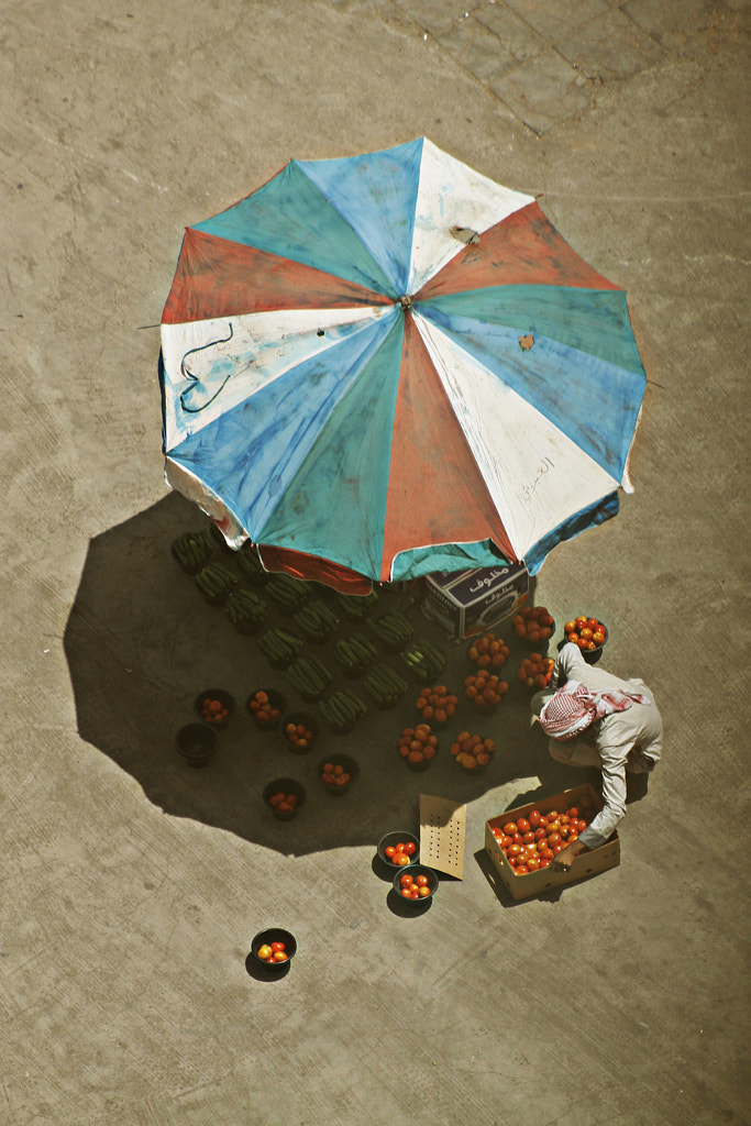
It can also help to consume as many images as possible, training your eye by studying photos that work. Cartier-Bresson himself regularly studied paintings to deepen his understanding of geometry. Throughout this article, you’ll find examples of compositions that follow the phi grid or the Fibonacci spiral.
When used correctly, as we see here, the golden ratio can bring your photos to life. But as with any photography guideline, it isn’t necessarily a rule; it’s just a tool. Some photographers swear by the divine proportion, while others think it’s overhyped. The truth—like the ratio—is more complex: it works in many situations, but it might not work every time.
The curves of the human face, for instance, naturally lend themselves to this compositional technique, as do works of architecture, but it’s ultimately up to you where to place the eyes, the horizon line, and other essential details. Follow the ratio when you want to convey a sense of harmony and balance, but don’t be afraid to mix it up and try new things as well.
The golden ratio has, in one way or another, informed artworks for centuries—and inspired best-selling novels—and we’re still learning more about it. Last year, for instance, researchers at Johns Hopkins University found that beyond the well-known examples of pinecones, galaxies, and hurricanes, the number could be found in the dimensions of the human skull. While we might not yet understand everything about it, this number seems to be baked into our anatomy, so it makes sense that we seek it out in art, consciously or not.
Not on 500px yet? Sign up here to explore more impactful photography.


Leave a reply