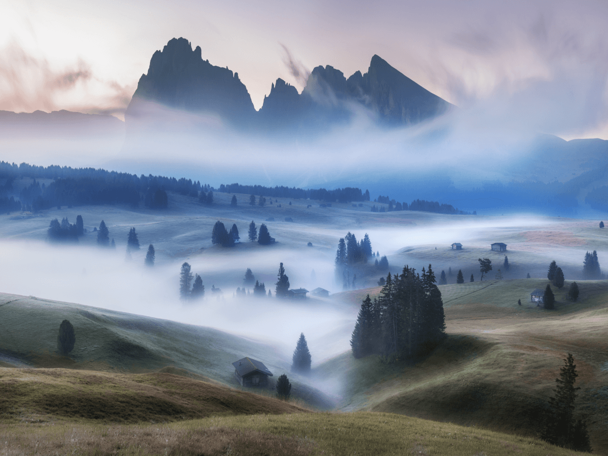
Analogous color schemes, composed of colors adjacent to each other on the color wheel, naturally produce harmonious and visually appealing images. These palettes offer photographers a gentle yet compelling approach to color, creating soothing, cohesive photographs that effortlessly draw viewers into a serene visual experience.
Understanding Analogous Colors
Analogous colors share common undertones and naturally complement each other, creating visual comfort and unity. Common examples include:
- Warm Analogous Schemes: Red, orange, and yellow hues evoke warmth, energy, and positivity.
- Cool Analogous Schemes: Green, blue, and violet hues convey calmness, tranquility, and introspection.
Emotional Impact of Analogous Colors
Each analogous color palette carries unique emotional associations. Selecting colors intentionally allows photographers to reinforce specific moods:
- Warm palettes promote excitement, vitality, and optimism, ideal for lifestyle or dynamic portrait photography.
- Cool palettes emphasize relaxation, peace, and contemplation, perfect for landscapes, seascapes, or reflective narratives.
Techniques for Successful Analogous Compositions
Creating powerful analogous compositions requires mindful planning and execution:
- Dominant and Supporting Colors: Choose a primary color to dominate your composition, using adjacent hues to provide depth and visual interest.
- Balancing Tonal Values: Incorporate a variety of tones within your analogous palette—from dark to light—to maintain visual balance and ensure clear differentiation between elements.
Lighting to Enhance Color Harmony
Lighting profoundly affects the appearance and interaction of colors within analogous schemes:
- Natural Light: Soft, natural daylight enhances color cohesion, bringing out subtle tonal variations and supporting visual harmony.
- Studio Lighting: Controlled lighting setups enable photographers to precisely manage color intensity, highlighting specific hues to strengthen composition and mood.
Composition Tips for Analogous Schemes
Intentional composition enhances the natural beauty and harmony of analogous color photography:
- Simplify Your Scene: Removing unnecessary elements ensures the analogous palette remains clear, focused, and impactful.
- Layering and Depth: Thoughtfully layering colors within your composition adds depth and encourages viewer engagement, inviting exploration of visual details.
Refine Through Subtle Post-Processing
Analogous color photography often benefits from nuanced post-processing:
- Adjust subtle differences in hue, saturation, and luminance to fine-tune harmony and enhance emotional resonance.
- Consider gentle contrast adjustments to highlight variations without disrupting overall visual tranquility.
Analogous color schemes offer photographers a unique opportunity to create naturally harmonious and emotionally resonant images. By thoughtfully selecting your palette, carefully managing composition and lighting, and subtly refining in post-processing, you can produce photographs characterized by visual ease, depth, and emotional clarity.
Embrace the subtle power of analogous colors and elevate your photographic storytelling with visually cohesive, harmonious compositions.
Extended reading: Using Color to Strengthen Your Photographic Narratives


