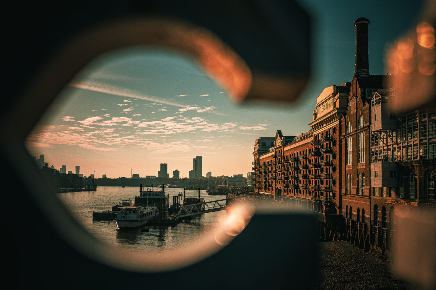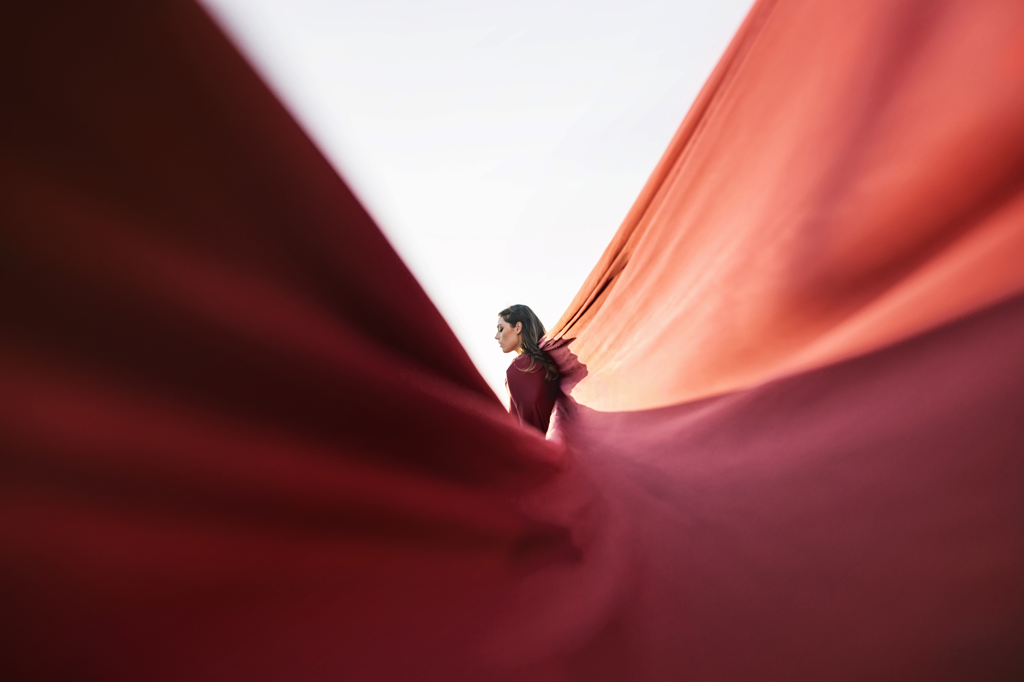
Most photographers think about color as something that happens in a scene and gets managed afterward. Monochromatic color photography flips that. Instead of managing color, you commit to a single dominant hue and build everything around it: the subject, the framing, the light, the background. The result is a body of work that has an unmistakable visual identity, and individual images that hold together with a coherence that multi-color compositions rarely achieve.
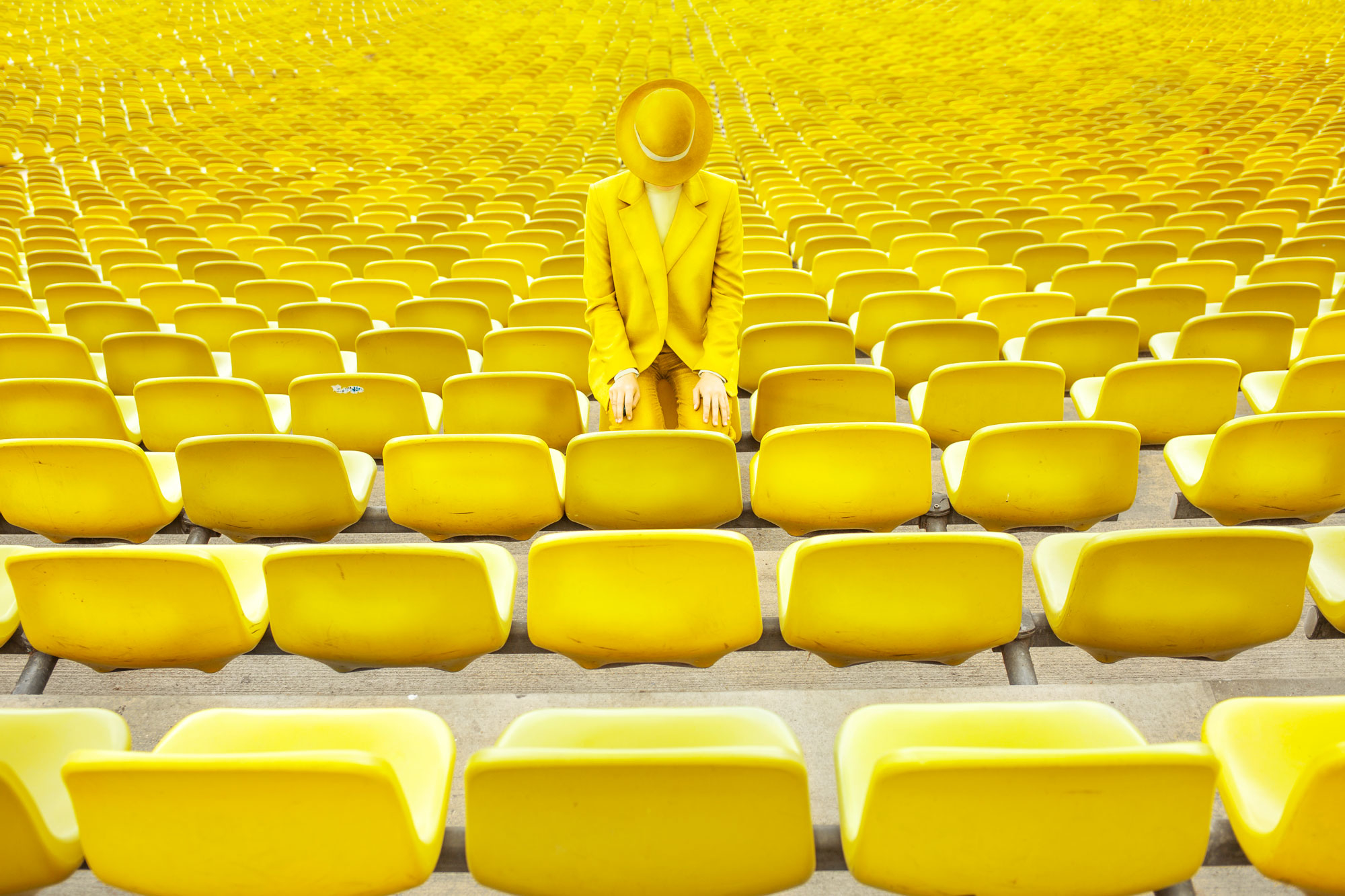
What monochromatic color photography actually means
Monochromatic doesn’t mean one exact shade. It means one dominant color family across the frame. A blue image might contain navy shadows, pale sky, teal water, and grey-blue stone. A red image might move from deep burgundy into bright scarlet into a warm blush. The variation in tone and saturation within a single hue is what gives monochromatic color photography its depth and prevents it from looking flat or gimmicky.
The goal is not to eliminate all other colors. It’s to make one color so dominant that everything else recedes. A small neutral element in a predominantly orange frame doesn’t break the composition. It often anchors it.
Why it works as a visual identity tool
Strong visual identity in photography comes from consistency. When a photographer returns repeatedly to a specific color, subject matter, or approach, a body of work begins to form a recognizable signature. Monochromatic color photography is one of the fastest ways to build that consistency because the organizing principle is immediately visible and easy to sustain across different locations, subjects, and light conditions.
For photographers building a portfolio, an Instagram presence, or a personal project, shooting in one color creates instant coherence. Viewers recognize the work before they read the name attached to it.
How to approach each color
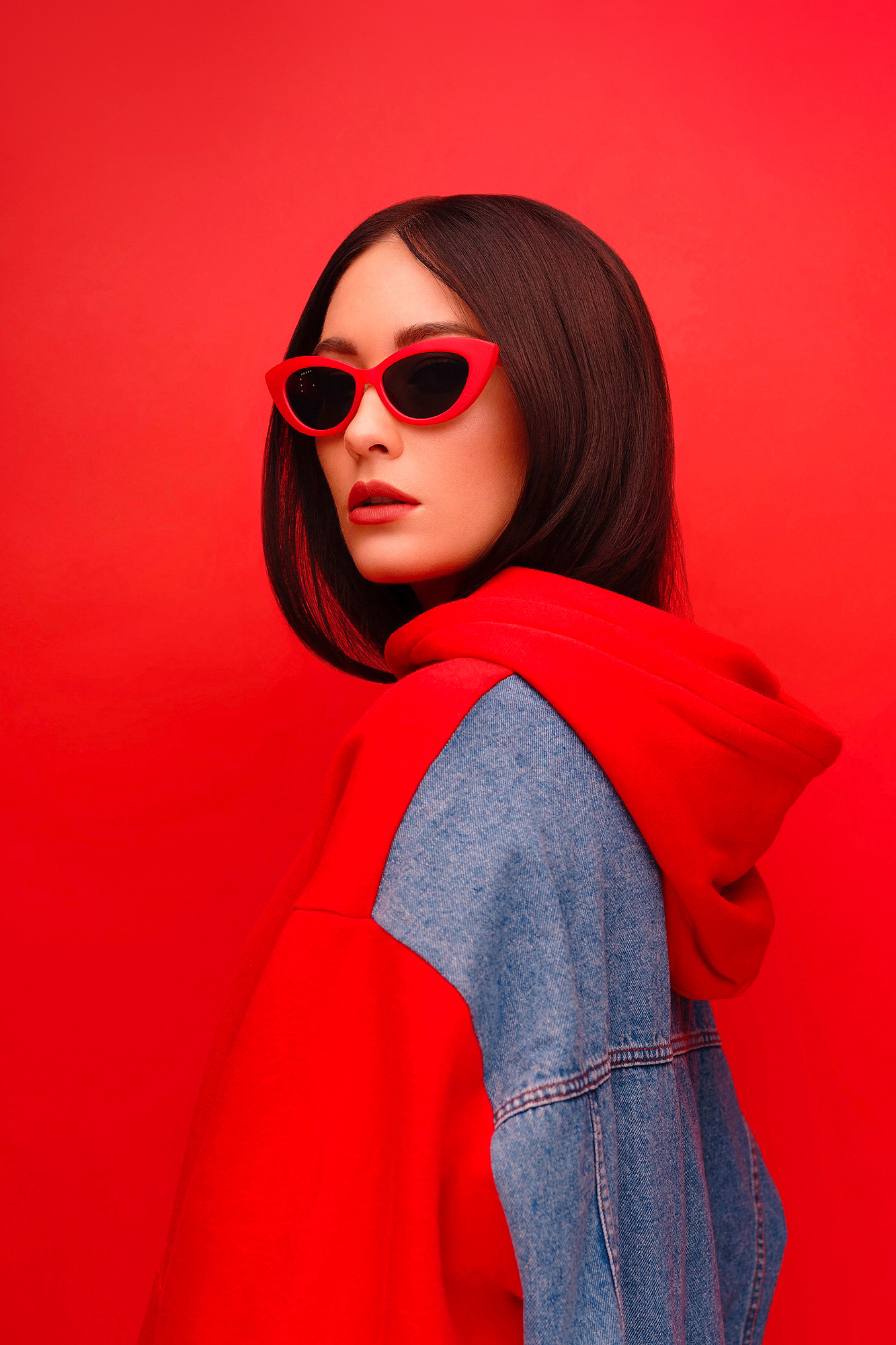
Red
High energy and high contrast. Red subjects photograph best against neutral or cool backgrounds that let the color lead. Markets, transport signage, flowers, and architecture all offer consistent red subjects in urban and natural environments.
Blue
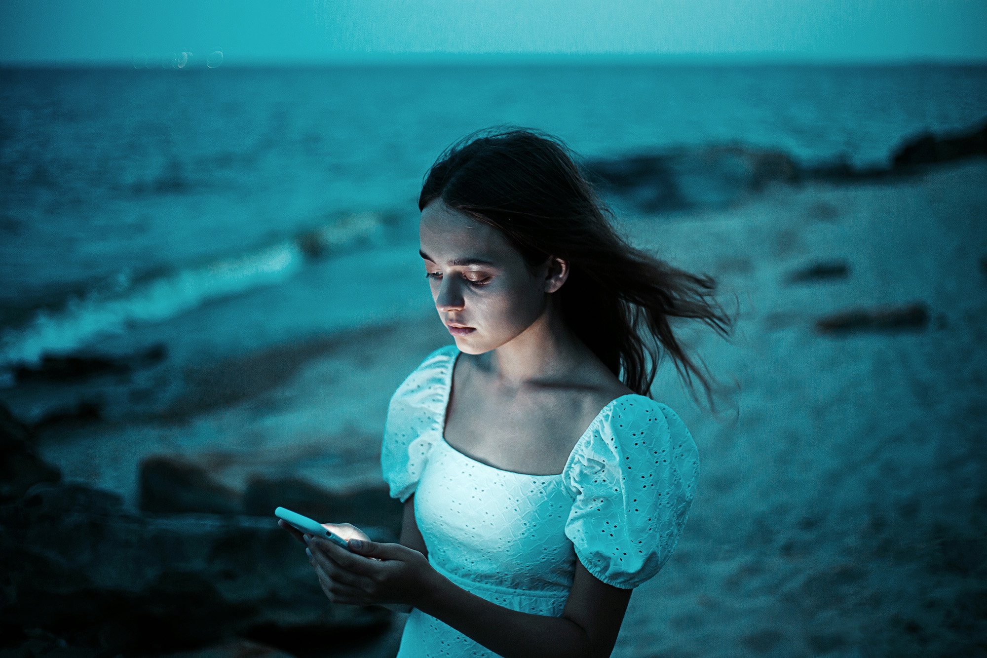
The most naturally abundant color in outdoor photography: sky, water, shadow, and twilight. Blue monochromatic color photography often comes from timing rather than seeking. Early morning and blue hour produce environments where blue dominates the frame without any intervention.
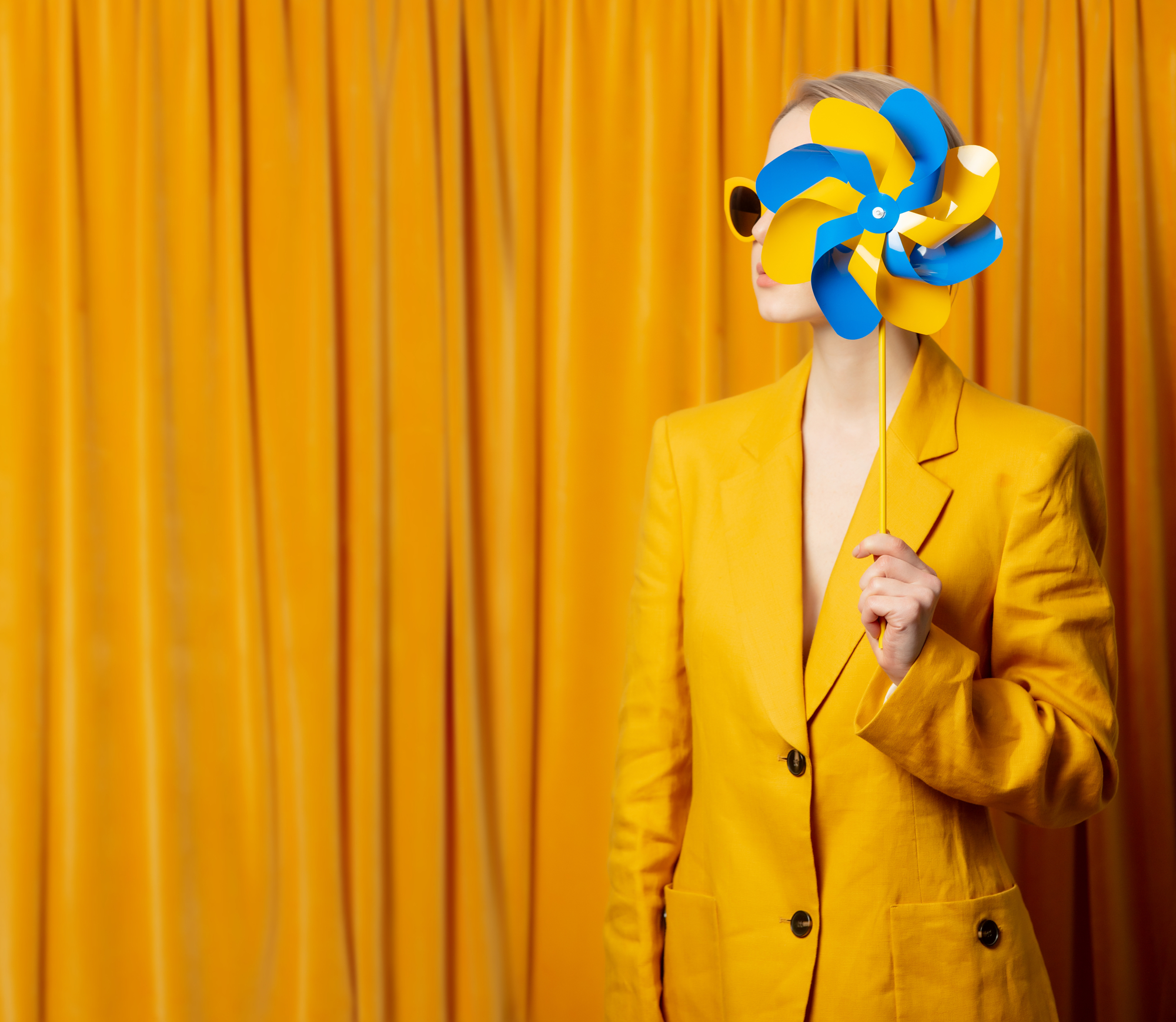
Yellow and warm tones
Harder to sustain as a consistent approach but striking when done well. Direct sunlight, autumn foliage, desert landscapes, and warm artificial light all produce yellow-dominant scenes. The challenge is avoiding overlap with the orange-dominant palette of golden hour photography.
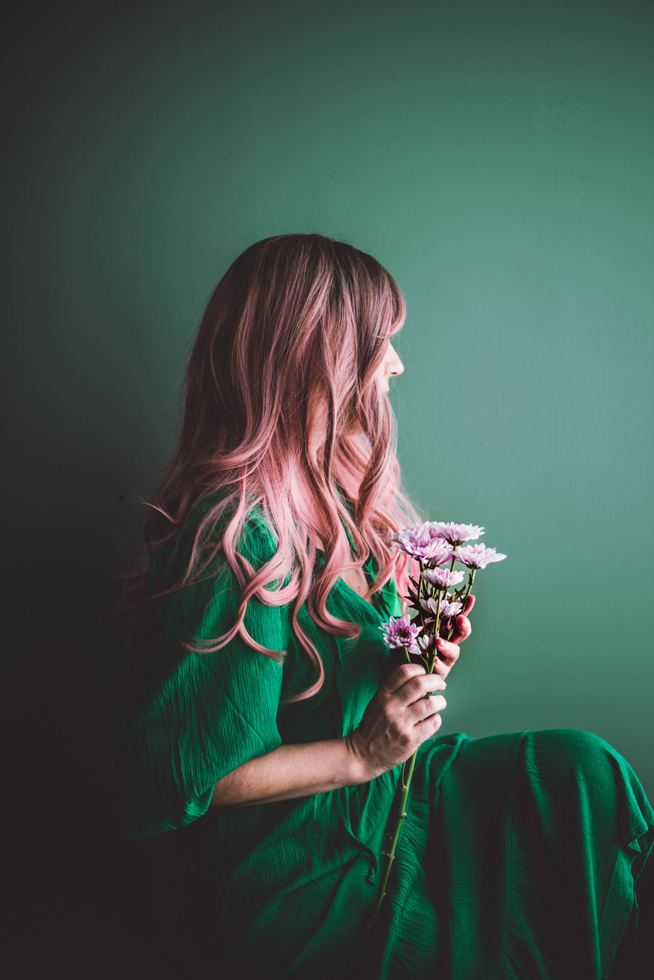
Green
Forest, foliage, moss, water. Green is the easiest color to work with in natural environments and one of the most calming in the finished image. Green monochromatic color photography tends toward stillness and works especially well in overcast light, which saturates greens without creating harsh contrast.
Practical tips for shooting in one color
Before you raise the camera, assess the dominant color in the scene. If it isn’t already the color you’re working in, look for a tighter frame, a different angle, or a better time of day. You’re not manipulating the scene. You’re editing your position and timing until the color takes over.
In post, small adjustments to the HSL panel can shift a scene closer to monochromatic without making it look processed. Pulling the saturation of competing colors down slightly, or shifting their hue toward your dominant color, can unify a frame that was almost there but not quite.