Piotr Skoczylas is a London-based surreal portrait photographer whose multiple exposures have absolutely blown us away. As soon as we found his work, we asked him if he’d be willing to share his editing secrets in a multiple exposure tutorial. Lucky for us, he said yes!
Check out the step-by-step tutorial below, try it for yourself, and then share the final image you’ve created in the comments at the bottom!
And if you’d like to see more of Piotr’s work, you can follow him on 500px, visit his Facebook page, or buy his prints on Artfinder.

My name is Piotr, and I am a surreal portrait photographer. I picked up a camera 3 years ago, and since that moment I knew I wanted my pictures to be something more than just the click of the shutter. It took me a while to figure out what exactly I wanted to do, and who I am as an artist, but lately I feel closer to my goal than ever!
I was experimenting for a really long time until I created something I really liked, and with which I could connect emotionally. I know there is still a lot of work ahead of me, but the “Double Exposure Series” is a series of all those great moments I had with photography and graphic design.
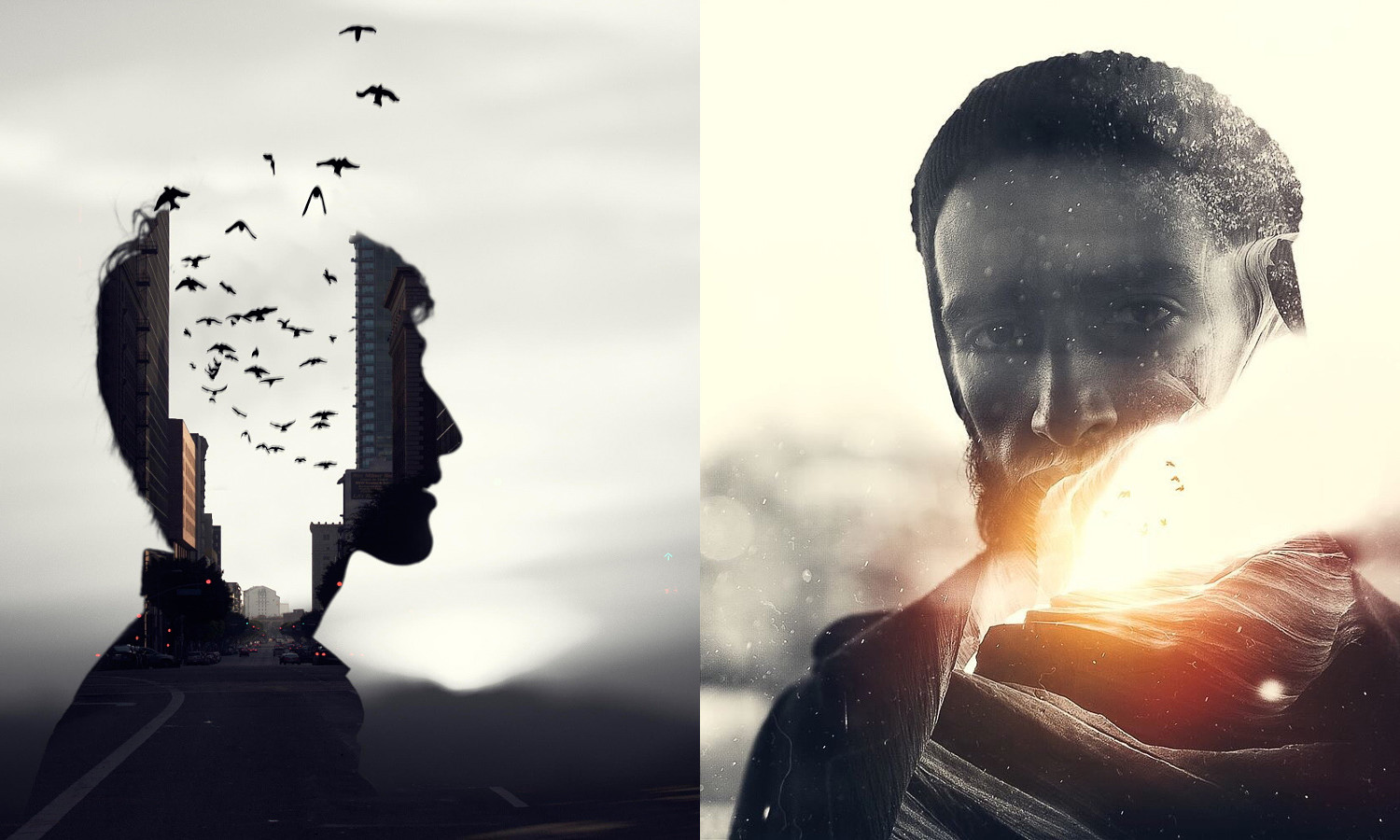
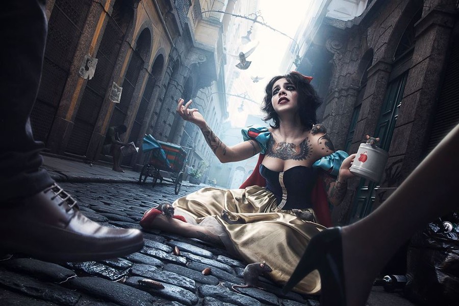
In the photo “It does not exist,” I am trying to visualize how freedom of choice (birds) can lead to some troubles (red light leak). We’ve all done something we regret; we’ve all made mistakes. But what happens when we don’t realize it? (empty space between the buildings). What if all thoughts (street with cars) are the wrong kinds of thoughts, which lead us to nowhere?
This is my personal interpretation, but I would love to get feedback and get to know your opinion and comments. It’s interesting how one picture can tell so many stories.
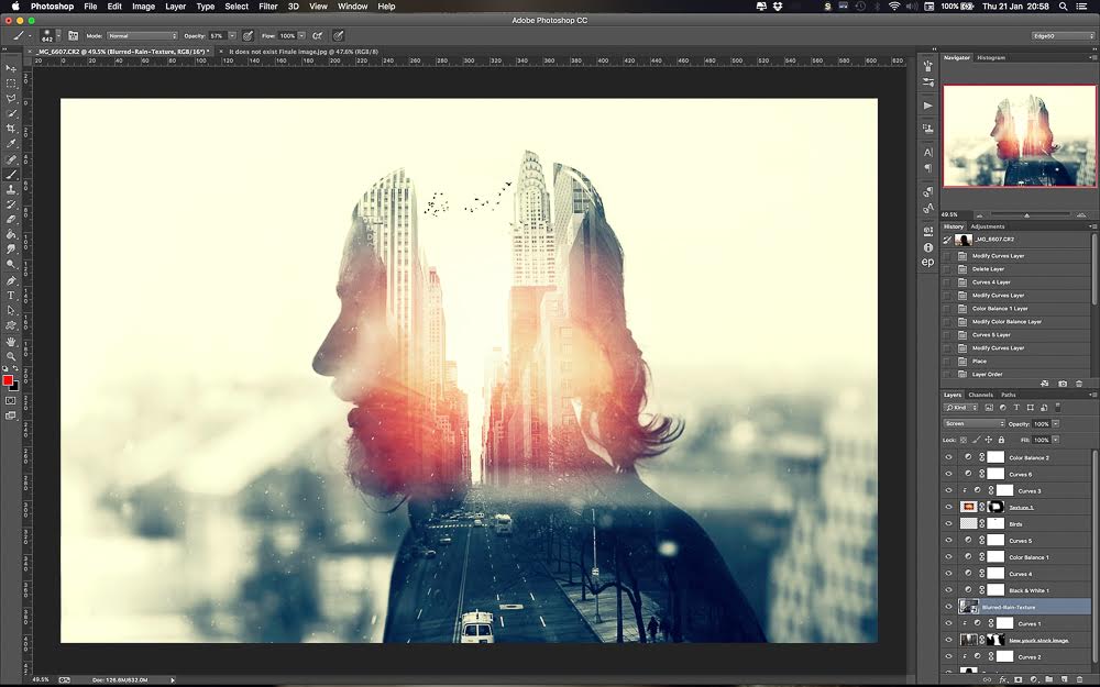
1. Open the base images.
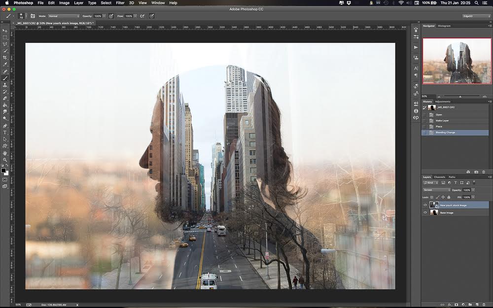
2. Overlay the photos.
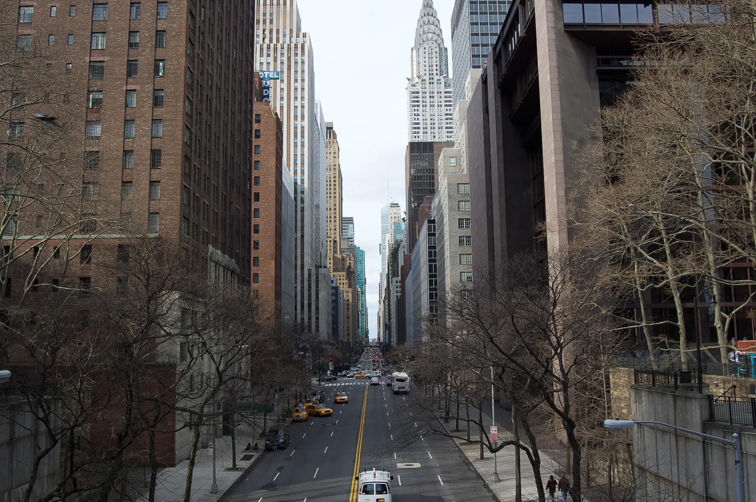
Position the photos New York so the space between the buildings is in the middle of the model’s head. Change the blending mode of the New York picture to Screen.
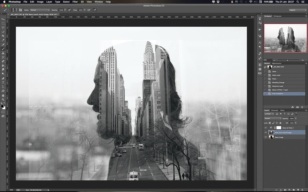
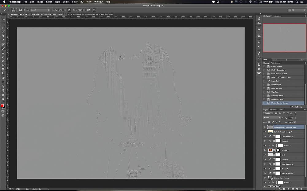
3. Desaturate the whole image.
4. Correct contrast.
Add couple of curves adjusting layers and correcting the contrast. You need a separate layer for each photo, as you need to have control over the darks and whites.
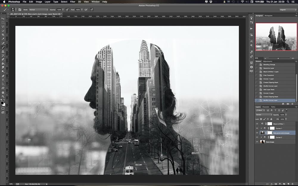
5. Create a mask on the New York photo and mask unwanted parts of the image.
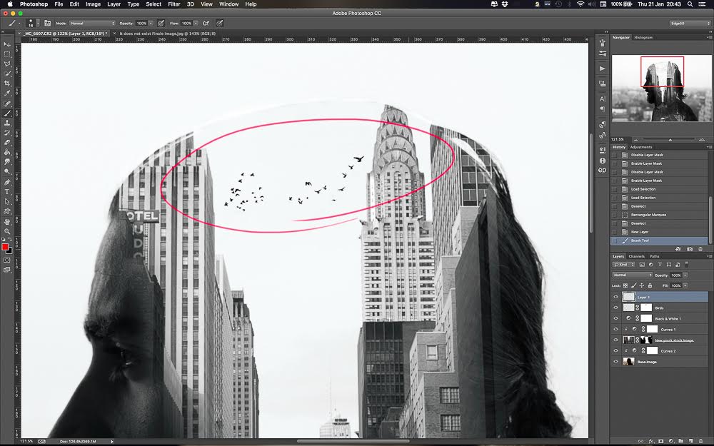
6. Add birds.
I use my own stock image but you can find a lot of different free birds images on Google. If you wish to use your own, you’ll have to cut them out of the background or, if they’re photographed against white sky, then its easy to blend them in. Just use the mask tool.
Usually when you make such a photo smaller, it looks sharper than the rest of your artwork. I would recommend using the standard blur filter and blurring it just a bit to get a more realistic look. 1px is usually enough in blur tool.
7. Add the middle light texture.
This one I got from Google. Change the blending more to Screen again. You will be left with those hideous lines marking the end of the photo. You want to blend it in using the mask tool again. Use a soft brush and just hide the unwanted parts. I use a tablet to edit, so it’s supper easy.
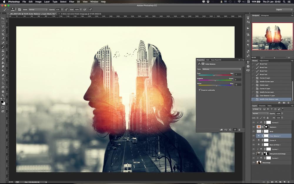
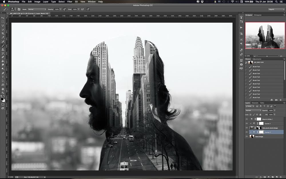
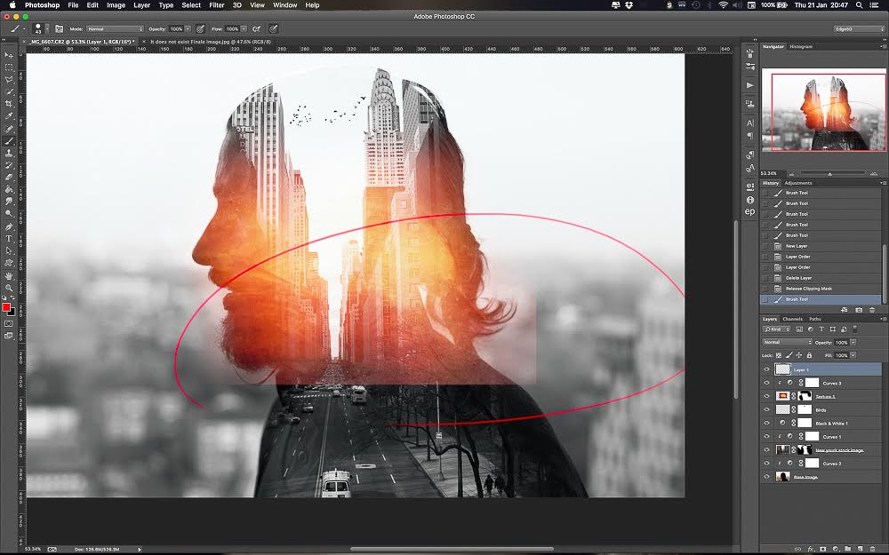
8. Adjust contrast and color.
Play around with curves and color balance layers to adjust the contrast and colors of the image.
I changed the photo to Black and White at the beginning, but I don’t want it to be fully out of color. Usually I add a bit of blue to the shadows and yellow to the highlights. It adds atmosphere.
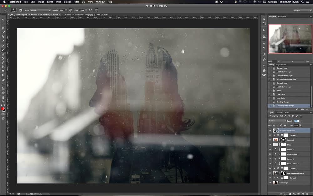
9. Add another image/layer for more drama and depth.
To add extra depth, I added my own stock image of blurred rain drops. I put it over my image, positioned it, and changed the blending mode to Screen again. As an optional step, you can create a clipping curves adjustment layer so only this image will be affected, and adjust the contrast so it’s a bit darker.
This is because in Screen mode you’re going to see less of it. For this image I left it untouched as it looked good to me.
10. Flatten image and sharpen it.
I use a high pass layer to do this, then I change it to soft light blending mode.
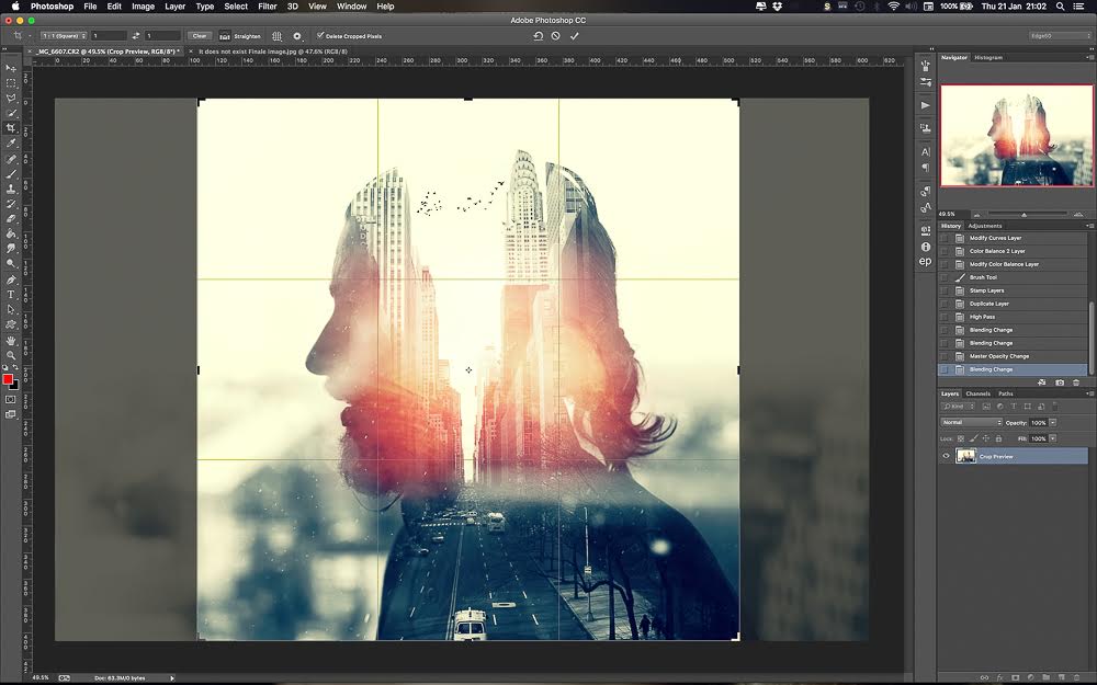
11. Crop the image.
I like the square ratio in this particular work. There are so many elements in this photo that you don’t want to be distracted by the background. That’s why I think square is a perfect crop for this shot.
12. YOU’RE DONE! 🙂
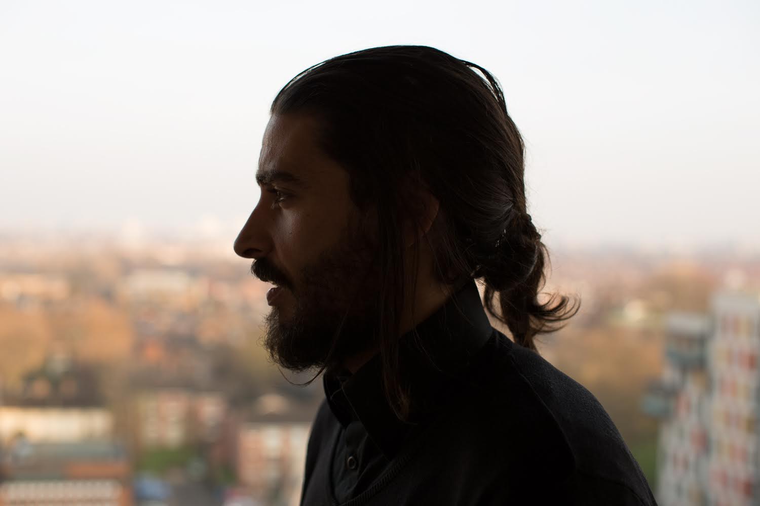
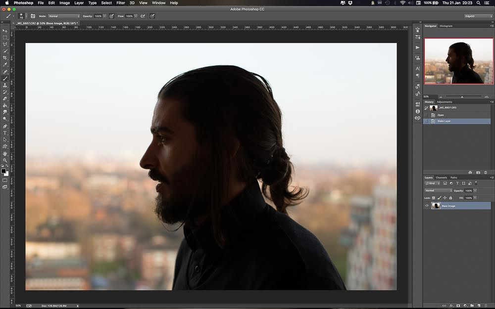
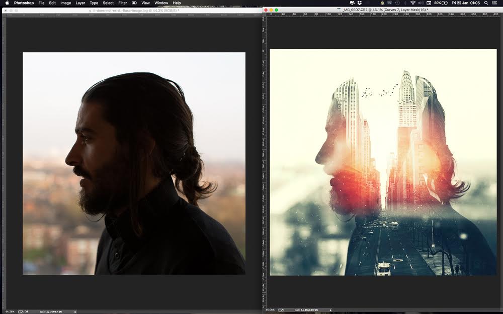
Here is a look at the original portrait vs final image:
Leave a reply