Pedro Quintela is a history teacher, talented photographer, and one of the most motivational people on 500px. His latest piece of advice is for anyone who would like to improve their approach to photography, from getting motivated to scene composition to color harmony to finding a great photo title.
For more about or from Pedro, follow him on 500px, check him out on Facebook and join his Photo Reflections FB group, or license his images on the 500px Marketplace.
I am often asked about the so-called “secrets” behind my photography work. Because I believe in sharing knowledge, I am unveiling some of the crucial moments I always consider during my creation process.
1. Gear, Motivation, and Imagination
By gear, I don’t mean having the best camera and lens in the world. How many amazing photos do we see everyday with older or budget equipments? Knowing your equipment very well beats not having a hundred megapixel sensor. Ask yourself: Where are the dials? How and what do they perform? How can they be tweaked to give me the best performance? Which is the sweet spot of my lens? Knowing these sorts of things create a more comfortable and confident mood whenever I shoot. How many times have you missed a moment because the camera was off, or the lens cap was on, or the ISO was too high, or you didn’t switch over to a particular mode quickly? I’m sure this has all happened to us.
Motivation plays a big role in our work. We all lose it sometimes, but we must always find a way to grab our gear, feel confident enough to go somewhere, and write pixels on our cards. Forms of art, such as a piece of music, a person, a book, a movie, can all trigger your motivation for photography. I shared an in-depth article on motivation here.
Imagination has always been a nightmare to me. Many of my friends laugh about this or think I’m joking, but the truth is I consider myself to be an unimaginative person. Perhaps it’s because I came into photography in my late thirties, or it’s my own personality, but I always have a difficult time building my imagination. How do I find it? The secret is, there’s no exact formula. You either have imagination within you or you don’t. I still try to shoot and compose as many images as I can, finding inspiration in them, and hoping they will set off my imagination.
To tap into this more, I always sit down with a notebook and I write down my ideas that I could combine in a single image someday.
2. Framing the Scene
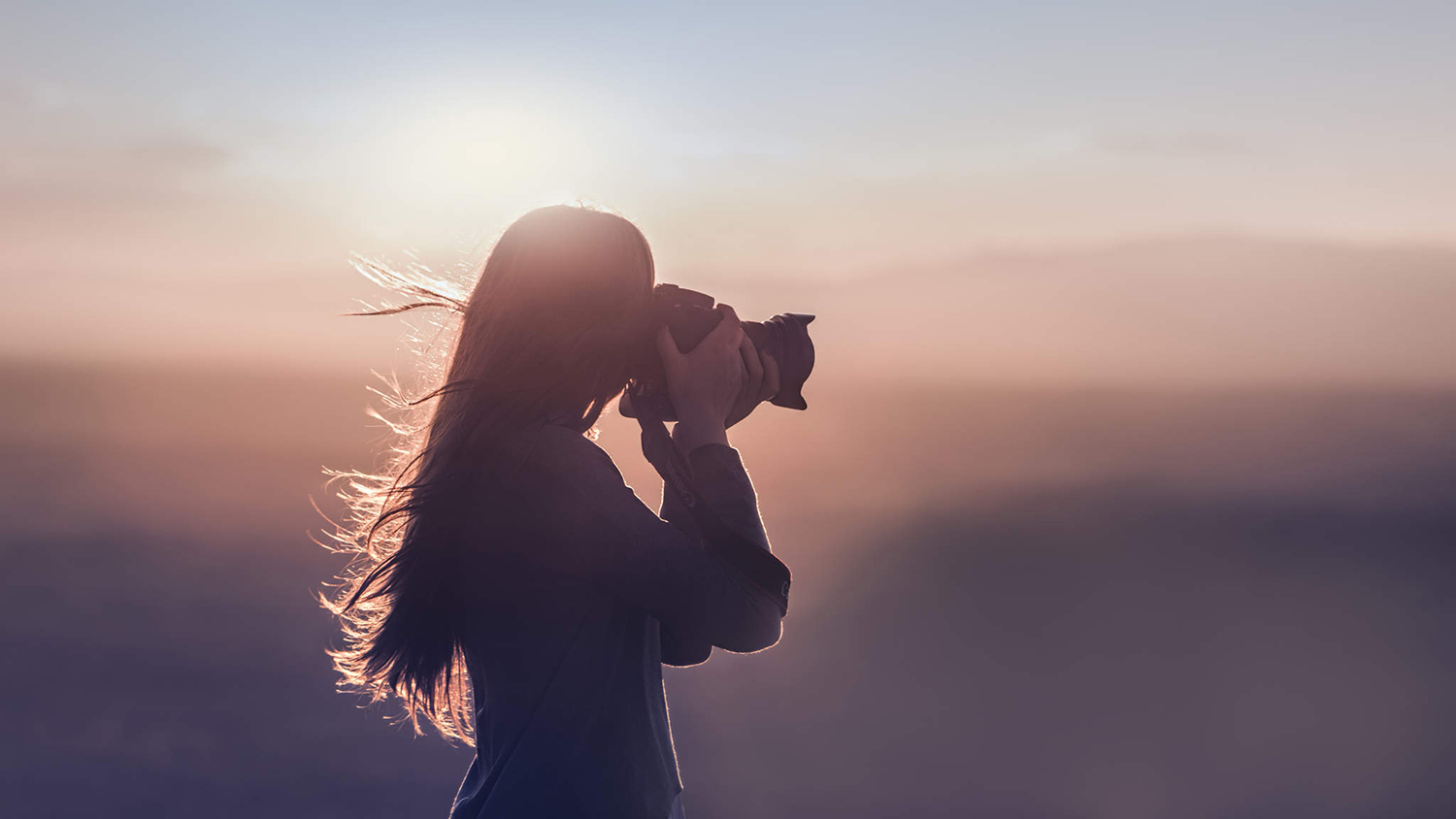
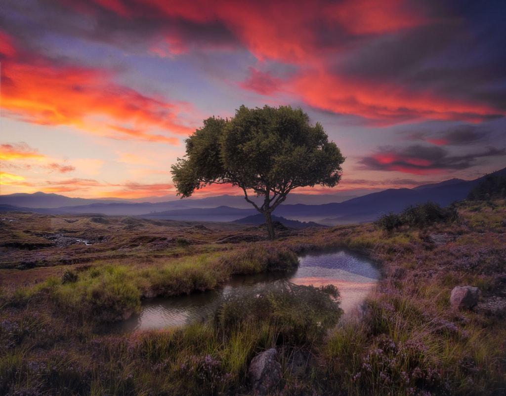
A key moment is framing your scene, especially when you’re shooting on location. Many would say this one is pretty obvious, but the way you see and capture the moment that your viewfinder (or the back display) has framed is very important. Seeing through your viewfinder creates another dimension. There are many variables in your camera (like sensor, lens angle, height, and many others) that make your framing different from what you see with your very own eyes. The best way to see and spot a scene is by looking through that square created by your viewfinder. It creates a vision in our mind and leads our own eyes to a particular world.
This moment is very challenging and motivational. It allows you to find and explore ways of deciding what you think is really important in your shot. So the first step is to analyze the moment. Find out why you want to capture a particular scene.
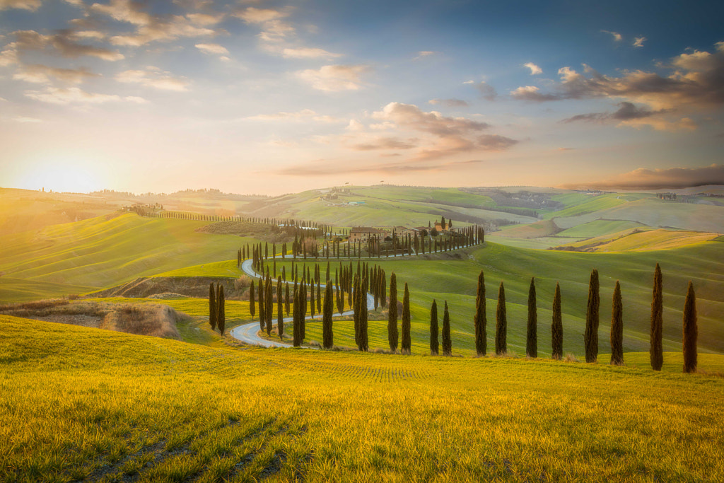
This article isn’t about composition rules, but you still have a lot of ways to create beautiful compositions. The most common of all is the Rule of Thirds. Other rules like Leading Lines and Depth are what I often use a lot in my own work. Taken individually, or combined, these techniques often deliver an amazing way to compose a great scene. For instance, if you want to create depth in a landscape, you need to include a variety of scales in your composition. For this to work, you will need proportions by giving a sense of different scales between the foreground and background. Another important thing is the light, another factor you must use to enhance your scene.
Don’t be afraid these tips. You´ll be surprised with how much they will boost your work, trust me.
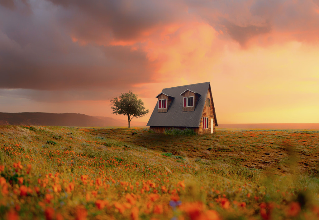
3. Keep It Simple
Simplicity is the most important rule that I always try to achieve. It could be a matter of personal taste. I’m not attracted to images charged with so many elements going on. They could distract the viewer, making it difficult to understand the purpose of a photo.
Our brain decides almost instinctively if the image is pleasant or not. When you share or show your photo, you have a small window (let’s say about 10-15 seconds) to grab the viewer’s attention. Creating a simple atmosphere that your viewer could relate to gives you extra time. Afterwards, your viewer may start to connect with your photo. There’s no better reward, at least to me, than when someone says to me, “I can´t stop looking at your picture.”
I never use more then 3 subjects or elements in my work. Anything beyond that becomes a slippery slope to distraction. Including negative space (or an empty area) gives your image some room for the subject to breathe and reinforces your subject’s main role. So the greater an image is, the less elements it will have within the frame. It’s an inverse proportionality rule.
The same line of thinking should be applied to colors. A simple color palette with subtle tanning differences is much better then a vast array of coloring. Again, the simplicity principle is applied to the brightest area and shadows in your image. The subject should be clearly seen above the rest of elements in the frame.

4. How Color Looks in Various Devices, and Color Harmony
I learn about color schemes and the accuracy of our screens the hard way. Thanks to the current computer I use for my image editing, I recently realized how inaccurate my previous computer screen was. There are many devices on the market to help you find a better experience. Nothing still beats a powerful monitor that is fully calibrated. And if you print your own photographs, you should take this great step even more.
On the other hand, there’s another secret you should know about. I always view my images in two or three devices, with a different scale. I do this for two reasons. First, to get an idea of what viewers will see on their screens. Second, to see how good a photo looks in a smaller scale. If the photo gets my instant attention on my mobile phone, it means it has potential.
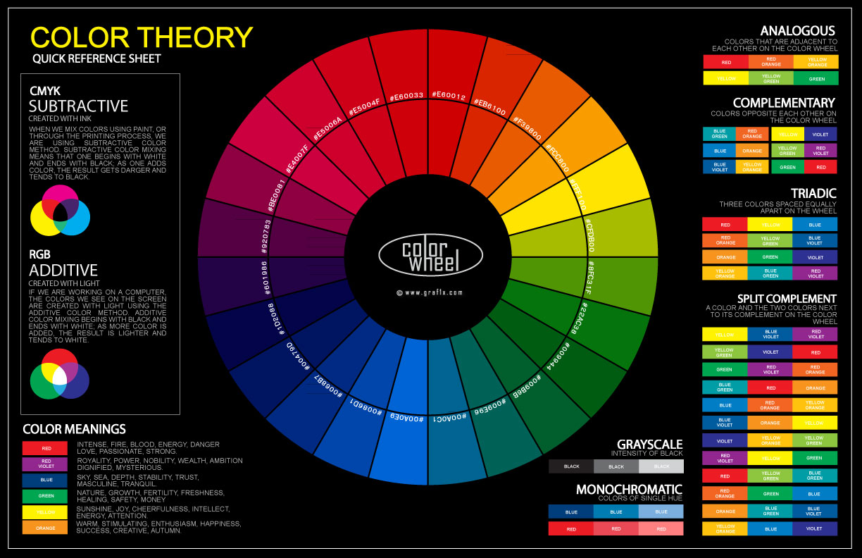
Furthermore, you need to find Color Harmony. Discovering and capturing the most pleasing color scheme isn’t easy. There are many theories around this subject. Some defend the use of analogous colors (the closest on the color wheel), while others are all about the opposite or complementary colors. The first ones are usually found in nature, and they’re pleasing to the eye. In my work, I tend to go with the opposite method when I want something to stand out. I also apply other color combinations, such as the triad, the rectangular, the square, and the split complementary. All are based on shapes you can find in the color wheel. There are many sites that can help you get this done in an accurate way.
5. How to Give Meaning to Your Image. Plus, How to Add a Title and Description
This is those of us who like to share photos on the web, and want to have our work seen by a large number of people. Our goal is to create and seek an emotional response from our viewers. Try to show your very best work. I’m not talking strictly about only showing photos with the finest details, sharpness, and flawless technique. If those are the only things that matter, then what’s the use of having the perfect photo when it has no deeper meaning?
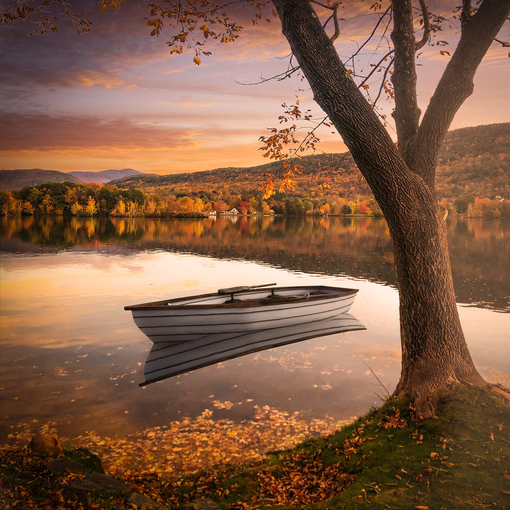
Instead of shooting a photo of a beautiful person just because she or he is beautiful, why don’t you create a visual story together with her or him? Adding a prop or a first-person perspective to your shot will bring a deeper meaning to your photo. If your photo has some negative space in the composition, your viewer will connect with your shot instantly. This can elicit emotion and intimacy in their minds. So try shooting different distances between you and your subject, as well as play with light from several angles. You’ll be surprised how a simple shadow can completely change an image. You can also find more information on that subject here.
There’s a lot of controversy about giving titles to pictures. Some photographers think it misleads the viewer and limits the viewing experience by giving a suggestion of how an image should be read from the beginning. I remember a friend of mine declaring, “A photo should speak for itself,” so it doesn’t need a title or a description. A title could distract your viewers. But here’s why I disagree with all that. I don’t upload a lot of images on photo communities like 500px. I just upload one photo every week, because I shoot only a few and I only want to display my best work. So every single picture I post is the result of a lot of interactions that I need to explain to my followers and viewers. From a quote I wrote to a movie I saw to a song I heard to an experience on location — all these situations are unique to me. I believe that if a person chose to view your image among millions of others, he or she deserves to be rewarded with a unique story or info about the photo.
I feel the same way about giving a title to a photo. I spend a lot of time finding a title that is perfect, and will trigger curiosity in a potential viewer. A title could also allow a discussion or debate. When someone commented on my photo, “Nothing Left to Lose” and said it was such a beautiful image and it didn’t deserve that title, I replied to him explaining what I really meant by it. So it was a bonus for me that my photo encouraged this kind of discussion.
I hope that you find these ideas I’ve shared helpful, and you have positive feedback for me. Just keep me posted about it in the comments below or join my Facebook group, Photo Reflections. Happy shooting!


Leave a reply